This document discusses typography and type design. It covers the parts of letters like x-height, cap height, ascenders, and descenders. It also covers typefaces, styles, measurements in points, kerning, tracking, leading, and special type effects.
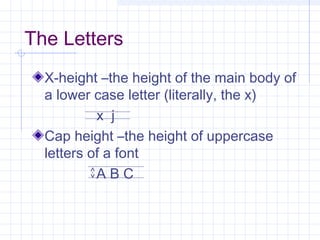
The Letters
X-height –theheight of the main body of
a lower case letter (literally, the x)
x j
Cap height –the height of uppercase
letters of a font
A B C
3.
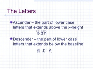
The Letters
Ascender –the part of lower case
letters that extends above the x-height
b d h
Descender – the part of lower case
letters that extends below the baseline
g p y
4.
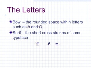
The Letters
Bowl –the rounded space within letters
such as b and Q
Serif – the short cross strokes of some
typeface
T f m
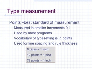
Type measurement
Points –beststandard of measurement
Measured in smaller increments 0.1
Used by most programs
Vocabulary of typesetting is in points
Used for line spacing and rule thickness
6 picas = 1 inch
12 points = 1 pica
72 points = 1 inch
10.
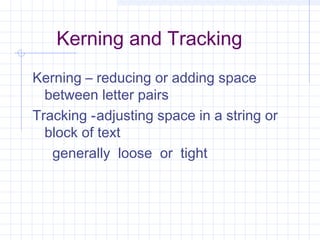
Kerning and Tracking
Kerning– reducing or adding space
between letter pairs
Tracking -adjusting space in a string or
block of text
generally loose or tight
11.
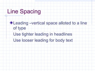
Line Spacing
Leading –verticalspace alloted to a line
of type
Use tighter leading in headlines
Use looser leading for body text
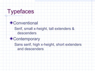
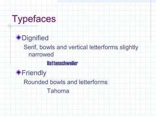
#2 The typeface you choose must match the message of your publication. Otherwise, you may confuse your readers.
There are rules, but sometimes you must abandon them when “it just doesn’t look right.”
#7 Squared serifs on type have an “official” look
Serif type helps readers distinguish letters in small type.
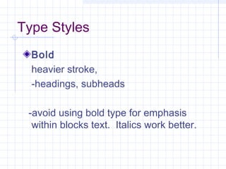
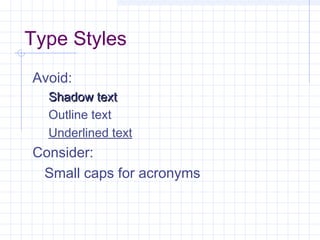
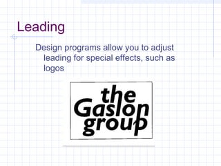
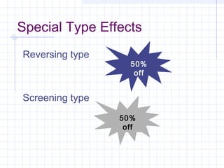
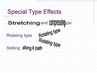
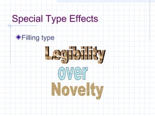
#9 Shadow, outline, underlining all interfere with text readability. Use only for special effects.
Small caps enhance readability by standing out less than full-size caps in text blocks


![[DevDay2019] Spacing and Typography, keys to a professional UI design - By Ng...](https://cdn.slidesharecdn.com/ss_thumbnails/duongnguyen-typographyspacing-190408082945-thumbnail.jpg?width=640&height=640&fit=bounds)


