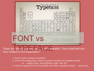
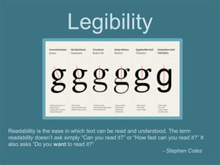
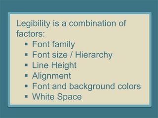
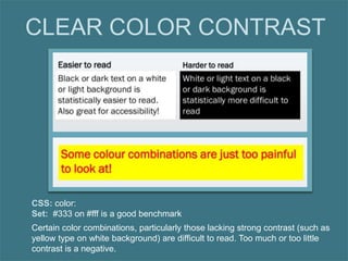
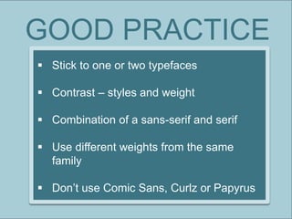
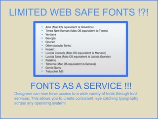
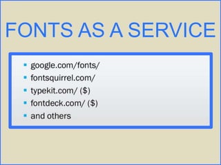
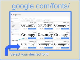
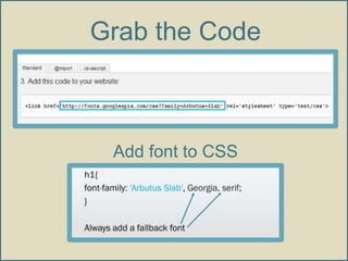
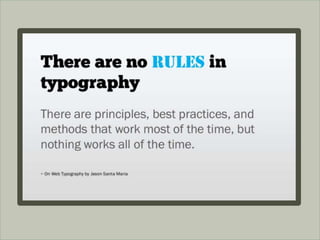
The document discusses typography and font design for legibility, including defining the differences between typefaces and fonts. It provides guidelines for font selection, hierarchy, line height, character length, alignment, color contrast, and other design choices to optimize readability of text. New font services now allow designers access to a wide variety of fonts to create consistent typography across any operating system.
5. Today the terms are pretty much interchangeable. I have searched and
have settled on this explanation:
1. A font is just a subset of typeface.
2. A font is the designation used for specific members of a typeface family,
i.e. – weight, style, size (Helvetica Light size 18).
3. A font is supposed to be of a specific size while a typeface doesn’t have to be.
FONT vs
TYPEFACE
6. Legibility
Readability is the ease in which text can be read and understood. The term
readability doesn’t ask simply “Can you read it?” or “How fast can you read it?” It
also asks “Do you want to read it?”
- Stephen Coles
7. Legibility is a combination of
factors:
Font family
Font size / Hierarchy
Line Height
Alignment
Font and background colors
White Space
8. One Font for the Headings
Choose one legible typeface with varied weights, or
choose two typefaces with contrasting styles and weights.
Combining a serif typeface with a sans serif typeface
(without serifs) gives the most contrast and visual appeal.
.
One font for the body copy.
9. Hierarchy
Hierarchy helps your audience distinguish between levels
of information, such as title, header, subhead and body.
Information can be set apart by changing font family, font
type, size and color.
To maintain unity, keep typographic choices consistent for
each section throughout a layout.
10. LEADING: Space between lines
CSS: line-height
Set: 140-150% of font size is a good bench mark
If letters, words, or lines are too far apart, readers have a hard time because
blocks of text tend to look too light, causing readers to lose a sense of continuity.
11. MEASURE: length of line of text
CSS: max-width
min-width
Set: 45-80 characters is
generally considered optimal
for readability.
12. CSS: text-align
Set: left, right, center, justify
JUSTIFICTION: paragraph alignment
RIVERS: Bad words spacing, usually with justified text, can create “rivers” or
unintentional areas of white space that flow down a page and create a visual
distraction for the reader.
13. Certain color combinations, particularly those lacking strong contrast (such as
yellow type on white background) are difficult to read. Too much or too little
contrast is a negative.
CLEAR COLOR CONTRAST
CSS: color:
Set: #333 on #fff is a good benchmark
14. GOOD PRACTICE
Stick to one or two typefaces
Contrast – styles and weight
Combination of a sans-serif and serif
Use different weights from the same
family
Don’t use Comic Sans, Curlz or Papyrus
15. LIMITED WEB SAFE FONTS !?!
FONTS AS A SERVICE !!!
Designers can now have access to a wide variety of fonts through font
services. This allows you to create consistent, eye catching typography
across any operating system!