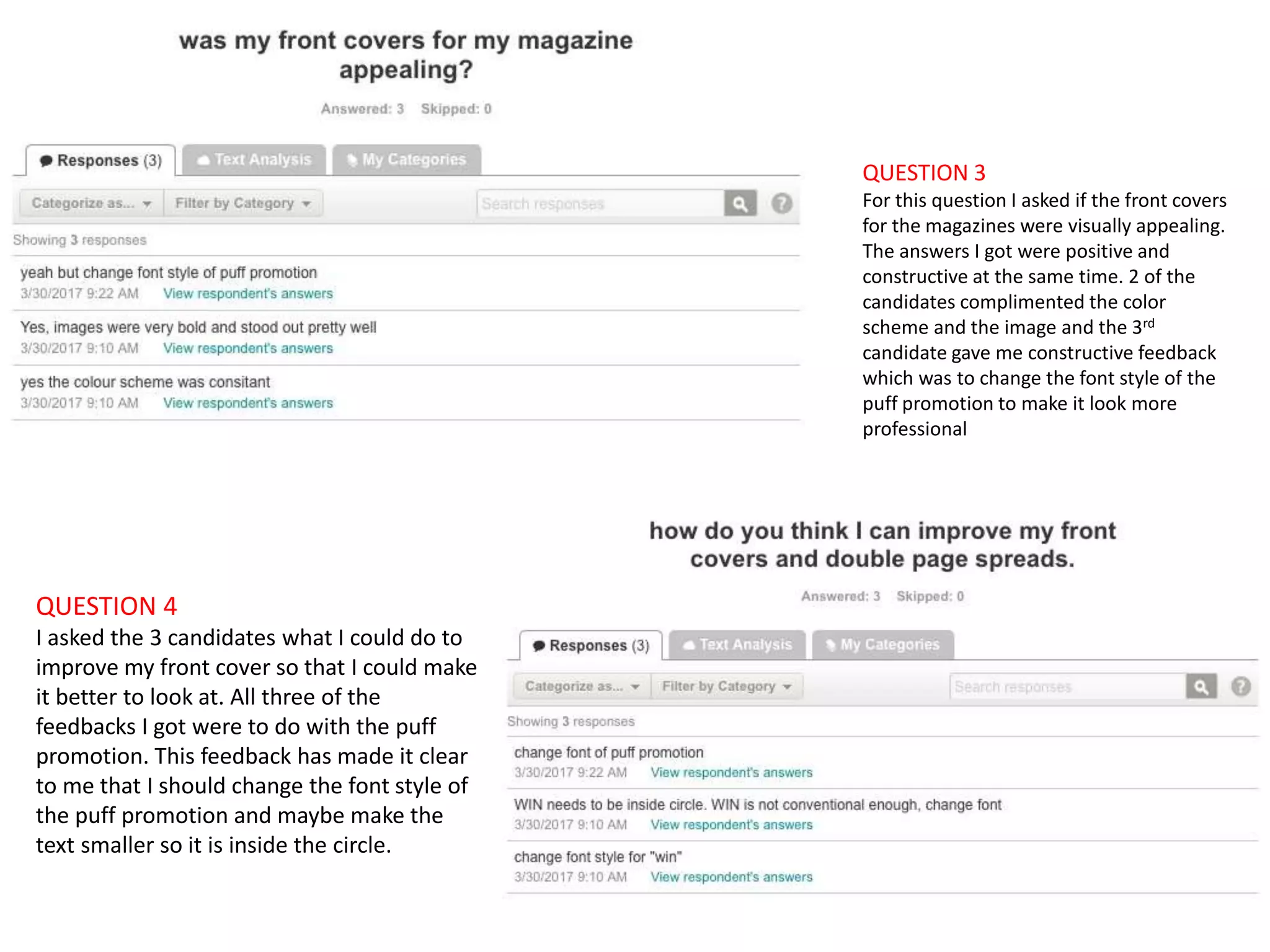
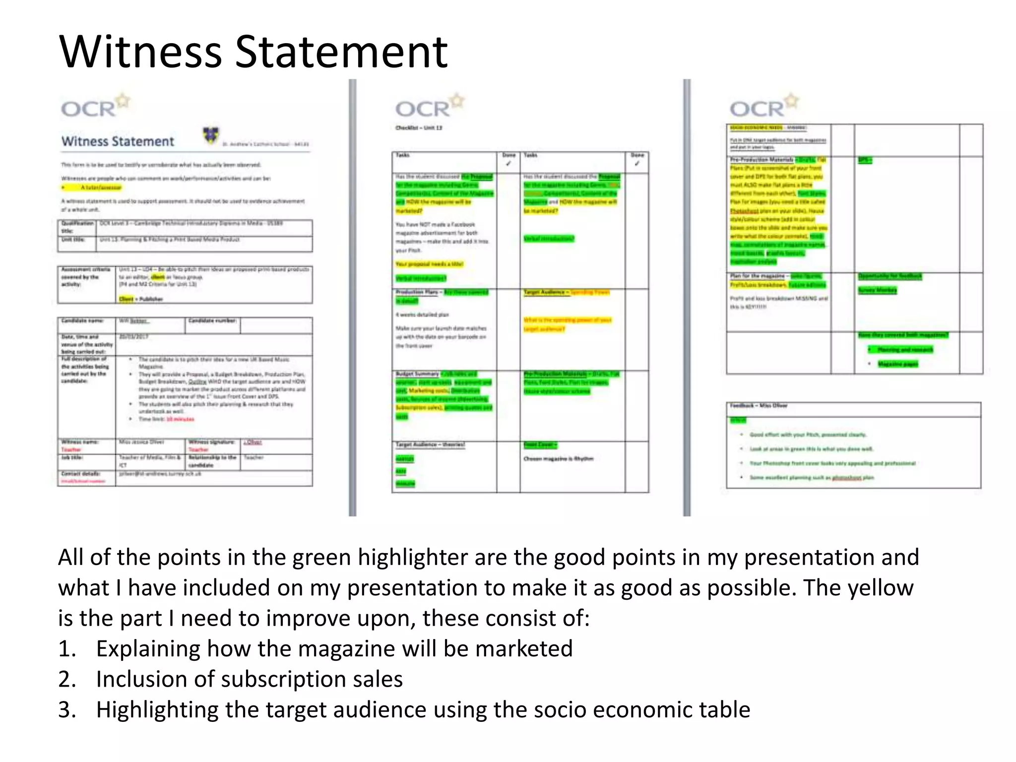
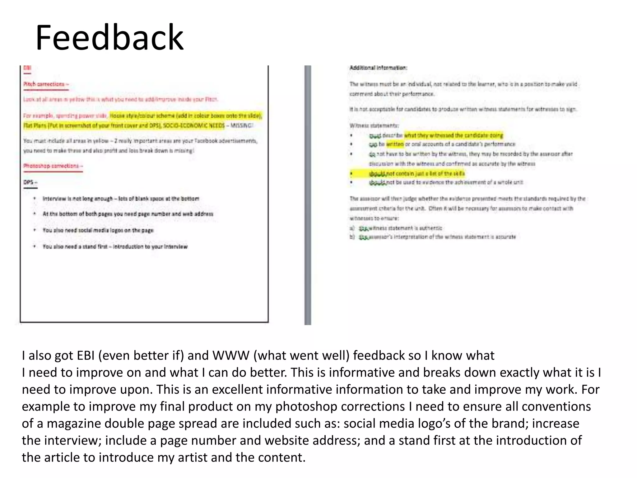
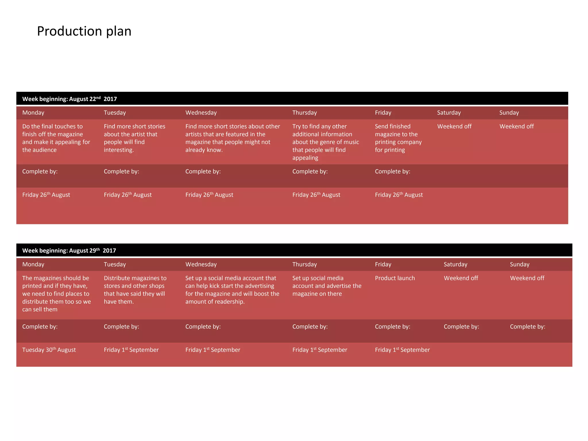
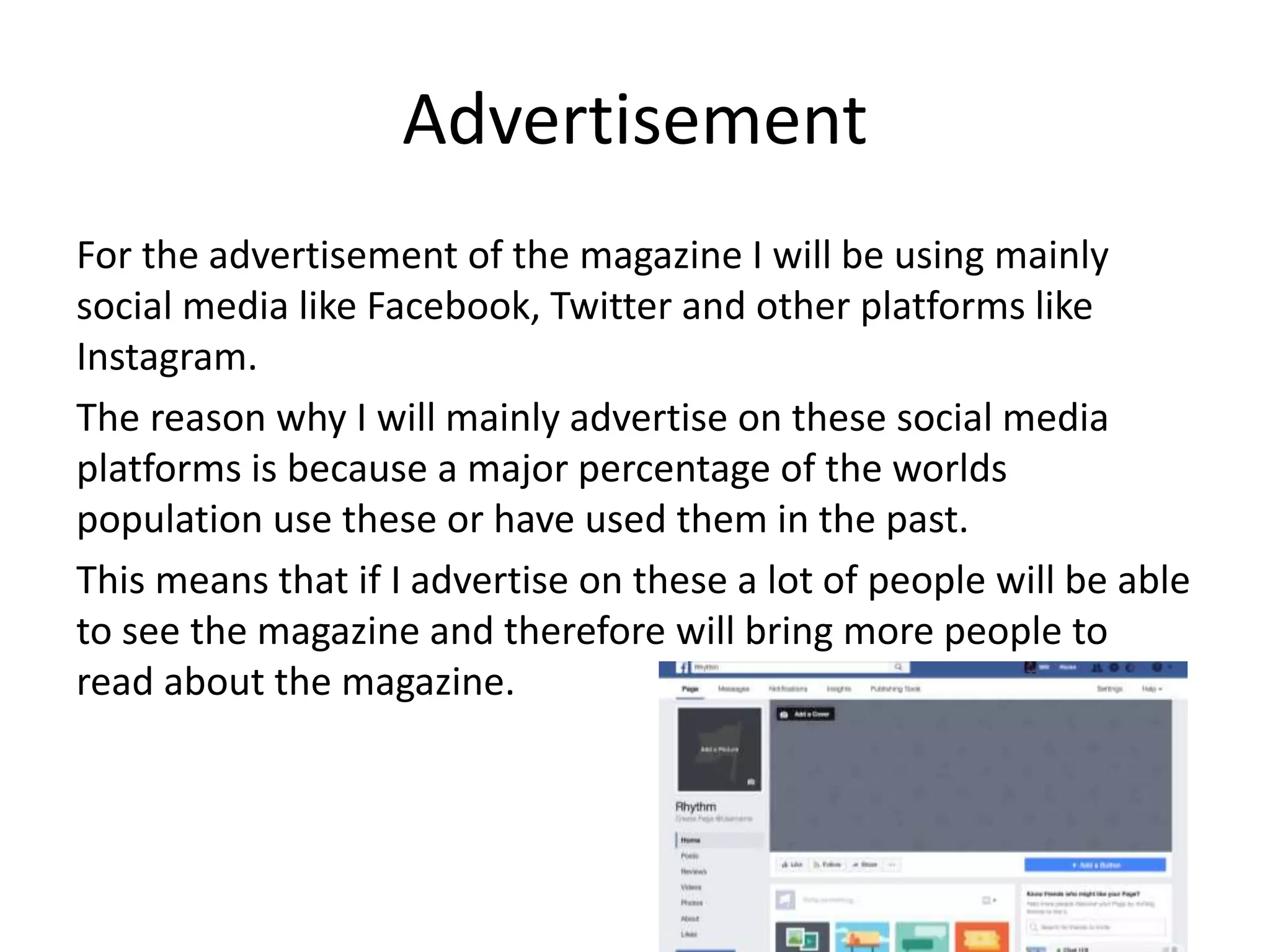
Contents
1. Environment for presentation
2. Sources for Presentation
3. Materials Used
4. My Pitch
5. Hand drawn drafts
6. House Style
7. Masthead
8. Pre Production task
9. Photoshop Drafts
10. Target audience
11. Photoshop Drafts 1st Correction
12. Photoshop Drafts 2nd Correction
13. Conclusion
Environment of Presentation
I have taken a few photos of the classroom environment where my presentation took place in. I presented the
presentation on a whiteboard which was situated in the middle of the classroom so the audience that I was
presenting in front of found it easy to watch the presentation. I also used a slide changer for the presentation.
This is because I could stand away from the whiteboard and control the slides without getting in the way of the
presentation. To record the presentation I used a Nikon camera. To hold the camera I also used a tripod to
keep it steady.
The classroom that my
presentation took place in
The remote that I used to change
the slides on the presentation.
The camera used to record the
presentation
The tripod I used to hold the
camera in a steady position
Evidence of Pitch and placement of me in relation to the enviroment
Materials Used
The materials that I used was an interactive whiteboard and a laser pointer on
a slide clicker. This made it easy for me to conduct my presentation as
professionally as possible. To film the presentation for evaluation I used a
DSLR camera that was mounted on a tripod for a steady and professional
video. This equipment allowed for a professional pitch and was industry
standard. This was a good way to gain constructive feedback in a controlled
environment.
Evidence of pitch.
This is the evidence that I have screen shot from the video that recorded my presentation. This
shows that I presented my pitch in front of a clients. This was a formal situation with professional
equipment. This allows constructive feedback to ensure the right corrects and the opinions were
within a safe controlled environment. This format allowed me to specifically explain my product
and use all the information I have gained and researched to sell the idea to the client in a
professional and informed manner. The Slideshow added additional information that I wasn’t
voicing and showed the specific facts and evidence for what I was saying.
Hand Drawn Drafts
These are the final sketch layouts that I have chosen as a base for the magazine Front
Cover and Double Page Spread. This is due to the spaced layout therefore easy
accessible to read. It also is a simple design, based from other popular magazines of
this genre and therefore is appealing to the reader visually. It includes all the
conventions of a music magazine and will be focused on the content within the pages
which is what the reader wants to be ‘informed and educated’ (Katz) and ‘Personally
identify’ (Katz) with the information.
As denoted in the final sketch of the front cover I would have the masthead at the top
of the page for clear visibility and the main image as the background in the center of
the page to make sure the audience know who is being featured, similarly the same
reason my headline is centrally positioned. I would use puff promotions and social
media to expand the consumer ship. The additional cover lines of related content will
be to the left side of the page over laying the main image to highlight the variety of
content within.
The double page spread as denoted by the final sketch will include the masthead to create
continuity and brand identification. The usual conventions of a double page spread such as
drop capitals and pull quotes will also be included to entice the readers in and the text and
image will be separate to make the page appealing as other magazines format is similar.
House Styles for Beat
The house style for BEAT magazine is monochrome and yellow. This is
because the two colours contrast well and they look good when there is
an even amount of each colour on a page. The yellow will be used for
key information such as Masthead and Headlines, whereas the white will
be used for additional information; cover lines and barcode.
This colour scheme will be carried out throughout the whole magazine
to show that it has a consistent house style, creating a brand identity and
continuity. This also appeals to the target audience who will identify with
this consistent style but also passing by audience who will be intrigued
by the magazine that stands out the most against competitors.
This colour scheme is new for this genre of music magazine with the
closest house style being Billboard who use a range of colours. This is
due to the gender neutral colours and the connotations of yellow being
happy. The synergy created with the social media icons allow the
magazine to use technological convergence to widen the audience and
use below the line marketing to promote their product. This should lead
to more readers and consumers as well as overall publicity. The icons
could possibly be altered to fit the house style with Photoshop skills to
change them to yellow.
House Styles for Rhythm
The house style for Rhythm magazine is monochrome and red. This is
because the two colours contrast well and they look good when there is
an even amount of each colour on a page. The red will be used for key
information such as Masthead and Headlines, whereas the white will be
used for additional information; cover lines and barcode.
This colour scheme will be carried out throughout the whole magazine
to show that it has a consistent house style, creating a brand identity and
continuity. This also appeals to the target audience who will identify with
this consistent style but also passing by audience who will be intrigued
by the magazine that stands out the most against competitors.
This colour scheme is popular for this genre of music magazine with Q
and NME adopting this house style. This is due to the gender neutral
colours and the connotations of red being passion. The synergy created
with the social media icons allow the magazine to use technological
convergence to widen the audience and use below the line marketing to
promote their product. This should lead to more readers and consumers
as well as overall publicity. The icons could possibly be altered to fit the
house style with Photoshop skills to change them to red.
Font Styles
MAGINUM
http://www.dafont.com/magnum.
font?text=Rhythm&back=theme
Funk machine
http://www.dafont.com/funk-
machine.font?text=Rhythm&back
=theme
Neon
http://www.dafont.com/neon-
80s.font?text=Rhythm&back=theme
Pincoyablack
http://www.dafont.com/pincoyablack.font?te
xt=Beat&back=theme
Arista
http://www.dafont.com/arista.font?text=
Beat&back=theme
Chunky Funks
http://www.dafont.com/chunky-
funks.font?text=Beat&back=theme
I think the fonts that I have chosen are typical of the music genre Hip-Hop, they are strong yet simple design,
meaning they are easy to identify and understand the wording. This Masthead simplicity will allow it to be easily
recognized adapted to every page. The fonts that I have chosen are suitable for the house style as well because they
are bold and eye catching to the audience and they look professional yet mainstream.
Masthead ideas
On this mind map I have analysed all the aspects that the Masthead should meet before the
magazine is produced. The aspects include things like: eye catching, original colours, unique
font styles etc.…
The reason for planning in advanced and especially for the Masthead is because it is the first
thing that the audience will see, it is the identity of the brand and it needs to stand out against
its competitors making it easy for the reader to recognise.
Masthead for Beat
COLOUR
SCHEME
FONT
Connotations behind BEAT
Style
Monochrome and a
primary colour
Beat is a term with music creation, Hip-hop
primarily relies on beats to create the song.
This masthead directly indicates the genre the
magazine will fall into.
Connotations behind Rhythm
Rhythm is a term used within the music
industry to describe the feel of the music. This
masthead relates to the genre of the
magazine being Hip-Hop a well know music
taste.
The font style needs to be in keeping with the genre of music
therefore will be using DaFont to select the most appropriate
block typography that is clear and easy to read and also works
in colour.
This will allow the primary colour to
stand out and therefore the categorize
the information into most important.
Connotation behind
colour Yellow
Happiness, upbeat,
strong, shine,
standout.
Test Photography and Prop List
The clothing against the night background worked well as the colours stood out. There were no requirements for hair and makeup but the
costume was key to represent the genre of music and allow the audience to identify with the subject.
The only problem that occurred during the filming was the lighting as this was taken at night and relied on street artificial light that wasn’t
controllable. This was not taken into consideration within the photography plan however the resources that solved this came from
components that were planned for. Using the flash setting on the camera and headlights from the transport allowed enough light to gain a
strong photo.
The point of the photography plan was to make sure every aspect of the set was covered
form costume to setting. This was a good guide building to the day to make sure that
everything needed was prepared and any problems had solutions.
Week beginning: August 8th 2017
Monday Tuesday Wednesday Thursday Friday Saturday Sunday
Meet new employees
and brief of the purpose
and overall initial ideas
for the magazine and
what I plan to achieve in
the short and long term .
Search for the artist to
interview for the first
addition of the magazine.
Needs to be a
popular/upcoming artist
of the Grime genre.
Delegate job to the writer to write
script for the interview of the
artist, considering what the
Get the reporter to
interview the chosen
artists with the questions
the writer came up with.
When the
answers have
been collated the
they can be
written up into
the magazine .
Do a photo-shoot of the
artist for the front cover
and DPS for the magazine,
take a wide range of shot
types and angles.
Get the designer to
design the layout of
the front cover and
DPS.
Complete by: Complete by: Complete by: Complete by: Complete by: Complete by: Complete by:
Monday 12th August
2017
Sunday 19th August 2017 Thursday 21st August 2017 Saturday 24th August
2017
Sunday 25th
August 2017
Tuesday 26th August 2017 Tuesday 26th August
2017
Week beginning: August 15th 2017
Monday Tuesday Wednesday Thursday Friday Saturday Sunday
Get reporter to research
the latest stories in the
music industry that are
related to the chosen
genre.
Edit the photos on
Photoshop that were
taken to make them look
good for the final cut of
the magazine.
Insert interview into the DPS of the
magazine.
Ask businesses if they
would like to advertise on
the pages.
Insert the articles
that were found
into other pages
of the magazines
Editor to proof read
annotate changes to
the magazines
content.
Any extra work to be
completed today, make
sure all content is to a
high standard and check
truth of the facts.
Complete by: Complete by: Complete by: Complete by: Complete by:
Friday 19 th August Saturday 20th August Wednesday 17th August Thursday 25th August Friday 26th August
Production Plan
Week beginning: August 29th 2017
Monday Tuesday Wednesday Thursday Friday Saturday Sunday
The magazines should be
printed and if they have,
we need to find places to
distribute them too.
Distribute magazines to
stores and other shops
that have signed the
contracts to sell them.
Set up a social media account that
can help kick start the advertising
for the magazine and will boost the
amount of readership.
Update Social media
accounts to full content
advertise offers and deals.
Product launch Weekend off Weekend off
Complete by: Complete by: Complete by: Complete by: Complete by: Complete by: Complete by:
Tuesday 30th August Friday 1st September Friday 1st September Friday 1st September Friday 1st September
The production plan shows me the dates that things need to be carried out and
completed by. It is useful to have a production plan made before production because it
gives yourself and employees a guideline when making the magazine.
Week beginning: August 22nd 2017
Monday Tuesday Wednesday Thursday Friday Saturday Sunday
Do the final touches to
finish off the magazine
and make it appealing for
the audience
Find more short stories
about the artist that
people will find
interesting.
Find more short stories about other
artists that are featured in the
magazine that people might not
already know.
Try to find any other
additional information
about the genre of music
that people will find
appealing
Send finished
magazine to the
printing company
for printing
Weekend off Weekend off
Complete by: Complete by: Complete by: Complete by: Complete by:
Friday 26th August Friday 26th August Friday 26th August Friday 26th August Friday 26th August
Production Plan
Target audience
Katz’ theory: according to Katz my magazine will ‘inform and educate’ the audience. This is through using interesting language and images in
order to attract the audience into reading the text. For example within the magazine it consists of interviews with famous people that are well
known, the use of well known celebrities attracts more people that are interested in the specific celebrity. Furthermore if my magazine use
well known people then people will enjoy reading the article more, this is how the magazine is able to inform and educate the audience. The
use of interesting images creates a diversion for the audience because it is enabling them to sit and read an interesting magazine and escape
reality for the duration of reading the magazine.
Hartley’s: Hartley's theory highlights that my magazine should consider Age, gender, class, ethnicity, self-image, nation and family.
They should make sure that the magazine getting published is age appropriate to younger people whop read the magazine, this
means no sign of gore or sexual images. It is also very important that they consider different races before publishing the magazine
this is because there might be some controversial language used that might offend certain people because of their race or
ethnicity. Another thing that it says s gender and self image. These are really important because there might be contexts that
could make people feel they are lower than other people because they are a male or female. Also people might look at their self
differently after looking at a model in an image
Maslow: Maslow's theory mentions 4 different potential outcomes for a reader after reading a magazine these are; social
climbers, care givers, explorers and survivors. Social climbers is when the audience are driven by improving their status in society.
This is important because it gives the audience confidence and a drive to do well in life. Caregivers is when the audience
sympathies with the characters situation. This is important because it gives the audience a chance to escape reality and be
engrossed into a magazine. Survivors is when the audience members want security and routine. This is important because they
have security knowing that the magazine will be published on a set date.
Sources: http://documents.mx/education/katz-hartley-and-maslow-theory.html
The target audience for my magazine is 15-20 year olds. This is because statistics prove that that age range like
hip hop more than other age ranges, this is therefore a larger audience.
The reason why I have chosen a larger audience is because the magazine will get more sales if they enjoy
reading the magazine. Furthermore it will increase the development of the brand and increase recognition
when people see it on the shelves at a store.
Improvements on
DPS 1st correction
As seen on the right I have made
the interview longer by increasing
the size of the text by a little bit.
This filled in the gap that was left
at the bottom of the interview
and filled the page. The reason
why it was essential that I needed
to do this is to make the magazine
look more professional, in
conclusion it made the double
page spread look more visually
appealing to look at because
there is no blank spaces. I also
include the social media logo’s to
promote technological
convergence and promote the
brand. The page number is now
located to the bottom left to
stand out and be easily seen.
before
after
For the second improvement I
added in a web address and a
page number, this makes the
magazine look more professional
because it tells the users the page
that they are currently on so it
therefore helps them to navigate
through the magazine easier. I
have also added the web address
because it gives the people a link
to the website so they can read
more about the article on the
page and read more about the
company. This promotes the
brand a entices readers to
participate and be more informed.
Before
After
Improvements on
DPS 2nd correction
I have added social media links at the bottom of each magazine double page
spreads, this is so the reader can see that we are on different social media
platforms and therefore can go to the websites and see what the company is
posting on these sites. This promotes technological convergence and
increases brand’s range to audience. This is ensuring that the audience can
particpate and relate to the magazine and shows the breadth of information
the magazine can offer.
Before
After
Improvements on DPS
3rd correction
As you can see I have added in a stand first to the interview, this
is short introduction to the interview and an insight as to what to
expect throughout the interview, as the artist is up and coming he
may not be well known therefore this introduces him before the
article is read and entices the reader to read more and find out
more information. This short sentence is catchy and outlines
what the article will feature and discuss.
Improvements on DPS 4th
correction
Conclusion
In this L0 I have underlined the strengths and
weaknesses of my pitch presentation and I got
feedback on how I can improve it for future reference. I
have also added in the production process of the
magazine to highlight what's happening on a day to day
basis in the production of the magazine.
The corrections were key in informing how to improve
my work and where I can make the product better. This
was a valuable task to ensure I had reached all criteria
needed to create a profitable product that its appealing
to the target audience.
Why I chose to use survey monkey
The reason why I chose survey
monkey to help improve my pitch is
because I could collate a variety of
different answers and opinions from
peers in my class. The reason why
this is helpful is because I can then
use that information to improve my
pitch. The other reason I chose
survey monkey is because it is easy
to use and I can also chose specific
questions that I would like the
answer to.
The following slides are the questions that I asked my peers and the feedback I got
back from them which I have annotated
QUESTION 1
In this question I asked what I could
improve with the overall presentation.
The feedback that I got from all 3
candidates were the same. This illustrates
that I need to make a Facebook page to
show how I have advertised the
magazines on social media
QUESTION 2
For this question I asked if I have
covered everything on the mark
scheme. The answers were similar
stating that I have covered most of the
marks needed however I missed the
‘marketing costs’ page which is clear
because it is in two of the feedbacks I
got
Improvements based on feedback from questions on
survey monkey
QUESTION 3
For this question I asked if the front covers
for the magazines were visually appealing.
The answers I got were positive and
constructive at the same time. 2 of the
candidates complimented the color
scheme and the image and the 3rd
candidate gave me constructive feedback
which was to change the font style of the
puff promotion to make it look more
professional
QUESTION 4
I asked the 3 candidates what I could do to
improve my front cover so that I could make
it better to look at. All three of the
feedbacks I got were to do with the puff
promotion. This feedback has made it clear
to me that I should change the font style of
the puff promotion and maybe make the
text smaller so it is inside the circle.
For this question I asked the candidates what they
would change about the presentation in general.
For one of the answers they said to look at the
checklist before presenting, this is because I
hesitated on some slides, the checklist helps me
remember the names of some slides. For the
second answer they said I am missing the ‘socio-
economic needs’ slides. They stated that if they
changed anything about the presentation they
would add that slide in. lastly the 3rd candidate
mentioned that I missed some information but did
not specify on what I missed. To see what I missed I
will look at the witness statement
I asked the 3 candidates in the
audience how they thought the
presentation went. All three of
the candidates said that the
presentation went very well or
alright. They did not specify on
what in specific I did well in.
I asked the candidates if I went into enough detail on the slides. He reason why I asked
this is because I needed to have a lot of detail when presenting the pitch. This is so that I
have as much information as possible within the PowerPoint. Luckily all three of the
answers I got within the feedback were all positive. They all said that I went into enough
detail throughout the whole presentation
Witness Statement
All of the points in the green highlighter are the good points in my presentation and
what I have included on my presentation to make it as good as possible. The yellow
is the part I need to improve upon, these consist of:
1. Explaining how the magazine will be marketed
2. Inclusion of subscription sales
3. Highlighting the target audience using the socio economic table
Feedback
I also got EBI (even better if) and WWW (what went well) feedback so I know what
I need to improve on and what I can do better. This is informative and breaks down exactly what it is I
need to improve upon. This is an excellent informative information to take and improve my work. For
example to improve my final product on my photoshop corrections I need to ensure all conventions
of a magazine double page spread are included such as: social media logo’s of the brand; increase
the interview; include a page number and website address; and a stand first at the introduction of
the article to introduce my artist and the content.
Week beginning: August 8th 2017
Monday Tuesday Wednesday Thursday Friday Saturday Sunday
Meet all the new
employees and tell them
about my initial ideas for
the magazine and what I
plan to achieve in the
short and long term
Search for a artist to
interview for the first
addition of the magazine.
Ask the writer to come up with
good ideas to ask the artists that
we have chosen for the magazine
Get the reporter to
interview the chosen
artists with the questions
the writer came up with
When the
answers have
been collated the
they can be
written up into
the magazine
Do a photo-shoot of the
artist for the front cover
and DPS for the magazine.
Get the designer to
design the layout of
the front cover and
DPS.
Complete by: Complete by: Complete by: Complete by: Complete by: Complete by: Complete by:
Monday 12th August
2017
Sunday 19th August 2017 Thursday 21st August 2017 Saturday 24th August
2017
Sunday 25th
August 2017
Tuesday 26th August 2017 Tuesday 26th August
2017
Week beginning: August 15th 2017
Monday Tuesday Wednesday Thursday Friday Saturday Sunday
Get reporter to look up
the latest stories in the
music industry that are
related to the chosen
genre
Edit the photos that were
taken to make them look
good for the final cit of
the magazine
Insert interview into the DPS of the
magazine.
Ask businesses if they
would like to advertise on
the pages.
Insert the articles
that were found
into other pages
of the magazines
No work on this
weekend
No work on this
weekend
Complete by: Complete by: Complete by: Complete by: Complete by:
Friday 19 th August Saturday 20th August Wesnesday 17th August Thursday 25th August Friday 26th August
Production plan
Week beginning: August 22nd 2017
Monday Tuesday Wednesday Thursday Friday Saturday Sunday
Do the final touches to
finish off the magazine
and make it appealing for
the audience
Find more short stories
about the artist that
people will find
interesting.
Find more short stories about other
artists that are featured in the
magazine that people might not
already know.
Try to find any other
additional information
about the genre of music
that people will find
appealing
Send finished
magazine to the
printing company
for printing
Weekend off Weekend off
Complete by: Complete by: Complete by: Complete by: Complete by:
Friday 26th August Friday 26th August Friday 26th August Friday 26th August Friday 26th August
Week beginning: August 29th 2017
Monday Tuesday Wednesday Thursday Friday Saturday Sunday
The magazines should be
printed and if they have,
we need to find places to
distribute them too so we
can sell them
Distribute magazines to
stores and other shops
that have said they will
have them.
Set up a social media account that
can help kick start the advertising
for the magazine and will boost the
amount of readership.
Set up social media
account and advertise the
magazine on there
Product launch Weekend off Weekend off
Complete by: Complete by: Complete by: Complete by: Complete by: Complete by: Complete by:
Tuesday 30th August Friday 1st September Friday 1st September Friday 1st September Friday 1st September
Production plan
IPSO Editors code of practise
https://www.ipso.co.uk/editors-code-of-practice/
The Code- It is the cornerstone of the system of voluntary self-regulation to which they have made a
binding contractual commitment. It balances both the rights of the individual and the public's right to
know.
Accuracy- This is when the media company has to make sure that what they are publishing is accurate
towards the IPSO guidelines. However if the company is inaccuracy when this must be corrected or they
have to write an apology. However the publisher could be sewed by the person they have accused if
they have no evidence of what they say.
Harassment- This is when the editor or journalists cannot engage in any form of intimidation or
harassment. This includes not persist in asking questions, telephoning and if they are on someone's
property and they are asked to leave they have to leave. For example my magazine’s journalist cannot
force someone into doing an interview with them otherwise they could be persecuted.
Privacy- This is when the editor has to be careful about what they are writing about someone and they
don’t expose any sensitive information. The code says that ‘Everyone is entitled to respect for his or her
private and family life, home, health and including digital communications’ so this means that if an
editor mentions any of this they can take action against them. For example my magazine cannot expose
any of this private information when writing about an artists without their permission. However if the
editor has consent from the person they are allowed to mention these topics.
Copyright- copyright is the legal right that is given to the originator for a number of years after they
create it. This allows them to print, preform, film or publish what they have created.
Equipment costs.
This camera is all the photographer will need because it is a good quality and simple
to use camera. The cost of this ‘cannon 700d’ is £569.99 there will only need to be
one camera because there is only one photographer.
http://www.argos.co.uk/product/1024470?cmpid=GS001&_$ja=tsid:59158%7Ccid:200291090%7Cagid:125256
97850%7Ctid:pla-
94832032610%7Ccrid:66128556290%7Cnw:g%7Crnd:16286430329956698556%7Cdvc:c%7Cadp:1o1&gclid=CL_
c0JqzodICFekW0wodwtsAbg
For the computer the employees will need something that is easy to edit the
magazines on and has the software that best suits the job role they will be carrying
out for this I have chosen an ‘IMAC’ this is because they are easy to use and have
everything they will need in order to carry out their jobs. The cost of one IMAC will
be £1,049.00 I will need 9 of these for all the employees so it will cost £9,441
http://www.apple.com/uk/shop/buy-mac/imac/215-inch-imac?afid=p238%7CsboCqtOrE-
dc_mtid_187079nc38483_pcrid_64626336361_&cid=aos-uk-kwgo-pla-mac-slid--product-MK142B/A-UK
For the office space I have selected an office in central London that is reasonably cheap
for the location. It will cost £495 per month for one person. I will only be renting the
office for a couple months (only for the duration of making the magazine. This means it
will cost £8910 for the 2 months for everyone.
https://www.officespacelondon.com/london-bridge
Photoshop corrections
Improvements on
DPS 1st correction
As seen on the right I have made
the interview longer by increasing
the size of the text by a little bit.
This filled in the gap that was left
at the bottom of the interview
and filled the page. The reason
why it was essential that I needed
to do this is to make the magazine
look more professional, in
conclusion it made the double
page spread look more visually
appealing to look at because
there is no blank spaces. I also
include the social media logo’s to
promote technological
convergence and promote the
brand. The page number is now
located to the bottom left to
stand out and be easily seen.
before
after
For the second improvement I
added in a web address and a
page number, this makes the
magazine look more professional
because it tells the users the page
that they are currently on so it
therefore helps them to navigate
through the magazine easier. I
have also added the web address
because it gives the people a link
to the website so they can read
more about the article on the
page and read more about the
company. This promotes the
brand a entices readers to
participate and be more informed.
Before
After
Improvements on
DPS 2nd correction
I have added social media links at the bottom of each magazine double page
spreads, this is so the reader can see that we are on different social media
platforms and therefore can go to the websites and see what the company is
posting on these sites. This promotes technological convergence and
increases brand’s range to audience. This is ensuring that the audience can
particpate and relate to the magazine and shows the breadth of information
the magazine can offer.
Before
After
Improvements on DPS
3rd correction
As you can see I have added in a stand first to the interview, this
is short introduction to the interview and an insight as to what to
expect throughout the interview, as the artist is up and coming he
may not be well known therefore this introduces him before the
article is read and entices the reader to read more and find out
more information. This short sentence is catchy and outlines
what the article will feature and discuss.
Improvements on DPS 4th
correction
Pitch corrections
The pitch corrections were related to the
content within the pitch and the information I
provided to the audience. The areas to focus on
where the house style and colour scheme and
to give them more information and key visuals
on what it will look like. This improved with
including the connotations behind the colours
but also visually including coloured blocks to
show how the colours work together on a page.
The first improvement was to show how the
magazine will be advertised for this I have made a
Facebook page and added it to the pitch
presentation. The second one was to add a title
onto the proposals which was easily done and
completed to make it clear what I am proposing in
black and white.
Pitch corrections 1st and 2nd
The third improvement(s) was so make my flat
plans different to each other and also add my
front page to the flat plans. I changed the flat
plans so they are different and I added the front
pages to the flat plans. This now shows strong
correlation on how the whole magazine will look
and the amount of content that will be included.
This informs the client more on the overall
product and what to expect on completion.
Pitch
corrections 2nd
Cost of having staff
• The yearly salary for a person editing a magazine is roughly £40,000.
https://www.indeed.co.uk/jobs?q=magazine+editor&l=london
• The average yearly pay for a publisher is £38,259
https://www.indeed.co.uk/jobs?q=magazine+publisher&l=london
• The average pay for a journalist is
£23,000https://www.google.co.uk/search?client=safari&rls=en&q=journalist+salary&ie=UTF-
8&oe=UTF-8&gfe_rd=cr&ei=dgerWJrMG6Wn8weblrTYBw
• For a writer £37,470 is the average pay.
https://www.indeed.co.uk/jobs?q=writer&l=london
• For the photographer I will get a sixth form student as a trainee and pay them £100 a week
so £400.
Advertisement
For the advertisement of the magazine I will be using mainly
social media like Facebook, Twitter and other platforms like
Instagram.
The reason why I will mainly advertise on these social media
platforms is because a major percentage of the worlds
population use these or have used them in the past.
This means that if I advertise on these a lot of people will be able
to see the magazine and therefore will bring more people to
read about the magazine.
Cost of printing
I will be printing 200 copies of the magazine when the magazine is first released for the first time to the public. This is so I know
how many people roughly want to read the magazine every month and will give me a rough estimate if I need to order more
copies in the future.
The cost of printing 250 copies of the magazine will cost £290.81
https://print24.com/uk/
Calendar events
The 1st of September is the day that most
students go back to school. It is important to
take this into consideration because as the
magazine is targeted at school aged children
there might not be a of people buying the
magazine until later in the day or week as they
have just started school again.
Conclusion
In this PowerPoint I have gone into depth on the key aspects the
magazine must have before the release and highlighted how
important it is to proof read work and do the corrections needed
to meet the expectations of a professional magazine before it is
released to the public for them to read. I have highlighted and
proved that I did my presentation in front of a client and I have
also added in information about start up costs, printing and
advertising costs. Finally I have shown the corrections that I have
made to my front cover, double page spread and also my pitch
presentation.
Favorite magazine

Unit 13 - L04 - L05

  • 2.
    Contents 1. Environment forpresentation 2. Sources for Presentation 3. Materials Used 4. My Pitch 5. Hand drawn drafts 6. House Style 7. Masthead 8. Pre Production task 9. Photoshop Drafts 10. Target audience 11. Photoshop Drafts 1st Correction 12. Photoshop Drafts 2nd Correction 13. Conclusion
  • 3.
    Environment of Presentation Ihave taken a few photos of the classroom environment where my presentation took place in. I presented the presentation on a whiteboard which was situated in the middle of the classroom so the audience that I was presenting in front of found it easy to watch the presentation. I also used a slide changer for the presentation. This is because I could stand away from the whiteboard and control the slides without getting in the way of the presentation. To record the presentation I used a Nikon camera. To hold the camera I also used a tripod to keep it steady. The classroom that my presentation took place in The remote that I used to change the slides on the presentation. The camera used to record the presentation The tripod I used to hold the camera in a steady position Evidence of Pitch and placement of me in relation to the enviroment
  • 4.
    Materials Used The materialsthat I used was an interactive whiteboard and a laser pointer on a slide clicker. This made it easy for me to conduct my presentation as professionally as possible. To film the presentation for evaluation I used a DSLR camera that was mounted on a tripod for a steady and professional video. This equipment allowed for a professional pitch and was industry standard. This was a good way to gain constructive feedback in a controlled environment.
  • 5.
    Evidence of pitch. Thisis the evidence that I have screen shot from the video that recorded my presentation. This shows that I presented my pitch in front of a clients. This was a formal situation with professional equipment. This allows constructive feedback to ensure the right corrects and the opinions were within a safe controlled environment. This format allowed me to specifically explain my product and use all the information I have gained and researched to sell the idea to the client in a professional and informed manner. The Slideshow added additional information that I wasn’t voicing and showed the specific facts and evidence for what I was saying.
  • 6.
    Hand Drawn Drafts Theseare the final sketch layouts that I have chosen as a base for the magazine Front Cover and Double Page Spread. This is due to the spaced layout therefore easy accessible to read. It also is a simple design, based from other popular magazines of this genre and therefore is appealing to the reader visually. It includes all the conventions of a music magazine and will be focused on the content within the pages which is what the reader wants to be ‘informed and educated’ (Katz) and ‘Personally identify’ (Katz) with the information. As denoted in the final sketch of the front cover I would have the masthead at the top of the page for clear visibility and the main image as the background in the center of the page to make sure the audience know who is being featured, similarly the same reason my headline is centrally positioned. I would use puff promotions and social media to expand the consumer ship. The additional cover lines of related content will be to the left side of the page over laying the main image to highlight the variety of content within. The double page spread as denoted by the final sketch will include the masthead to create continuity and brand identification. The usual conventions of a double page spread such as drop capitals and pull quotes will also be included to entice the readers in and the text and image will be separate to make the page appealing as other magazines format is similar.
  • 7.
    House Styles forBeat The house style for BEAT magazine is monochrome and yellow. This is because the two colours contrast well and they look good when there is an even amount of each colour on a page. The yellow will be used for key information such as Masthead and Headlines, whereas the white will be used for additional information; cover lines and barcode. This colour scheme will be carried out throughout the whole magazine to show that it has a consistent house style, creating a brand identity and continuity. This also appeals to the target audience who will identify with this consistent style but also passing by audience who will be intrigued by the magazine that stands out the most against competitors. This colour scheme is new for this genre of music magazine with the closest house style being Billboard who use a range of colours. This is due to the gender neutral colours and the connotations of yellow being happy. The synergy created with the social media icons allow the magazine to use technological convergence to widen the audience and use below the line marketing to promote their product. This should lead to more readers and consumers as well as overall publicity. The icons could possibly be altered to fit the house style with Photoshop skills to change them to yellow.
  • 8.
    House Styles forRhythm The house style for Rhythm magazine is monochrome and red. This is because the two colours contrast well and they look good when there is an even amount of each colour on a page. The red will be used for key information such as Masthead and Headlines, whereas the white will be used for additional information; cover lines and barcode. This colour scheme will be carried out throughout the whole magazine to show that it has a consistent house style, creating a brand identity and continuity. This also appeals to the target audience who will identify with this consistent style but also passing by audience who will be intrigued by the magazine that stands out the most against competitors. This colour scheme is popular for this genre of music magazine with Q and NME adopting this house style. This is due to the gender neutral colours and the connotations of red being passion. The synergy created with the social media icons allow the magazine to use technological convergence to widen the audience and use below the line marketing to promote their product. This should lead to more readers and consumers as well as overall publicity. The icons could possibly be altered to fit the house style with Photoshop skills to change them to red.
  • 9.
    Font Styles MAGINUM http://www.dafont.com/magnum. font?text=Rhythm&back=theme Funk machine http://www.dafont.com/funk- machine.font?text=Rhythm&back =theme Neon http://www.dafont.com/neon- 80s.font?text=Rhythm&back=theme Pincoyablack http://www.dafont.com/pincoyablack.font?te xt=Beat&back=theme Arista http://www.dafont.com/arista.font?text= Beat&back=theme ChunkyFunks http://www.dafont.com/chunky- funks.font?text=Beat&back=theme I think the fonts that I have chosen are typical of the music genre Hip-Hop, they are strong yet simple design, meaning they are easy to identify and understand the wording. This Masthead simplicity will allow it to be easily recognized adapted to every page. The fonts that I have chosen are suitable for the house style as well because they are bold and eye catching to the audience and they look professional yet mainstream.
  • 10.
    Masthead ideas On thismind map I have analysed all the aspects that the Masthead should meet before the magazine is produced. The aspects include things like: eye catching, original colours, unique font styles etc.… The reason for planning in advanced and especially for the Masthead is because it is the first thing that the audience will see, it is the identity of the brand and it needs to stand out against its competitors making it easy for the reader to recognise. Masthead for Beat COLOUR SCHEME FONT Connotations behind BEAT Style Monochrome and a primary colour Beat is a term with music creation, Hip-hop primarily relies on beats to create the song. This masthead directly indicates the genre the magazine will fall into. Connotations behind Rhythm Rhythm is a term used within the music industry to describe the feel of the music. This masthead relates to the genre of the magazine being Hip-Hop a well know music taste. The font style needs to be in keeping with the genre of music therefore will be using DaFont to select the most appropriate block typography that is clear and easy to read and also works in colour. This will allow the primary colour to stand out and therefore the categorize the information into most important. Connotation behind colour Yellow Happiness, upbeat, strong, shine, standout.
  • 11.
    Test Photography andProp List The clothing against the night background worked well as the colours stood out. There were no requirements for hair and makeup but the costume was key to represent the genre of music and allow the audience to identify with the subject. The only problem that occurred during the filming was the lighting as this was taken at night and relied on street artificial light that wasn’t controllable. This was not taken into consideration within the photography plan however the resources that solved this came from components that were planned for. Using the flash setting on the camera and headlights from the transport allowed enough light to gain a strong photo. The point of the photography plan was to make sure every aspect of the set was covered form costume to setting. This was a good guide building to the day to make sure that everything needed was prepared and any problems had solutions.
  • 12.
    Week beginning: August8th 2017 Monday Tuesday Wednesday Thursday Friday Saturday Sunday Meet new employees and brief of the purpose and overall initial ideas for the magazine and what I plan to achieve in the short and long term . Search for the artist to interview for the first addition of the magazine. Needs to be a popular/upcoming artist of the Grime genre. Delegate job to the writer to write script for the interview of the artist, considering what the Get the reporter to interview the chosen artists with the questions the writer came up with. When the answers have been collated the they can be written up into the magazine . Do a photo-shoot of the artist for the front cover and DPS for the magazine, take a wide range of shot types and angles. Get the designer to design the layout of the front cover and DPS. Complete by: Complete by: Complete by: Complete by: Complete by: Complete by: Complete by: Monday 12th August 2017 Sunday 19th August 2017 Thursday 21st August 2017 Saturday 24th August 2017 Sunday 25th August 2017 Tuesday 26th August 2017 Tuesday 26th August 2017 Week beginning: August 15th 2017 Monday Tuesday Wednesday Thursday Friday Saturday Sunday Get reporter to research the latest stories in the music industry that are related to the chosen genre. Edit the photos on Photoshop that were taken to make them look good for the final cut of the magazine. Insert interview into the DPS of the magazine. Ask businesses if they would like to advertise on the pages. Insert the articles that were found into other pages of the magazines Editor to proof read annotate changes to the magazines content. Any extra work to be completed today, make sure all content is to a high standard and check truth of the facts. Complete by: Complete by: Complete by: Complete by: Complete by: Friday 19 th August Saturday 20th August Wednesday 17th August Thursday 25th August Friday 26th August Production Plan
  • 13.
    Week beginning: August29th 2017 Monday Tuesday Wednesday Thursday Friday Saturday Sunday The magazines should be printed and if they have, we need to find places to distribute them too. Distribute magazines to stores and other shops that have signed the contracts to sell them. Set up a social media account that can help kick start the advertising for the magazine and will boost the amount of readership. Update Social media accounts to full content advertise offers and deals. Product launch Weekend off Weekend off Complete by: Complete by: Complete by: Complete by: Complete by: Complete by: Complete by: Tuesday 30th August Friday 1st September Friday 1st September Friday 1st September Friday 1st September The production plan shows me the dates that things need to be carried out and completed by. It is useful to have a production plan made before production because it gives yourself and employees a guideline when making the magazine. Week beginning: August 22nd 2017 Monday Tuesday Wednesday Thursday Friday Saturday Sunday Do the final touches to finish off the magazine and make it appealing for the audience Find more short stories about the artist that people will find interesting. Find more short stories about other artists that are featured in the magazine that people might not already know. Try to find any other additional information about the genre of music that people will find appealing Send finished magazine to the printing company for printing Weekend off Weekend off Complete by: Complete by: Complete by: Complete by: Complete by: Friday 26th August Friday 26th August Friday 26th August Friday 26th August Friday 26th August Production Plan
  • 14.
    Target audience Katz’ theory:according to Katz my magazine will ‘inform and educate’ the audience. This is through using interesting language and images in order to attract the audience into reading the text. For example within the magazine it consists of interviews with famous people that are well known, the use of well known celebrities attracts more people that are interested in the specific celebrity. Furthermore if my magazine use well known people then people will enjoy reading the article more, this is how the magazine is able to inform and educate the audience. The use of interesting images creates a diversion for the audience because it is enabling them to sit and read an interesting magazine and escape reality for the duration of reading the magazine. Hartley’s: Hartley's theory highlights that my magazine should consider Age, gender, class, ethnicity, self-image, nation and family. They should make sure that the magazine getting published is age appropriate to younger people whop read the magazine, this means no sign of gore or sexual images. It is also very important that they consider different races before publishing the magazine this is because there might be some controversial language used that might offend certain people because of their race or ethnicity. Another thing that it says s gender and self image. These are really important because there might be contexts that could make people feel they are lower than other people because they are a male or female. Also people might look at their self differently after looking at a model in an image Maslow: Maslow's theory mentions 4 different potential outcomes for a reader after reading a magazine these are; social climbers, care givers, explorers and survivors. Social climbers is when the audience are driven by improving their status in society. This is important because it gives the audience confidence and a drive to do well in life. Caregivers is when the audience sympathies with the characters situation. This is important because it gives the audience a chance to escape reality and be engrossed into a magazine. Survivors is when the audience members want security and routine. This is important because they have security knowing that the magazine will be published on a set date. Sources: http://documents.mx/education/katz-hartley-and-maslow-theory.html The target audience for my magazine is 15-20 year olds. This is because statistics prove that that age range like hip hop more than other age ranges, this is therefore a larger audience. The reason why I have chosen a larger audience is because the magazine will get more sales if they enjoy reading the magazine. Furthermore it will increase the development of the brand and increase recognition when people see it on the shelves at a store.
  • 15.
    Improvements on DPS 1stcorrection As seen on the right I have made the interview longer by increasing the size of the text by a little bit. This filled in the gap that was left at the bottom of the interview and filled the page. The reason why it was essential that I needed to do this is to make the magazine look more professional, in conclusion it made the double page spread look more visually appealing to look at because there is no blank spaces. I also include the social media logo’s to promote technological convergence and promote the brand. The page number is now located to the bottom left to stand out and be easily seen. before after
  • 16.
    For the secondimprovement I added in a web address and a page number, this makes the magazine look more professional because it tells the users the page that they are currently on so it therefore helps them to navigate through the magazine easier. I have also added the web address because it gives the people a link to the website so they can read more about the article on the page and read more about the company. This promotes the brand a entices readers to participate and be more informed. Before After Improvements on DPS 2nd correction
  • 17.
    I have addedsocial media links at the bottom of each magazine double page spreads, this is so the reader can see that we are on different social media platforms and therefore can go to the websites and see what the company is posting on these sites. This promotes technological convergence and increases brand’s range to audience. This is ensuring that the audience can particpate and relate to the magazine and shows the breadth of information the magazine can offer. Before After Improvements on DPS 3rd correction
  • 18.
    As you cansee I have added in a stand first to the interview, this is short introduction to the interview and an insight as to what to expect throughout the interview, as the artist is up and coming he may not be well known therefore this introduces him before the article is read and entices the reader to read more and find out more information. This short sentence is catchy and outlines what the article will feature and discuss. Improvements on DPS 4th correction
  • 19.
    Conclusion In this L0I have underlined the strengths and weaknesses of my pitch presentation and I got feedback on how I can improve it for future reference. I have also added in the production process of the magazine to highlight what's happening on a day to day basis in the production of the magazine. The corrections were key in informing how to improve my work and where I can make the product better. This was a valuable task to ensure I had reached all criteria needed to create a profitable product that its appealing to the target audience.
  • 21.
    Why I choseto use survey monkey The reason why I chose survey monkey to help improve my pitch is because I could collate a variety of different answers and opinions from peers in my class. The reason why this is helpful is because I can then use that information to improve my pitch. The other reason I chose survey monkey is because it is easy to use and I can also chose specific questions that I would like the answer to. The following slides are the questions that I asked my peers and the feedback I got back from them which I have annotated
  • 22.
    QUESTION 1 In thisquestion I asked what I could improve with the overall presentation. The feedback that I got from all 3 candidates were the same. This illustrates that I need to make a Facebook page to show how I have advertised the magazines on social media QUESTION 2 For this question I asked if I have covered everything on the mark scheme. The answers were similar stating that I have covered most of the marks needed however I missed the ‘marketing costs’ page which is clear because it is in two of the feedbacks I got Improvements based on feedback from questions on survey monkey
  • 23.
    QUESTION 3 For thisquestion I asked if the front covers for the magazines were visually appealing. The answers I got were positive and constructive at the same time. 2 of the candidates complimented the color scheme and the image and the 3rd candidate gave me constructive feedback which was to change the font style of the puff promotion to make it look more professional QUESTION 4 I asked the 3 candidates what I could do to improve my front cover so that I could make it better to look at. All three of the feedbacks I got were to do with the puff promotion. This feedback has made it clear to me that I should change the font style of the puff promotion and maybe make the text smaller so it is inside the circle.
  • 24.
    For this questionI asked the candidates what they would change about the presentation in general. For one of the answers they said to look at the checklist before presenting, this is because I hesitated on some slides, the checklist helps me remember the names of some slides. For the second answer they said I am missing the ‘socio- economic needs’ slides. They stated that if they changed anything about the presentation they would add that slide in. lastly the 3rd candidate mentioned that I missed some information but did not specify on what I missed. To see what I missed I will look at the witness statement I asked the 3 candidates in the audience how they thought the presentation went. All three of the candidates said that the presentation went very well or alright. They did not specify on what in specific I did well in.
  • 25.
    I asked thecandidates if I went into enough detail on the slides. He reason why I asked this is because I needed to have a lot of detail when presenting the pitch. This is so that I have as much information as possible within the PowerPoint. Luckily all three of the answers I got within the feedback were all positive. They all said that I went into enough detail throughout the whole presentation
  • 26.
    Witness Statement All ofthe points in the green highlighter are the good points in my presentation and what I have included on my presentation to make it as good as possible. The yellow is the part I need to improve upon, these consist of: 1. Explaining how the magazine will be marketed 2. Inclusion of subscription sales 3. Highlighting the target audience using the socio economic table
  • 27.
    Feedback I also gotEBI (even better if) and WWW (what went well) feedback so I know what I need to improve on and what I can do better. This is informative and breaks down exactly what it is I need to improve upon. This is an excellent informative information to take and improve my work. For example to improve my final product on my photoshop corrections I need to ensure all conventions of a magazine double page spread are included such as: social media logo’s of the brand; increase the interview; include a page number and website address; and a stand first at the introduction of the article to introduce my artist and the content.
  • 28.
    Feedback I also gotEBI (even better if) and WWW (what went well) feedback so I know what I need to improve on and what I can do better. This is informative and breaks down exactly what it is I need to improve upon. This is an excellent informative information to take and improve my work. For example to improve my final product on my photoshop corrections I need to ensure all conventions of a magazine double page spread are included such as: social media logo’s of the brand; increase the interview; include a page number and website address; and a stand first at the introduction of the article to introduce my artist and the content.
  • 29.
    Week beginning: August8th 2017 Monday Tuesday Wednesday Thursday Friday Saturday Sunday Meet all the new employees and tell them about my initial ideas for the magazine and what I plan to achieve in the short and long term Search for a artist to interview for the first addition of the magazine. Ask the writer to come up with good ideas to ask the artists that we have chosen for the magazine Get the reporter to interview the chosen artists with the questions the writer came up with When the answers have been collated the they can be written up into the magazine Do a photo-shoot of the artist for the front cover and DPS for the magazine. Get the designer to design the layout of the front cover and DPS. Complete by: Complete by: Complete by: Complete by: Complete by: Complete by: Complete by: Monday 12th August 2017 Sunday 19th August 2017 Thursday 21st August 2017 Saturday 24th August 2017 Sunday 25th August 2017 Tuesday 26th August 2017 Tuesday 26th August 2017 Week beginning: August 15th 2017 Monday Tuesday Wednesday Thursday Friday Saturday Sunday Get reporter to look up the latest stories in the music industry that are related to the chosen genre Edit the photos that were taken to make them look good for the final cit of the magazine Insert interview into the DPS of the magazine. Ask businesses if they would like to advertise on the pages. Insert the articles that were found into other pages of the magazines No work on this weekend No work on this weekend Complete by: Complete by: Complete by: Complete by: Complete by: Friday 19 th August Saturday 20th August Wesnesday 17th August Thursday 25th August Friday 26th August Production plan
  • 30.
    Week beginning: August22nd 2017 Monday Tuesday Wednesday Thursday Friday Saturday Sunday Do the final touches to finish off the magazine and make it appealing for the audience Find more short stories about the artist that people will find interesting. Find more short stories about other artists that are featured in the magazine that people might not already know. Try to find any other additional information about the genre of music that people will find appealing Send finished magazine to the printing company for printing Weekend off Weekend off Complete by: Complete by: Complete by: Complete by: Complete by: Friday 26th August Friday 26th August Friday 26th August Friday 26th August Friday 26th August Week beginning: August 29th 2017 Monday Tuesday Wednesday Thursday Friday Saturday Sunday The magazines should be printed and if they have, we need to find places to distribute them too so we can sell them Distribute magazines to stores and other shops that have said they will have them. Set up a social media account that can help kick start the advertising for the magazine and will boost the amount of readership. Set up social media account and advertise the magazine on there Product launch Weekend off Weekend off Complete by: Complete by: Complete by: Complete by: Complete by: Complete by: Complete by: Tuesday 30th August Friday 1st September Friday 1st September Friday 1st September Friday 1st September Production plan
  • 31.
    IPSO Editors codeof practise https://www.ipso.co.uk/editors-code-of-practice/ The Code- It is the cornerstone of the system of voluntary self-regulation to which they have made a binding contractual commitment. It balances both the rights of the individual and the public's right to know. Accuracy- This is when the media company has to make sure that what they are publishing is accurate towards the IPSO guidelines. However if the company is inaccuracy when this must be corrected or they have to write an apology. However the publisher could be sewed by the person they have accused if they have no evidence of what they say. Harassment- This is when the editor or journalists cannot engage in any form of intimidation or harassment. This includes not persist in asking questions, telephoning and if they are on someone's property and they are asked to leave they have to leave. For example my magazine’s journalist cannot force someone into doing an interview with them otherwise they could be persecuted. Privacy- This is when the editor has to be careful about what they are writing about someone and they don’t expose any sensitive information. The code says that ‘Everyone is entitled to respect for his or her private and family life, home, health and including digital communications’ so this means that if an editor mentions any of this they can take action against them. For example my magazine cannot expose any of this private information when writing about an artists without their permission. However if the editor has consent from the person they are allowed to mention these topics. Copyright- copyright is the legal right that is given to the originator for a number of years after they create it. This allows them to print, preform, film or publish what they have created.
  • 32.
    Equipment costs. This camerais all the photographer will need because it is a good quality and simple to use camera. The cost of this ‘cannon 700d’ is £569.99 there will only need to be one camera because there is only one photographer. http://www.argos.co.uk/product/1024470?cmpid=GS001&_$ja=tsid:59158%7Ccid:200291090%7Cagid:125256 97850%7Ctid:pla- 94832032610%7Ccrid:66128556290%7Cnw:g%7Crnd:16286430329956698556%7Cdvc:c%7Cadp:1o1&gclid=CL_ c0JqzodICFekW0wodwtsAbg For the computer the employees will need something that is easy to edit the magazines on and has the software that best suits the job role they will be carrying out for this I have chosen an ‘IMAC’ this is because they are easy to use and have everything they will need in order to carry out their jobs. The cost of one IMAC will be £1,049.00 I will need 9 of these for all the employees so it will cost £9,441 http://www.apple.com/uk/shop/buy-mac/imac/215-inch-imac?afid=p238%7CsboCqtOrE- dc_mtid_187079nc38483_pcrid_64626336361_&cid=aos-uk-kwgo-pla-mac-slid--product-MK142B/A-UK For the office space I have selected an office in central London that is reasonably cheap for the location. It will cost £495 per month for one person. I will only be renting the office for a couple months (only for the duration of making the magazine. This means it will cost £8910 for the 2 months for everyone. https://www.officespacelondon.com/london-bridge
  • 33.
  • 34.
    Improvements on DPS 1stcorrection As seen on the right I have made the interview longer by increasing the size of the text by a little bit. This filled in the gap that was left at the bottom of the interview and filled the page. The reason why it was essential that I needed to do this is to make the magazine look more professional, in conclusion it made the double page spread look more visually appealing to look at because there is no blank spaces. I also include the social media logo’s to promote technological convergence and promote the brand. The page number is now located to the bottom left to stand out and be easily seen. before after
  • 35.
    For the secondimprovement I added in a web address and a page number, this makes the magazine look more professional because it tells the users the page that they are currently on so it therefore helps them to navigate through the magazine easier. I have also added the web address because it gives the people a link to the website so they can read more about the article on the page and read more about the company. This promotes the brand a entices readers to participate and be more informed. Before After Improvements on DPS 2nd correction
  • 36.
    I have addedsocial media links at the bottom of each magazine double page spreads, this is so the reader can see that we are on different social media platforms and therefore can go to the websites and see what the company is posting on these sites. This promotes technological convergence and increases brand’s range to audience. This is ensuring that the audience can particpate and relate to the magazine and shows the breadth of information the magazine can offer. Before After Improvements on DPS 3rd correction
  • 37.
    As you cansee I have added in a stand first to the interview, this is short introduction to the interview and an insight as to what to expect throughout the interview, as the artist is up and coming he may not be well known therefore this introduces him before the article is read and entices the reader to read more and find out more information. This short sentence is catchy and outlines what the article will feature and discuss. Improvements on DPS 4th correction
  • 38.
    Pitch corrections The pitchcorrections were related to the content within the pitch and the information I provided to the audience. The areas to focus on where the house style and colour scheme and to give them more information and key visuals on what it will look like. This improved with including the connotations behind the colours but also visually including coloured blocks to show how the colours work together on a page.
  • 39.
    The first improvementwas to show how the magazine will be advertised for this I have made a Facebook page and added it to the pitch presentation. The second one was to add a title onto the proposals which was easily done and completed to make it clear what I am proposing in black and white. Pitch corrections 1st and 2nd
  • 40.
    The third improvement(s)was so make my flat plans different to each other and also add my front page to the flat plans. I changed the flat plans so they are different and I added the front pages to the flat plans. This now shows strong correlation on how the whole magazine will look and the amount of content that will be included. This informs the client more on the overall product and what to expect on completion. Pitch corrections 2nd
  • 41.
    Cost of havingstaff • The yearly salary for a person editing a magazine is roughly £40,000. https://www.indeed.co.uk/jobs?q=magazine+editor&l=london • The average yearly pay for a publisher is £38,259 https://www.indeed.co.uk/jobs?q=magazine+publisher&l=london • The average pay for a journalist is £23,000https://www.google.co.uk/search?client=safari&rls=en&q=journalist+salary&ie=UTF- 8&oe=UTF-8&gfe_rd=cr&ei=dgerWJrMG6Wn8weblrTYBw • For a writer £37,470 is the average pay. https://www.indeed.co.uk/jobs?q=writer&l=london • For the photographer I will get a sixth form student as a trainee and pay them £100 a week so £400.
  • 42.
    Advertisement For the advertisementof the magazine I will be using mainly social media like Facebook, Twitter and other platforms like Instagram. The reason why I will mainly advertise on these social media platforms is because a major percentage of the worlds population use these or have used them in the past. This means that if I advertise on these a lot of people will be able to see the magazine and therefore will bring more people to read about the magazine.
  • 43.
    Cost of printing Iwill be printing 200 copies of the magazine when the magazine is first released for the first time to the public. This is so I know how many people roughly want to read the magazine every month and will give me a rough estimate if I need to order more copies in the future. The cost of printing 250 copies of the magazine will cost £290.81 https://print24.com/uk/
  • 45.
    Calendar events The 1stof September is the day that most students go back to school. It is important to take this into consideration because as the magazine is targeted at school aged children there might not be a of people buying the magazine until later in the day or week as they have just started school again.
  • 46.
    Conclusion In this PowerPointI have gone into depth on the key aspects the magazine must have before the release and highlighted how important it is to proof read work and do the corrections needed to meet the expectations of a professional magazine before it is released to the public for them to read. I have highlighted and proved that I did my presentation in front of a client and I have also added in information about start up costs, printing and advertising costs. Finally I have shown the corrections that I have made to my front cover, double page spread and also my pitch presentation.
  • 47.