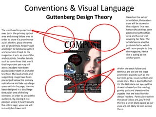
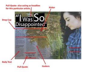
Production Commentary
Design Programmes
The word processing aspect of my magazine in order to write my article was done through
Microsoft Word; once I had completed my first draft, it was sent over to someone within my class
who acted as a ‘sub-editor’. From here they added foot notes to the article and made suggested
changes regarding grammar and spelling before sending it back to me in order to complete a final
edit. When designing my double page spread I simply copied and pasted it over to photoshop as
well as saving an original copy to my blog. The most prominent reason for me choosing to use
Microsoft Word is the fact that’s it’s compatible with most computers and can be formatted in a
multitude of ways- this meant that I could work on my article in more than one location.
Both my front page and double page spread were designed in Photoshop. I had initially set out to
use dafont.com in order to source a stock font, however due to time constraints I ended up using
pre-set one from the software. Designing the layout was a fairly simple task that involved
adjusting image sizes, overlaying layers and making any technical changes in terms of colour
correction. Since I did not gain permission to use my front cover image, I was required to make
changes to it in order to avoid copyright. The tools primarily used in order to fix the colour
correction issues were the burn, spot healing and dodge tool- this allowed me to manipulate the
exposure, adjust highlights and remove blemishes. Photoshop was an easy way for me to
enhance and clean up both my images and overall magazine so that it had a professional feel to
it.
FORMATS
For the following project I created both a front cover and double page spread for a magazine of
my choice- in this case I decided to go with an indie rock/folk genre. During the early stages of
production I looked at similar magazines as well as ones that appealed to me as an individual.
This allowed me to get an understanding of the layout in terms of colouring, positioning, types of
articles and just a general feel overall. The pristine, polished look that I found within fashion
magazines appealed to me the most so I therefore waned to showcase this element within my
own work whilst keeping to the musical genre. The thing that stood out to me the most when
looking at musical genre magazines is that they typically showcase the artist entire body, however
I wanted to break convention and go with the full face portrait shot. I liked the use of colour
blocking in order to make the text stand out which is something tried to replicate within my own
work. The two magazines that I chose to analyse were Vogue- due to the use of imagery- and
Kerrang because of the layout and colouring.
Conventions & Visual Language
When designing my front cover and double page spread I tried to keep in
mind the conventions that I had both seen and liked within the magazines I
had analysed. The first one being that I ensured the masthead stands out and
catches the eye of the reader; in order to do this I gave the text a fairly dark
colouring and decreased the opacity of the image whilst also ensuring that the
font size was the largest aspect of the page. I decided to go with the musical
term ‘Compose’ as the title as I believed it to be a name readers could
associate with. As well as this, I believed it to be a word you’d associate with
music when trying to perfect it which added to the modern, pristine feel I’m
going for. I conventionally placed it within an area of the magazine in which
you’d expect as this is where our eyes are drawn to first-the primary optical
area and strong fallow area. I applied the same process when choosing where
to place the subjects face; although she isn’t the prominent aspect of the
page, she’s where the readers eyes will be drawn to based on the reading
gravity path and the probable anchor point that will cause them to buy the
magazine, hence why I did not place any text over her face. Now that the
major components are out of the way, readers will begin to look at the
secondary points- the main focus being the lead article. I again went for a bold
colouring and large font that stands out against the rest of the page text, as
well as placing it on its own side of the page to emphasise it’s importance. By
using the same font I was applying consistency to my magazine as you would
see within an industry standard on. ‘Ready, Set, Jet’ allowed to put a little play
on the words ‘Ready, Steady, Go’ and draw in readers by leaving the guessing.
I notice that a lot of magazine use badge flashes as a substitution to a sub
heading in order to get straight to the point and I therefore incorporated one
within my own in order to advertise a competition- another aspect that will
draw in the target audience. My magazine also includes cover lines as a way
of providing snippets as to what to expect in the magazine, this is a secondary
way of attracting the audience. I also ensured that I included conventional
aspects that are very minimal such as the barcode, issue number and release
date. By keeping to one colour theme I was ensuring that the key aspects
stood out rather than leavings readers wondering where to start from.
Masthead
Lead ArticleBadge Flash
Cover lines
Barcode, Date,
Issue Number
Guttenberg Design Theory
The masthead is spread out
over both the primary optical
area and strong fallow area in
order to show it’s prominence
as it’s the first place the eyes
will be drawn too. Readers will
also begin to familiarise with it
and associate it back to the
magazine- it acts as one of the
anchor points. Smaller details
such as cover lines that aren’t
that important yet may still
attract readers have been
placed underneath in a smaller
text font. The lead article and
supporting image have been
placed just below the primary
optical area and take up a large
space within the page; they’ve
been designed in a bold large
font as it’s one of the key
elements in order to attract the
audience. By placing it in a
position where it nearly covers
the entire page, you eyes will
instantly be drawn to it.
Within the weak fallow and
terminal are we see the least
prominent aspects such as the
barcode, price, issue number and
cover lines. This is due to the fact
its’ the last place our eyes will be
drawn to based on the reading
gravity path and therefore the
aspects that are least likely to
attract readers. Particularly within
the weak fallow are, you’ll find
there is a lot of blank space as our
eyes are not likely to skim across
there.
Based on the axis of
orientation, the readers
eyes will be drawn to
the subjects face next
hence why she has been
positioned within that
area and has no text
covering her face. The
artists face is also the
probable factor which
will cause people to buy
the magazine, hence
she is acting as the
anchor point.
Drop Cap
Pull Quote- also acting as headline
for this particular article.
Body Text
Pull Quote Gutters
Kicker
Audience
Overall my magazine is aimed at the slightly older teen of around 15-24- this is based on the
artists that appear, the layout and colouring of the magazine, the articles and competitions.
Although a very diverse genre indie folk and the festivals that accompany them generally
appeal to a much younger generation, therefore allowing them to relate to the magazine.
Based on this particular target audiences income and social background I’d say that they’re
within the C1-E band on the social scale- either manual or skilled workers and the
unemployed; the language is also designed to suit their dialogue. Based on the female
dominance we see within the magazine, I’d say that it would primarily appeal to females,
however there may be males who’ll buy the magazine based on
Factors that attract
younger audiences
this factor due to the fact it is young, beautiful, leading women
that appear within it. The magazine meets audiences needs as it
showcases the female prominence within the industry, therefore
influencing girls as well as attracting males in a ‘materialistic’
way. The cover lines we see on the front cover of the magazine,
showcase the diversity of topics therefore appealing to a
multitude of interests.

Pr11 production commentary

  • 1.
  • 2.
    Design Programmes The wordprocessing aspect of my magazine in order to write my article was done through Microsoft Word; once I had completed my first draft, it was sent over to someone within my class who acted as a ‘sub-editor’. From here they added foot notes to the article and made suggested changes regarding grammar and spelling before sending it back to me in order to complete a final edit. When designing my double page spread I simply copied and pasted it over to photoshop as well as saving an original copy to my blog. The most prominent reason for me choosing to use Microsoft Word is the fact that’s it’s compatible with most computers and can be formatted in a multitude of ways- this meant that I could work on my article in more than one location. Both my front page and double page spread were designed in Photoshop. I had initially set out to use dafont.com in order to source a stock font, however due to time constraints I ended up using pre-set one from the software. Designing the layout was a fairly simple task that involved adjusting image sizes, overlaying layers and making any technical changes in terms of colour correction. Since I did not gain permission to use my front cover image, I was required to make changes to it in order to avoid copyright. The tools primarily used in order to fix the colour correction issues were the burn, spot healing and dodge tool- this allowed me to manipulate the exposure, adjust highlights and remove blemishes. Photoshop was an easy way for me to enhance and clean up both my images and overall magazine so that it had a professional feel to it.
  • 3.
    FORMATS For the followingproject I created both a front cover and double page spread for a magazine of my choice- in this case I decided to go with an indie rock/folk genre. During the early stages of production I looked at similar magazines as well as ones that appealed to me as an individual. This allowed me to get an understanding of the layout in terms of colouring, positioning, types of articles and just a general feel overall. The pristine, polished look that I found within fashion magazines appealed to me the most so I therefore waned to showcase this element within my own work whilst keeping to the musical genre. The thing that stood out to me the most when looking at musical genre magazines is that they typically showcase the artist entire body, however I wanted to break convention and go with the full face portrait shot. I liked the use of colour blocking in order to make the text stand out which is something tried to replicate within my own work. The two magazines that I chose to analyse were Vogue- due to the use of imagery- and Kerrang because of the layout and colouring.
  • 4.
    Conventions & VisualLanguage When designing my front cover and double page spread I tried to keep in mind the conventions that I had both seen and liked within the magazines I had analysed. The first one being that I ensured the masthead stands out and catches the eye of the reader; in order to do this I gave the text a fairly dark colouring and decreased the opacity of the image whilst also ensuring that the font size was the largest aspect of the page. I decided to go with the musical term ‘Compose’ as the title as I believed it to be a name readers could associate with. As well as this, I believed it to be a word you’d associate with music when trying to perfect it which added to the modern, pristine feel I’m going for. I conventionally placed it within an area of the magazine in which you’d expect as this is where our eyes are drawn to first-the primary optical area and strong fallow area. I applied the same process when choosing where to place the subjects face; although she isn’t the prominent aspect of the page, she’s where the readers eyes will be drawn to based on the reading gravity path and the probable anchor point that will cause them to buy the magazine, hence why I did not place any text over her face. Now that the major components are out of the way, readers will begin to look at the secondary points- the main focus being the lead article. I again went for a bold colouring and large font that stands out against the rest of the page text, as well as placing it on its own side of the page to emphasise it’s importance. By using the same font I was applying consistency to my magazine as you would see within an industry standard on. ‘Ready, Set, Jet’ allowed to put a little play on the words ‘Ready, Steady, Go’ and draw in readers by leaving the guessing. I notice that a lot of magazine use badge flashes as a substitution to a sub heading in order to get straight to the point and I therefore incorporated one within my own in order to advertise a competition- another aspect that will draw in the target audience. My magazine also includes cover lines as a way of providing snippets as to what to expect in the magazine, this is a secondary way of attracting the audience. I also ensured that I included conventional aspects that are very minimal such as the barcode, issue number and release date. By keeping to one colour theme I was ensuring that the key aspects stood out rather than leavings readers wondering where to start from. Masthead Lead ArticleBadge Flash Cover lines Barcode, Date, Issue Number
  • 5.
    Guttenberg Design Theory Themasthead is spread out over both the primary optical area and strong fallow area in order to show it’s prominence as it’s the first place the eyes will be drawn too. Readers will also begin to familiarise with it and associate it back to the magazine- it acts as one of the anchor points. Smaller details such as cover lines that aren’t that important yet may still attract readers have been placed underneath in a smaller text font. The lead article and supporting image have been placed just below the primary optical area and take up a large space within the page; they’ve been designed in a bold large font as it’s one of the key elements in order to attract the audience. By placing it in a position where it nearly covers the entire page, you eyes will instantly be drawn to it. Within the weak fallow and terminal are we see the least prominent aspects such as the barcode, price, issue number and cover lines. This is due to the fact its’ the last place our eyes will be drawn to based on the reading gravity path and therefore the aspects that are least likely to attract readers. Particularly within the weak fallow are, you’ll find there is a lot of blank space as our eyes are not likely to skim across there. Based on the axis of orientation, the readers eyes will be drawn to the subjects face next hence why she has been positioned within that area and has no text covering her face. The artists face is also the probable factor which will cause people to buy the magazine, hence she is acting as the anchor point.
  • 6.
    Drop Cap Pull Quote-also acting as headline for this particular article. Body Text Pull Quote Gutters Kicker
  • 7.
    Audience Overall my magazineis aimed at the slightly older teen of around 15-24- this is based on the artists that appear, the layout and colouring of the magazine, the articles and competitions. Although a very diverse genre indie folk and the festivals that accompany them generally appeal to a much younger generation, therefore allowing them to relate to the magazine. Based on this particular target audiences income and social background I’d say that they’re within the C1-E band on the social scale- either manual or skilled workers and the unemployed; the language is also designed to suit their dialogue. Based on the female dominance we see within the magazine, I’d say that it would primarily appeal to females, however there may be males who’ll buy the magazine based on Factors that attract younger audiences this factor due to the fact it is young, beautiful, leading women that appear within it. The magazine meets audiences needs as it showcases the female prominence within the industry, therefore influencing girls as well as attracting males in a ‘materialistic’ way. The cover lines we see on the front cover of the magazine, showcase the diversity of topics therefore appealing to a multitude of interests.