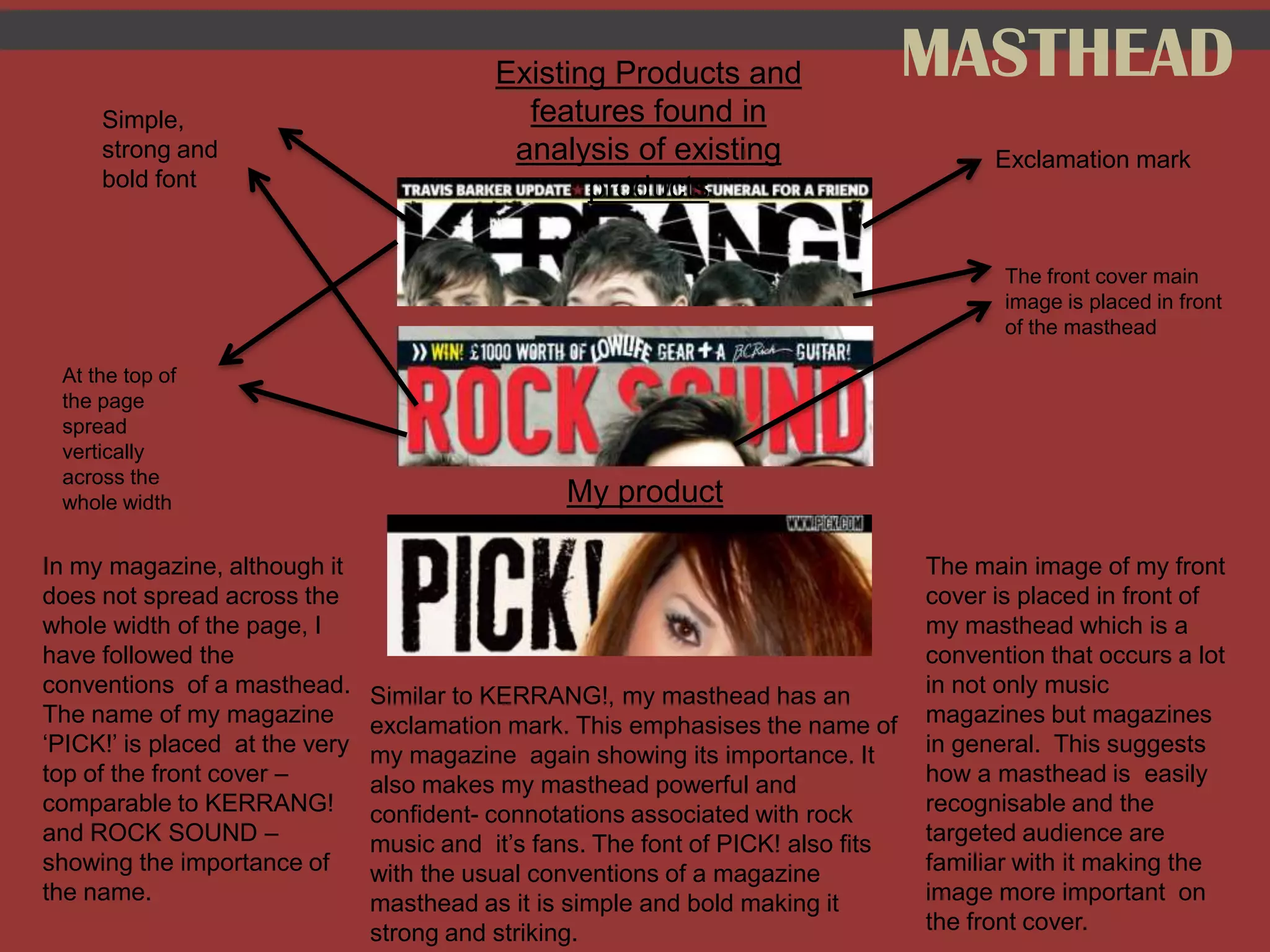
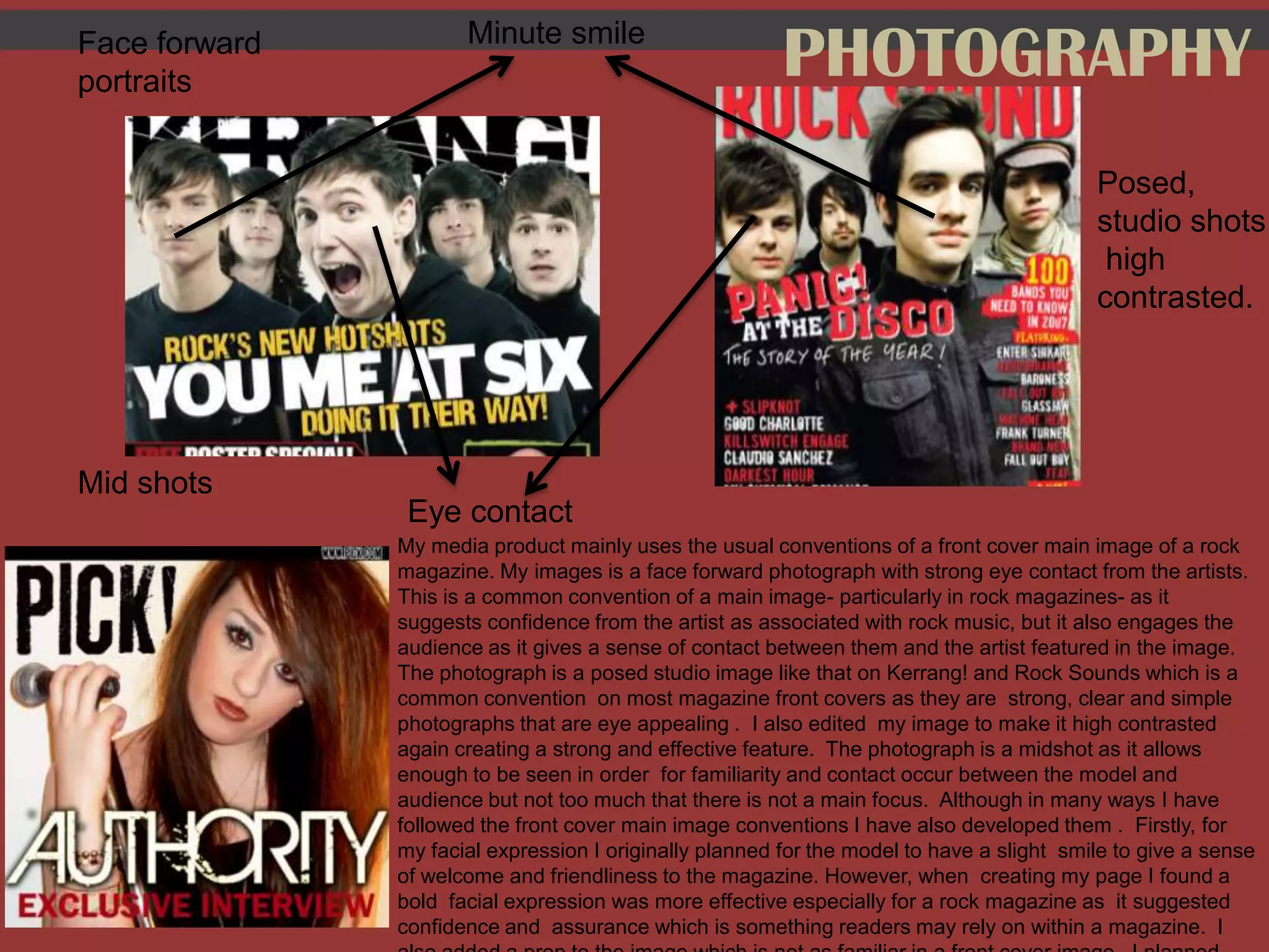
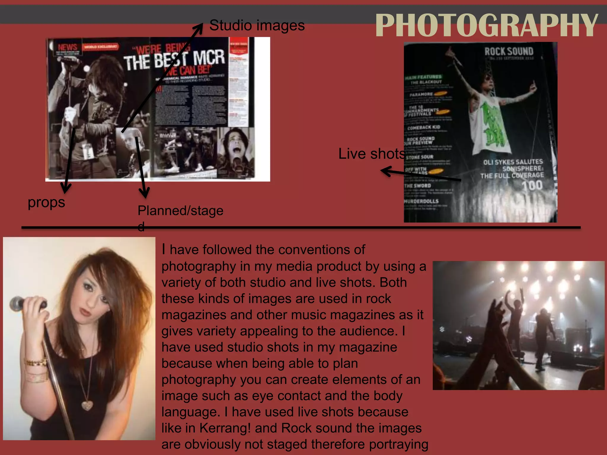
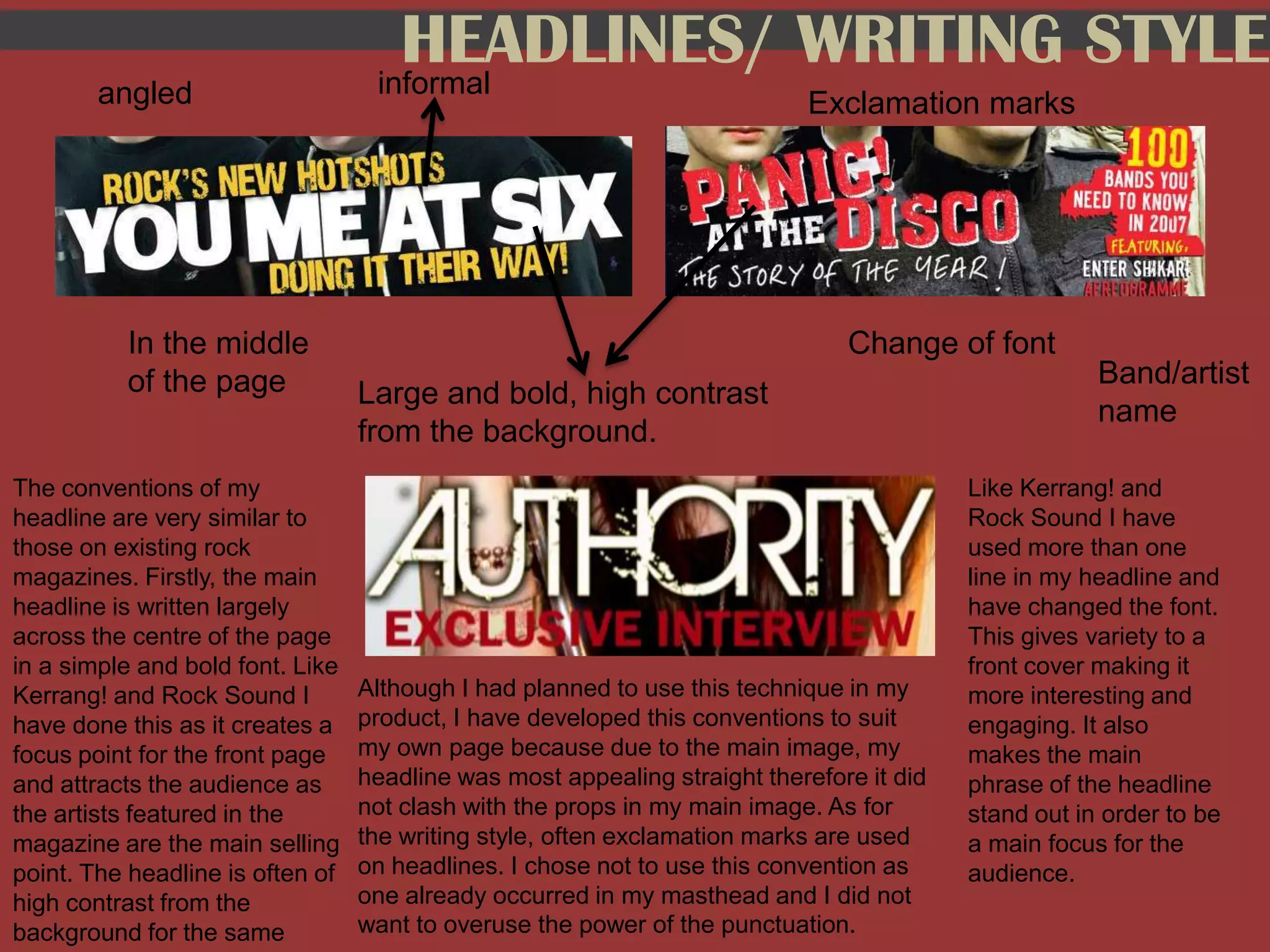
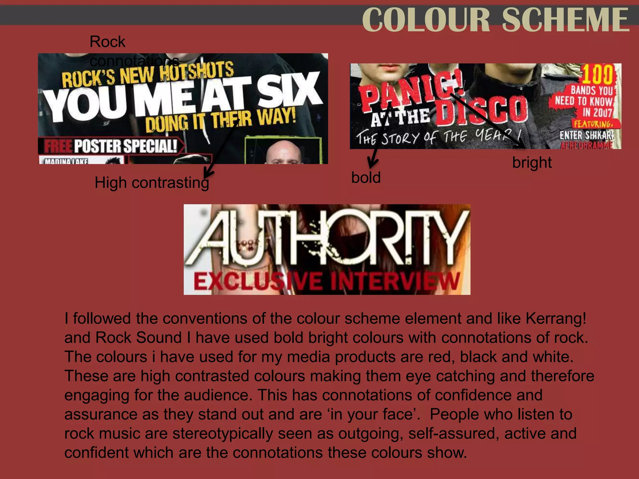
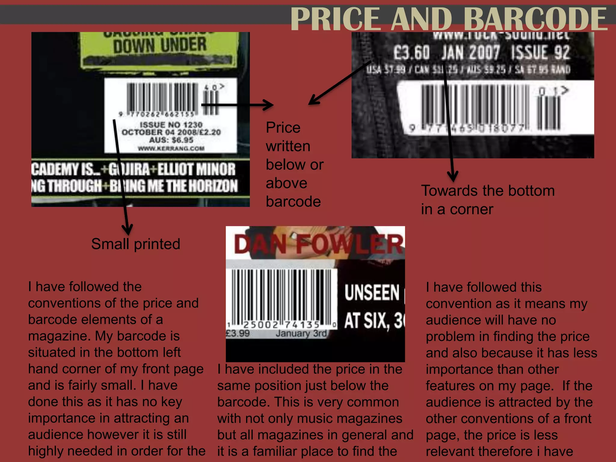
The media product uses conventions found in existing music magazines such as rock magazines. These include a masthead at the top of the page with the magazine's name in a bold font and an exclamation point. The main cover image features a face forward portrait of an artist with strong eye contact, as is typical. Photographs include both posed studio shots and live shots. Headlines are written in a large, bold font in the center of the page and may use different fonts or be at an angle. The color scheme uses high contrasting bold colors like red, black, and white that have rock connotations. The price and barcode are placed together towards the bottom corner in a small, inconspicuous font.