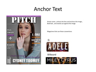
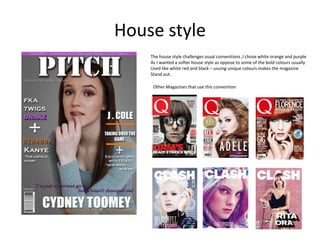
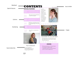
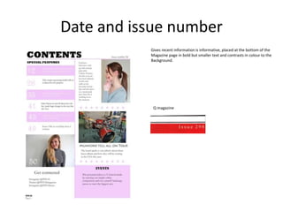
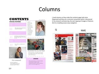
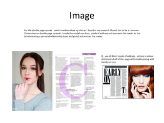
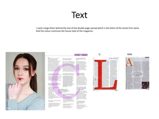
Evaluation Question 1
In what ways does your media product
use, develop or challenge forms and
conventions of real media products?
Front Cover
Header
Masthead
Sell line
Features
Main image
Cover line
Anchor Text
Main cover line
Masthead
Is in a large, simple and bold text in san serif font at the top of the page in front of the
main image, It is in a colour that contrasts the back ground so that it stands out ,this
makes it eye catching and gives brand awareness too.
Other magazines that use this convention
Sell line
I used the convention of a sell line on the front cover this works as
An insight into the magazine , it is usually placed under the masthead
As I have done and stands out and is informative (uses and gratifications)
Other magazines that use this convention
Q magazine – Discover great music
NME – New musical express
Main Image
Medium close up which is a common convention, single person shot , Direct
Mode of address , links to main story , personal relationship (uses and grats) , creates
Link between artist and audience, Subject is prominent on the page , dark background
In contrast to light subject which causes them to be eye catching and stand out,
Challenges the usual convention of a white background, subject is provocative,
Sexualised image , identity is present not objectified .
Magazines that use these conventions
Header
EXCLUSIVE creates engagement with the audience ,text has influence , buzzword
‘EXCLUSIVE’, In capitals to make it stand out , eye catching , Exclusivity is informing
The unknown (uses and grats needle model)
Magazines that use these conventions
NME
Features
An insight into all the features –informative (uses and grats)
They contrast to the background and are on both sides of the
Magazine, they are also in a smaller font to the main cover
Line
Magazines that use these conventions
Billboard Q
NME
Pull Quotes
Pull quotes create questions and engagement with the
Reader –entices the audience
Magazines that use these conventions
NME
Q
Anchor Text
Artists name , entices the fans and anchors the image ,
Bold text , and stands out against the image
Magazines that use these conventions
Q
Billboard
Cover lines
Cover lines create a question so that the audience wants to find out answers
- They use the uses and grats needle model
Having a pull quote with the cover line is not a convention that is used on
All music magazines but some other magazines to challenge this convention
And do and this is why I added it to my cover. It entices the audience to
Read more and seperates it from the features
Magazines that also use this
Q
Main cover line
The common convention is to place the main cover line near the
Anchor text to show the connection, use of a shadow to make the
Text stand out againt the background –it is informative (uses and grats)
- Entices the reader to find out more
Q
billboard
Other magazines that use this convention
House style
The house style challenges usual conventions ,I chose white orange and purple
As I wanted a softer house style as oppose to some of the bold colours usually
Used like white red and black – usuing unique colours makes the magazine
Stand out.
Other Magazines that use this convention
Issue number
Masthead
Special Features
Columns
Social media links
Images
Numbering
Date and issue number
Gives recent information is informative, placed at the bottom of the
Magazine page in bold but smaller text and contrasts in colour to the
Background.
Q magazine
Images
All the images I have taken of my models are mid close ups
So there body language and facial expressions are easy to read.
I used a phot of a musical instrument (drum kit) so that the
Contents page wasn’t crowded with pictures of people and also
Makes it clear that it is a music magazine.
The images on the page do not over lap which gives the magazine
A professional look.
Rolling Stone
Q
Columns
I Used columns as they make the contents page look more
Organised and they are a common convention which I discovered
In my research and planning. No over lapping of images or features
And no crowding causes easy navigation.
Q NME
Numbering
Big numbering makes them stand out on the page and cuases easy
navigation for the reader- it creates easy shortcuts and
convenience. It informs of what is inside the magazine (uses and
grats) and it sticks to the house style of the magazine.
Q
Special features
Title in bold text – eyecatching –breaks down the image
giving a brief explanation- easy navigation. Shot description
of the special features this entices the reader, co –
ordinating of numbers and not being too text heavy .
Social Media links
In my research I haven’t come across many
contents pages that contain social media links,
however I decided to use it as I feel it is modern
and that many people do use media across social
media now and as the magazine is mainly aimed
at young adults it would also appeal to them. It
also means that the reader can keep up to date
between issues just like cosmopolitan magazine
does on its snapchat feed to keep readers up to
date.
Page Number
Page number is informative and the name of the magazine is
Just above it keeping brand awareness and proffessional
Consistency.
Q Billboard
Masthead
Bold and simple , contrasting to the light colours used on
The page.
Q
Billboard
Double Page Spread Anchor Text
Columns
Pull quote
Image
Drop Cap
Page number
Layout
I used the convention of having one whole page for the main image on the spread and It being on the left hand side of
The spread while the text is on the right hand side of the page. I did this as I wanted the image to be the main focus of
The spread. I wanted it to be enticing to draw the audience to read the article.
Q magazine, I mainly based my double page spread
On the layout used by Q
Image
For the double page spread I used a medium close up shot as I found in my research I found this to be a common
Convention on double page spreads. I made the model use direct mode of address as it connects the reader to the
Artist creating a personal relationship (uses and grats) and entices the reader.
Q , use of direct mode of address , picture in colour
And covers half of the page with model posing with
Hands on face
Text
I used a large letter behind the text of the double page spread which is the letter of the artists first name
And the colour continues the house style of the magazine.
Q NME
Columns
Having the page split up in to three equal columns is a convention that is used in many other magazines
Therefore I chose to use it in my own double page spread as it makes it look organised and professional.
Nme use of three columns and pull qoute
Larger than the rest of text
Pull quote
Pull quote gives an insight to the rest of the article which creates engagement and
Questions , personal relationships are created (uses and grats) a larger font is also
Used.
Nme
Artists name
I didn’t title my double page spread but had the artists name in the top corner of the page which entices the fans to read
The article, it stands out as it is in bold and colored text.
Q magazine
Page Numbers and Drop cap
Page numbers are informative I put the beat logo above the page numbers as it creates brand awareness
Q magazine use of 2 drop caps

Evaluation question 1 jeannine

  • 1.
    Evaluation Question 1 Inwhat ways does your media product use, develop or challenge forms and conventions of real media products?
  • 2.
    Front Cover Header Masthead Sell line Features Mainimage Cover line Anchor Text Main cover line
  • 3.
    Masthead Is in alarge, simple and bold text in san serif font at the top of the page in front of the main image, It is in a colour that contrasts the back ground so that it stands out ,this makes it eye catching and gives brand awareness too. Other magazines that use this convention
  • 4.
    Sell line I usedthe convention of a sell line on the front cover this works as An insight into the magazine , it is usually placed under the masthead As I have done and stands out and is informative (uses and gratifications) Other magazines that use this convention Q magazine – Discover great music NME – New musical express
  • 5.
    Main Image Medium closeup which is a common convention, single person shot , Direct Mode of address , links to main story , personal relationship (uses and grats) , creates Link between artist and audience, Subject is prominent on the page , dark background In contrast to light subject which causes them to be eye catching and stand out, Challenges the usual convention of a white background, subject is provocative, Sexualised image , identity is present not objectified . Magazines that use these conventions
  • 6.
    Header EXCLUSIVE creates engagementwith the audience ,text has influence , buzzword ‘EXCLUSIVE’, In capitals to make it stand out , eye catching , Exclusivity is informing The unknown (uses and grats needle model) Magazines that use these conventions NME
  • 7.
    Features An insight intoall the features –informative (uses and grats) They contrast to the background and are on both sides of the Magazine, they are also in a smaller font to the main cover Line Magazines that use these conventions Billboard Q NME
  • 8.
    Pull Quotes Pull quotescreate questions and engagement with the Reader –entices the audience Magazines that use these conventions NME Q
  • 9.
    Anchor Text Artists name, entices the fans and anchors the image , Bold text , and stands out against the image Magazines that use these conventions Q Billboard
  • 10.
    Cover lines Cover linescreate a question so that the audience wants to find out answers - They use the uses and grats needle model Having a pull quote with the cover line is not a convention that is used on All music magazines but some other magazines to challenge this convention And do and this is why I added it to my cover. It entices the audience to Read more and seperates it from the features Magazines that also use this Q
  • 11.
    Main cover line Thecommon convention is to place the main cover line near the Anchor text to show the connection, use of a shadow to make the Text stand out againt the background –it is informative (uses and grats) - Entices the reader to find out more Q billboard Other magazines that use this convention
  • 12.
    House style The housestyle challenges usual conventions ,I chose white orange and purple As I wanted a softer house style as oppose to some of the bold colours usually Used like white red and black – usuing unique colours makes the magazine Stand out. Other Magazines that use this convention
  • 13.
  • 14.
    Date and issuenumber Gives recent information is informative, placed at the bottom of the Magazine page in bold but smaller text and contrasts in colour to the Background. Q magazine
  • 15.
    Images All the imagesI have taken of my models are mid close ups So there body language and facial expressions are easy to read. I used a phot of a musical instrument (drum kit) so that the Contents page wasn’t crowded with pictures of people and also Makes it clear that it is a music magazine. The images on the page do not over lap which gives the magazine A professional look. Rolling Stone Q
  • 16.
    Columns I Used columnsas they make the contents page look more Organised and they are a common convention which I discovered In my research and planning. No over lapping of images or features And no crowding causes easy navigation. Q NME
  • 17.
    Numbering Big numbering makesthem stand out on the page and cuases easy navigation for the reader- it creates easy shortcuts and convenience. It informs of what is inside the magazine (uses and grats) and it sticks to the house style of the magazine. Q
  • 18.
    Special features Title inbold text – eyecatching –breaks down the image giving a brief explanation- easy navigation. Shot description of the special features this entices the reader, co – ordinating of numbers and not being too text heavy .
  • 19.
    Social Media links Inmy research I haven’t come across many contents pages that contain social media links, however I decided to use it as I feel it is modern and that many people do use media across social media now and as the magazine is mainly aimed at young adults it would also appeal to them. It also means that the reader can keep up to date between issues just like cosmopolitan magazine does on its snapchat feed to keep readers up to date.
  • 20.
    Page Number Page numberis informative and the name of the magazine is Just above it keeping brand awareness and proffessional Consistency. Q Billboard
  • 21.
    Masthead Bold and simple, contrasting to the light colours used on The page. Q Billboard
  • 22.
    Double Page SpreadAnchor Text Columns Pull quote Image Drop Cap Page number
  • 23.
    Layout I used theconvention of having one whole page for the main image on the spread and It being on the left hand side of The spread while the text is on the right hand side of the page. I did this as I wanted the image to be the main focus of The spread. I wanted it to be enticing to draw the audience to read the article. Q magazine, I mainly based my double page spread On the layout used by Q
  • 24.
    Image For the doublepage spread I used a medium close up shot as I found in my research I found this to be a common Convention on double page spreads. I made the model use direct mode of address as it connects the reader to the Artist creating a personal relationship (uses and grats) and entices the reader. Q , use of direct mode of address , picture in colour And covers half of the page with model posing with Hands on face
  • 25.
    Text I used alarge letter behind the text of the double page spread which is the letter of the artists first name And the colour continues the house style of the magazine. Q NME
  • 26.
    Columns Having the pagesplit up in to three equal columns is a convention that is used in many other magazines Therefore I chose to use it in my own double page spread as it makes it look organised and professional. Nme use of three columns and pull qoute Larger than the rest of text
  • 27.
    Pull quote Pull quotegives an insight to the rest of the article which creates engagement and Questions , personal relationships are created (uses and grats) a larger font is also Used. Nme
  • 28.
    Artists name I didn’ttitle my double page spread but had the artists name in the top corner of the page which entices the fans to read The article, it stands out as it is in bold and colored text. Q magazine
  • 29.
    Page Numbers andDrop cap Page numbers are informative I put the beat logo above the page numbers as it creates brand awareness Q magazine use of 2 drop caps