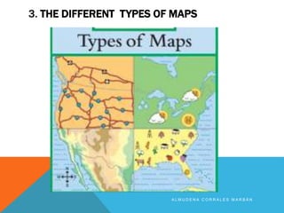
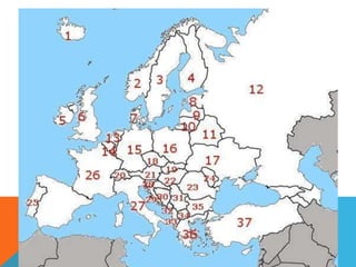
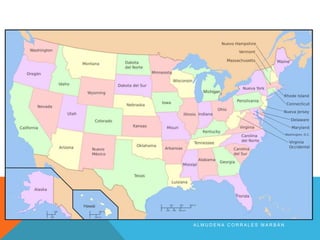
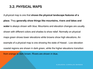
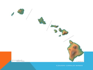
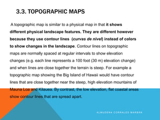
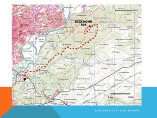
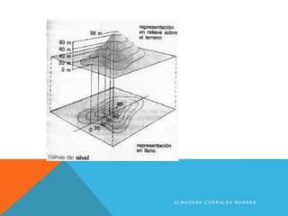
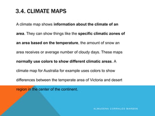
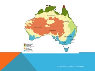
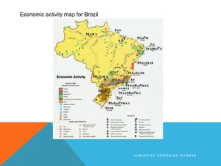
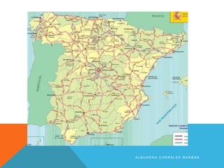
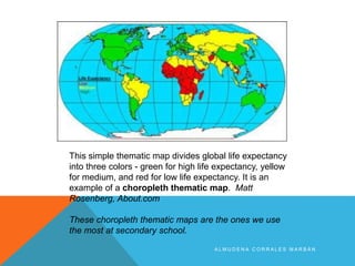
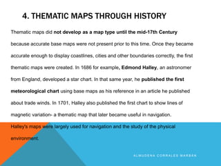
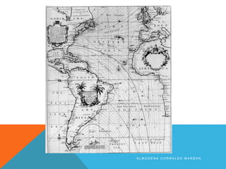
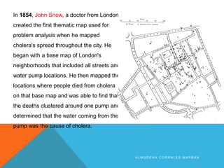
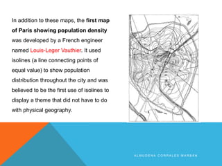
A L M U D E N A C O R R A L E S M A R B Á N
1. INTRODUCTION
A L M U D E N A C O R R A L E S M A R B Á N
In geography, maps are one of the most
important tools researchers, cartographers,
students and others can use to examine the
entire Earth or a specific part of it.
2. WHAT IS A MAP?
A L M U D E N A C O R R A L E S M A R B Á N
Simply defined, maps are pictures of the Earth's surface. They can
be general reference and show landforms, political boundaries,
water, the locations of cities, or in the case of thematic maps, show
different but very specific topics such as the average rainfall
distribution for an area or the distribution of a certain disease
throughout a county. Today with the increased use of GIS, also known
as Geographic Information Systems, thematic maps are growing in
importance.
3. THE DIFFERENT TYPES OF MAPS
A L M U D E N A C O R R A L E S M A R B Á N
3.1. POLITICAL MAP
A L M U D E N A C O R R A L E S M A R B Á N
A political map does not show any topographic features. It instead
focuses solely on the state and national boundaries of a place. They
also include the locations of cities - both large and small, depending on
the detail of the map. A common type of political map would be one
showing the 50 U.S. states and their borders along with the United
States' north and south international borders or for us the POLITICAL
MAP OF EUROPE!
Have a try and write down the name of the states and their capitals
in a separate sheet of paper.
1…………….
A L M U D E N A C O R R A L E S M A R B Á N
3.2. PHYSICAL MAPS
A L M U D E N A C O R R A L E S M A R B Á N
A physical map is one that shows the physical landscape features of a
place. They generally show things like mountains, rivers and lakes and
water is always shown with blue. Mountains and elevation changes are usually
shown with different colors and shades to show relief. Normally on physical
maps green shows lower elevations while browns show high elevations. An
example of a physical map is one showing the state of Hawaii . Low elevation
coastal regions are shown in dark green, while the higher elevations transition
from orange to dark brown. Rivers are shown in blue.
A L M U D E N A C O R R A L E S M A R B Á N
Write down on this map the main:
Peninsulas …………………
Rivers………………….
Mountains……………………..
Seas…………………………….
Islands…………………………….
Very good, good, average, bad
3.3. TOPOGRAPHIC MAPS
A L M U D E N A C O R R A L E S M A R B Á N
A topographic map is similar to a physical map in that it shows
different physical landscape features. They are different however
because they use contour lines (curvas de nivel) instead of colors
to show changes in the landscape. Contour lines on topographic
maps are normally spaced at regular intervals to show elevation
changes (e.g. each line represents a 100 foot (30 m) elevation change)
and when lines are close together the terrain is steep. For example a
topographic map showing the Big Island of Hawaii would have contour
lines that are close together near the steep, high elevation mountains of
Mauna Loa and Kilauea. By contrast, the low elevation, flat coastal areas
show contour lines that are spread apart.
A L M U D E N A C O R R A L E S M A R B Á N
TOPOGRAPHIC SECTION
CORTE TOPOGRÁFICO
A L M U D E N A C O R R A L E S M A R B Á N
3.4. CLIMATE MAPS
A L M U D E N A C O R R A L E S M A R B Á N
A climate map shows information about the climate of an
area. They can show things like the specific climatic zones of
an area based on the temperature, the amount of snow an
area receives or average number of cloudy days. These maps
normally use colors to show different climatic areas. A
climate map for Australia for example uses colors to show
differences between the temperate area of Victoria and desert
region in the center of the continent.
A L M U D E N A C O R R A L E S M A R B Á N
3.5. ECONOMIC OR RESOURCE MAP
A L M U D E N A C O R R A L E S M A R B Á N
An economic or resource map shows the specific type
of economic activity or natural resources present in
an area through the use of different symbols or colors
depending on what is being shown on the map. For
example an economic activity map for Brazil can use
colors to show different agricultural products of given
areas, letters for natural resources and symbols for
different industries
A L M U D E N A C O R R A L E S M A R B Á N
Economic activity map for Brazil
3.6. ROAD MAPS
A L M U D E N A C O R R A L E S M A R B Á N
A road map is one of the most widely used map types. These maps
show major and minor highways and roads (depending on detail) as
well as things like airports, city locations and points of interest like
parks, campgrounds and monuments. Major highways on a road map
are generally red and larger than other roads, while minor roads are a
lighter color and a narrower line. A road map of Spain for example would
show the major highways as a wide red line and other large roads as a
lighter red.
A L M U D E N A C O R R A L E S M A R B Á N
3.7. THEMATIC MAPS
A L M U D E N A C O R R A L E S M A R B Á N
A thematic map is a map that focuses on a particular theme or special topic
and they are different from the six aforementioned general reference maps
because they do not just show natural features like rivers, cities, political
subdivisions, elevation and highways. If these items are on a thematic map, they
are background information and are used as reference points to enhance the
map's theme.
A L M U D E N A C O R R A L E S M A R B Á N
This simple thematic map divides global life expectancy
into three colors - green for high life expectancy, yellow
for medium, and red for low life expectancy. It is an
example of a choropleth thematic map. Matt
Rosenberg, About.com
These choropleth thematic maps are the ones we use
the most at secondary school.
4. THEMATIC MAPS THROUGH HISTORY
A L M U D E N A C O R R A L E S M A R B Á N
Thematic maps did not develop as a map type until the mid-17th Century
because accurate base maps were not present prior to this time. Once they became
accurate enough to display coastlines, cities and other boundaries correctly, the first
thematic maps were created. In 1686 for example, Edmond Halley, an astronomer
from England, developed a star chart. In that same year, he published the first
meteorological chart using base maps as his reference in an article he published
about trade winds. In 1701, Halley also published the first chart to show lines of
magnetic variation- a thematic map that later became useful in navigation.
Halley's maps were largely used for navigation and the study of the physical
environment.
A L M U D E N A C O R R A L E S M A R B Á N
In 1854, John Snow, a doctor from London
created the first thematic map used for
problem analysis when he mapped
cholera's spread throughout the city. He
began with a base map of London's
neighborhoods that included all streets and
water pump locations. He then mapped the
locations where people died from cholera
on that base map and was able to find that
the deaths clustered around one pump and
determined that the water coming from the
pump was the cause of cholera.
A L M U D E N A C O R R A L E S M A R B Á N
In addition to these maps, the first map
of Paris showing population density
was developed by a French engineer
named Louis-Leger Vauthier. It used
isolines (a line connecting points of
equal value) to show population
distribution throughout the city and was
believed to be the first use of isolines to
display a theme that did not have to do
with physical geography.
MAIN SOURCES:
A L M U D E N A C O R R A L E S M A R B Á N
http://geography.about.com/
http://www.lib.utexas.edu/maps/world.html

Types of maps

  • 1.
    A L MU D E N A C O R R A L E S M A R B Á N
  • 2.
    1. INTRODUCTION A LM U D E N A C O R R A L E S M A R B Á N In geography, maps are one of the most important tools researchers, cartographers, students and others can use to examine the entire Earth or a specific part of it.
  • 3.
    2. WHAT ISA MAP? A L M U D E N A C O R R A L E S M A R B Á N Simply defined, maps are pictures of the Earth's surface. They can be general reference and show landforms, political boundaries, water, the locations of cities, or in the case of thematic maps, show different but very specific topics such as the average rainfall distribution for an area or the distribution of a certain disease throughout a county. Today with the increased use of GIS, also known as Geographic Information Systems, thematic maps are growing in importance.
  • 4.
    3. THE DIFFERENTTYPES OF MAPS A L M U D E N A C O R R A L E S M A R B Á N
  • 5.
    3.1. POLITICAL MAP AL M U D E N A C O R R A L E S M A R B Á N A political map does not show any topographic features. It instead focuses solely on the state and national boundaries of a place. They also include the locations of cities - both large and small, depending on the detail of the map. A common type of political map would be one showing the 50 U.S. states and their borders along with the United States' north and south international borders or for us the POLITICAL MAP OF EUROPE! Have a try and write down the name of the states and their capitals in a separate sheet of paper. 1…………….
  • 6.
    A L MU D E N A C O R R A L E S M A R B Á N
  • 7.
    A L MU D E N A C O R R A L E S M A R B Á N
  • 8.
    3.2. PHYSICAL MAPS AL M U D E N A C O R R A L E S M A R B Á N A physical map is one that shows the physical landscape features of a place. They generally show things like mountains, rivers and lakes and water is always shown with blue. Mountains and elevation changes are usually shown with different colors and shades to show relief. Normally on physical maps green shows lower elevations while browns show high elevations. An example of a physical map is one showing the state of Hawaii . Low elevation coastal regions are shown in dark green, while the higher elevations transition from orange to dark brown. Rivers are shown in blue.
  • 9.
    A L MU D E N A C O R R A L E S M A R B Á N
  • 10.
    A L MU D E N A C O R R A L E S M A R B Á N Write down on this map the main: Peninsulas ………………… Rivers…………………. Mountains…………………….. Seas……………………………. Islands……………………………. Very good, good, average, bad
  • 11.
    3.3. TOPOGRAPHIC MAPS AL M U D E N A C O R R A L E S M A R B Á N A topographic map is similar to a physical map in that it shows different physical landscape features. They are different however because they use contour lines (curvas de nivel) instead of colors to show changes in the landscape. Contour lines on topographic maps are normally spaced at regular intervals to show elevation changes (e.g. each line represents a 100 foot (30 m) elevation change) and when lines are close together the terrain is steep. For example a topographic map showing the Big Island of Hawaii would have contour lines that are close together near the steep, high elevation mountains of Mauna Loa and Kilauea. By contrast, the low elevation, flat coastal areas show contour lines that are spread apart.
  • 12.
    A L MU D E N A C O R R A L E S M A R B Á N
  • 13.
    A L MU D E N A C O R R A L E S M A R B Á N
  • 14.
    A L MU D E N A C O R R A L E S M A R B Á N
  • 15.
    A L MU D E N A C O R R A L E S M A R B Á N TOPOGRAPHIC SECTION CORTE TOPOGRÁFICO
  • 16.
    A L MU D E N A C O R R A L E S M A R B Á N
  • 17.
    3.4. CLIMATE MAPS AL M U D E N A C O R R A L E S M A R B Á N A climate map shows information about the climate of an area. They can show things like the specific climatic zones of an area based on the temperature, the amount of snow an area receives or average number of cloudy days. These maps normally use colors to show different climatic areas. A climate map for Australia for example uses colors to show differences between the temperate area of Victoria and desert region in the center of the continent.
  • 18.
    A L MU D E N A C O R R A L E S M A R B Á N
  • 19.
    3.5. ECONOMIC ORRESOURCE MAP A L M U D E N A C O R R A L E S M A R B Á N An economic or resource map shows the specific type of economic activity or natural resources present in an area through the use of different symbols or colors depending on what is being shown on the map. For example an economic activity map for Brazil can use colors to show different agricultural products of given areas, letters for natural resources and symbols for different industries
  • 20.
    A L MU D E N A C O R R A L E S M A R B Á N Economic activity map for Brazil
  • 21.
    3.6. ROAD MAPS AL M U D E N A C O R R A L E S M A R B Á N A road map is one of the most widely used map types. These maps show major and minor highways and roads (depending on detail) as well as things like airports, city locations and points of interest like parks, campgrounds and monuments. Major highways on a road map are generally red and larger than other roads, while minor roads are a lighter color and a narrower line. A road map of Spain for example would show the major highways as a wide red line and other large roads as a lighter red.
  • 22.
    A L MU D E N A C O R R A L E S M A R B Á N
  • 23.
    3.7. THEMATIC MAPS AL M U D E N A C O R R A L E S M A R B Á N A thematic map is a map that focuses on a particular theme or special topic and they are different from the six aforementioned general reference maps because they do not just show natural features like rivers, cities, political subdivisions, elevation and highways. If these items are on a thematic map, they are background information and are used as reference points to enhance the map's theme.
  • 24.
    A L MU D E N A C O R R A L E S M A R B Á N This simple thematic map divides global life expectancy into three colors - green for high life expectancy, yellow for medium, and red for low life expectancy. It is an example of a choropleth thematic map. Matt Rosenberg, About.com These choropleth thematic maps are the ones we use the most at secondary school.
  • 25.
    4. THEMATIC MAPSTHROUGH HISTORY A L M U D E N A C O R R A L E S M A R B Á N Thematic maps did not develop as a map type until the mid-17th Century because accurate base maps were not present prior to this time. Once they became accurate enough to display coastlines, cities and other boundaries correctly, the first thematic maps were created. In 1686 for example, Edmond Halley, an astronomer from England, developed a star chart. In that same year, he published the first meteorological chart using base maps as his reference in an article he published about trade winds. In 1701, Halley also published the first chart to show lines of magnetic variation- a thematic map that later became useful in navigation. Halley's maps were largely used for navigation and the study of the physical environment.
  • 26.
    A L MU D E N A C O R R A L E S M A R B Á N
  • 27.
    A L MU D E N A C O R R A L E S M A R B Á N In 1854, John Snow, a doctor from London created the first thematic map used for problem analysis when he mapped cholera's spread throughout the city. He began with a base map of London's neighborhoods that included all streets and water pump locations. He then mapped the locations where people died from cholera on that base map and was able to find that the deaths clustered around one pump and determined that the water coming from the pump was the cause of cholera.
  • 28.
    A L MU D E N A C O R R A L E S M A R B Á N In addition to these maps, the first map of Paris showing population density was developed by a French engineer named Louis-Leger Vauthier. It used isolines (a line connecting points of equal value) to show population distribution throughout the city and was believed to be the first use of isolines to display a theme that did not have to do with physical geography.
  • 29.
    MAIN SOURCES: A LM U D E N A C O R R A L E S M A R B Á N http://geography.about.com/ http://www.lib.utexas.edu/maps/world.html