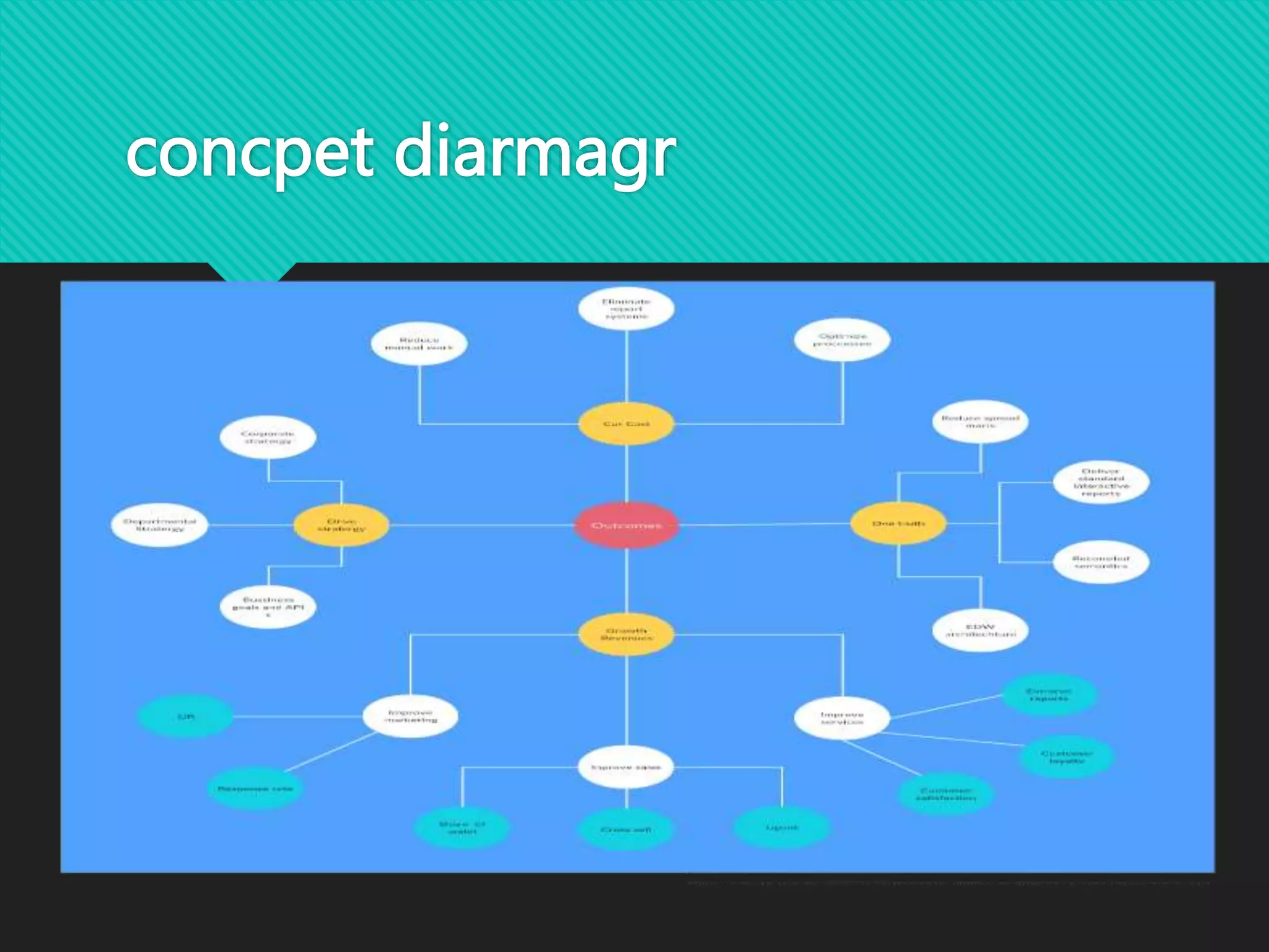
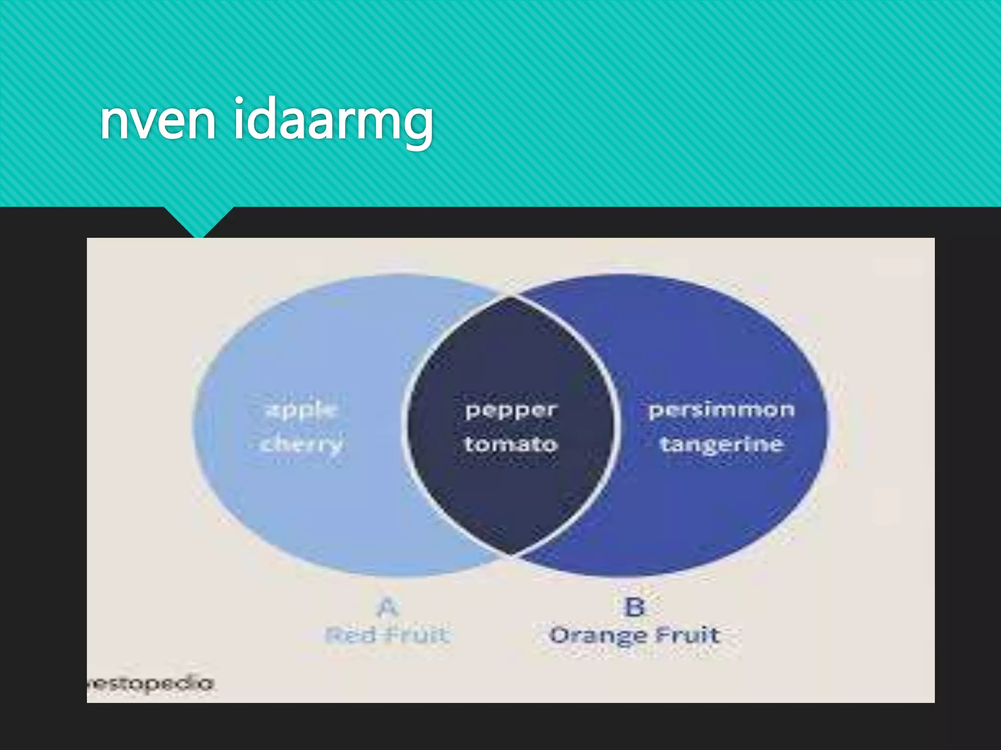
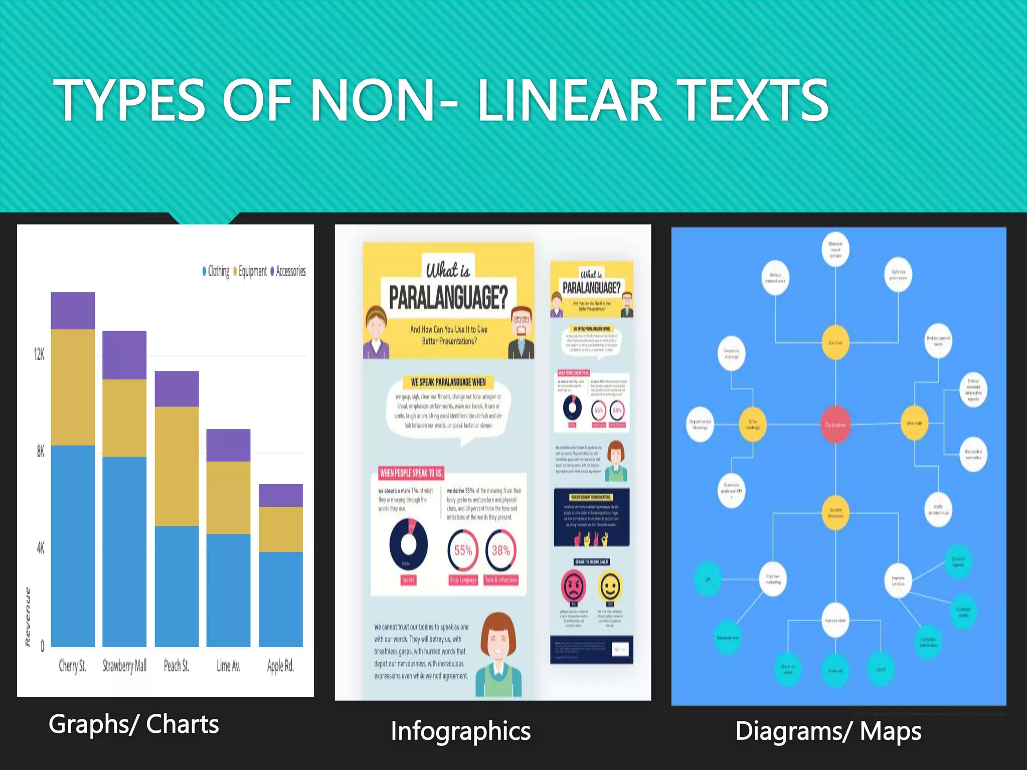
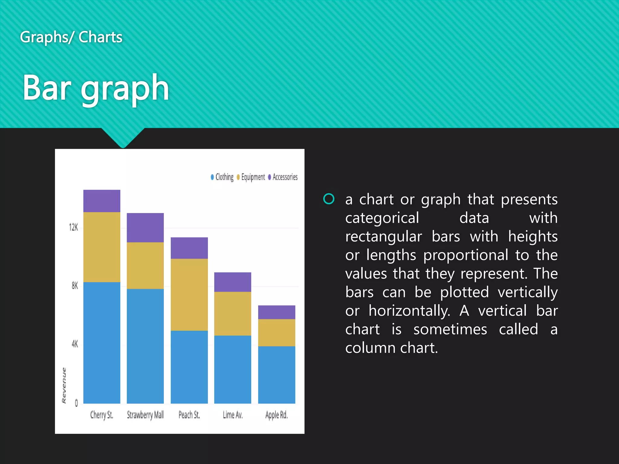
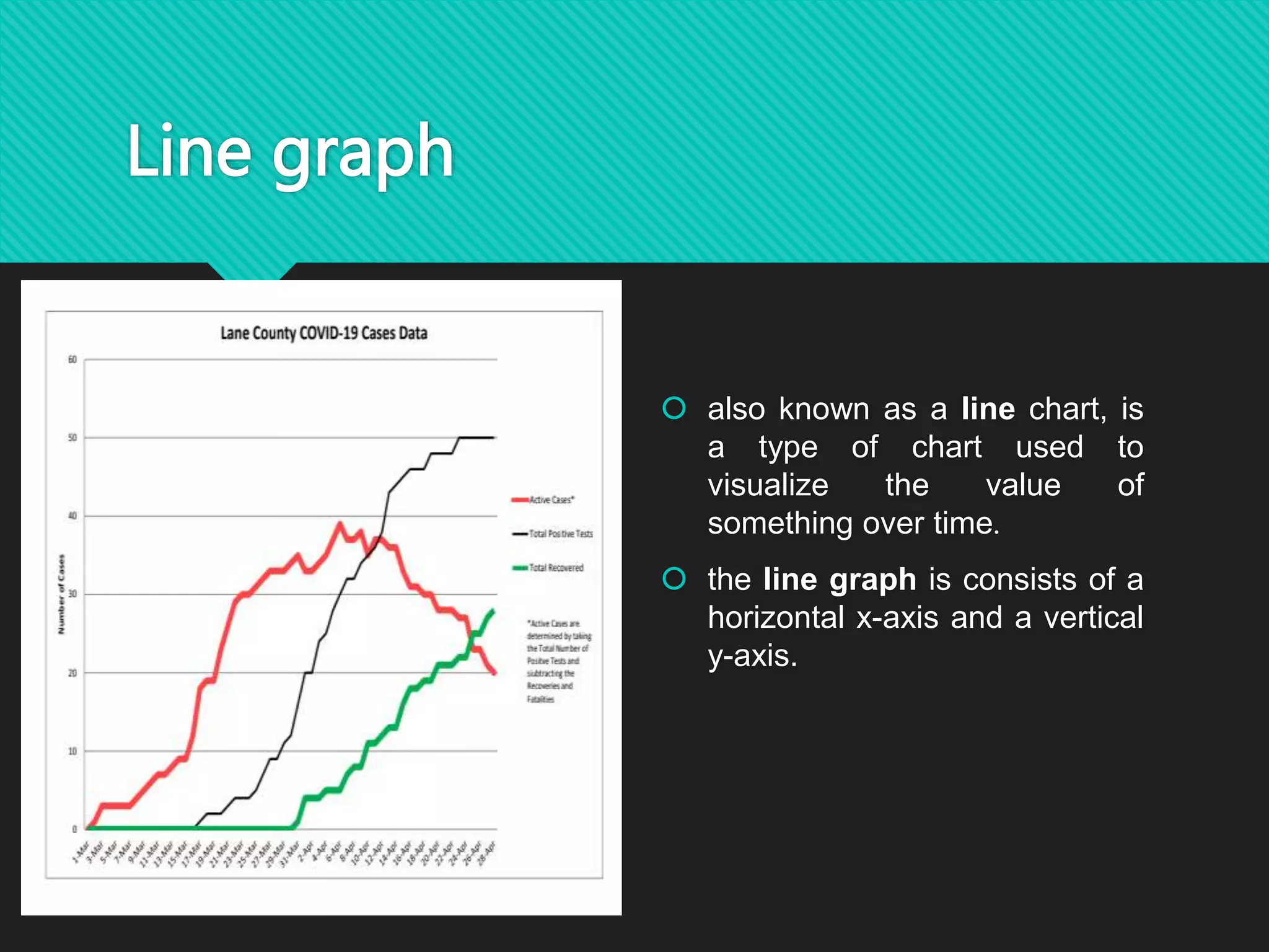
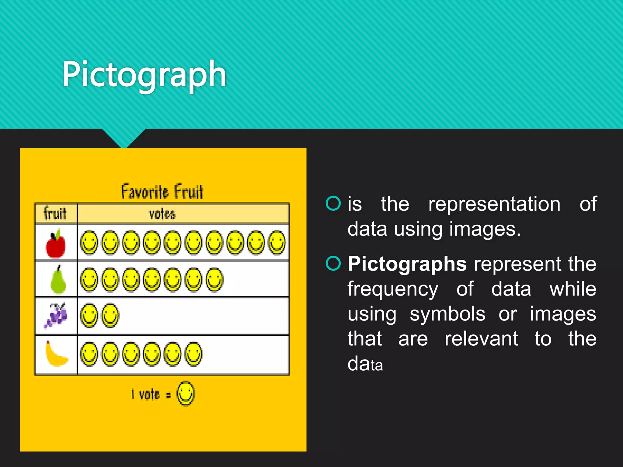
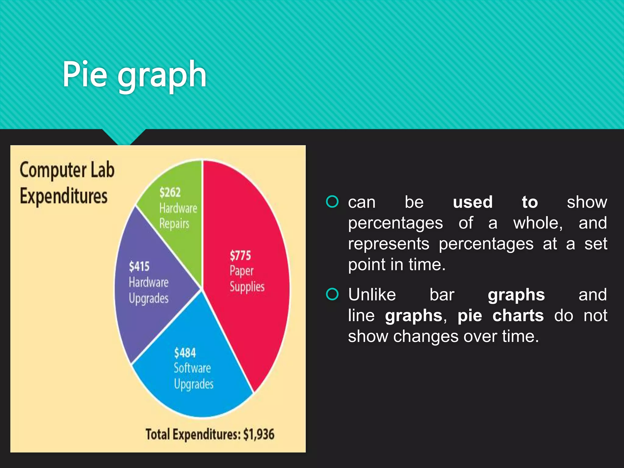
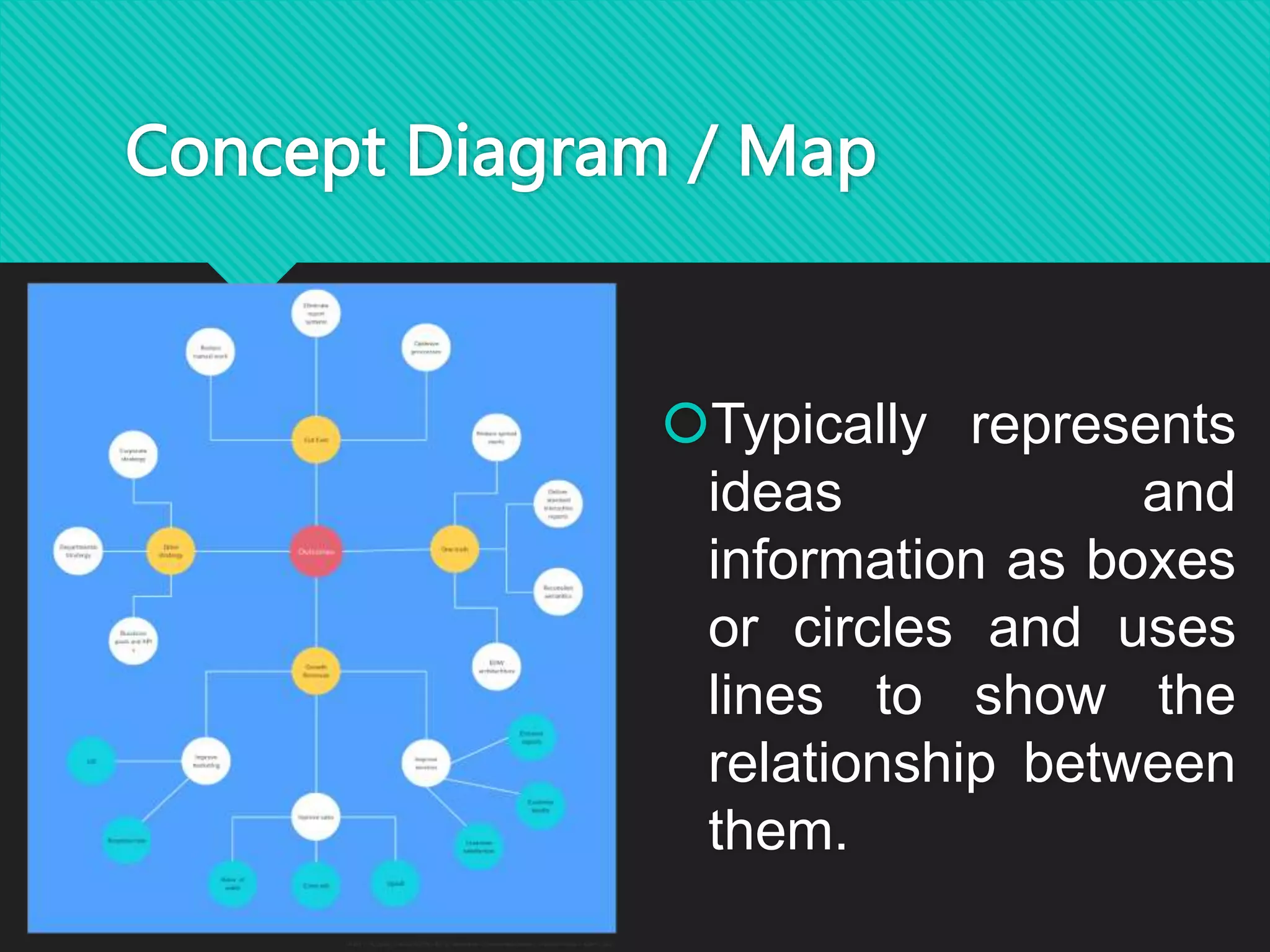
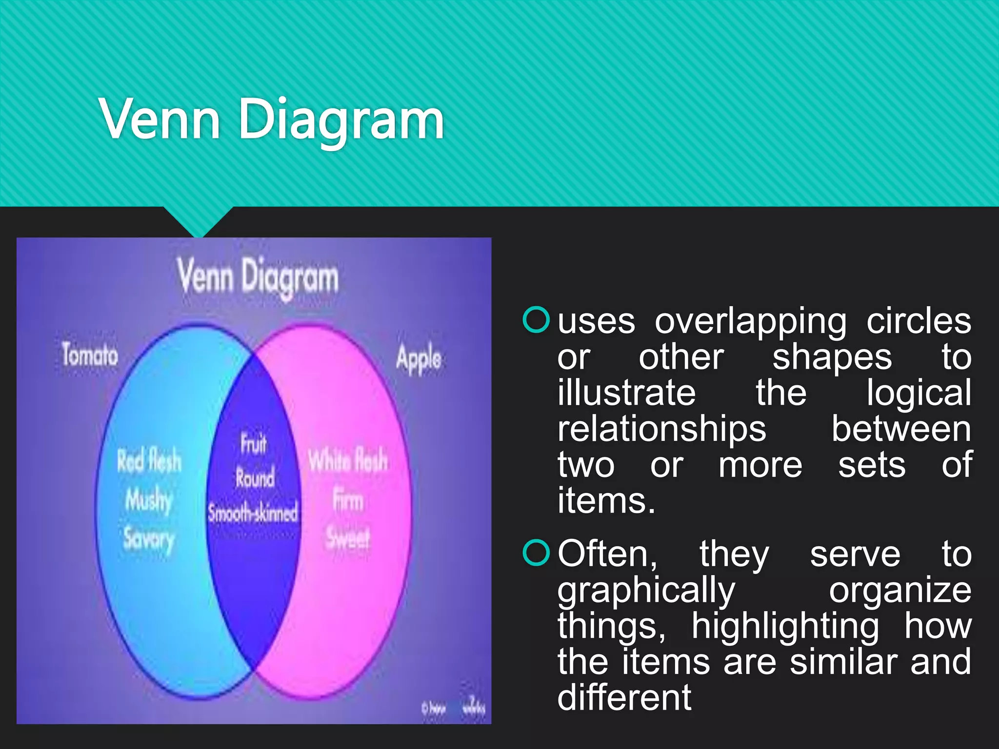
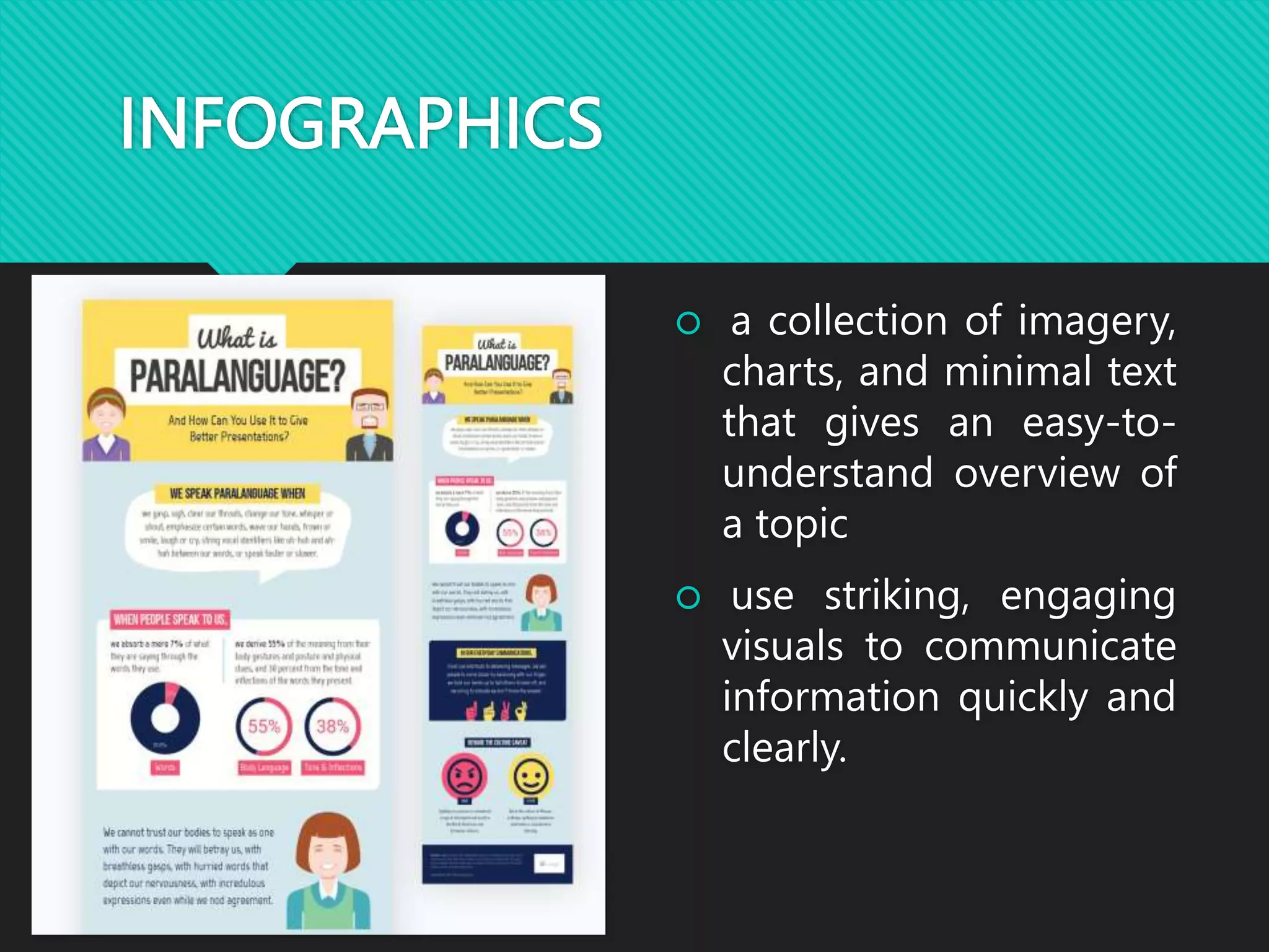
inofpgrashci
arb agphr
concpet diarmagr
pictahorpg
nven idaarmg
TYPES OF NON- LINEAR TEXTS
Graphs/ Charts Infographics Diagrams/ Maps
Bar graph
 a chart or graph that presents
categorical data with
rectangular bars with heights
or lengths proportional to the
values that they represent. The
bars can be plotted vertically
or horizontally. A vertical bar
chart is sometimes called a
column chart.
Graphs/ Charts
Line graph
 also known as a line chart, is
a type of chart used to
visualize the value of
something over time.
 the line graph is consists of a
horizontal x-axis and a vertical
y-axis.
Pictograph
 is the representation of
data using images.
 Pictographs represent the
frequency of data while
using symbols or images
that are relevant to the
data
Pie graph
 can be used to show
percentages of a whole, and
represents percentages at a set
point in time.
 Unlike bar graphs and
line graphs, pie charts do not
show changes over time.
Concept Diagram / Map
Typically represents
ideas and
information as boxes
or circles and uses
lines to show the
relationship between
them.
Venn Diagram
uses overlapping circles
or other shapes to
illustrate the logical
relationships between
two or more sets of
items.
Often, they serve to
graphically organize
things, highlighting how
the items are similar and
different
INFOGRAPHICS
 a collection of imagery,
charts, and minimal text
that gives an easy-to-
understand overview of
a topic
 use striking, engaging
visuals to communicate
information quickly and
clearly.

transcoding_linear_to_non-linear_text.pptx

  • 2.
  • 3.
  • 4.
  • 5.
  • 6.
  • 8.
    TYPES OF NON-LINEAR TEXTS Graphs/ Charts Infographics Diagrams/ Maps
  • 9.
    Bar graph  achart or graph that presents categorical data with rectangular bars with heights or lengths proportional to the values that they represent. The bars can be plotted vertically or horizontally. A vertical bar chart is sometimes called a column chart. Graphs/ Charts
  • 10.
    Line graph  alsoknown as a line chart, is a type of chart used to visualize the value of something over time.  the line graph is consists of a horizontal x-axis and a vertical y-axis.
  • 11.
    Pictograph  is therepresentation of data using images.  Pictographs represent the frequency of data while using symbols or images that are relevant to the data
  • 12.
    Pie graph  canbe used to show percentages of a whole, and represents percentages at a set point in time.  Unlike bar graphs and line graphs, pie charts do not show changes over time.
  • 13.
    Concept Diagram /Map Typically represents ideas and information as boxes or circles and uses lines to show the relationship between them.
  • 14.
    Venn Diagram uses overlappingcircles or other shapes to illustrate the logical relationships between two or more sets of items. Often, they serve to graphically organize things, highlighting how the items are similar and different
  • 15.
    INFOGRAPHICS  a collectionof imagery, charts, and minimal text that gives an easy-to- understand overview of a topic  use striking, engaging visuals to communicate information quickly and clearly.