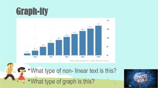
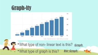
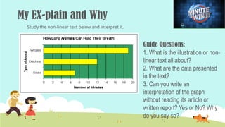
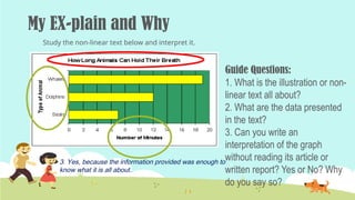
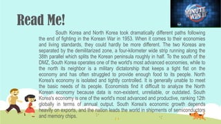
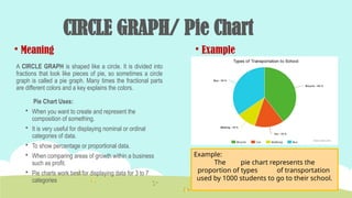
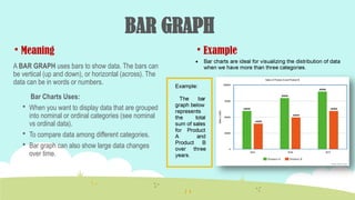
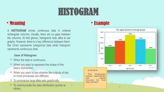
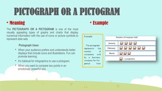
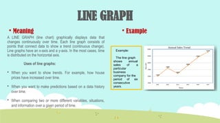
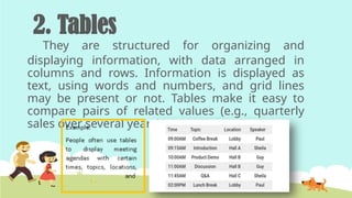
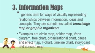
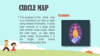
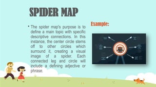
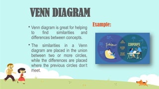
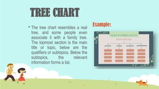
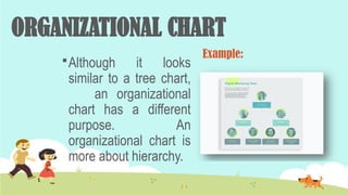
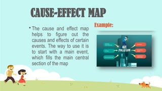
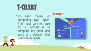
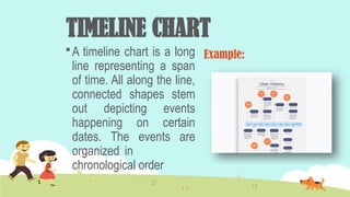
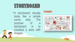
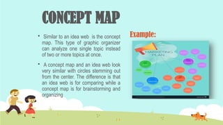
English 8
Quarter 2- Module 1
Jeanilyn G. Minsalan, TII
ATTENDANCE
DAILY
FEED
FOR THE
SOUL
DAILY
FEED
FOR THE
SOUL
You have your own
timeline, Focus on
your growth 
Linear
and
Non- linear text
Learning Competency:
In this module, your goal is to
explain visual-verbal relationships
illustrated in tables, graphs, and
information maps found in
expository texts.
Learning Objectives:
At the end of the lesson, the students are able to:
a. Explain illustrations presented through non-
linear texts.
b. Differentiate linear from non-linear texts.
c. Provide examples of non-linear texts in the
community.
MATCHING TYPE:
Identify what chart/graph it is in column A.
a. Pie graph
b. histogram
c. bar graph
d. line graph
1. 2.
3. 4.
Column A
Column B
MATCHING TYPE:
Identify what chart/graph it is in column A.
a. Pie graph
b. histogram
c. bar graph
d. line graph
1. 2.
3. 4.
Column A
Column B
Graph-ity
What type of non- linear text is this?
What type of graph is this?
Graph-ity
What type of non- linear text is this?
What type of graph is this?
Graph
Bar Graph
My EX-plain and Why
Guide Questions:
1. What is the illustration or non-
linear text all about?
2. What are the data presented
in the text?
3. Can you write an
interpretation of the graph
without reading its article or
written report? Yes or No? Why
do you say so?
Study the non-linear text below and interpret it.
3. Yes, because the information provided was enough to
know what it is all about.
Read Me!
 Tell into the class what is talked about in the paragraph below.
Almost all Koreans live in cities, which occupy only a
small portion of the nation‘s total area. The country divides its
land by use — urban areas, managed areas, natural
preserves, and farms and forests — in order to carry out its
planning initiatives. Of the categories, urban areas take up
16.7 percent of the country, while farms and forests occupy
46.5 percent, followed by 25.6 percent for managed areas
and 11.2 percent for preserves.
South Korea and North Korea took dramatically different paths following
the end of fighting in the Korean War in 1953. When it comes to their economies
and living standards, they could hardly be more different. The two Koreas are
separated by the demilitarized zone, a four-kilometer wide strip running along the
38th parallel which splits the Korean peninsula roughly in half. To the south of the
DMZ, South Korea operates one of the world's most advanced economies, while to
the north its neighbor is a military dictatorship that keeps a tight fist on the
economy and has often struggled to provide enough food to its people. North
Korea's economy is isolated and tightly controlled. It is generally unable to meet
the basic needs of its people. Economists find it difficult to analyze the North
Korean economy because data is non-existent, unreliable, or outdated. South
Korea's economy is one of the world's most advanced and productive, ranking 12th
globally in terms of annual output. South Korea's economic growth depends
heavily on exports, and the nation leads the world in shipments of semiconductors
and memory chips.
Read Me!
Read Me!
First paragraph
 Korea’s land partition.
Second paragraph
South and North Korea
economic status.
VOCABULARY LIST
 Linear Texts – the most common type of text that need to
be read from beginning to the end. They focus on the
arrangement of words, both grammatically and
stylistically. Novels, poems, short stories, letters and
educational texts are examples of linear texts.
 Non-Linear Texts – texts with visuals or representations.
The readers do not have to go through the text in a
sequential manner in order to make sense of the text.
 Expository Texts – are designed to explain, inform and
present facts on specific topics.
Linear text
Non-
Linear text
&
Linear text
Linear Text
• Linear text refers to traditional text
that needs to be read from
beginning to the end.
• Here, the reader makes sense of
the text according to the
grammatical and syntactic
arrangement of the words.
Moreover, this type of text has an
order or sequence; it’s typically the
author of the text who decides the
order of the text, or its reading
path. Generally, texts printed on
paper are considered as linear
texts. Novels, poems, short stories,
letters, educational texts, all those
texts we read from the beginning
to the end, are linear texts.
Non-
Linear text
Non-Linear Text
A number of visual forms or non-linear
texts could be encountered in
textbooks and other reading materials.
Non-linear texts are used to present
data in an orderly way and also to
enable the readers to see large
quantities of information at a glance.
Non-linear texts are used to:
summarize figures
show trends
show comparisons
clarify difficult concepts
show relationships
Examples of non-linear texts
• Graphs
• Table
• Information Maps
1. Graphs
These are the
representation of data
represented by symbols or
legends.
Different kinds of Graphs
CIRCLE GRAPH/ Pie Chart
 Meaning
A CIRCLE GRAPH is shaped like a circle. It is divided into
fractions that look like pieces of pie, so sometimes a circle
graph is called a pie graph. Many times the fractional parts
are different colors and a key explains the colors.
Pie Chart Uses:
 When you want to create and represent the
composition of something.
 It is very useful for displaying nominal or ordinal
categories of data.
 To show percentage or proportional data.
 When comparing areas of growth within a business
such as profit.
 Pie charts work best for displaying data for 3 to 7
categories
 Example
Example:
The pie chart represents the
proportion of types of transportation
used by 1000 students to go to their school.
BAR GRAPH
 Meaning
A BAR GRAPH uses bars to show data. The bars can
be vertical (up and down), or horizontal (across). The
data can be in words or numbers.
Bar Charts Uses:
 When you want to display data that are grouped
into nominal or ordinal categories (see nominal
vs ordinal data).
 To compare data among different categories.
 Bar graph can also show large data changes
over time.
 Example
HISTOGRAM
 Meaning
A HISTOGRAM shows continuous data in ordered
rectangular columns. Usually, there are no gaps between
the columns. At first glance, histograms look alike to bar
graphs. However, there is a key difference between them.
Bar Chart represents categorical data while histogram
represents continuous data.
Uses of Histogram:
 When the data is continuous.
 When you want to represent the shape of the
data‘s distribution.
 When you want to see whether the outputs of two
or more processes are different.
 To summarize large data sets graphically.
 To communicate the data distribution quickly to
others.
 Example
PICTOGRAPH OR A PICTOGRAM
 Meaning
The PICTOGRAPH OR A PICTOGRAM is one of the most
visually appealing types of graphs and charts that display
numerical information with the use of icons or picture symbols to
represent data sets
Pictograph Uses:
 When your audience prefers and understands better
displays that include icons and illustrations. Fun can
promote learning.
 It‘s habitual for infographics to use a pictogram.
 When you want to compare two points in an
emotionally powerful way
 Example
LINE GRAPH
 Meaning
A LINE GRAPH (line chart) graphically displays data that
changes continuously over time. Each line graph consists of
points that connect data to show a trend (continuous change).
Line graphs have an x-axis and a y-axis. In the most cases, time
is distributed on the horizontal axis.
Uses of line graphs:
 When you want to show trends. For example, how house
prices have increased over time.
 When you want to make predictions based on a data history
over time.
 When comparing two or more different variables, situations,
and information over a given period of time.
 Example
Example:
The line graph
shows annual
sales of a
particular
business
company for the
period of six
consecutive
years.
2. Tables
They are structured for organizing and
displaying information, with data arranged in
columns and rows. Information is displayed as
text, using words and numbers, and grid lines
may be present or not. Tables make it easy to
compare pairs of related values (e.g., quarterly
sales over several years).
3. Information Maps
 generic term for ways of visually representing
relationships between information, ideas and
concepts. They are sometimes called knowledge
map or graphic organizers.
Examples are circle map, spider map, Venn
diagram, tree chart, organizational chart, cause
and effect map, T-chart, timeline chart, storyboard
and concept map
Different Examples of
Information Maps
CIRCLE MAP
 The purpose of the circle map
is to brainstorm an idea or topic
using related information. A circle
map consists of a large circle
with another circle inside, where
the main topic or idea takes
center stage. Surrounding it is
the larger circle where
corresponding ideas flow.
Example:
SPIDER MAP
 The spider map's purpose is to
define a main topic with specific
descriptive connections. In this
instance, the center circle stems
off to other circles which
surround it, creating a visual
image of a spider. Each
connected leg and circle will
include a defining adjective or
phrase.
Example:
VENN DIAGRAM
 Venn diagram is great for helping
to find similarities and
differences between concepts.
 The similarities in a Venn
diagram are placed in the union
between two or more circles,
while the differences are placed
where the previous circles don‘t
meet.
Example:
TREE CHART
 The tree chart resembles a real
tree, and some people even
associate it with a family tree.
The topmost section is the main
title or topic, below are the
qualifiers or subtopics. Below the
subtopics, the relevant
information forms a list.
Example:
ORGANIZATIONAL CHART
Although it looks
similar to a tree chart,
an organizational
chart has a different
purpose. An
organizational chart is
more about hierarchy.
Example:
CAUSE-EFFECT MAP
 The cause and effect map
helps to figure out the
causes and effects of certain
events. The way to use it is
to start with a main event,
which fills the main central
section of the map
Example:
T-CHART
 It's used mainly for
comparing two topics.
The most common use
for a T-Chart is to
compare the pros and
cons of a decision that
needs to be made
Example:
TIMELINE CHART
 A timeline chart is a long
line representing a span
of time. All along the line,
connected shapes stem
out depicting events
happening on certain
dates. The events are
organized in
chronological order
Example:
STORYBOARD
A storyboard visually
looks like a simple
comic strip. The
purpose of a
storyboard is to
visualize a story with
images.
Example:
CONCEPT MAP
 Similar to an idea web is the concept
map. This type of graphic organizer
can analyze one single topic instead
of two or more topics at once.
 A concept map and an idea web look
very similar with circles stemming out
from the center. The difference is that
an idea web is for comparing while a
concept map is for brainstorming and
organizing
Example:
OPEN FORUM
Group work: Change is Coming!
 Make a bar graph out of the illustration below.
Infographic: The long shadow of school bullying
Individual Task 1:
Type in your answers from the questions below:
1. Where can we see non-linear texts in the
community?
2. Is it important to know how to interpret them?
Group Task 2: Divided We Stand
Divide the class into five. Using the data assigned yesterday, let them do the following
tasks:
 Group 1: Make a circle graph out of the number of students who live in each barangay.
 Group 2: Make a bar graph out of the number of students with their favorite subjects.
 Group 3: Make a picture graph out of the number of students using different social
media platforms.
 Group 4: Make a histogram out their expenses from Monday to Friday.
 Group 5: Make a line graph out of the average grades of the students from first to fourth
quarter in English 7.
Rubrics:
Presentation-
35%
Content - 35%
Creativity - 30%
Total: 100%
Complete the concept map below...
Transcode Information
Line Graph
Linear Text
Non-
Linear
Text Bar Graph
Novels
Assignment:
Find a non-linear text
in the community. Be
able to interpret it.
Happy learning!

English 8- Quarter Two-----Module 1.pptx

  • 1.
    English 8 Quarter 2-Module 1 Jeanilyn G. Minsalan, TII
  • 3.
  • 4.
  • 5.
    DAILY FEED FOR THE SOUL You haveyour own timeline, Focus on your growth 
  • 6.
  • 7.
    Learning Competency: In thismodule, your goal is to explain visual-verbal relationships illustrated in tables, graphs, and information maps found in expository texts.
  • 8.
    Learning Objectives: At theend of the lesson, the students are able to: a. Explain illustrations presented through non- linear texts. b. Differentiate linear from non-linear texts. c. Provide examples of non-linear texts in the community.
  • 9.
    MATCHING TYPE: Identify whatchart/graph it is in column A. a. Pie graph b. histogram c. bar graph d. line graph 1. 2. 3. 4. Column A Column B
  • 10.
    MATCHING TYPE: Identify whatchart/graph it is in column A. a. Pie graph b. histogram c. bar graph d. line graph 1. 2. 3. 4. Column A Column B
  • 11.
    Graph-ity What type ofnon- linear text is this? What type of graph is this?
  • 12.
    Graph-ity What type ofnon- linear text is this? What type of graph is this? Graph Bar Graph
  • 13.
    My EX-plain andWhy Guide Questions: 1. What is the illustration or non- linear text all about? 2. What are the data presented in the text? 3. Can you write an interpretation of the graph without reading its article or written report? Yes or No? Why do you say so? Study the non-linear text below and interpret it.
  • 14.
    My EX-plain andWhy Guide Questions: 1. What is the illustration or non- linear text all about? 2. What are the data presented in the text? 3. Can you write an interpretation of the graph without reading its article or written report? Yes or No? Why do you say so? Study the non-linear text below and interpret it. 3. Yes, because the information provided was enough to know what it is all about.
  • 15.
    Read Me!  Tellinto the class what is talked about in the paragraph below. Almost all Koreans live in cities, which occupy only a small portion of the nation‘s total area. The country divides its land by use — urban areas, managed areas, natural preserves, and farms and forests — in order to carry out its planning initiatives. Of the categories, urban areas take up 16.7 percent of the country, while farms and forests occupy 46.5 percent, followed by 25.6 percent for managed areas and 11.2 percent for preserves.
  • 16.
    South Korea andNorth Korea took dramatically different paths following the end of fighting in the Korean War in 1953. When it comes to their economies and living standards, they could hardly be more different. The two Koreas are separated by the demilitarized zone, a four-kilometer wide strip running along the 38th parallel which splits the Korean peninsula roughly in half. To the south of the DMZ, South Korea operates one of the world's most advanced economies, while to the north its neighbor is a military dictatorship that keeps a tight fist on the economy and has often struggled to provide enough food to its people. North Korea's economy is isolated and tightly controlled. It is generally unable to meet the basic needs of its people. Economists find it difficult to analyze the North Korean economy because data is non-existent, unreliable, or outdated. South Korea's economy is one of the world's most advanced and productive, ranking 12th globally in terms of annual output. South Korea's economic growth depends heavily on exports, and the nation leads the world in shipments of semiconductors and memory chips. Read Me!
  • 17.
    Read Me! First paragraph Korea’s land partition. Second paragraph South and North Korea economic status.
  • 18.
    VOCABULARY LIST  LinearTexts – the most common type of text that need to be read from beginning to the end. They focus on the arrangement of words, both grammatically and stylistically. Novels, poems, short stories, letters and educational texts are examples of linear texts.  Non-Linear Texts – texts with visuals or representations. The readers do not have to go through the text in a sequential manner in order to make sense of the text.  Expository Texts – are designed to explain, inform and present facts on specific topics.
  • 19.
  • 20.
  • 21.
    Linear Text • Lineartext refers to traditional text that needs to be read from beginning to the end. • Here, the reader makes sense of the text according to the grammatical and syntactic arrangement of the words. Moreover, this type of text has an order or sequence; it’s typically the author of the text who decides the order of the text, or its reading path. Generally, texts printed on paper are considered as linear texts. Novels, poems, short stories, letters, educational texts, all those texts we read from the beginning to the end, are linear texts.
  • 22.
  • 23.
    Non-Linear Text A numberof visual forms or non-linear texts could be encountered in textbooks and other reading materials. Non-linear texts are used to present data in an orderly way and also to enable the readers to see large quantities of information at a glance.
  • 24.
    Non-linear texts areused to: summarize figures show trends show comparisons clarify difficult concepts show relationships
  • 25.
    Examples of non-lineartexts • Graphs • Table • Information Maps
  • 26.
    1. Graphs These arethe representation of data represented by symbols or legends.
  • 27.
  • 28.
    CIRCLE GRAPH/ PieChart  Meaning A CIRCLE GRAPH is shaped like a circle. It is divided into fractions that look like pieces of pie, so sometimes a circle graph is called a pie graph. Many times the fractional parts are different colors and a key explains the colors. Pie Chart Uses:  When you want to create and represent the composition of something.  It is very useful for displaying nominal or ordinal categories of data.  To show percentage or proportional data.  When comparing areas of growth within a business such as profit.  Pie charts work best for displaying data for 3 to 7 categories  Example Example: The pie chart represents the proportion of types of transportation used by 1000 students to go to their school.
  • 29.
    BAR GRAPH  Meaning ABAR GRAPH uses bars to show data. The bars can be vertical (up and down), or horizontal (across). The data can be in words or numbers. Bar Charts Uses:  When you want to display data that are grouped into nominal or ordinal categories (see nominal vs ordinal data).  To compare data among different categories.  Bar graph can also show large data changes over time.  Example
  • 30.
    HISTOGRAM  Meaning A HISTOGRAMshows continuous data in ordered rectangular columns. Usually, there are no gaps between the columns. At first glance, histograms look alike to bar graphs. However, there is a key difference between them. Bar Chart represents categorical data while histogram represents continuous data. Uses of Histogram:  When the data is continuous.  When you want to represent the shape of the data‘s distribution.  When you want to see whether the outputs of two or more processes are different.  To summarize large data sets graphically.  To communicate the data distribution quickly to others.  Example
  • 31.
    PICTOGRAPH OR APICTOGRAM  Meaning The PICTOGRAPH OR A PICTOGRAM is one of the most visually appealing types of graphs and charts that display numerical information with the use of icons or picture symbols to represent data sets Pictograph Uses:  When your audience prefers and understands better displays that include icons and illustrations. Fun can promote learning.  It‘s habitual for infographics to use a pictogram.  When you want to compare two points in an emotionally powerful way  Example
  • 32.
    LINE GRAPH  Meaning ALINE GRAPH (line chart) graphically displays data that changes continuously over time. Each line graph consists of points that connect data to show a trend (continuous change). Line graphs have an x-axis and a y-axis. In the most cases, time is distributed on the horizontal axis. Uses of line graphs:  When you want to show trends. For example, how house prices have increased over time.  When you want to make predictions based on a data history over time.  When comparing two or more different variables, situations, and information over a given period of time.  Example Example: The line graph shows annual sales of a particular business company for the period of six consecutive years.
  • 33.
    2. Tables They arestructured for organizing and displaying information, with data arranged in columns and rows. Information is displayed as text, using words and numbers, and grid lines may be present or not. Tables make it easy to compare pairs of related values (e.g., quarterly sales over several years).
  • 34.
    3. Information Maps generic term for ways of visually representing relationships between information, ideas and concepts. They are sometimes called knowledge map or graphic organizers. Examples are circle map, spider map, Venn diagram, tree chart, organizational chart, cause and effect map, T-chart, timeline chart, storyboard and concept map
  • 35.
  • 36.
    CIRCLE MAP  Thepurpose of the circle map is to brainstorm an idea or topic using related information. A circle map consists of a large circle with another circle inside, where the main topic or idea takes center stage. Surrounding it is the larger circle where corresponding ideas flow. Example:
  • 37.
    SPIDER MAP  Thespider map's purpose is to define a main topic with specific descriptive connections. In this instance, the center circle stems off to other circles which surround it, creating a visual image of a spider. Each connected leg and circle will include a defining adjective or phrase. Example:
  • 38.
    VENN DIAGRAM  Venndiagram is great for helping to find similarities and differences between concepts.  The similarities in a Venn diagram are placed in the union between two or more circles, while the differences are placed where the previous circles don‘t meet. Example:
  • 39.
    TREE CHART  Thetree chart resembles a real tree, and some people even associate it with a family tree. The topmost section is the main title or topic, below are the qualifiers or subtopics. Below the subtopics, the relevant information forms a list. Example:
  • 40.
    ORGANIZATIONAL CHART Although itlooks similar to a tree chart, an organizational chart has a different purpose. An organizational chart is more about hierarchy. Example:
  • 41.
    CAUSE-EFFECT MAP  Thecause and effect map helps to figure out the causes and effects of certain events. The way to use it is to start with a main event, which fills the main central section of the map Example:
  • 42.
    T-CHART  It's usedmainly for comparing two topics. The most common use for a T-Chart is to compare the pros and cons of a decision that needs to be made Example:
  • 43.
    TIMELINE CHART  Atimeline chart is a long line representing a span of time. All along the line, connected shapes stem out depicting events happening on certain dates. The events are organized in chronological order Example:
  • 44.
    STORYBOARD A storyboard visually lookslike a simple comic strip. The purpose of a storyboard is to visualize a story with images. Example:
  • 45.
    CONCEPT MAP  Similarto an idea web is the concept map. This type of graphic organizer can analyze one single topic instead of two or more topics at once.  A concept map and an idea web look very similar with circles stemming out from the center. The difference is that an idea web is for comparing while a concept map is for brainstorming and organizing Example:
  • 46.
  • 47.
    Group work: Changeis Coming!  Make a bar graph out of the illustration below. Infographic: The long shadow of school bullying
  • 48.
    Individual Task 1: Typein your answers from the questions below: 1. Where can we see non-linear texts in the community? 2. Is it important to know how to interpret them?
  • 49.
    Group Task 2:Divided We Stand Divide the class into five. Using the data assigned yesterday, let them do the following tasks:  Group 1: Make a circle graph out of the number of students who live in each barangay.  Group 2: Make a bar graph out of the number of students with their favorite subjects.  Group 3: Make a picture graph out of the number of students using different social media platforms.  Group 4: Make a histogram out their expenses from Monday to Friday.  Group 5: Make a line graph out of the average grades of the students from first to fourth quarter in English 7. Rubrics: Presentation- 35% Content - 35% Creativity - 30% Total: 100%
  • 50.
    Complete the conceptmap below... Transcode Information Line Graph Linear Text Non- Linear Text Bar Graph Novels
  • 51.
    Assignment: Find a non-lineartext in the community. Be able to interpret it.
  • 52.