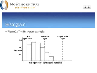
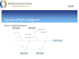
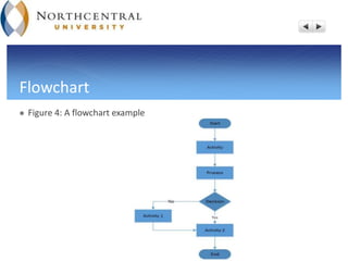
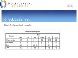
TQM Tools and Techniques
Activity 5:
TQM tools and Techniques Presentation
Mohamed Benhalla
Dr. Steven Munkeby
12/20/2015
Overview
 The Main purposes of the TQM tool and techniques.
 Pareto and histogram description and benefits.
 Cause and effect diagram.
 Flowchart diagram.
 Check Sheet and the Scatter diagram.
 Statistical process control (SPC).
 Some other TQM tools and techniques.
The general TQM tools and techniques
 The TQM implementation and tools will improve the organizational
performance by detecting or preventing the problems that can impact the
process operation, the cost, and the quality (Prajogo & Sohal, 2003).
 Reducing the cost and minimizing the waste using the TQM tools will give
the firm a competitive edge on the prices and quality.
 The TQM tool will provide the continual quality improvement that build a
strong firm’s brand and name locally and in the global market (Bunney &
Dale 1997 ).
Continued-
 The TQM tools and techniques will facilitate the analysis of the data and the
process, which it will result in better decisions.
 The TQM tools can be categorized either by their applications (such as
problem solving, data collection or quality awareness) or by their functions (
like purchasing, sales, engineering, service) (Bunney & Dale 1997 ).
 The TQM tools are classified either byqualitative tools (flow charts, cause-
and-effect diagrams) or by quantitative tools (control charts, scatter
diagrams, Pareto charts, and histogram) (Scheuermann et al., 1997)
Pareto Chart
 Figure 1: Pareto chart examples
Continued-
 The chart gets its name from the Italian economist Vilfredo Pareto (1848-1923)
(Goetsch & Davis, 2016).
 The majority of problems (80%) come from the minority of causes (20%) (Goetsch &
Davis, 2016 ).
 The chart is used to focus on the most important problems or opportunities among
others.
 It helps to establish priorities to distinguish between the significant few items and
the trivial many.
 It helps to detect the root causes of the problem by ordering frequencies from the
highest ones to the lowest.
Histogram
 Figure 2 : The Histogram example
Continued-
 A histogram is a graph that illustrates the frequency distributions ( Goetsch
& Davis, 2016).
 Two type of data can be used and represented in the histogram: attributes
and variables data (Goetsch & Davis, 2016).
 It highlights graphically, the variation of the data grouped by the set.
 The histogram is a type of bar chart, and the high bars represent the high
frequencies and the lower bars indicate the low occurrences of the data.
Cause-effects diagram
Figure: Fishbone diagram
Continued-
 The cause-effect diagram also called a fishbone diagram or Ishikawa diagram
due to the Japanese quality expert Kaora Ishikawa (Gowtsch & Davis, 2016).
 It identifies and highlights the different possible causes that can impact an
effect.
 It gathers the various teams from the different organizational functions to work
together for the brainstorming.
 It is the only TQM tool that is not based on the statistics techniques.
 It depicts and identifies the major causes from the roots.
Flowchart
 Figure 4: A flowchart example
 The Flowchart is a group of symbols and text that are connected with arrows to show
the direction of the data and the process workflow ( Gowtsch & Davis, 2016).
 The flowchart is TQM’s qualitative tool that represent graphically the process (Heizer
& Render, 2011).
 It provides the company with a visual repetition of the different steps taken a
business or operations processes ( Schroeder et al., 2011).
 It breaks down a complex process into simple and clear sub-processes for better
understanding.
Check List sheet
Figure 5: Check sheet example.
Continued-
 Check sheet also named concentration diagram is structured and organized from the
collecting data concerning the people, the machines, and the processes (Poornima,
2011).
 It is another TQM tool that can be adapted for the variety of purposes and problems
resolving.
 It displays the information in an efficient visual way to make it easier for the reader
when analyzing the data.
 It counts and displays the number of specific problems occurrences.
 IT assigns the type and the category of each specific problem.
Scatter diagrams
 Figure 6: Scatter diagram examples
Continued-
 The scatter diagram (the scatter plot or the X-Y graph) is another TQM tool that
displays the degree and the type and the correlation (relationship) that existent
between the variables (Poornima & Charantimath, 2011).
 When the points on the graph are aligned forming almost a straight line, it means
that the variables are correlated.
 The scatter diagram can display a positive correlation, negative correlation, or no
correlation between the variables.
 By finding the relationship between the variables, the firm has more capability to
determine the root causes.
Control chart
 Figure 7 : Control chart example
Continued-
 The control chart relies on the Statistical process control (SPC) method developed by
Dr. Walter Shewart in 1931 to separate the common causes from the special causes
variation in the process (Goetschi & Davis, 2016).
 The central line (Average line), UCL and the LCL are the upper and the lower control
limits of the control chart upon which, the consistency and the variation of the
process is measured (Schroeder et al., 2011).
 It prevent and eliminate the special causes to maintain the stability and the
consistency of the process ( Heizer & Render, 2011).
 The use of the SPC will restrict 99.73% of the outputs to fall within ± 3σ limits of the
process ( goetschi & Davis, 2016).
Some other quality tools and techniques
 QFD- Quality Function Deployment is a quality approach used in the service/
product design to match the customer’s expectations and attributes with
the firm’s capabilities and features (Goetsch & Davis, 2016)
 The Five- S: it stands for Sort, Store, Shine, Standardize, and Sustain. This
Japanese technique is used to eliminate waste, reduce problems and errors,
increase safety and profits.
 FMEA: Failure mode and effect analysis, this tool will prioritize the defect
and problems by their severity and risks, eliminate them and make sure that
they will not occur again within the process.
 In summary, if the TQM tools and techniques used properly and effectively,
the process performance will be consistent and stable, the problems and
the wastes will be eliminated and minimized. In addition, the cost will be
reduced and the quality will be improved. Thereby, the success of the TQM
implementation will give the organization a competitive edge and increase
its profits.
 Bunney, H., & Dale, B. (1997). The implementation of quality management
tools andtechniques: a study.The TQM Magazine, 9(3), 183-189
 Heizer, J & Render, B (2011). Principle of operations management. Printice
Hall Pearson. New jersey, NJ.
 Poornima M. Charantimath. (2011). Total Quality Management. Second
edition. Pearson. New Jersy : NJ: USA.
 Prajogo, D., & Sohal, A. (2003). The relationship between TQM practices,
quality performance, and innovation performance: An empirical
examination. International Journal of Quality & Reliability Management, 20(8),
901-918.
 Schroeder, R. G., Goldstein, S. M., & Rungtusanatham, M. J. (2011) Operations
management: Contemporary concepts and cases. McGraw-Hill companies. New
York, NY.
 Scheuermann, L., Zhu, Z., & Scheuermann, S. (1997). TQM success efforts: use
morequantitative or qualitative tools? Industrial Management & Data Systems,
97 (7), 264-270

TQM

  • 1.
    TQM Tools andTechniques Activity 5: TQM tools and Techniques Presentation Mohamed Benhalla Dr. Steven Munkeby 12/20/2015
  • 2.
    Overview  The Mainpurposes of the TQM tool and techniques.  Pareto and histogram description and benefits.  Cause and effect diagram.  Flowchart diagram.  Check Sheet and the Scatter diagram.  Statistical process control (SPC).  Some other TQM tools and techniques.
  • 3.
    The general TQMtools and techniques  The TQM implementation and tools will improve the organizational performance by detecting or preventing the problems that can impact the process operation, the cost, and the quality (Prajogo & Sohal, 2003).  Reducing the cost and minimizing the waste using the TQM tools will give the firm a competitive edge on the prices and quality.  The TQM tool will provide the continual quality improvement that build a strong firm’s brand and name locally and in the global market (Bunney & Dale 1997 ).
  • 4.
    Continued-  The TQMtools and techniques will facilitate the analysis of the data and the process, which it will result in better decisions.  The TQM tools can be categorized either by their applications (such as problem solving, data collection or quality awareness) or by their functions ( like purchasing, sales, engineering, service) (Bunney & Dale 1997 ).  The TQM tools are classified either byqualitative tools (flow charts, cause- and-effect diagrams) or by quantitative tools (control charts, scatter diagrams, Pareto charts, and histogram) (Scheuermann et al., 1997)
  • 5.
    Pareto Chart  Figure1: Pareto chart examples
  • 6.
    Continued-  The chartgets its name from the Italian economist Vilfredo Pareto (1848-1923) (Goetsch & Davis, 2016).  The majority of problems (80%) come from the minority of causes (20%) (Goetsch & Davis, 2016 ).  The chart is used to focus on the most important problems or opportunities among others.  It helps to establish priorities to distinguish between the significant few items and the trivial many.  It helps to detect the root causes of the problem by ordering frequencies from the highest ones to the lowest.
  • 7.
    Histogram  Figure 2: The Histogram example
  • 8.
    Continued-  A histogramis a graph that illustrates the frequency distributions ( Goetsch & Davis, 2016).  Two type of data can be used and represented in the histogram: attributes and variables data (Goetsch & Davis, 2016).  It highlights graphically, the variation of the data grouped by the set.  The histogram is a type of bar chart, and the high bars represent the high frequencies and the lower bars indicate the low occurrences of the data.
  • 9.
  • 10.
    Continued-  The cause-effectdiagram also called a fishbone diagram or Ishikawa diagram due to the Japanese quality expert Kaora Ishikawa (Gowtsch & Davis, 2016).  It identifies and highlights the different possible causes that can impact an effect.  It gathers the various teams from the different organizational functions to work together for the brainstorming.  It is the only TQM tool that is not based on the statistics techniques.  It depicts and identifies the major causes from the roots.
  • 11.
    Flowchart  Figure 4:A flowchart example
  • 12.
     The Flowchartis a group of symbols and text that are connected with arrows to show the direction of the data and the process workflow ( Gowtsch & Davis, 2016).  The flowchart is TQM’s qualitative tool that represent graphically the process (Heizer & Render, 2011).  It provides the company with a visual repetition of the different steps taken a business or operations processes ( Schroeder et al., 2011).  It breaks down a complex process into simple and clear sub-processes for better understanding.
  • 13.
    Check List sheet Figure5: Check sheet example.
  • 14.
    Continued-  Check sheetalso named concentration diagram is structured and organized from the collecting data concerning the people, the machines, and the processes (Poornima, 2011).  It is another TQM tool that can be adapted for the variety of purposes and problems resolving.  It displays the information in an efficient visual way to make it easier for the reader when analyzing the data.  It counts and displays the number of specific problems occurrences.  IT assigns the type and the category of each specific problem.
  • 15.
    Scatter diagrams  Figure6: Scatter diagram examples
  • 16.
    Continued-  The scatterdiagram (the scatter plot or the X-Y graph) is another TQM tool that displays the degree and the type and the correlation (relationship) that existent between the variables (Poornima & Charantimath, 2011).  When the points on the graph are aligned forming almost a straight line, it means that the variables are correlated.  The scatter diagram can display a positive correlation, negative correlation, or no correlation between the variables.  By finding the relationship between the variables, the firm has more capability to determine the root causes.
  • 17.
    Control chart  Figure7 : Control chart example
  • 18.
    Continued-  The controlchart relies on the Statistical process control (SPC) method developed by Dr. Walter Shewart in 1931 to separate the common causes from the special causes variation in the process (Goetschi & Davis, 2016).  The central line (Average line), UCL and the LCL are the upper and the lower control limits of the control chart upon which, the consistency and the variation of the process is measured (Schroeder et al., 2011).  It prevent and eliminate the special causes to maintain the stability and the consistency of the process ( Heizer & Render, 2011).  The use of the SPC will restrict 99.73% of the outputs to fall within ± 3σ limits of the process ( goetschi & Davis, 2016).
  • 19.
    Some other qualitytools and techniques  QFD- Quality Function Deployment is a quality approach used in the service/ product design to match the customer’s expectations and attributes with the firm’s capabilities and features (Goetsch & Davis, 2016)  The Five- S: it stands for Sort, Store, Shine, Standardize, and Sustain. This Japanese technique is used to eliminate waste, reduce problems and errors, increase safety and profits.  FMEA: Failure mode and effect analysis, this tool will prioritize the defect and problems by their severity and risks, eliminate them and make sure that they will not occur again within the process.
  • 20.
     In summary,if the TQM tools and techniques used properly and effectively, the process performance will be consistent and stable, the problems and the wastes will be eliminated and minimized. In addition, the cost will be reduced and the quality will be improved. Thereby, the success of the TQM implementation will give the organization a competitive edge and increase its profits.
  • 21.
     Bunney, H.,& Dale, B. (1997). The implementation of quality management tools andtechniques: a study.The TQM Magazine, 9(3), 183-189  Heizer, J & Render, B (2011). Principle of operations management. Printice Hall Pearson. New jersey, NJ.  Poornima M. Charantimath. (2011). Total Quality Management. Second edition. Pearson. New Jersy : NJ: USA.
  • 22.
     Prajogo, D.,& Sohal, A. (2003). The relationship between TQM practices, quality performance, and innovation performance: An empirical examination. International Journal of Quality & Reliability Management, 20(8), 901-918.  Schroeder, R. G., Goldstein, S. M., & Rungtusanatham, M. J. (2011) Operations management: Contemporary concepts and cases. McGraw-Hill companies. New York, NY.  Scheuermann, L., Zhu, Z., & Scheuermann, S. (1997). TQM success efforts: use morequantitative or qualitative tools? Industrial Management & Data Systems, 97 (7), 264-270