Beyond the EU: DORA and NIS 2 Directive's Global Impact
Magazine page deconstructed for young female readers
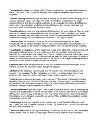
1. The masthead has been abbreviated to TOTP is very small and has been placed in the top right
corner. This is part of the house style and helps the audience to recognise the name of the
magazine.
The main heading is extremely large and bold. It takes up the whole of the top of the page, and is
very eye catching. It uses a very bright pink which will have been used to attract the target
audience of young girls, as pink is considered to be a stereotypically ‘girly’ colour. Bright blue and
green colours have also been used which are also effective as they connote happiness and
innocence, which emphasises the target age range.
The subheadings are also pink, which again will help to attract the target audience. They are quite
large, which makes them eye attaching and very easy to read. The font used looks handwritten,
however it also looks very neat and cursive. This is effective as girls stereotypically have neater
handwriting than boys, and so it seems more personal four the target audience.
The article titles are all written in black, as this colour contrasts strongly with the white
background. The key words in the titles are all in bold, which makes them more noticeable. For
example Alfie Deyes and Ed Sheeran’s names are in bold, which will attract the target audience.
The selection of images used on this page are all photos of the artists and celebrities mentioned
in the articles. This will attract the target audience as they will most likely be fans of these
celebrities and so will want to read about them. There isn't really a main image on this page, which
is unusual. However the fact that a lot of the images are about the same size implies that all of the
content is just as interesting and important. Most of the people in the images are looking directly at
the camera, which seems more welcoming for the audience.
Page numbers are placed next to the article titles and also next to some of the images as this
makes it easier for the reader to navigate through the magazine.
A letter fromthe writer has been included, and this includes more information about whats
included in the magazine. The fact that this text is in the form of a letter makes it seem more
personal to the reader, as it seems as though it’s been written especially for them.
The fonts used on this cover are again, mainly sans serif. This makes it look less sophisticated,
highlighting the age range that Top Of The Pops is targeted towards. Many of the fonts appear to
be handwritten, and this makes it seem as though the magazine has been written specifically for
the reader, making it a lot more friendly and personal.
The colour scheme is again very bright. There is a lot of pink used as this colour is stereotypically
very feminine. Bright greens and blues have also been used, and these colours have connotations
of the perfect summer’s day, making them seem very friendly and innocent. This emphasises that
the magazine is aimed towards young girls, not women. White and black have also been used as
these colours contrast well.
The language used is very colloquial, which makes it very formal. Examples of this are ‘mag’, ‘
hey’, ‘celebs’ and ‘brill’. Colloquial language is usually only used in speech, and so this makes the
text seem a lot more personal.
The overall impression of this page is very busy, but also very fun and friendly. The use of bright
colours makes it look like there is a lot going on and this implies that there is a lot if content.