
Recommended
More Related Content
What's hot
What's hot (19)
Viewers also liked
Viewers also liked (20)
Similar to Brand Identity, Typography, Layout, Colour and Language Analysis
Similar to Brand Identity, Typography, Layout, Colour and Language Analysis (20)
Recently uploaded
Recently uploaded (20)
Brand Identity, Typography, Layout, Colour and Language Analysis
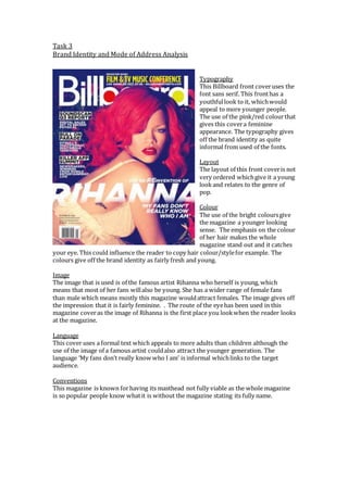
- 1. Task 3 Brand Identity and Mode of Address Analysis Typography This Billboard front cover uses the font sans serif. This front has a youthful look to it, which would appeal to more younger people. The use of the pink/red colour that gives this cover a feminine appearance. The typography gives off the brand identity as quite informal from used of the fonts. Layout The layout of this front cover is not very ordered which give it a young look and relates to the genre of pop. Colour The use of the bright colours give the magazine a younger looking sense. The emphasis on the colour of her hair makes the whole magazine stand out and it catches your eye. This could influence the reader to copy hair colour/style for example. The colours give off the brand identity as fairly fresh and young. Image The image that is used is of the famous artist Rihanna who herself is young, which means that most of her fans will also be young. She has a wider range of female fans than male which means mostly this magazine would attract females. The image gives off the impression that it is fairly feminine. . The route of the eye has been used in this magazine cover as the image of Rihanna is the first place you look when the reader looks at the magazine. Language This cover uses a formal text which appeals to more adults than children although the use of the image of a famous artist could also attract the younger generation. The language ‘My fans don’t really know who I am’ is informal which links to the target audience. Conventions This magazine is known for having its masthead not fully viable as the whole magazine is so popular people know what it is without the magazine stating its fully name.
- 2. Typography This content page uses the font san serif for the mast head which is the same as the front cover. The masthead at the top of the page is bigger than the rest of the text which is fairly conventional. Layout The layout of this content page is ordered. There is no text overlapping any images which gives a professional look to the page which is more based on adults than children. The layout of the text on this content page is in columns. Colour The colours that are used are mostly black, white and blue these are quite adult colours as they are bright. Image This content page uses a variety of images, of which some are cartoon. This appeals to a range of audiences such as teenagers and young adults. Language The language that has been used is more formal that informal, this appeals to more adults than children. Conventions A convention of this magazine is to have the recent album/song music chart.
- 3. Typography The font that is use across this page the font san serif is used. It give a female vibe because the text is fairly close together and some of the text is pink which connotes romance and femininity. Layout The layout for this double page spread is ordered as all the text fits around the image in columns, this gives an adult theme as it would not interest children to read this magazine as there are not bright colours and loads of images. Colour There are limited colours used on this double page spread. Mostly the colours black, white and pink have been used this gives a simple look to the page which would appeal more to adults than children. The mode of address for this magazine is the used of the colours using the colour pink would appeal to women. Image This Billboard double page spread has a large image which uses the route of the eye as it is the first place the reader looks when looking at the page. Language The language is formal which is based more on adults that children as they use more slang words. Conventions A convention for this double page spread is the use of the columns which gives a professional look the page which would be more based on adults.