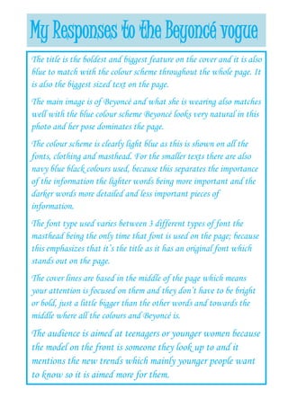
1. My Responses to the Beyoncé vogue
The title is the boldest and biggest feature on the cover and it is also
blue to match with the colour scheme throughout the whole page. It
is also the biggest sized text on the page.
The main image is of Beyoncé and what she is wearing also matches
well with the blue colour scheme Beyoncé looks very natural in this
photo and her pose dominates the page.
The colour scheme is clearly light blue as this is shown on all the
fonts, clothing and masthead. For the smaller texts there are also
navy blue black colours used, because this separates the importance
of the information the lighter words being more important and the
darker words more detailed and less important pieces of
information.
The font type used varies between 3 different types of font the
masthead being the only time that font is used on the page; because
this emphasizes that it’s the title as it has an original font which
stands out on the page.
The cover lines are based in the middle of the page which means
your attention is focused on them and they don’t have to be bright
or bold, just a little bigger than the other words and towards the
middle where all the colours and Beyoncé is.
The audience is aimed at teenagers or younger women because
the model on the front is someone they look up to and it
mentions the new trends which mainly younger people want
to know so it is aimed more for them.