1. Hollie Hubbard task two
Typography
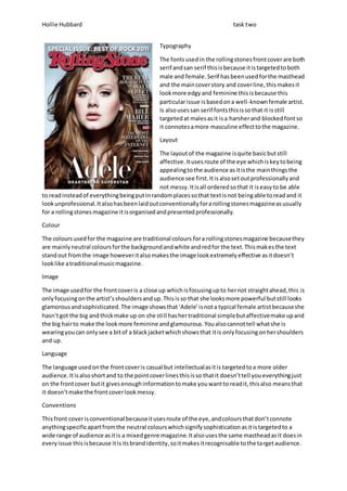
The fonts used in the rolling stones front cover are both
serif and san serif this is because it is targeted to both
male and female. Serif has been used for the masthead
and the main cover story and cover line, this makes it
look more edgy and feminine this is because this
particular issue is based on a well-known female artist.
Is also uses san serif fonts this is so that it is still
targeted at males as it is a harsher and blocked font so
it connotes a more masculine effect to the magazine.
Layout
The layout of the magazine is quite basic but still
affective. It uses route of the eye which is key to being
appealing to the audience as it is the main things the
audience see first. It is also set out professionally and
not messy. It is all ordered so that it is easy to be able
to read instead of everything being put in random places so that text is not being able to read and it
look unprofessional. It also has been laid out conventionally for a rolling stones magazine as usually
for a rolling stones magazine it is organised and presented professionally.
Colour
The colours used for the magazine are traditional colours for a rolling stones magazine because they
are mainly neutral colours for the background and white and red for the text. This makes the text
stand out from the image however it also makes the image look extremely effective as it doesn’t
look like a traditional music magazine.
Image
The image used for the front cover is a close up which is focusing up to her not straight ahead, this is
only focusing on the artist’s shoulders and up. This is so that she looks more powerful but still looks
glamorous and sophisticated. The image shows that ‘Adele’ is not a typical female artist because she
hasn’t got the big and thick make up on she sti ll has her traditional simple but affective make up and
the big hair to make the look more feminine and glamourous. You also cannot tell what she is
wearing you can only see a bit of a black jacket which shows that it is only focusing on her shoulders
and up.
Language
The language used on the front cover is casual but intellectual as it is targeted to a more older
audience. It is also short and to the point cover lines this is so that it doesn’t tell you everything just
on the front cover but it gives enough information to make you want to read it, this also means that
it doesn’t make the front cover look messy.
Conventions
This front cover is conventional because it uses route of the eye, and colours that don’t connote
anything specific apart from the neutral colours which signify sophistication as it is targeted to a
wide range of audience as it is a mixed genre magazine. It also uses the same masthead as it does in
every issue this is because it is its brand identity, so it makes it recognisable to the target audience.
2. Hollie Hubbard task two
Typography
The fonts used in this contents page is serif this makes it
look more like it has been hand written so it looks
original and old fashioned. It also uses big fonts for the
two main cover lines this makes it stand out from the
rest of the contents page and separates it from the
other headlines.
Layout
The layout for the contents page is unconventional for
how it is usually set out for the rolling stones magazine
because the images is usually to the left. However in this
particular issue there are two images which are on both
sides of the page. Although the magazine has kept their
issue number to the top right corner of the page as this
is their house style.
Colour
The colours used for the contents page are plain and neutral colours by using black and white this
makes it appealing to the target audience as there are many different genres that are incorporated
into the magazine. It also makes the Beyonce image and issue number stand out as everything else
from the contents page is in black and white.
Images
The images used in the contents page are quite plain for the rolling stones magazine however they
are still eye catching. They are both targeted at two different types of genres as on is more 60’s/70’s
and the other is more pop/R&B style. This also fits into the mixed genre theme to the magazine.
Language
The language used is intellectual as it is targeted to older target audience, so by doing this the
magazine looks more appealing and less childish to the audience. It also has quite a lot of sentences
on which is unconventional for a rolling stones magazine as it is usually a very small amount of text.
Conventions
This contents page is both conventional and unconventional. This is because its colours and language
are conventional however it also had some conventions for example such as the image and the
typography.
Typography
The fonts used are san serif this is because
the article is about a boy band and a san
serif font is more masculine unlike serif. All
the text is in black which also connotes a
more masculine and dark side unlike if it
was a more bright colour such as orange or
pink.
3. Hollie Hubbard task two
Layout
The layout used for the double page spread doesn’t use route of the eye, however it is still
conventional as it has the text to the left side of the two pages and the image is spread out between
one and a quarter of the pages to the right. So that it makes all parts of the double page spread
stand out and not look busy and overdone.
Colour
The colours used in this spread are mainly dark mysterious colours, this connotes masculinity,
darkness, and thriller. This makes the artists look more masculine and different it also signifies there
genre of music which is rock and helps make it appeal to people who like the genre and to more
masculine people.
Image
The image used it quite plain but affective it is all in dark colours which makes the image look
mysterious and sexual so it can appeal to men and women. It is also and long shot so it is focusing on
every part of the artist’s bodies and expressions it also focuses up to them so it makes them look
more powerful.
Language
The language used is more sophisticated as it is aimed at an older target audience, instead of being
childish and put simpler as it would be in a music magazine targeted to younger teenagers and
children. It also mentions other groups which is also related to the magazine and the article.
Conventions
This is conventional to a music magazine because it uses all the right colours to identify the genre,
the right language to target the right age of audience. It also uses the right fonts and images to
express and connote the genre and identity of the magazine and group the article is on.