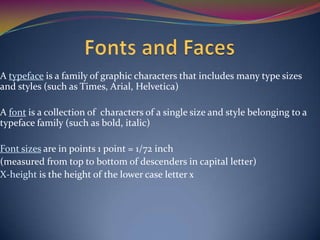
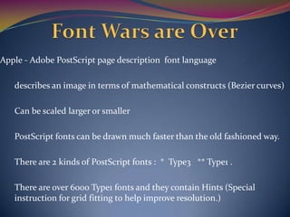
Objectives
At the end of this chapter the reader will be able to:
•Recognize the importance of word choice.
•Describe the difference between typeface and a font .
•Find sources for free and shareware fonts.
•Define Hyper media, hypertext, links, anchors.
Structure
1. Introduction
2. Power of Meaning
3. About fonts and Faces
4. Using text in Multimedia
5. Computers and Text
6. Font editing and Design tools
7. Hypermedia and Hypertext
Text came into use about 6,000 years ago
Using symbols for communication relatively recent - 6,0000 years old
15th Century- Johann Gutenberg printing press revolutionized information.
But today, text and the ability to read are doorways to power and
Knowledge.
Reading and writings are expected necessary skills.
Recently - another revolution - the World Wide Web and its native language
- HTML
Titles
Menus
Navigational aids
•Words must be chosen carefully
•Words appear in:
•Test the words you plan to use
•Keep a thesaurus handy
Type terminology
•Typeface
Arial
Courier
Times
•Fonts
•Points
•Styles
•Leading
•Kerning
A typeface is a family of graphic characters that includes many type sizes
and styles (such as Times, Arial, Helvetica)
A font is a collection of characters of a single size and style belonging to a
typeface family (such as bold, italic)
Font sizes are in points 1 point = 1/72 inch
(measured from top to bottom of descenders in capital letter)
X-height is the height of the lower case letter x
Size.
Background and foreground color.
Style.
Leading (pronounced “ledding”).
Examples of styles are boldface and italic
Italic
Bold
Underlined
Computers can
adjust the line spacing (called leading)
leading
and
the space between pairs of letters, called kerning
PostScript, TrueType and Master fonts can be altered.
Bitmapped fonts cannot be altered
The computer draws or rasterizes a letter on the screen with
pixels or dots.
When type was set by hand, the type for a font was kept in a drawer or case,
The upper drawer held the capital letters, and the lower drawer held the
smaller letters
From this we get the terms uppercase and lowercase
In online messaging, use of all uppercase letters is considered to be
“YELLING” or “SHOUTING”.
Password, and paths in a URL are case sensitive ( that is “home” is different
from “HOME”)
It is easier to read words that have a mixture of upper and lower case letters
rather than all upper case.
Placing an Uppercase letter in the middle of the word ,called an Intercap, a
trend that emerged from computer programming community.
Example : middleName,endOfChar
Type either has a little decoration at the end of the letter - called
a serif
or it doesn’t - sans serif ( “sans” from the French meaning
without)
Examples ( Times - serif “T” )
( Arial - sans serif “T”)
Use what is appropriate to convey your message
WYSIWYG - What you see is what you get!
Aim for a balance between too much text and too little.
Make web pages no more than 1 to 2 screenfuls of text
Bring the user to the destination with as few actions as possible.
Use menu text accompanied by a single action .This requires little training
and is clean and immediate.
Use text for titles, for menus, for navigations, and for content.
From a design perspective, your font choice font size no. of headlines you
place on a particular screen must be related both to complexity of your
message and to its venue.
If the messages are a part of interactive website where the user is seeking
information ,lots of information can be packed on to the screen.(too little
text on each page could be annoying, as user requires to unnecessary wait
and click mouse. )
When creating Public Presentations, rather than having lots of text
contents must be organized into small points, large fonts and lots of white
spaces.
Use the most legible font available
Use as few different faces as possible
( too many called “ransom-note”) –Typography.
Use bold and italics to convey meaning.
Adjust line spacing ( leading).
Adjust the spacing between letters in headings to remove gaps.
Use colors and background to make type stand out.
Use meaningful word for links and menus.
Anti-aliasing or dithering blends colors along the edges of letters to create
gentle effect.
Experiment with Drop Shadows.
Surround headlines with white space.
Try attention grabbing effect with color, word art or large drop letters at
the beginning of text.
Try using Drop Caps and Small Caps.
If one is using centre alignment, Then width of the line should be small.
 Learn to accept Criticism.(Double check your font style/size with others
opinions.)
Use meaningful words or phrases and for links and menu items.
Text links on web pages can accent your message.(ie avoid using red for
text and iridecent green for underline)
Bold or emphasize the text to highlight ideas or concept but do not make
text look like a hyperlink when it is not.
On web page, put vital text elements and menu in the top 320 pixels.
A Multimedia project or web site should include:
content or information.
navigation tools such as menus, mouse clicks, key presses or touch
screen.
some indication or map of where the user is in the presentation
Buttons are objects that make things happen when they are clicked.
Use common button shapes and sizes.
Label them clearly
And
BE SURE THEY WORK!
Reading from a computer screen is slower than from a book.
People blink 3-5 times/minute, using a computer and 20-25 times/minute
reading a book.
This reduced eye movement causes fatigue, dryness .
Try to present only a few paragraphs per page with font that’s legible.
Display whole paragraph on screen and avoid breaks in between
paragraphs.
Monitor use wider-than-tall aspect ratios called landscape.
Most books use taller-than- wide orientation, called portrait.
Don’t try to shrink a full page onto a monitor
Portrait Landscape
Four possible solutions to work with a block of text that is taller than what
will fit :
1. Put the text in a scrolling field (Web Browsers).
2. Put text into a single field or graphic image in a project widow and
let the user move up and down based on command.
3. Break the text into fields that fit on monitor – sized pages and
design control buttons to flip through the pages.
4. Design the project for a special monitor that’s taller than its width
eBooks are books digitized and formatted to be read using a E-Reader.
E- Readers display text, graphics and multimedia– most using E-Ink
screens between 5” and 10“ diagonal, some with touch screen, some with
WiFi and some with 3G Connectivity.
Ex: iPad, Sony Reader, Google Nexus,CyBook,Jet Book, Kindle …….
The E- Ink screen is a technology for “Electronic Paper”, designed to
imitate the appearance of ordinary ink on paper.
But e-Ink is not required to read books, as they can be viewed on most
computers and many personal Digital Assistants.
The standard document format used for displaying text pages on the Web
is called Hyper Text Markup Language.
We can specify typefaces, size,color and other properties by “Marking Up”
the text in document using Tags.
Ex : <B> This Content is Bold </B>
Cascading Style Sheets work in conjunction with HTML and provide Fine
tuning and control of text and layout.
HTML Version 5 is a redesign that stretches into multimedia delivery
tool, making HTML no longer just a text display tool with assorted
attchment and plugged in objects.(+Introduction of <CANVAS>)
During the infancy of the Macintosh Computer's monitor H/W, Apple
chose to use a screen resolution of 72Pixels per Inch which was a standard
measurement of printing industry.
Also each pixel was made square shaped, providing even measurements in
all directions.
Later Macintosh provided VGA video standard set for PC with 96 pixels per
inch.
Apple - Adobe PostScript page description font language
describes an image in terms of mathematical constructs (Bezier curves)
Can be scaled larger or smaller
PostScript fonts can be drawn much faster than the old fashioned way.
There are 2 kinds of PostScript fonts : * Type3 ** Type1 .
There are over 6000 Type1 fonts and they contain Hints (Special
instruction for grid fitting to help improve resolution.)
Apple and Macintosh announced a joint effort to develop a “better and
faster” font methodology – “True Type”.
In addition to printing smooth characters, it could also draw characters to
a low resolution monitor.
It was based on Apple Technology, it was licensed to Microsoft.
Adobe and Microsoft then developed a new and improved font
managament system incorporating the features of PostScript and TrueType
called the “Open Type”.
A free publicly available international standard.
The wars came to an end.
Typefaces are created at Foundry, a term much like case, that has carried
over from times, when lead was poured into moulds to make letter faces.
Special Interest Groups (SIG) at America Online where people enjoy
designing and making interesting font, post them online for others to
download.
Ex : CocaCola,Sphagatti,Kerouac
Sites :
www.typequarry.com
www.oldfonts.com
www.myfonts.com
www.will-barris.com
The ASCII (American Standard Code for Information Interchange)
Character set :
Is a 7 bit character encoding system commonly used by computer system.
ASCII assigns a number or value to 128 characters, including upper
case, lower case, punctuation marks, Arabic numbers and mathematical
symbols.
It also includes characters used for device control messages like carriage
return, tab and so on.
Was invented and standardized for analog teletype communication early
in the age of bits and bytes.
A Byte consists of 8 bits.
ASCII uses only 7 bits to code 128 characters, the 8th bit is left unused.
This extra bit allows to encode another 128 values for an extended
character set.
This was filled by ANSI(American National Standards Institute) standard
characters.
Unicode – a 16 bit architecture of Multilingual text and character.
Originally accommodated up to about 65000 characters to include
characters to include characters from all known languages and alphabets
in the world.
Several languages share a set of symbols that have historically related
derivation, the shared symbols of each language are unified into collection
of symbols- Scripts
A single script can work for many languages.
Unicode standard includes more than 180000 Han Characters as well as
obsolete alphabets such as Cuneiform, Hieroglyphs and Ancient Han
Characters.

Multimedia chapter 2

  • 1.
    Objectives At the endof this chapter the reader will be able to: •Recognize the importance of word choice. •Describe the difference between typeface and a font . •Find sources for free and shareware fonts. •Define Hyper media, hypertext, links, anchors.
  • 2.
    Structure 1. Introduction 2. Powerof Meaning 3. About fonts and Faces 4. Using text in Multimedia 5. Computers and Text 6. Font editing and Design tools 7. Hypermedia and Hypertext
  • 3.
    Text came intouse about 6,000 years ago
  • 4.
    Using symbols forcommunication relatively recent - 6,0000 years old 15th Century- Johann Gutenberg printing press revolutionized information. But today, text and the ability to read are doorways to power and Knowledge. Reading and writings are expected necessary skills. Recently - another revolution - the World Wide Web and its native language - HTML
  • 5.
    Titles Menus Navigational aids •Words mustbe chosen carefully •Words appear in: •Test the words you plan to use •Keep a thesaurus handy
  • 6.
  • 7.
    A typeface isa family of graphic characters that includes many type sizes and styles (such as Times, Arial, Helvetica) A font is a collection of characters of a single size and style belonging to a typeface family (such as bold, italic) Font sizes are in points 1 point = 1/72 inch (measured from top to bottom of descenders in capital letter) X-height is the height of the lower case letter x
  • 9.
    Size. Background and foregroundcolor. Style. Leading (pronounced “ledding”).
  • 10.
    Examples of stylesare boldface and italic Italic Bold Underlined
  • 11.
    Computers can adjust theline spacing (called leading) leading and the space between pairs of letters, called kerning
  • 12.
    PostScript, TrueType andMaster fonts can be altered. Bitmapped fonts cannot be altered The computer draws or rasterizes a letter on the screen with pixels or dots.
  • 13.
    When type wasset by hand, the type for a font was kept in a drawer or case, The upper drawer held the capital letters, and the lower drawer held the smaller letters From this we get the terms uppercase and lowercase In online messaging, use of all uppercase letters is considered to be “YELLING” or “SHOUTING”.
  • 14.
    Password, and pathsin a URL are case sensitive ( that is “home” is different from “HOME”) It is easier to read words that have a mixture of upper and lower case letters rather than all upper case. Placing an Uppercase letter in the middle of the word ,called an Intercap, a trend that emerged from computer programming community. Example : middleName,endOfChar
  • 15.
    Type either hasa little decoration at the end of the letter - called a serif or it doesn’t - sans serif ( “sans” from the French meaning without) Examples ( Times - serif “T” ) ( Arial - sans serif “T”) Use what is appropriate to convey your message
  • 16.
    WYSIWYG - Whatyou see is what you get! Aim for a balance between too much text and too little. Make web pages no more than 1 to 2 screenfuls of text Bring the user to the destination with as few actions as possible. Use menu text accompanied by a single action .This requires little training and is clean and immediate. Use text for titles, for menus, for navigations, and for content.
  • 17.
    From a designperspective, your font choice font size no. of headlines you place on a particular screen must be related both to complexity of your message and to its venue. If the messages are a part of interactive website where the user is seeking information ,lots of information can be packed on to the screen.(too little text on each page could be annoying, as user requires to unnecessary wait and click mouse. ) When creating Public Presentations, rather than having lots of text contents must be organized into small points, large fonts and lots of white spaces.
  • 18.
    Use the mostlegible font available Use as few different faces as possible ( too many called “ransom-note”) –Typography. Use bold and italics to convey meaning. Adjust line spacing ( leading). Adjust the spacing between letters in headings to remove gaps. Use colors and background to make type stand out. Use meaningful word for links and menus.
  • 19.
    Anti-aliasing or ditheringblends colors along the edges of letters to create gentle effect. Experiment with Drop Shadows. Surround headlines with white space. Try attention grabbing effect with color, word art or large drop letters at the beginning of text. Try using Drop Caps and Small Caps. If one is using centre alignment, Then width of the line should be small.
  • 20.
     Learn toaccept Criticism.(Double check your font style/size with others opinions.) Use meaningful words or phrases and for links and menu items. Text links on web pages can accent your message.(ie avoid using red for text and iridecent green for underline) Bold or emphasize the text to highlight ideas or concept but do not make text look like a hyperlink when it is not. On web page, put vital text elements and menu in the top 320 pixels.
  • 21.
    A Multimedia projector web site should include: content or information. navigation tools such as menus, mouse clicks, key presses or touch screen. some indication or map of where the user is in the presentation
  • 22.
    Buttons are objectsthat make things happen when they are clicked. Use common button shapes and sizes. Label them clearly And BE SURE THEY WORK!
  • 23.
    Reading from acomputer screen is slower than from a book. People blink 3-5 times/minute, using a computer and 20-25 times/minute reading a book. This reduced eye movement causes fatigue, dryness . Try to present only a few paragraphs per page with font that’s legible. Display whole paragraph on screen and avoid breaks in between paragraphs.
  • 24.
    Monitor use wider-than-tallaspect ratios called landscape. Most books use taller-than- wide orientation, called portrait. Don’t try to shrink a full page onto a monitor Portrait Landscape
  • 25.
    Four possible solutionsto work with a block of text that is taller than what will fit : 1. Put the text in a scrolling field (Web Browsers). 2. Put text into a single field or graphic image in a project widow and let the user move up and down based on command. 3. Break the text into fields that fit on monitor – sized pages and design control buttons to flip through the pages. 4. Design the project for a special monitor that’s taller than its width
  • 26.
    eBooks are booksdigitized and formatted to be read using a E-Reader. E- Readers display text, graphics and multimedia– most using E-Ink screens between 5” and 10“ diagonal, some with touch screen, some with WiFi and some with 3G Connectivity. Ex: iPad, Sony Reader, Google Nexus,CyBook,Jet Book, Kindle ……. The E- Ink screen is a technology for “Electronic Paper”, designed to imitate the appearance of ordinary ink on paper. But e-Ink is not required to read books, as they can be viewed on most computers and many personal Digital Assistants.
  • 27.
    The standard documentformat used for displaying text pages on the Web is called Hyper Text Markup Language. We can specify typefaces, size,color and other properties by “Marking Up” the text in document using Tags. Ex : <B> This Content is Bold </B> Cascading Style Sheets work in conjunction with HTML and provide Fine tuning and control of text and layout. HTML Version 5 is a redesign that stretches into multimedia delivery tool, making HTML no longer just a text display tool with assorted attchment and plugged in objects.(+Introduction of <CANVAS>)
  • 28.
    During the infancyof the Macintosh Computer's monitor H/W, Apple chose to use a screen resolution of 72Pixels per Inch which was a standard measurement of printing industry. Also each pixel was made square shaped, providing even measurements in all directions. Later Macintosh provided VGA video standard set for PC with 96 pixels per inch.
  • 29.
    Apple - AdobePostScript page description font language describes an image in terms of mathematical constructs (Bezier curves) Can be scaled larger or smaller PostScript fonts can be drawn much faster than the old fashioned way. There are 2 kinds of PostScript fonts : * Type3 ** Type1 . There are over 6000 Type1 fonts and they contain Hints (Special instruction for grid fitting to help improve resolution.)
  • 30.
    Apple and Macintoshannounced a joint effort to develop a “better and faster” font methodology – “True Type”. In addition to printing smooth characters, it could also draw characters to a low resolution monitor. It was based on Apple Technology, it was licensed to Microsoft. Adobe and Microsoft then developed a new and improved font managament system incorporating the features of PostScript and TrueType called the “Open Type”. A free publicly available international standard. The wars came to an end.
  • 31.
    Typefaces are createdat Foundry, a term much like case, that has carried over from times, when lead was poured into moulds to make letter faces. Special Interest Groups (SIG) at America Online where people enjoy designing and making interesting font, post them online for others to download. Ex : CocaCola,Sphagatti,Kerouac Sites : www.typequarry.com www.oldfonts.com www.myfonts.com www.will-barris.com
  • 32.
    The ASCII (AmericanStandard Code for Information Interchange) Character set : Is a 7 bit character encoding system commonly used by computer system. ASCII assigns a number or value to 128 characters, including upper case, lower case, punctuation marks, Arabic numbers and mathematical symbols. It also includes characters used for device control messages like carriage return, tab and so on. Was invented and standardized for analog teletype communication early in the age of bits and bytes.
  • 33.
    A Byte consistsof 8 bits. ASCII uses only 7 bits to code 128 characters, the 8th bit is left unused. This extra bit allows to encode another 128 values for an extended character set. This was filled by ANSI(American National Standards Institute) standard characters.
  • 34.
    Unicode – a16 bit architecture of Multilingual text and character. Originally accommodated up to about 65000 characters to include characters to include characters from all known languages and alphabets in the world. Several languages share a set of symbols that have historically related derivation, the shared symbols of each language are unified into collection of symbols- Scripts A single script can work for many languages. Unicode standard includes more than 180000 Han Characters as well as obsolete alphabets such as Cuneiform, Hieroglyphs and Ancient Han Characters.