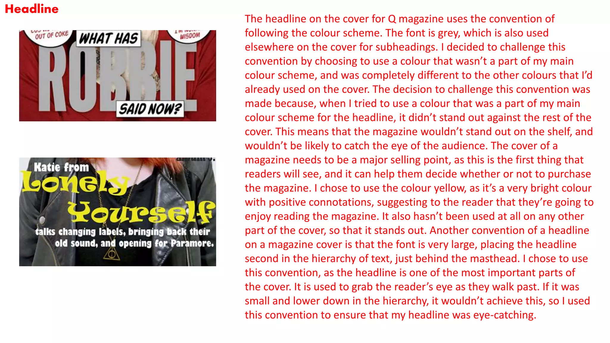
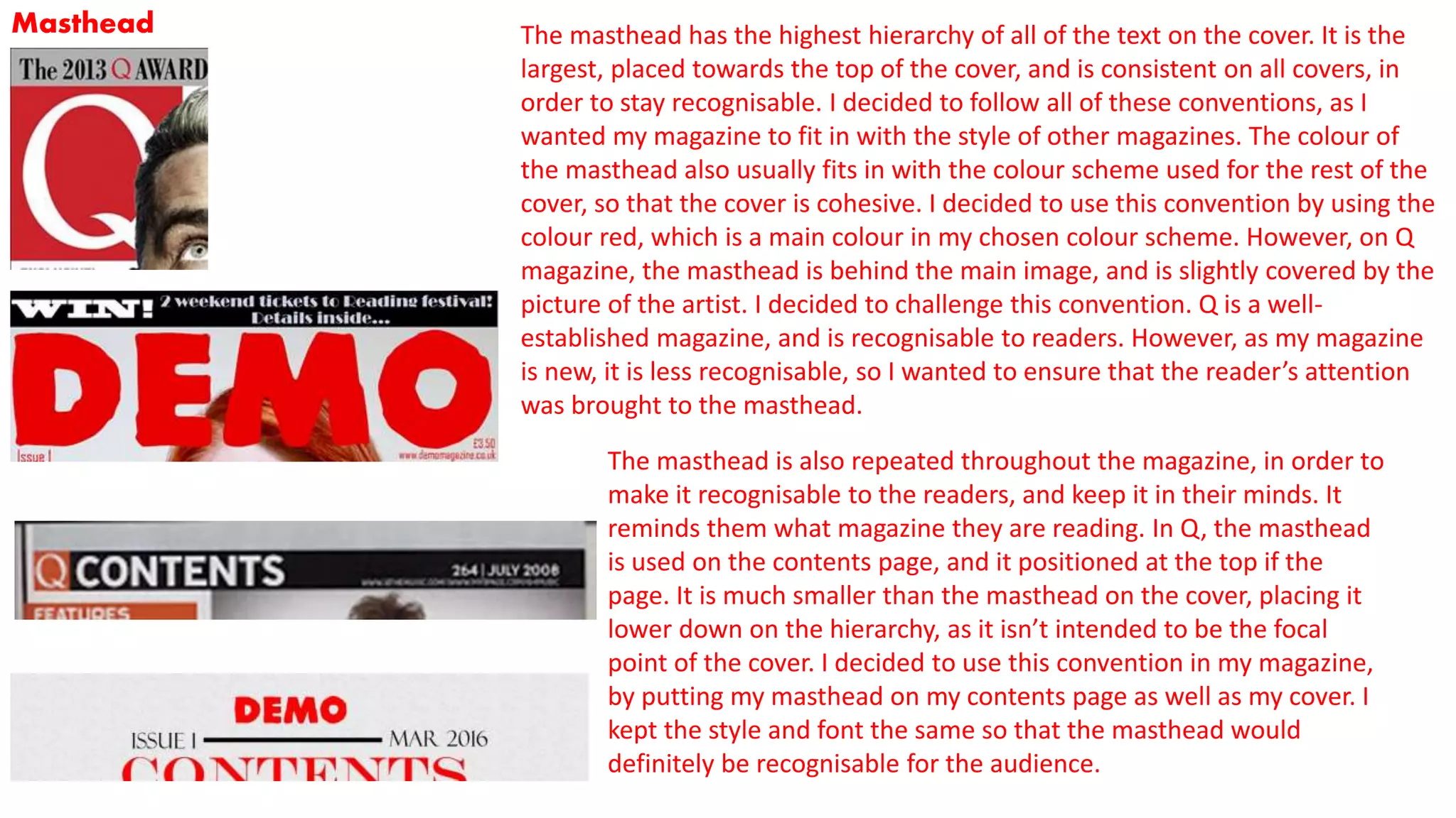
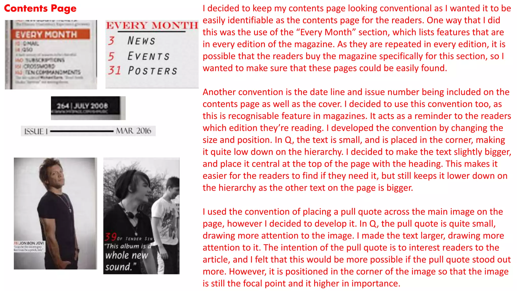
The document discusses how the media product uses and develops conventions from real magazines like Q Magazine.
It summarizes how the main cover image, headline, masthead, contents page, and double page spread follow conventions from Q Magazine in areas like photography style, font sizes, colors, and layouts. However, it also challenges some conventions by using unexpected colors for the headline to make it stand out, placing the masthead above the image so it's more noticeable, and including a sub-image on the double page spread to provide more character information. The goal is to create a magazine that fits magazine conventions but also catches readers' attention.