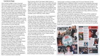
Contents Page
The content page is over crowned
because there is a load of images which
are over lapped which each-other and
the on the left hand side is the side
which contains loads of images and on
the right hand side contains some stories
based on cover story and regulars and
on the left hand side there is writing on
each of the persons pictures and it tells
you what pages to go onto.
In the middle of the left hand side of the
page there is a big circle which is saying
“Long-Range Forecast” which could
mean that there could be part about
the weather at some festivals.
On the bottom bit of the page on the right
there is a part where it is for you to subscribe
which grabs the audience view because they
could want to get some updates every time
and they could win stuff which makes the
protagonist like these types of magazines more.
The colours and the text that has been
included are different compared to the
other content pages because they are
not over lapped from each other and it
makes the page crowned and gives it a
different affect because it includes a
range of images but it is all about rock
and different things that have
happened throughout a range of time,
by having a range of images and
colours and text makes the page stand
out and by having writing on the
pictures displays there is a range of
things to see inside the magazine and
by writing in red and having some parts
in white makes the page stand out and
it gives it a different affect. Also by
including blue writing and by having a
light house in the circle could represent
that it could be about weather.
On the bottom of the page they have the
month and year and they have the letter “Q”
and the page number which helps people
know what page to go on.
The use of the subscription to the magazine it
lets the reader know that this is recurring
monthly. Letting the reader know this at the
beginning of the magazine will make the
reader aware that if they like this issue, they
can subscribe and get them delivered to there
house. By putting “Subscribe” in capitals and in
white on a black background really makes this
section stand out against the rest of the page.
The magazine immediately appeals to the mass of the audience
due to the diversity of the music features here. It includes David
Bowie who will appeal to an older type of audience who may have
been big fans from the 60s and 70s. It also included Rihanna which
will appeal people who are into pop music. By appealing to many
different types of audiences, Q magazine are take full advantage
of the amount of people who are attracted in buying and reading
there style of magazine
Each photo which has been taken gives a
different effect by the way it has been placed,
taken and the colours which have been used.
This is another way of getting the audience
view, because for example Liam Gallaher has
got an old feel to it, and it looks like they have
been taken by a Polaroid camera. This can
show that he magazine is still not completely
modern and it still has a retro affect
Using page numbers as bullet point for each features of the
magazine gives a different affect towards the magazine because
of the way that it has been laid out and it gives more clarity to the
reader, it also allows the reader to pick what they would want to
read and see what they are mostly interested and then flick to the
page that they want to read and discover more about. Also by
having numbers as bullet points means that they will find a section
where all type audience are interested in.
Using small pictures to accompany the
feature's to break up the writing and gives
more information about what the article can
be about and it gives the audience more of an
understanding towards what could happen.
And it brings more colour towards the page
Contents Page
The main image shows that it takes up the whole page and it grabs the readers attention because it is
based on Adele, and she is known a star and everyone knows her which means that it will grab there
attention when they read the magazine.
Furthermore, she looking on the side towards the
camera and she is not looking straight towards the
camera and the photo is taking a mid shot
because it does not include her body, it is a mid
shot of Adele, this type of photo creates a classy
and sophisticated look which goes with the “Q”
style of the magazine and it the image that has
been used is different compared to the other style
of content pages.
The way that the magazine puts the page number on
the top of the images, it makes it easier for the reader
to discover where the parts are that they want to read
and by including the page numbers on the pictures' it
gives the page a different type of affect and this type
of layout has been used in all of the other type of
content pages, meaning that they are keeping the
same type of layout throughout the rest of the other
music magazines. Also it makes the audience want to
buy the magazine more often as they know what to be
looking for.
The “Every Month” section of the bottom left hand
side of the column which displays the features' of the
Q magazine and it makes the reader what to read
the magazine more and want them to buy the
magazine more often and it means that they will
know what will appear next time in each of the “Q”
magazines that they buy. Also the red banner grabs
the audience attention because it is bold and it grabs
peoples view towards the magazine and it makes the
page have more colour and gives the page a
different type of affect. Also “every month” it is
promoting the reader to discover what is being said
on the red bold box.
The simple title but it is effective towards the
audience . It stands out from the out because
it has been written in white with a black
boarder and it makes it stand out because
the “Q” is in red and it makes the page stand
out and grabs the protagonist attention. The
red, white and black theme that they have
chosen to use, follows the scheme of the rest
of the magazine. Also the date has been
written has been written clearly on the right
hand side which has been written in white
and it tells the audience when it had been
released and helps the buyers know which
one they need to buy next because it will
have the date to help you.
Furthermore Q has also promoted there
viewers by putting there website underneath
the date meaning that they are trying to get
there primary audience to get more involved
and discover more about the magazine.
Nevertheless, the part at the bottom in the
right hand side corner it has a short summary
of the articles and it gives the reader what
else is going to be included. The tag line “Q
Review” it has a sense where it rhymes and
grabs the audience attention and it remains
in there heads and it sometimes has key points
about each issue for the reader and so that
the reader know what they will discover next.
Contents Page
The date and the issue number is normally featured on the content page and it shows the reader what month and week the magazine was made to be
launched for. And to help the audience to know which magazine to buy next
The title of this content page is small and not
every eye catchy, but it is in capital letters, bold
and clear. It is positioned at the top of the page
to make the page look formal and professional.
The logo of the magazine is also featured on this
content page, this is done to show how
consistency through out the magazine.
The main image is on the content page which is
very large and dominating, it is because the
editor wants the reader to see the image first
when they open the magazine. It immediately
gives the reader an idea of what is featured in
the magazine. The quote in the image is like a pull
quote. It gives a brief quote if what will be
included in the article. The band is all looking
different directions which shows that they are not
giving direct address towards the audience, also
this type of photo is a long shot because it
catches there whole body. There clothes that
they are wearing are all different as none of them
are wearing matching clothes which gives the
page a different affect.
Also by having one big main image it grabs there
attention towards the page as it will grab there
attention faster because it is clear and big and
when you open the magazine it is the first thing
that you see.
The page number and titles are all down the left hand side
of the page and each title has a brief description of what
is on the certain page.
The smaller image at the bottom of Nick Cave who is a
very famous Australian musician, song writer, author and
screenwriter, composer and occasional film actor.
The reader can relate to this man because they will be
interested in all different sectors of media which he is
included in.
The colour and fonts that have been included are simple and have been included in all of the other content
pages, which makes the page have a layout and keeps the audience interested towards the page. Also the
colours that have been used are a mixture of colours, by using the red, white and black it gives the page more
colour and grabs the protagonist attention.
The tag line “Q Review” it has a sense where
it rhymes and grabs the audience attention
and it remains in there heads and it
sometimes has key points about each issue
for the reader and so that the reader know
what they will discover next.
The “Every Month” section of the bottom left hand side of
the column which displays the features' of the Q magazine
and it makes the reader what to read the magazine more
and want them to buy the magazine more often and it
means that they will know what will appear next time in
each of the “Q” magazines that they buy.
On the left hand side in the middle between features and
every month, there is a section in a different colour and it
is all about the Oasis Special meaning that there is
something being shown in this magazine and by using a
different colour, by using gold it displays that it is not the
same as the rest of the information and it is more
important. By using the word “SPECIAL” in capitals it
makes the stand out and grabs the audience attention
because they think that it is something different and Oasis
is very known band and people who are fans towards the
Oasis they will want to read it and catch up on the gossip
on the band.

Content pages

  • 1.
    Contents Page The contentpage is over crowned because there is a load of images which are over lapped which each-other and the on the left hand side is the side which contains loads of images and on the right hand side contains some stories based on cover story and regulars and on the left hand side there is writing on each of the persons pictures and it tells you what pages to go onto. In the middle of the left hand side of the page there is a big circle which is saying “Long-Range Forecast” which could mean that there could be part about the weather at some festivals. On the bottom bit of the page on the right there is a part where it is for you to subscribe which grabs the audience view because they could want to get some updates every time and they could win stuff which makes the protagonist like these types of magazines more. The colours and the text that has been included are different compared to the other content pages because they are not over lapped from each other and it makes the page crowned and gives it a different affect because it includes a range of images but it is all about rock and different things that have happened throughout a range of time, by having a range of images and colours and text makes the page stand out and by having writing on the pictures displays there is a range of things to see inside the magazine and by writing in red and having some parts in white makes the page stand out and it gives it a different affect. Also by including blue writing and by having a light house in the circle could represent that it could be about weather. On the bottom of the page they have the month and year and they have the letter “Q” and the page number which helps people know what page to go on. The use of the subscription to the magazine it lets the reader know that this is recurring monthly. Letting the reader know this at the beginning of the magazine will make the reader aware that if they like this issue, they can subscribe and get them delivered to there house. By putting “Subscribe” in capitals and in white on a black background really makes this section stand out against the rest of the page. The magazine immediately appeals to the mass of the audience due to the diversity of the music features here. It includes David Bowie who will appeal to an older type of audience who may have been big fans from the 60s and 70s. It also included Rihanna which will appeal people who are into pop music. By appealing to many different types of audiences, Q magazine are take full advantage of the amount of people who are attracted in buying and reading there style of magazine Each photo which has been taken gives a different effect by the way it has been placed, taken and the colours which have been used. This is another way of getting the audience view, because for example Liam Gallaher has got an old feel to it, and it looks like they have been taken by a Polaroid camera. This can show that he magazine is still not completely modern and it still has a retro affect Using page numbers as bullet point for each features of the magazine gives a different affect towards the magazine because of the way that it has been laid out and it gives more clarity to the reader, it also allows the reader to pick what they would want to read and see what they are mostly interested and then flick to the page that they want to read and discover more about. Also by having numbers as bullet points means that they will find a section where all type audience are interested in. Using small pictures to accompany the feature's to break up the writing and gives more information about what the article can be about and it gives the audience more of an understanding towards what could happen. And it brings more colour towards the page
  • 2.
    Contents Page The mainimage shows that it takes up the whole page and it grabs the readers attention because it is based on Adele, and she is known a star and everyone knows her which means that it will grab there attention when they read the magazine. Furthermore, she looking on the side towards the camera and she is not looking straight towards the camera and the photo is taking a mid shot because it does not include her body, it is a mid shot of Adele, this type of photo creates a classy and sophisticated look which goes with the “Q” style of the magazine and it the image that has been used is different compared to the other style of content pages. The way that the magazine puts the page number on the top of the images, it makes it easier for the reader to discover where the parts are that they want to read and by including the page numbers on the pictures' it gives the page a different type of affect and this type of layout has been used in all of the other type of content pages, meaning that they are keeping the same type of layout throughout the rest of the other music magazines. Also it makes the audience want to buy the magazine more often as they know what to be looking for. The “Every Month” section of the bottom left hand side of the column which displays the features' of the Q magazine and it makes the reader what to read the magazine more and want them to buy the magazine more often and it means that they will know what will appear next time in each of the “Q” magazines that they buy. Also the red banner grabs the audience attention because it is bold and it grabs peoples view towards the magazine and it makes the page have more colour and gives the page a different type of affect. Also “every month” it is promoting the reader to discover what is being said on the red bold box. The simple title but it is effective towards the audience . It stands out from the out because it has been written in white with a black boarder and it makes it stand out because the “Q” is in red and it makes the page stand out and grabs the protagonist attention. The red, white and black theme that they have chosen to use, follows the scheme of the rest of the magazine. Also the date has been written has been written clearly on the right hand side which has been written in white and it tells the audience when it had been released and helps the buyers know which one they need to buy next because it will have the date to help you. Furthermore Q has also promoted there viewers by putting there website underneath the date meaning that they are trying to get there primary audience to get more involved and discover more about the magazine. Nevertheless, the part at the bottom in the right hand side corner it has a short summary of the articles and it gives the reader what else is going to be included. The tag line “Q Review” it has a sense where it rhymes and grabs the audience attention and it remains in there heads and it sometimes has key points about each issue for the reader and so that the reader know what they will discover next.
  • 3.
    Contents Page The dateand the issue number is normally featured on the content page and it shows the reader what month and week the magazine was made to be launched for. And to help the audience to know which magazine to buy next The title of this content page is small and not every eye catchy, but it is in capital letters, bold and clear. It is positioned at the top of the page to make the page look formal and professional. The logo of the magazine is also featured on this content page, this is done to show how consistency through out the magazine. The main image is on the content page which is very large and dominating, it is because the editor wants the reader to see the image first when they open the magazine. It immediately gives the reader an idea of what is featured in the magazine. The quote in the image is like a pull quote. It gives a brief quote if what will be included in the article. The band is all looking different directions which shows that they are not giving direct address towards the audience, also this type of photo is a long shot because it catches there whole body. There clothes that they are wearing are all different as none of them are wearing matching clothes which gives the page a different affect. Also by having one big main image it grabs there attention towards the page as it will grab there attention faster because it is clear and big and when you open the magazine it is the first thing that you see. The page number and titles are all down the left hand side of the page and each title has a brief description of what is on the certain page. The smaller image at the bottom of Nick Cave who is a very famous Australian musician, song writer, author and screenwriter, composer and occasional film actor. The reader can relate to this man because they will be interested in all different sectors of media which he is included in. The colour and fonts that have been included are simple and have been included in all of the other content pages, which makes the page have a layout and keeps the audience interested towards the page. Also the colours that have been used are a mixture of colours, by using the red, white and black it gives the page more colour and grabs the protagonist attention. The tag line “Q Review” it has a sense where it rhymes and grabs the audience attention and it remains in there heads and it sometimes has key points about each issue for the reader and so that the reader know what they will discover next. The “Every Month” section of the bottom left hand side of the column which displays the features' of the Q magazine and it makes the reader what to read the magazine more and want them to buy the magazine more often and it means that they will know what will appear next time in each of the “Q” magazines that they buy. On the left hand side in the middle between features and every month, there is a section in a different colour and it is all about the Oasis Special meaning that there is something being shown in this magazine and by using a different colour, by using gold it displays that it is not the same as the rest of the information and it is more important. By using the word “SPECIAL” in capitals it makes the stand out and grabs the audience attention because they think that it is something different and Oasis is very known band and people who are fans towards the Oasis they will want to read it and catch up on the gossip on the band.