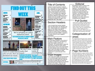
In what ways does your media product
use, develop or challenge forms and
conventions of real media products?
Masthead
My masthead was derived from a unique
design, which I believed would reflect the word
‘reverb’ itself; the shadow to represent the
‘echo’ associated with reverb from a guitar
amp. It is located in the primary optical area
and is therefore the first thing that the reader
encounters. This emphasises the importance of
the title in comparison to the other text. It also
reinforces the general use of the primary
optical area for the masthead, such as NME.

Main Image
The main image features the character
gesturing towards the headline/anchorage
text, which allows the reader’s eye to drift
toward the anchorage and headline. The
undeterred, but slightly intrigued expression
on the character’s face infers and aura of
interest and so the reader is pulled in. The
image itself is a medium shot, involving
more than just the head and shoulders and
this gives the reader a further insight into
the story in which the image represents,
sitting in the centre of the page with and
imposing nature over the kickers/cover
lines. This follows the general trend in
music magazine, with an exception to
direct address which isn’t used.

Headline +
Anchorage
The headline, is underneath the
anchorage, which is unusual, but as I
was imitating some parts of the NME
issue above, it is clear that the same
structure applies. The white contrasting
with the black, mirrors the clothing worn
by the character in the main image. The
opacity translucence in the box behind
the anchorage/headline adds some
emphasis to the black and white.
The anchorage being above the headline
works due to the leading text ‘learn to
understand’ and how this is less
significant in size to the headline ‘The
Keystones’.

Selling Line/Skyline
In this instance, my skyline mimics the
above example for style, and advertises an
‘extra’ to feel the privilege the reader, for
mine the ‘free earphones’. As well as this, it
introduces things which may appear in the
magazine, such as ‘The Killers’ in an
interesting font and ‘New bands emerging
this year’. This gives the reader an extra
insight into the content of the magazine
without revealing too much to jeopardise
reading enjoyment and this is fairly
common in any type of music
magazine, mainly pop.

Kickers/Cover Lines
The kickers and cover lines are located in the left top
and middle thirds. The white and dark blue colour
x
scheme is derived to stand out against the blue
background. The overall colour scheme is used in order
to appeal to both sexes, despite the stereotypical
association of blue with masculinity. Blue also connotes
trust, loyalty, wisdom, confidence, intelligence; these
qualities may appeal to the reader. Using colour
connotations helps the reader associate with the
audience and NME tends to follow this trend, as in the
above magazine, the colour relates to the main image.
Title of Contents
Instead of using the general ‘Contents’
title, I have taken a more direct statement
which addresses the reader straight
away. ‘Find out this week’ causes the
reader to feel intrigued by the content
listed. This challenges rival magazines
because it is a unique factor. It’s bold
appearance reflects its significance and it
appears at the top centrally. The font is
maintained throughout the page in the
leading text ‘and..’ and ‘news’.

Section Headers
I have included three section headers
which are titled ‘News’ and ‘Reviews’ and
‘And’. These headers are a navigational
aspect for the reader to be able to
categorise the content of the magazine
and pick out certain pieces of information.
It fits the house style of NME in respect to
the boxed columns, which suggests
organisation.

Main Feature
The main feature appears in the centre of
the page in a larger box, and featuring a
larger inset image to reinforce its
importance. The central position makes the
reader feel as though the other stories
revolve around it, and it is the most exciting.
The direct address of the characters also
helps to add to the effect of emphasis. Most
magazines use this effect to create
significance in a prominent part of the
contents

Inset Images
I have used inset images around the stories
on my contents page to give character to
the stories and help signify their meaning.
They give an overall view into what the
issue holds which will determine its potential
interest for the reader. These are very
common and are almost always used.

Editorial

My editorial includes a medium shot
of the ‘editor’ with a quote and
signature. The addressing nature of
the editorial shows the editor looking
at the camera, and mainly, the
audience; to make the reader feel
important. The editorial is used to
capture a sense of involvement so
they are common, and I have
developed it to a unique way which
complements the magazine.

Pull Quotes

I have used a number of pull quotes to
carry the reader further into the story
and help them understand the story
better when they read it. By putting
these in italics, they are intriguing and
display a subtle significance in a
sophisticated manor. Whilst mirroring
NME, these catch attention efficiently.

Categorisation of
areas

By categorising each part of my contents
page the reader can differentiate between
the stories and feel a sense of organisation
whilst reading. Each picture is made the
clear centre of attention within each box,
followed by leading text. Again,
magazines like Q and NME may use this
design for the same reason and I have
made a link between genres here.

Page Numbers
Each inset image has a page number, which
is bold and imposing. They are significant to
accompany the importance of the story, so, if
he reader is interested in the story, they
navigate easily to the page. Such as many
rival magazines do with this technique, I
have used bold black type to identify
between the inset images and where to find
where they are relevant in the magazine
Feature Article
Photo
The feature article photo
features three models
overlooking a picturesque scene
with connotations of nature and
purity. The idea of the models
facing the same way as the
camera gives an aura of
involvement to the reader,
whilst also distancing them by
not directly addressing them –
creating a sense of mystery. The
use of thirds demonstrates the
importance of the sun in
comparison to the characters in
the image. This hierarchy gives
the characters modesty.

Section Header
The section header reminds the
reader (in the primary optical
area) of the magazine masthead
whilst also demonstrating its
significance as it is the first thing
the reader sees. In magazines, it’s
a way of asserting authority.

Headline

Page Number
The page number is essential for
navigation and appears at the bottom
right hand corner of the screen
(tertiary optical area). This allows the
reader to identify the page number
whilst leaving the page. All music
magazine use page numbers in
different positions depending on the
layout.

Pull Quote
I have used a pull quote which is located
above the models in the photo to present
their relationship with the text. The quote
helps the reader gain a prior insight into
the story, and also bonds the reader with
the characters included in the story, like
most magazines (such as MOJO and their
renowned use of direct address) try to
achieve. This connection creates fan-bases
and interest.

The headline is made bold and
important by the underlying
appearance of the sun emerging
from behind it. It reflects the
colours and font used on the
contents and so the reader can
relate between the story and the
magazine identity easily.

Bottom bar (alternative side bar)
Article Columns
I have used a bar to separate the page number from the rest of
the text/content in order to help the reader differentiate
between the information on the story and the navigational
aspects. It also helps give the page an organised look and (as
most magazines use a sidebar) gives it a unique look.

The article columns are aligned in
front of a translucent background to
enhance their visibility . This is
unique as it is not a common feature
in indie magazines. The text inside is
pushed away from the revealing sun
in the feature article photo to show
its emergence.

Question 1 powerpoint

  • 1.
    In what waysdoes your media product use, develop or challenge forms and conventions of real media products?
  • 2.
    Masthead My masthead wasderived from a unique design, which I believed would reflect the word ‘reverb’ itself; the shadow to represent the ‘echo’ associated with reverb from a guitar amp. It is located in the primary optical area and is therefore the first thing that the reader encounters. This emphasises the importance of the title in comparison to the other text. It also reinforces the general use of the primary optical area for the masthead, such as NME. Main Image The main image features the character gesturing towards the headline/anchorage text, which allows the reader’s eye to drift toward the anchorage and headline. The undeterred, but slightly intrigued expression on the character’s face infers and aura of interest and so the reader is pulled in. The image itself is a medium shot, involving more than just the head and shoulders and this gives the reader a further insight into the story in which the image represents, sitting in the centre of the page with and imposing nature over the kickers/cover lines. This follows the general trend in music magazine, with an exception to direct address which isn’t used. Headline + Anchorage The headline, is underneath the anchorage, which is unusual, but as I was imitating some parts of the NME issue above, it is clear that the same structure applies. The white contrasting with the black, mirrors the clothing worn by the character in the main image. The opacity translucence in the box behind the anchorage/headline adds some emphasis to the black and white. The anchorage being above the headline works due to the leading text ‘learn to understand’ and how this is less significant in size to the headline ‘The Keystones’. Selling Line/Skyline In this instance, my skyline mimics the above example for style, and advertises an ‘extra’ to feel the privilege the reader, for mine the ‘free earphones’. As well as this, it introduces things which may appear in the magazine, such as ‘The Killers’ in an interesting font and ‘New bands emerging this year’. This gives the reader an extra insight into the content of the magazine without revealing too much to jeopardise reading enjoyment and this is fairly common in any type of music magazine, mainly pop. Kickers/Cover Lines The kickers and cover lines are located in the left top and middle thirds. The white and dark blue colour x scheme is derived to stand out against the blue background. The overall colour scheme is used in order to appeal to both sexes, despite the stereotypical association of blue with masculinity. Blue also connotes trust, loyalty, wisdom, confidence, intelligence; these qualities may appeal to the reader. Using colour connotations helps the reader associate with the audience and NME tends to follow this trend, as in the above magazine, the colour relates to the main image.
  • 3.
    Title of Contents Insteadof using the general ‘Contents’ title, I have taken a more direct statement which addresses the reader straight away. ‘Find out this week’ causes the reader to feel intrigued by the content listed. This challenges rival magazines because it is a unique factor. It’s bold appearance reflects its significance and it appears at the top centrally. The font is maintained throughout the page in the leading text ‘and..’ and ‘news’. Section Headers I have included three section headers which are titled ‘News’ and ‘Reviews’ and ‘And’. These headers are a navigational aspect for the reader to be able to categorise the content of the magazine and pick out certain pieces of information. It fits the house style of NME in respect to the boxed columns, which suggests organisation. Main Feature The main feature appears in the centre of the page in a larger box, and featuring a larger inset image to reinforce its importance. The central position makes the reader feel as though the other stories revolve around it, and it is the most exciting. The direct address of the characters also helps to add to the effect of emphasis. Most magazines use this effect to create significance in a prominent part of the contents Inset Images I have used inset images around the stories on my contents page to give character to the stories and help signify their meaning. They give an overall view into what the issue holds which will determine its potential interest for the reader. These are very common and are almost always used. Editorial My editorial includes a medium shot of the ‘editor’ with a quote and signature. The addressing nature of the editorial shows the editor looking at the camera, and mainly, the audience; to make the reader feel important. The editorial is used to capture a sense of involvement so they are common, and I have developed it to a unique way which complements the magazine. Pull Quotes I have used a number of pull quotes to carry the reader further into the story and help them understand the story better when they read it. By putting these in italics, they are intriguing and display a subtle significance in a sophisticated manor. Whilst mirroring NME, these catch attention efficiently. Categorisation of areas By categorising each part of my contents page the reader can differentiate between the stories and feel a sense of organisation whilst reading. Each picture is made the clear centre of attention within each box, followed by leading text. Again, magazines like Q and NME may use this design for the same reason and I have made a link between genres here. Page Numbers Each inset image has a page number, which is bold and imposing. They are significant to accompany the importance of the story, so, if he reader is interested in the story, they navigate easily to the page. Such as many rival magazines do with this technique, I have used bold black type to identify between the inset images and where to find where they are relevant in the magazine
  • 4.
    Feature Article Photo The featurearticle photo features three models overlooking a picturesque scene with connotations of nature and purity. The idea of the models facing the same way as the camera gives an aura of involvement to the reader, whilst also distancing them by not directly addressing them – creating a sense of mystery. The use of thirds demonstrates the importance of the sun in comparison to the characters in the image. This hierarchy gives the characters modesty. Section Header The section header reminds the reader (in the primary optical area) of the magazine masthead whilst also demonstrating its significance as it is the first thing the reader sees. In magazines, it’s a way of asserting authority. Headline Page Number The page number is essential for navigation and appears at the bottom right hand corner of the screen (tertiary optical area). This allows the reader to identify the page number whilst leaving the page. All music magazine use page numbers in different positions depending on the layout. Pull Quote I have used a pull quote which is located above the models in the photo to present their relationship with the text. The quote helps the reader gain a prior insight into the story, and also bonds the reader with the characters included in the story, like most magazines (such as MOJO and their renowned use of direct address) try to achieve. This connection creates fan-bases and interest. The headline is made bold and important by the underlying appearance of the sun emerging from behind it. It reflects the colours and font used on the contents and so the reader can relate between the story and the magazine identity easily. Bottom bar (alternative side bar) Article Columns I have used a bar to separate the page number from the rest of the text/content in order to help the reader differentiate between the information on the story and the navigational aspects. It also helps give the page an organised look and (as most magazines use a sidebar) gives it a unique look. The article columns are aligned in front of a translucent background to enhance their visibility . This is unique as it is not a common feature in indie magazines. The text inside is pushed away from the revealing sun in the feature article photo to show its emergence.