NME Magazine Textual Analysis
•
1 like•461 views

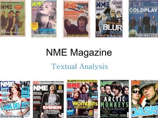
This is my textual analysis of NME January 2012 front cover, contents page and double page spread. Click the full screen button to enlarge the presentation:)

Recommended
More Related Content
What's hot
What's hot (20)
Similar to NME Magazine Textual Analysis
Similar to NME Magazine Textual Analysis (20)
More from Catherine Baker
More from Catherine Baker (12)
Recently uploaded
Recently uploaded (13)
NME Magazine Textual Analysis
- 1. NME Magazine Textual Analysis
- 2. The newspaper styled magazine, has a twist that would appeal to their target market of the older generation. A Dog End is shown, which is a “pretend” fold on a page, indicating that you have to come back to this storyline as it is that interesting. The barcode, price, website and date is in the bottom right and corner, which is conventionally where is should be presented. This particular magazine as a 3 colour scheme of Pink, White and Black. This is like NME, as they usually stick to three main colours on a front cover, but most commonly, red, yellow and black. There is a sky line at the top advertising free posters of icons from the 80’s, implying their target audience are people who knew the artists who made it big then. The lack of expression on their faces, intrigues the individual to find out more as well as showing they mean business for the music industry of 2012. An anchorage is used to show what is “exclusive” in this magazine. Menu Bar is used on the side of the magazine to present the stories to the reader. The font used is sans serif , bold, block capital letters to “shout” out to the reader, that this magazine is a must have. Direct Mode of Address is used to make the audience feel more involved in the magazine. A boost is used in the middle of the magazine as it is the most important story line. It also informs the audience if one of their favourite bands is inside. The Mast Head placed at the top left hand corner, helps keep in style house continuity through each issue of the magazine. Main image placed in the centre as it is the main centre of attention, plus the information can go around it. Also, the high angle shot used, makes the reader look up at them, portraying them as the next big thing. “ Bored? Skint?” the use of questions is a direct mode of address to make the reader feel involved. A burst of winning Noel Gallagher tickets is used as an insert on the front cover, which contrasts from the main image in order for it to stand out.
- 3. The use of upper case font helps it stand out on the contents page. By having a pull out quote from the Maccabees, gives a preview of the article, intriguing the reader to find out more. This is a usual convention of this magazine , advertising the subscription page. Due to the fact they have gone again their conventional colour scheme of red, yellow and black on the red cover, they decided to use it on the front cover instead. Like a newspaper article , NME have split their contents page into 3 columns with a black line to divide the story lines up, so the audience know where they can find each article. The use of the advertising of alcohol “Jagermeister”, helps to emphasise this is more of a male dominated magazine, as this seems to be a “manly” type of drink. Like every NME magazine, they replace the words “contents” or “contents page” with, black, bold upper case lettering of “inside this week” to stand out on the contents page. All of the page number are situated on the right hand side of the pictures, as well as being in large, bold, black font so the reader can easily navigate their way through to find each story. The sell lines are presented with big photos to emphasise there are the main focus of the magazine. The rest of the “extra” news are located in a small columns down the middle. By having pictures of “80’s” posters, heightens the idea that the audience are aimed at the 80’s kids.
- 4. The double page spread links to the contents page, by having the article split up into 3 columns, rule of thirds . The use of the drop capitals “W”, “T” and “L” to show where the information starts and the main bits of the article. Serif font is used throughout the double page spread like a newspaper article to add formality. The use of the 3 colour scheme , pink, white and black, links back to the front cover, suggesting continuity is trying to be kept throughout the magazine. There are mini boxes of writing used on the page, to break up the writing as there is a lot on the page. Furthermore, the rest of the other double page spread stick to this style, implying the idea that they are keeping continuity throughout. Pull out quotes by the artists seems to be used to give a direct address to the reader, to feel like we are getting to know them personally. By having direct mode of address , they seem to be looking at the reader, again enticing the audience to read more. The main body of text looks like 12 size font, which is conventional for most newspapers. It is also written in a serif font, and looks like “news times roman” which is easier to read and what you would expect to find in a newspaper. The reader can tell the magazine has tried to keep that side to it since it became a more magazine style publication. By having a blank background , the reader doesn't get distracted by anything and just focuses in on them. By having Orlando positioned in the foreground compared to his other band mates, suggests that he is the main singer and may be the most important element to this band, keeping them together. RULE OF THIRDS The white and black font used for the questions and answers stand out on the contrasting pink colour.