FACTUAL WRITING COPY 
Melissa Storey
LEAFLETS
Colourful shapes, text and 
images are used to make this 
leaflet look more appealing 
than others. It is targeted 
towards families with young 
children, this is shown by the 
image of the child and the 
bright colours throughout the 
leaflet. 
The heading of the 
leaflet uses a bold 
font and colours 
which make it stand out 
straight away. The colours are 
quite playful making it appeal 
to young children, who they 
aim this zoo for. 
The images are full of exciting 
animals and fun things to do, 
making it look like a great 
place to visit. This leaflet 
advertises their zoo over 
others therefore making it 
look fun and exciting by 
photographs shows parents 
and children what they can do 
and see before reading any of 
the information. 
The images carry on 
throughout the leaflet making 
it still seem fun for the 
children. 
The bright colours and large 
fonts for headers attract your 
attention making it an clear 
leaflet to read. The bold and 
different coloured fonts 
indicate more important 
things, 
making it 
conciseness as it 
is simple and the 
language is clear. 
The table is easy to read and 
keeps the leaflet simple, so 
busy parents can find the 
information they are looking 
for quickly. 
The language for this is 
leaflet is simple and quick, 
but informative as the text is 
targeted towards the parents. 
The ASA will apply to this 
leaflet because it is 
advertising towards children 
therefore they should not 
make the children nag at the 
parents to make them come 
here. Therefore they 
have advertised it mainly towards a family rather than part of the family.
The typography of this leaflet is very bright and 
full. The colours used are bright, neutral and 
calm colours that you would associate with a 
gym or a healthy lifestyle. This is so it gets 
across to the correct audience. 
There are 
lots of 
promotional offers on 
this leaflet. The 
language is simple 
and short. It uses 
words such as 
“we’re” instead of we 
are. This is to 
promote a gym to an 
audience which 
doesn’t have as 
much money as 
other people who 
regularly use the 
gym. 
They use 
photographs and 
diagrams to show 
where the gym is 
and what is there. 
The girl looks 
extremely happy 
showing how going 
to this gym can 
effect you as a 
person in a good 
way. Photographs 
are like the visual 
truth that people 
believe. 
The leaflet is 
simple and easy 
to read making 
the clarity of the 
leaflet clear. It 
also is kept 
simple ensuring 
conciseness is 
kept to a 
minimum. The 
information looks 
factually right but 
may cause 
ambiguity 
because of the 
cheap price, 
people will be 
wondering what 
the catch is. 
The large bold 
fonts make it 
easy to read and 
helps you 
understand 
quickly what is 
important on this 
leaflet.
INSTRUCTIONS
Lots of helpful black and white 
illustrations are used on this 
instruction sheet. Theses help 
explain not only what the product 
looks like or does from different 
angles but also how to get it to work 
in a step by step visual. The smaller 
illustrations are what shows you 
what to do and explains to text in 
more detail. 
The steps are in a complicated 
layout. The register of the 
language is very formal using 
words such as “nomenclature” 
and “installation”. There is no 
shortened words, this is not a 
simple instruction manual to 
follow and would take time to set 
up this speedlite. 
There are different steps within a 
step making it confusing and not 
making the instructions clear 
making the clarity and 
conciseness of the work hardly 
present. 
Large bold heading so you 
know what the manual is 
about, the image is so you 
know which product the 
instructions are for. 
The text does not leave the 
space for interpretation, 
avoiding ambiguity. The 
steps are very formal and 
instructional.
Instructions need to be 
simple and instructional. 
These instructions look 
simple. They have a step by 
step guide and illustrations 
to go with them. 
The illustrations are simple 
drawings and uses arrows to 
indicate the way the net 
should be put up. The 
illustrations explain what the 
text is saying in a simple 
visual language. 
The step by step instructions 
are easy to read, they are 
very clear. It does not use 
long words, in fact it 
shortens sentences to keep 
it conciseness and simple as 
it is a net for children to play 
football. 
The clarity and conciseness 
is very well done in this. 
Instead of saying “Push the 
pole through the top” they 
show with with a arrow 
direction and saying “Push 
Pole top, direction (A)” the 
illustrations make this much 
clearer.
HOW TO GUIDES
The title is the only thing in colour on 
this informational leaflet. It quickly 
informs the audience that this is the title 
and it shows its importance by colour, 
size and effect. 
Step by step 
instruction on 
how to cure low 
back pain from 
the NHS. This 
has to be clear, 
factual and true 
to help people. 
People trust the 
NHS therefore 
the information 
must be 
trustworthy and 
factual. 
Illustrations are used to explain what to 
do in each step, this is a good and 
helpful way to explain 
the point clearly making 
the clarity of this leaflet 
clear and easy 
to understand. 
The language 
and register of 
this particular 
informational 
instructions 
leaflet is very 
formal and 
informative. It 
does not use 
slang as it is for 
the whole of the 
UK. 
Bold headlines 
are also used on 
the first line of the 
paragraph so you 
know where it 
starts and what 
step you are on.
This step by step guide is from a teen magazine 
therefore there is a large image of the hairstyle on a 
model. This shows the final product and how it should 
look in the end. It is a powerful image. 
They have used bold effects on the text to make things 
stand out more. The heading is very large compared to the 
rest of the text making it stand out. The colours used also 
make things stand out. They typography chosen is clever as 
they have make certain text stand out more than others to 
show importance. 
The text is simple 
and gets straight to 
the point. It 
instructionally tells 
you what to do but is 
quite informal as it is 
only for teenage girls. 
They have 
highlighted 
certain words 
such as “high 
ponytail” and 
“hairspray” 
There is a bigger ratio of images than text. The images 
indicate what you need, what you will achieve and a step 
by step indication. The step by step photographs tell you 
what to do in the next step without you having to read the 
text.
FACTUAL JOURNALISM
The large image shows 
what, where and who the 
article is about. You can 
see it is a relaxed article 
from the way she is posing 
and her smiling facial 
expression. The picture 
connects to the text. 
Having an image with an 
article breaks it up a bit and 
more people will be drawn 
to the article because dogs 
may interest them or just 
because of the image. 
This article is biased 
because it only has one 
point of view coming from 
the vet. No one else is 
quoted or says their 
opinion about becoming a 
vet and what problems that 
has. 
The wording is very formal, 
there is not slang or 
shortened vocabulary. It is 
informative as it is 
informing people what it is 
like to become a vet with 
the pros and cons. 
The title is larger and 
bolder than the rest of 
the text because it 
needs to stand out and 
attract the audience 
because this is the first 
piece of text they will 
see about the article. 
There is a small 
paragraph indicating 
what the article is about 
and who it was written 
by. This is a typical 
convention of a layout 
of a newspaper article. 
It referrers it sources 
ensuring that the 
information is from the 
correct source. They do 
this by putting quotation 
marks around the text 
said by a particular 
person. The veterinary 
nurse Andrea 
Montesano has been 
quoted a lot in this 
article and her words 
have all be quoted and 
stated.
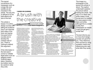
The image is a 
photograph of the 
person this article is 
about. The caption 
underneath explains 
the picture before 
reading the article. The 
way it is in black and 
white makes it look 
formal and it is tradition 
for news papers to be 
black and white, 
although this is a better 
quality than 
newspapers so maybe 
it was just get get a 
similar feel. 
The text informs you 
on how short design 
courses are good for 
you. They reference 
their sources by using 
quotation marks and 
referencing who said 
what after they quote. 
The typical 
conventions of a 
newspaper such as 
a large title and 
subtitle are all 
included in this 
article. The way this 
is defined is by the 
bold effects and 
size of the text. 
The article is 
biased. It is all for 
design courses and 
telling the audience 
how it can exercise 
both sides of the 
brain and saying 
how good short 
courses are to 
develop the 
creative side of 
you. There is 
nothing to defend 
this argument. 
If the information in 
the text wasn’t 
correct or reliable 
legal action such as 
gagging orders 
could be taken 
place, therefore 
journalists need to 
be careful in what 
they write.

Task 1 research

  • 1.
    FACTUAL WRITING COPY Melissa Storey
  • 2.
  • 3.
    Colourful shapes, textand images are used to make this leaflet look more appealing than others. It is targeted towards families with young children, this is shown by the image of the child and the bright colours throughout the leaflet. The heading of the leaflet uses a bold font and colours which make it stand out straight away. The colours are quite playful making it appeal to young children, who they aim this zoo for. The images are full of exciting animals and fun things to do, making it look like a great place to visit. This leaflet advertises their zoo over others therefore making it look fun and exciting by photographs shows parents and children what they can do and see before reading any of the information. The images carry on throughout the leaflet making it still seem fun for the children. The bright colours and large fonts for headers attract your attention making it an clear leaflet to read. The bold and different coloured fonts indicate more important things, making it conciseness as it is simple and the language is clear. The table is easy to read and keeps the leaflet simple, so busy parents can find the information they are looking for quickly. The language for this is leaflet is simple and quick, but informative as the text is targeted towards the parents. The ASA will apply to this leaflet because it is advertising towards children therefore they should not make the children nag at the parents to make them come here. Therefore they have advertised it mainly towards a family rather than part of the family.
  • 4.
    The typography ofthis leaflet is very bright and full. The colours used are bright, neutral and calm colours that you would associate with a gym or a healthy lifestyle. This is so it gets across to the correct audience. There are lots of promotional offers on this leaflet. The language is simple and short. It uses words such as “we’re” instead of we are. This is to promote a gym to an audience which doesn’t have as much money as other people who regularly use the gym. They use photographs and diagrams to show where the gym is and what is there. The girl looks extremely happy showing how going to this gym can effect you as a person in a good way. Photographs are like the visual truth that people believe. The leaflet is simple and easy to read making the clarity of the leaflet clear. It also is kept simple ensuring conciseness is kept to a minimum. The information looks factually right but may cause ambiguity because of the cheap price, people will be wondering what the catch is. The large bold fonts make it easy to read and helps you understand quickly what is important on this leaflet.
  • 5.
  • 6.
    Lots of helpfulblack and white illustrations are used on this instruction sheet. Theses help explain not only what the product looks like or does from different angles but also how to get it to work in a step by step visual. The smaller illustrations are what shows you what to do and explains to text in more detail. The steps are in a complicated layout. The register of the language is very formal using words such as “nomenclature” and “installation”. There is no shortened words, this is not a simple instruction manual to follow and would take time to set up this speedlite. There are different steps within a step making it confusing and not making the instructions clear making the clarity and conciseness of the work hardly present. Large bold heading so you know what the manual is about, the image is so you know which product the instructions are for. The text does not leave the space for interpretation, avoiding ambiguity. The steps are very formal and instructional.
  • 7.
    Instructions need tobe simple and instructional. These instructions look simple. They have a step by step guide and illustrations to go with them. The illustrations are simple drawings and uses arrows to indicate the way the net should be put up. The illustrations explain what the text is saying in a simple visual language. The step by step instructions are easy to read, they are very clear. It does not use long words, in fact it shortens sentences to keep it conciseness and simple as it is a net for children to play football. The clarity and conciseness is very well done in this. Instead of saying “Push the pole through the top” they show with with a arrow direction and saying “Push Pole top, direction (A)” the illustrations make this much clearer.
  • 8.
  • 9.
    The title isthe only thing in colour on this informational leaflet. It quickly informs the audience that this is the title and it shows its importance by colour, size and effect. Step by step instruction on how to cure low back pain from the NHS. This has to be clear, factual and true to help people. People trust the NHS therefore the information must be trustworthy and factual. Illustrations are used to explain what to do in each step, this is a good and helpful way to explain the point clearly making the clarity of this leaflet clear and easy to understand. The language and register of this particular informational instructions leaflet is very formal and informative. It does not use slang as it is for the whole of the UK. Bold headlines are also used on the first line of the paragraph so you know where it starts and what step you are on.
  • 10.
    This step bystep guide is from a teen magazine therefore there is a large image of the hairstyle on a model. This shows the final product and how it should look in the end. It is a powerful image. They have used bold effects on the text to make things stand out more. The heading is very large compared to the rest of the text making it stand out. The colours used also make things stand out. They typography chosen is clever as they have make certain text stand out more than others to show importance. The text is simple and gets straight to the point. It instructionally tells you what to do but is quite informal as it is only for teenage girls. They have highlighted certain words such as “high ponytail” and “hairspray” There is a bigger ratio of images than text. The images indicate what you need, what you will achieve and a step by step indication. The step by step photographs tell you what to do in the next step without you having to read the text.
  • 11.
  • 12.
    The large imageshows what, where and who the article is about. You can see it is a relaxed article from the way she is posing and her smiling facial expression. The picture connects to the text. Having an image with an article breaks it up a bit and more people will be drawn to the article because dogs may interest them or just because of the image. This article is biased because it only has one point of view coming from the vet. No one else is quoted or says their opinion about becoming a vet and what problems that has. The wording is very formal, there is not slang or shortened vocabulary. It is informative as it is informing people what it is like to become a vet with the pros and cons. The title is larger and bolder than the rest of the text because it needs to stand out and attract the audience because this is the first piece of text they will see about the article. There is a small paragraph indicating what the article is about and who it was written by. This is a typical convention of a layout of a newspaper article. It referrers it sources ensuring that the information is from the correct source. They do this by putting quotation marks around the text said by a particular person. The veterinary nurse Andrea Montesano has been quoted a lot in this article and her words have all be quoted and stated.
  • 13.
    The image isa photograph of the person this article is about. The caption underneath explains the picture before reading the article. The way it is in black and white makes it look formal and it is tradition for news papers to be black and white, although this is a better quality than newspapers so maybe it was just get get a similar feel. The text informs you on how short design courses are good for you. They reference their sources by using quotation marks and referencing who said what after they quote. The typical conventions of a newspaper such as a large title and subtitle are all included in this article. The way this is defined is by the bold effects and size of the text. The article is biased. It is all for design courses and telling the audience how it can exercise both sides of the brain and saying how good short courses are to develop the creative side of you. There is nothing to defend this argument. If the information in the text wasn’t correct or reliable legal action such as gagging orders could be taken place, therefore journalists need to be careful in what they write.