SlideShare a Scribd company logo
1 of 6
Factual Products
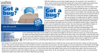
Leaflets With this leaflet you can see that straight away you can see what it is for and what it is
about. As you have this very bold text saying ‘Got a bug’ which straight away catches your
eye with it being the biggest thing on the leaflet apart from the picture next to it.
Straight away on the leaflet this is the first thing to catch
your eye for how big and bold the text is. So they have
used visual hierarchy as this is the first thing they would
like you to look at on the leaflet. Not only have they made
it big compared to other text but also its bold and really in
your face which for a rhetorical question straight away it
gets you thinking. So straight away the leaflet is drawing
you in and getting you to read more to find out if you do.
The colour that has been used also matches well with the leaflet overall with it being blue
as when looking at the leaflet you can see that it has different shades of blue. It goes from
dark to more of a pastel blue colour as well. But since they have used different shades of
blue and not just the same colour they have made it have clarity as it is still easy to
understand especially when they have used white and black text depending on the
background colour so that it is still easy to understand and read clearly. When reading the
information that the leaflet is presenting you also find that it is conciseness as well.
As the information they have on their leaflet is very simple and straight to the point so they’ve tried to use as few word as they
can while still trying to get the point through of what to do if you do think you have a bug. Since the leaflet is from the NHS and is
about if you’ve got a big they have to make sure that everything they say is accurate so they are able to help people for example
the information of what you should do if you have a big needs to be correct for example if you’ve had a cough for four week you
need to visit your GP. This is something that they do need to make sure is correct and its not 3 or 5 weeks and that it is 4.
You next go on to read the bottom of the leaflet where it has much more information that is a little bit more serious then the text that is above as it tells you why
else you may want to call your doctor or even the NHS for advice on any illness you may have. This even though is a bit more important is at the bottom of the page
as after you have read all the information this is where your eyes will look next and so your ending the leaflet with just that little bit more serious information as it
will be the most thing you remember since you read it last. I think the fact that they have added a little cartoon to the leaflet does make it look less serious and
brings more of a kid of fun side to the leaflet so that your not reading all about illness. As for some people it can be scary but having the cartoon can draw people
towards this leaflet more rather then one that is filled with just writing.
LeafletsLeaflets can be used for many reasons, one of the most common reasons for a leaflet is used by a company or an organization that are informing
people about products or their services to their targeted audience. But they are also used as adverting or to give the
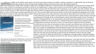
public more information on things. When looking at a leaflet from my college on depression I noticed the cover was a photograph of a sky and some mountains which
used a colour scheme of a calming blue and white to match this. So straight away it is using its colour scheme to try and calm the reader. The first page you look at
shows a photograph of a young girl looking quiet sad, this has been used to go with the information they are giving you. It also makes it more of the audience and will
also stir up their emotions a little. With the first page after they have written a paragraph about what the subject is they have then used bullet points to clear up extra
detail in a clear and short way to be able to get their point across. This can come under clarity and conciseness. As they are first keeping their paragraphs clear so that
the audience are able to easily understand what has been said and then they are next using conciseness so that they are able to get more of their point across used as
few words as possible, it also keeps it more simple. In their leaflet they have also used the use of bold font this is so that it grabs the readers attention more then
everything else on the page. As this is something that is clearly important for people to know. This piece of
bold text is telling people that its not always obvious why people may develop depression so this has been
highlighted in bold font so that someone who is reading this wont feel as bad and can understand that they
are feeling like this and there may not be a reason. So it will be able to make them that tiny bit better.
The leaflet also has clear titles so that people are able to see which each different part of the text is about. I
would say the text they have used is a regular one to be used I would say that it is very soft with its round
ages. This is a good use of typography as they have kept the colour of the natural with just a light grey then
the font itself quiet rounded not harsh and sharp. But when talking about the font when I was reading what
had been written I cam across the fact that is informal with the words it uses. As it uses the shorter version
rather then the more formal writing that you will find. But this all depends mainly on who your target
audience is and with this leaflet you will find that it is targeting for a younger audience especially teenagers
so the language they used is allowed to be informal for that I how the majority of their audience would type
and speak as well.
Here is first a screenshot from the NHS and talking about depression. I then have some text from the leaflet
this is to prove that what the leaflet is telling is accurate. As they are both telling you how depression is
when you are sad and down for a certain period of time. So by comparing these together you are able to see
that it must be true facts as if it wasn’t you wouldn't have more then one piece of writing state that it can
take a while until you are class as depressed. You are not able too class as depressed if you are down or sad
a few times. That is more classed as normal.
How to guide
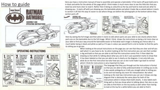
Here you have a instruction manual of how to assemble and operate a batmobile. It first starts off quiet bold and is
in black and white for the whole of the page which I think makes it much more clear to see the little bits that you
need too and more clear to read it. Rather then it being as colourful as the toy and hard to read and see what its
showing you. It starts off with just showing you the batmobile whole and what it looks like as whole before it starts
to section it off. But this way its easier to see where things are before the photographs at the bottom where they
section parts off.
Here by seeing the full image and then when it starts to talk where parts are your able to see clearly where them
parts are on the batmobile due to the full image. Which I think shows the instructions as being a lot more clear as
your able to find your way around the batmobile easier to find what each image is showing you hence why it is
much better being in black and white as well as if it was in colour you would find it a lot to harder to find the parts
its telling you to go too.
When looking at the actual instructions on the page you can see that they are clear and tell you
well what it is you have to do. So when looking at the first instruction you can see that number
is big and bold so that you are able to tell that this instruction comes first. It then label the
drawing so that while its talking about what you are to do it uses quotation marks to show that
it has been labeled so that you are able to see it clearly on the diagram. It not only tells you
what do on the first instruction but also how you can un do it and make it go back to normal
which I think for instructions is very important to have.
The language that they use through out the instructions is formal
so that you are able to fully understand what it is telling you to do.
It also avoids ambiguity as it tells you straight what its telling you
to do and not leaving any room for interpretation. But when
looking as the next two instructions you can see it shows one big
diagram that is obviously the same place for both of the
instructions which it shows them both clearly . It also labels each
thing well so that you know what its talking about. But also so you
are able to find them on the toy easily as well rather then having
to look at the toy for a while before you are able to find it.
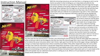
Instruction Manual With this instructing manual you can see that there is a lot going on and it can be
hard to see what it is that its telling you as it mixes black and white for the
instructions but then next to it you have this brightly coloured image that has got
the nerf gun labeled so that while reading the instructions your able to easily find
the things. When looking at the first page you can see that the top half they have
used diagrams to show you the instructions but they have a bit of simple text
underneath with just a little bit of an explanation to go with it. Then underneath
this you have a lot more important information about the toy for example the
battery. As you can see by this diagram it is
clear as to what it is showing you as it
has arrows to show you and the piece
that you are having to work with they
have made into an orange colour.
Then it has a little bit of writing
underneath just to explain a bit more.
You then have the instructions at the bottom of the
page as well which I don’t think are too clear due to
the font and how close the writing is. So I feel like
someone who may find it hard to see could have
difficulty to read all this which I think isn't the best as
for the fact that it does say it is important so you
want to be able to read it all clearly.
You then have this full coloured which I feel like is very distracting for the fact that you have the other page that is black and
white so that your able to see the diagrams. But then you have the coloured page that is very in your face and what you look
at first before the actual instructions which I don’t think is right apart from the fact that all this page is doing is labeling the
nerf gun so it does have importance but I think it would be much better if they either stayed with colour for it all or white
and black. But I think for instructions it should have stayed black and white so that it wasn’t as distracting and so that you
was able to read it a lot more easier as I think because of how brightly coloured it is you still have trouble seeing the other
page and concentrating on that as well. But I think overall these instructions haven't been done well as it is very simple to the
point some people may not understand clearly what it is telling you to do. Where as if it just explained a little bit more
people would understand it a lot more.
Factual Journalism Here I have a factual journalism that I found on BBC news of the USA president Trump and how he has
all of a sudden changed his mind on separating families up. Straight away as you can see with a factual
journalism they will grab your attention by the title depending on its importance. With this title I feel like
they really are dragging you in by the fact they have worded it by saying how Trump ‘Backs down’ as
already you can see which way this article is going and feels like it already could be bias as you can tell
that this article isn't too fond of Trump and his decisions in this subject.
It then really goes in to detail about the subject but staying to the point so that you can read it clear and
interrupt it in a different way to then your reading. But at the same time you are still able to think your
own opinion. They also added a few images so that your able to see the importance in this article and
how bad the top actually is which I think shows it is bias as no where in the article is it ever positive
about the topic. By using images we are able to see the situation ourselves and make more of a
judgement on the article and situation. With the article you also have bolded sentences to show
importance over other sentences and to show that this is where the article is going to change a little to
a different part of the subject. As this way your able to see that they are going to change and what it will
be talking about next so that its clear and easy for people to understand.
Next in this article they also show you a diagram to really show case the importance of this article and
how Trumps decision is affecting families. Which they’ve shown clearly through using colour and
presenting it with arrows so that you can follow it. When reading this article you can see that there is no
evidence to an argument with everything been said about Trump rather negative even mentioning how
trump only ended up changing his mind due to the opinions of his wife and daughter. They’ve also made
sure to reference sources if they have gotten any information from somewhere else or any of their
photograph or diagrams. When the news is writing articles like this they really need to make sure that
everything they are writing is true and not any false information as this can then cause legal constraints
which could really damage a news business as if you were to find this out you would then no longer trust
what you are reading.
The news then need to make sure that they follow the codes of practice like the editors code of practice
which can mean things like making sure what your writing is accurate, privacy. Which I feel like this
article was close to as it did mention things like his wife and daughter but it didn't breach it as much as it
could have been worse so I do feel like this article does follow the codes of practice.

More Related Content

What's hot

Magazine design evaluation
Magazine design evaluationMagazine design evaluation
Magazine design evaluationWanderingHalle
 
Cover Layout
Cover LayoutCover Layout
Cover LayoutMaleeha17
 
Magazine design evaluation
Magazine design evaluationMagazine design evaluation
Magazine design evaluationWanderingHalle
 
house style for my magazine
house style for my magazinehouse style for my magazine
house style for my magazinedoaa elmnayneh
 
1. initial plans(2) (1) finished
1. initial plans(2) (1) finished1. initial plans(2) (1) finished
1. initial plans(2) (1) finishedamy foster
 
4. pre production(1)
4. pre production(1)4. pre production(1)
4. pre production(1)amy foster
 
1. initial plans(2)
1. initial plans(2)1. initial plans(2)
1. initial plans(2)amy foster
 
Creating the Front Cover
Creating the  Front CoverCreating the  Front Cover
Creating the Front CoverEmeeB
 
Factual writing Task One
Factual writing Task OneFactual writing Task One
Factual writing Task OneAlex Walker
 
Evaluation (question 5)
Evaluation (question 5)Evaluation (question 5)
Evaluation (question 5)Nathan Adikwu
 
Planning and research Isaac McKenzie
Planning and research Isaac McKenziePlanning and research Isaac McKenzie
Planning and research Isaac McKenzieIsaac Mckenzie
 

What's hot (20)

Presentation
PresentationPresentation
Presentation
 
Task 1
Task 1Task 1
Task 1
 
Magazine design evaluation
Magazine design evaluationMagazine design evaluation
Magazine design evaluation
 
7. evaluation done
7. evaluation done7. evaluation done
7. evaluation done
 
Cover Layout
Cover LayoutCover Layout
Cover Layout
 
Task 1 new project
Task 1 new projectTask 1 new project
Task 1 new project
 
Magazine design evaluation
Magazine design evaluationMagazine design evaluation
Magazine design evaluation
 
house style for my magazine
house style for my magazinehouse style for my magazine
house style for my magazine
 
Task 10
Task 10Task 10
Task 10
 
1. initial plans(2) (1) finished
1. initial plans(2) (1) finished1. initial plans(2) (1) finished
1. initial plans(2) (1) finished
 
4. pre production(1)
4. pre production(1)4. pre production(1)
4. pre production(1)
 
1. initial plans(2)
1. initial plans(2)1. initial plans(2)
1. initial plans(2)
 
Magazine design evaluation
Magazine design evaluationMagazine design evaluation
Magazine design evaluation
 
4. pre production fmp
4. pre production fmp4. pre production fmp
4. pre production fmp
 
Task 1
Task 1 Task 1
Task 1
 
Creating the Front Cover
Creating the  Front CoverCreating the  Front Cover
Creating the Front Cover
 
Factual writing Task One
Factual writing Task OneFactual writing Task One
Factual writing Task One
 
Evaluation (question 5)
Evaluation (question 5)Evaluation (question 5)
Evaluation (question 5)
 
Powerpoint 3
Powerpoint 3Powerpoint 3
Powerpoint 3
 
Planning and research Isaac McKenzie
Planning and research Isaac McKenziePlanning and research Isaac McKenzie
Planning and research Isaac McKenzie
 

Similar to Factual products

Factual writing copy
Factual writing copyFactual writing copy
Factual writing copyabbydowning
 
Factual writing
Factual writing Factual writing
Factual writing RubySheepie
 
Factual writing presentation
Factual writing presentationFactual writing presentation
Factual writing presentationOliviaBolt
 
Factual writing presentation
Factual writing presentationFactual writing presentation
Factual writing presentationOliviaBolt
 
Factual writing presentation
Factual writing presentationFactual writing presentation
Factual writing presentationOliviaBolt
 
Factual writing presentation (1)
Factual writing presentation (1)Factual writing presentation (1)
Factual writing presentation (1)OliviaBolt
 
Factual writing analysing
Factual writing analysingFactual writing analysing
Factual writing analysingJordan Bohill
 
Evaluation of existing factual writing
Evaluation of existing factual writingEvaluation of existing factual writing
Evaluation of existing factual writingkatiesteph5
 
Factual writing analysing
Factual writing analysingFactual writing analysing
Factual writing analysingJordan Bohill
 
Task 1 factual writing
Task 1 factual writingTask 1 factual writing
Task 1 factual writingRyan Goldsmith
 
Factual Writing Proforma
Factual Writing Proforma Factual Writing Proforma
Factual Writing Proforma SophieBaker98
 
Digital graphics evaluation pro forma
Digital graphics evaluation pro formaDigital graphics evaluation pro forma
Digital graphics evaluation pro formaGeorginaWhitelock
 

Similar to Factual products (20)

Task 1
Task 1Task 1
Task 1
 
Factual writing copy
Factual writing copyFactual writing copy
Factual writing copy
 
Factual writing
Factual writing Factual writing
Factual writing
 
Factual writing presentation
Factual writing presentationFactual writing presentation
Factual writing presentation
 
Factual writing presentation
Factual writing presentationFactual writing presentation
Factual writing presentation
 
Factual writing presentation
Factual writing presentationFactual writing presentation
Factual writing presentation
 
Factual writing presentation (1)
Factual writing presentation (1)Factual writing presentation (1)
Factual writing presentation (1)
 
Factual writing analysing
Factual writing analysingFactual writing analysing
Factual writing analysing
 
Evaluation of existing factual writing
Evaluation of existing factual writingEvaluation of existing factual writing
Evaluation of existing factual writing
 
Factual writing analysing
Factual writing analysingFactual writing analysing
Factual writing analysing
 
Task 1 factual writing
Task 1 factual writingTask 1 factual writing
Task 1 factual writing
 
Task 1
Task 1Task 1
Task 1
 
Task 1
Task 1Task 1
Task 1
 
Factual writing
Factual writing Factual writing
Factual writing
 
Task 1
Task 1Task 1
Task 1
 
Factual Writing Proforma
Factual Writing Proforma Factual Writing Proforma
Factual Writing Proforma
 
Digital graphics evaluation pro forma
Digital graphics evaluation pro formaDigital graphics evaluation pro forma
Digital graphics evaluation pro forma
 
Evaluation
EvaluationEvaluation
Evaluation
 
Evaluation
EvaluationEvaluation
Evaluation
 
Evaluation
EvaluationEvaluation
Evaluation
 

More from millierobyn

Evaluation fanzine
Evaluation fanzine Evaluation fanzine
Evaluation fanzine millierobyn
 
Working to a brief pro forma-2
Working to a brief pro forma-2Working to a brief pro forma-2
Working to a brief pro forma-2millierobyn
 
Idea development pro forma 2
Idea development pro forma 2Idea development pro forma 2
Idea development pro forma 2millierobyn
 
Idea development pro forma-2.5
Idea development pro forma-2.5Idea development pro forma-2.5
Idea development pro forma-2.5millierobyn
 
Pop punk articles
Pop punk articles Pop punk articles
Pop punk articles millierobyn
 
Existing products
Existing products Existing products
Existing products millierobyn
 
Survey analyising
Survey analyising Survey analyising
Survey analyising millierobyn
 

More from millierobyn (17)

Client pitch
Client pitch Client pitch
Client pitch
 
Client pitch
Client pitch Client pitch
Client pitch
 
Evaluation
Evaluation Evaluation
Evaluation
 
Presentation1
Presentation1Presentation1
Presentation1
 
Evaluation fanzine
Evaluation fanzine Evaluation fanzine
Evaluation fanzine
 
Working to a brief pro forma-2
Working to a brief pro forma-2Working to a brief pro forma-2
Working to a brief pro forma-2
 
Idea development pro forma 2
Idea development pro forma 2Idea development pro forma 2
Idea development pro forma 2
 
Evaluation
Evaluation Evaluation
Evaluation
 
Pre production
Pre productionPre production
Pre production
 
Client pitch
Client pitch Client pitch
Client pitch
 
Client pitch 2
Client pitch 2Client pitch 2
Client pitch 2
 
Idea development pro forma-2.5
Idea development pro forma-2.5Idea development pro forma-2.5
Idea development pro forma-2.5
 
Pop punk articles
Pop punk articles Pop punk articles
Pop punk articles
 
Existing products
Existing products Existing products
Existing products
 
Survey analyising
Survey analyising Survey analyising
Survey analyising
 
Evaluation 1
Evaluation 1Evaluation 1
Evaluation 1
 
Scheduel 1
Scheduel 1 Scheduel 1
Scheduel 1
 

Recently uploaded

“Oh GOSH! Reflecting on Hackteria's Collaborative Practices in a Global Do-It...
“Oh GOSH! Reflecting on Hackteria's Collaborative Practices in a Global Do-It...“Oh GOSH! Reflecting on Hackteria's Collaborative Practices in a Global Do-It...
“Oh GOSH! Reflecting on Hackteria's Collaborative Practices in a Global Do-It...Marc Dusseiller Dusjagr
 
Sanyam Choudhary Chemistry practical.pdf
Sanyam Choudhary Chemistry practical.pdfSanyam Choudhary Chemistry practical.pdf
Sanyam Choudhary Chemistry practical.pdfsanyamsingh5019
 
Measures of Central Tendency: Mean, Median and Mode
Measures of Central Tendency: Mean, Median and ModeMeasures of Central Tendency: Mean, Median and Mode
Measures of Central Tendency: Mean, Median and ModeThiyagu K
 
SOCIAL AND HISTORICAL CONTEXT - LFTVD.pptx
SOCIAL AND HISTORICAL CONTEXT - LFTVD.pptxSOCIAL AND HISTORICAL CONTEXT - LFTVD.pptx
SOCIAL AND HISTORICAL CONTEXT - LFTVD.pptxiammrhaywood
 
CARE OF CHILD IN INCUBATOR..........pptx
CARE OF CHILD IN INCUBATOR..........pptxCARE OF CHILD IN INCUBATOR..........pptx
CARE OF CHILD IN INCUBATOR..........pptxGaneshChakor2
 
Kisan Call Centre - To harness potential of ICT in Agriculture by answer farm...
Kisan Call Centre - To harness potential of ICT in Agriculture by answer farm...Kisan Call Centre - To harness potential of ICT in Agriculture by answer farm...
Kisan Call Centre - To harness potential of ICT in Agriculture by answer farm...Krashi Coaching
 
APM Welcome, APM North West Network Conference, Synergies Across Sectors
APM Welcome, APM North West Network Conference, Synergies Across SectorsAPM Welcome, APM North West Network Conference, Synergies Across Sectors
APM Welcome, APM North West Network Conference, Synergies Across SectorsAssociation for Project Management
 
Separation of Lanthanides/ Lanthanides and Actinides
Separation of Lanthanides/ Lanthanides and ActinidesSeparation of Lanthanides/ Lanthanides and Actinides
Separation of Lanthanides/ Lanthanides and ActinidesFatimaKhan178732
 
Contemporary philippine arts from the regions_PPT_Module_12 [Autosaved] (1).pptx
Contemporary philippine arts from the regions_PPT_Module_12 [Autosaved] (1).pptxContemporary philippine arts from the regions_PPT_Module_12 [Autosaved] (1).pptx
Contemporary philippine arts from the regions_PPT_Module_12 [Autosaved] (1).pptxRoyAbrique
 
POINT- BIOCHEMISTRY SEM 2 ENZYMES UNIT 5.pptx
POINT- BIOCHEMISTRY SEM 2 ENZYMES UNIT 5.pptxPOINT- BIOCHEMISTRY SEM 2 ENZYMES UNIT 5.pptx
POINT- BIOCHEMISTRY SEM 2 ENZYMES UNIT 5.pptxSayali Powar
 
Employee wellbeing at the workplace.pptx
Employee wellbeing at the workplace.pptxEmployee wellbeing at the workplace.pptx
Employee wellbeing at the workplace.pptxNirmalaLoungPoorunde1
 
microwave assisted reaction. General introduction
microwave assisted reaction. General introductionmicrowave assisted reaction. General introduction
microwave assisted reaction. General introductionMaksud Ahmed
 
The basics of sentences session 2pptx copy.pptx
The basics of sentences session 2pptx copy.pptxThe basics of sentences session 2pptx copy.pptx
The basics of sentences session 2pptx copy.pptxheathfieldcps1
 
Grant Readiness 101 TechSoup and Remy Consulting
Grant Readiness 101 TechSoup and Remy ConsultingGrant Readiness 101 TechSoup and Remy Consulting
Grant Readiness 101 TechSoup and Remy ConsultingTechSoup
 
Industrial Policy - 1948, 1956, 1973, 1977, 1980, 1991
Industrial Policy - 1948, 1956, 1973, 1977, 1980, 1991Industrial Policy - 1948, 1956, 1973, 1977, 1980, 1991
Industrial Policy - 1948, 1956, 1973, 1977, 1980, 1991RKavithamani
 
How to Make a Pirate ship Primary Education.pptx
How to Make a Pirate ship Primary Education.pptxHow to Make a Pirate ship Primary Education.pptx
How to Make a Pirate ship Primary Education.pptxmanuelaromero2013
 

Recently uploaded (20)

“Oh GOSH! Reflecting on Hackteria's Collaborative Practices in a Global Do-It...
“Oh GOSH! Reflecting on Hackteria's Collaborative Practices in a Global Do-It...“Oh GOSH! Reflecting on Hackteria's Collaborative Practices in a Global Do-It...
“Oh GOSH! Reflecting on Hackteria's Collaborative Practices in a Global Do-It...
 
Sanyam Choudhary Chemistry practical.pdf
Sanyam Choudhary Chemistry practical.pdfSanyam Choudhary Chemistry practical.pdf
Sanyam Choudhary Chemistry practical.pdf
 
Measures of Central Tendency: Mean, Median and Mode
Measures of Central Tendency: Mean, Median and ModeMeasures of Central Tendency: Mean, Median and Mode
Measures of Central Tendency: Mean, Median and Mode
 
SOCIAL AND HISTORICAL CONTEXT - LFTVD.pptx
SOCIAL AND HISTORICAL CONTEXT - LFTVD.pptxSOCIAL AND HISTORICAL CONTEXT - LFTVD.pptx
SOCIAL AND HISTORICAL CONTEXT - LFTVD.pptx
 
CARE OF CHILD IN INCUBATOR..........pptx
CARE OF CHILD IN INCUBATOR..........pptxCARE OF CHILD IN INCUBATOR..........pptx
CARE OF CHILD IN INCUBATOR..........pptx
 
Kisan Call Centre - To harness potential of ICT in Agriculture by answer farm...
Kisan Call Centre - To harness potential of ICT in Agriculture by answer farm...Kisan Call Centre - To harness potential of ICT in Agriculture by answer farm...
Kisan Call Centre - To harness potential of ICT in Agriculture by answer farm...
 
APM Welcome, APM North West Network Conference, Synergies Across Sectors
APM Welcome, APM North West Network Conference, Synergies Across SectorsAPM Welcome, APM North West Network Conference, Synergies Across Sectors
APM Welcome, APM North West Network Conference, Synergies Across Sectors
 
Model Call Girl in Tilak Nagar Delhi reach out to us at 🔝9953056974🔝
Model Call Girl in Tilak Nagar Delhi reach out to us at 🔝9953056974🔝Model Call Girl in Tilak Nagar Delhi reach out to us at 🔝9953056974🔝
Model Call Girl in Tilak Nagar Delhi reach out to us at 🔝9953056974🔝
 
Separation of Lanthanides/ Lanthanides and Actinides
Separation of Lanthanides/ Lanthanides and ActinidesSeparation of Lanthanides/ Lanthanides and Actinides
Separation of Lanthanides/ Lanthanides and Actinides
 
Contemporary philippine arts from the regions_PPT_Module_12 [Autosaved] (1).pptx
Contemporary philippine arts from the regions_PPT_Module_12 [Autosaved] (1).pptxContemporary philippine arts from the regions_PPT_Module_12 [Autosaved] (1).pptx
Contemporary philippine arts from the regions_PPT_Module_12 [Autosaved] (1).pptx
 
POINT- BIOCHEMISTRY SEM 2 ENZYMES UNIT 5.pptx
POINT- BIOCHEMISTRY SEM 2 ENZYMES UNIT 5.pptxPOINT- BIOCHEMISTRY SEM 2 ENZYMES UNIT 5.pptx
POINT- BIOCHEMISTRY SEM 2 ENZYMES UNIT 5.pptx
 
Employee wellbeing at the workplace.pptx
Employee wellbeing at the workplace.pptxEmployee wellbeing at the workplace.pptx
Employee wellbeing at the workplace.pptx
 
microwave assisted reaction. General introduction
microwave assisted reaction. General introductionmicrowave assisted reaction. General introduction
microwave assisted reaction. General introduction
 
The basics of sentences session 2pptx copy.pptx
The basics of sentences session 2pptx copy.pptxThe basics of sentences session 2pptx copy.pptx
The basics of sentences session 2pptx copy.pptx
 
Model Call Girl in Bikash Puri Delhi reach out to us at 🔝9953056974🔝
Model Call Girl in Bikash Puri  Delhi reach out to us at 🔝9953056974🔝Model Call Girl in Bikash Puri  Delhi reach out to us at 🔝9953056974🔝
Model Call Girl in Bikash Puri Delhi reach out to us at 🔝9953056974🔝
 
Grant Readiness 101 TechSoup and Remy Consulting
Grant Readiness 101 TechSoup and Remy ConsultingGrant Readiness 101 TechSoup and Remy Consulting
Grant Readiness 101 TechSoup and Remy Consulting
 
Staff of Color (SOC) Retention Efforts DDSD
Staff of Color (SOC) Retention Efforts DDSDStaff of Color (SOC) Retention Efforts DDSD
Staff of Color (SOC) Retention Efforts DDSD
 
Industrial Policy - 1948, 1956, 1973, 1977, 1980, 1991
Industrial Policy - 1948, 1956, 1973, 1977, 1980, 1991Industrial Policy - 1948, 1956, 1973, 1977, 1980, 1991
Industrial Policy - 1948, 1956, 1973, 1977, 1980, 1991
 
TataKelola dan KamSiber Kecerdasan Buatan v022.pdf
TataKelola dan KamSiber Kecerdasan Buatan v022.pdfTataKelola dan KamSiber Kecerdasan Buatan v022.pdf
TataKelola dan KamSiber Kecerdasan Buatan v022.pdf
 
How to Make a Pirate ship Primary Education.pptx
How to Make a Pirate ship Primary Education.pptxHow to Make a Pirate ship Primary Education.pptx
How to Make a Pirate ship Primary Education.pptx
 

Factual products

  • 2. Leaflets With this leaflet you can see that straight away you can see what it is for and what it is about. As you have this very bold text saying ‘Got a bug’ which straight away catches your eye with it being the biggest thing on the leaflet apart from the picture next to it. Straight away on the leaflet this is the first thing to catch your eye for how big and bold the text is. So they have used visual hierarchy as this is the first thing they would like you to look at on the leaflet. Not only have they made it big compared to other text but also its bold and really in your face which for a rhetorical question straight away it gets you thinking. So straight away the leaflet is drawing you in and getting you to read more to find out if you do. The colour that has been used also matches well with the leaflet overall with it being blue as when looking at the leaflet you can see that it has different shades of blue. It goes from dark to more of a pastel blue colour as well. But since they have used different shades of blue and not just the same colour they have made it have clarity as it is still easy to understand especially when they have used white and black text depending on the background colour so that it is still easy to understand and read clearly. When reading the information that the leaflet is presenting you also find that it is conciseness as well. As the information they have on their leaflet is very simple and straight to the point so they’ve tried to use as few word as they can while still trying to get the point through of what to do if you do think you have a bug. Since the leaflet is from the NHS and is about if you’ve got a big they have to make sure that everything they say is accurate so they are able to help people for example the information of what you should do if you have a big needs to be correct for example if you’ve had a cough for four week you need to visit your GP. This is something that they do need to make sure is correct and its not 3 or 5 weeks and that it is 4. You next go on to read the bottom of the leaflet where it has much more information that is a little bit more serious then the text that is above as it tells you why else you may want to call your doctor or even the NHS for advice on any illness you may have. This even though is a bit more important is at the bottom of the page as after you have read all the information this is where your eyes will look next and so your ending the leaflet with just that little bit more serious information as it will be the most thing you remember since you read it last. I think the fact that they have added a little cartoon to the leaflet does make it look less serious and brings more of a kid of fun side to the leaflet so that your not reading all about illness. As for some people it can be scary but having the cartoon can draw people towards this leaflet more rather then one that is filled with just writing.
  • 3. LeafletsLeaflets can be used for many reasons, one of the most common reasons for a leaflet is used by a company or an organization that are informing people about products or their services to their targeted audience. But they are also used as adverting or to give the public more information on things. When looking at a leaflet from my college on depression I noticed the cover was a photograph of a sky and some mountains which used a colour scheme of a calming blue and white to match this. So straight away it is using its colour scheme to try and calm the reader. The first page you look at shows a photograph of a young girl looking quiet sad, this has been used to go with the information they are giving you. It also makes it more of the audience and will also stir up their emotions a little. With the first page after they have written a paragraph about what the subject is they have then used bullet points to clear up extra detail in a clear and short way to be able to get their point across. This can come under clarity and conciseness. As they are first keeping their paragraphs clear so that the audience are able to easily understand what has been said and then they are next using conciseness so that they are able to get more of their point across used as few words as possible, it also keeps it more simple. In their leaflet they have also used the use of bold font this is so that it grabs the readers attention more then everything else on the page. As this is something that is clearly important for people to know. This piece of bold text is telling people that its not always obvious why people may develop depression so this has been highlighted in bold font so that someone who is reading this wont feel as bad and can understand that they are feeling like this and there may not be a reason. So it will be able to make them that tiny bit better. The leaflet also has clear titles so that people are able to see which each different part of the text is about. I would say the text they have used is a regular one to be used I would say that it is very soft with its round ages. This is a good use of typography as they have kept the colour of the natural with just a light grey then the font itself quiet rounded not harsh and sharp. But when talking about the font when I was reading what had been written I cam across the fact that is informal with the words it uses. As it uses the shorter version rather then the more formal writing that you will find. But this all depends mainly on who your target audience is and with this leaflet you will find that it is targeting for a younger audience especially teenagers so the language they used is allowed to be informal for that I how the majority of their audience would type and speak as well. Here is first a screenshot from the NHS and talking about depression. I then have some text from the leaflet this is to prove that what the leaflet is telling is accurate. As they are both telling you how depression is when you are sad and down for a certain period of time. So by comparing these together you are able to see that it must be true facts as if it wasn’t you wouldn't have more then one piece of writing state that it can take a while until you are class as depressed. You are not able too class as depressed if you are down or sad a few times. That is more classed as normal.
  • 4. How to guide Here you have a instruction manual of how to assemble and operate a batmobile. It first starts off quiet bold and is in black and white for the whole of the page which I think makes it much more clear to see the little bits that you need too and more clear to read it. Rather then it being as colourful as the toy and hard to read and see what its showing you. It starts off with just showing you the batmobile whole and what it looks like as whole before it starts to section it off. But this way its easier to see where things are before the photographs at the bottom where they section parts off. Here by seeing the full image and then when it starts to talk where parts are your able to see clearly where them parts are on the batmobile due to the full image. Which I think shows the instructions as being a lot more clear as your able to find your way around the batmobile easier to find what each image is showing you hence why it is much better being in black and white as well as if it was in colour you would find it a lot to harder to find the parts its telling you to go too. When looking at the actual instructions on the page you can see that they are clear and tell you well what it is you have to do. So when looking at the first instruction you can see that number is big and bold so that you are able to tell that this instruction comes first. It then label the drawing so that while its talking about what you are to do it uses quotation marks to show that it has been labeled so that you are able to see it clearly on the diagram. It not only tells you what do on the first instruction but also how you can un do it and make it go back to normal which I think for instructions is very important to have. The language that they use through out the instructions is formal so that you are able to fully understand what it is telling you to do. It also avoids ambiguity as it tells you straight what its telling you to do and not leaving any room for interpretation. But when looking as the next two instructions you can see it shows one big diagram that is obviously the same place for both of the instructions which it shows them both clearly . It also labels each thing well so that you know what its talking about. But also so you are able to find them on the toy easily as well rather then having to look at the toy for a while before you are able to find it.
  • 5. Instruction Manual With this instructing manual you can see that there is a lot going on and it can be hard to see what it is that its telling you as it mixes black and white for the instructions but then next to it you have this brightly coloured image that has got the nerf gun labeled so that while reading the instructions your able to easily find the things. When looking at the first page you can see that the top half they have used diagrams to show you the instructions but they have a bit of simple text underneath with just a little bit of an explanation to go with it. Then underneath this you have a lot more important information about the toy for example the battery. As you can see by this diagram it is clear as to what it is showing you as it has arrows to show you and the piece that you are having to work with they have made into an orange colour. Then it has a little bit of writing underneath just to explain a bit more. You then have the instructions at the bottom of the page as well which I don’t think are too clear due to the font and how close the writing is. So I feel like someone who may find it hard to see could have difficulty to read all this which I think isn't the best as for the fact that it does say it is important so you want to be able to read it all clearly. You then have this full coloured which I feel like is very distracting for the fact that you have the other page that is black and white so that your able to see the diagrams. But then you have the coloured page that is very in your face and what you look at first before the actual instructions which I don’t think is right apart from the fact that all this page is doing is labeling the nerf gun so it does have importance but I think it would be much better if they either stayed with colour for it all or white and black. But I think for instructions it should have stayed black and white so that it wasn’t as distracting and so that you was able to read it a lot more easier as I think because of how brightly coloured it is you still have trouble seeing the other page and concentrating on that as well. But I think overall these instructions haven't been done well as it is very simple to the point some people may not understand clearly what it is telling you to do. Where as if it just explained a little bit more people would understand it a lot more.
  • 6. Factual Journalism Here I have a factual journalism that I found on BBC news of the USA president Trump and how he has all of a sudden changed his mind on separating families up. Straight away as you can see with a factual journalism they will grab your attention by the title depending on its importance. With this title I feel like they really are dragging you in by the fact they have worded it by saying how Trump ‘Backs down’ as already you can see which way this article is going and feels like it already could be bias as you can tell that this article isn't too fond of Trump and his decisions in this subject. It then really goes in to detail about the subject but staying to the point so that you can read it clear and interrupt it in a different way to then your reading. But at the same time you are still able to think your own opinion. They also added a few images so that your able to see the importance in this article and how bad the top actually is which I think shows it is bias as no where in the article is it ever positive about the topic. By using images we are able to see the situation ourselves and make more of a judgement on the article and situation. With the article you also have bolded sentences to show importance over other sentences and to show that this is where the article is going to change a little to a different part of the subject. As this way your able to see that they are going to change and what it will be talking about next so that its clear and easy for people to understand. Next in this article they also show you a diagram to really show case the importance of this article and how Trumps decision is affecting families. Which they’ve shown clearly through using colour and presenting it with arrows so that you can follow it. When reading this article you can see that there is no evidence to an argument with everything been said about Trump rather negative even mentioning how trump only ended up changing his mind due to the opinions of his wife and daughter. They’ve also made sure to reference sources if they have gotten any information from somewhere else or any of their photograph or diagrams. When the news is writing articles like this they really need to make sure that everything they are writing is true and not any false information as this can then cause legal constraints which could really damage a news business as if you were to find this out you would then no longer trust what you are reading. The news then need to make sure that they follow the codes of practice like the editors code of practice which can mean things like making sure what your writing is accurate, privacy. Which I feel like this article was close to as it did mention things like his wife and daughter but it didn't breach it as much as it could have been worse so I do feel like this article does follow the codes of practice.