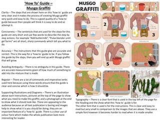
This document analyzes the instruction manual for the "Musical Crib Puppy." It finds that the manual provides clear, easy to understand instructions supported by diagrams. The steps to replace batteries and avoid leakage seem accurate. However, the caution text is somewhat ambiguous. The language is formal as instructions require. It also notes that the manual communicates vital information that could otherwise cause confusion or danger through clear fonts, diagrams, and formatting of important text. Overall, the analysis finds that the manual effectively guides users while avoiding potential issues.
This document provides an analysis of different types of factual writing, including a leaflet, recipe article, assembly guide, and instruction manual. It examines the clarity, conciseness, accuracy, ambiguity, bias, register, evidence, references, and legal issues of each document. Key aspects like layout, color, writing, and typography are also evaluated for how well they convey information.
The document contains guidelines for magazine cover design. It discusses the purpose and design of different elements on the cover including the masthead, main cover line, cover lines, selling line, images, and left side of the cover. It provides tips on font size, color, and positioning of these elements to attract readers' attention and effectively promote the stories inside.
The document contains guidelines for magazine cover design. It provides details on key design elements like the masthead, cover lines, selling lines, images, and barcodes/pricing. The masthead should stand out prominently in bold colors. Cover lines should be in straight lines and describe articles inside. Images should be associated with the main cover line. Barcodes and prices inform readers of cost. Together these elements aim to attract readers' attention and communicate what the magazine contains.
This document summarizes a factual writing piece in 3 sentences:
The document discusses different typographic tools used in factual writing such as changing font sizes, colors, and styles to draw attention to important information. Sections are divided using titles in red with explanations below. Images are also included to further describe and show what the text is explaining.
- The double page spread uses a studio photo of the artist looking directly at the camera to create a personal connection. An important quote from the article is used as the headline in bold.
- The artist's name is in bold near the title to highlight their importance. The introduction paragraph briefly explains the article.
- Pictures are used throughout to break up the text, along with large letters starting paragraphs and highlighted quotes in a block color. The artist's name is repeated at the top of each page related to the feature article.
The document discusses the typical elements and conventions found on magazine contents pages, including titles, images, fonts, columns, page numbers, headings, and subscription information. It provides examples from contents pages of the Kerrang, Q, and NME magazines. The contents pages follow common magazine design principles like using different fonts and sizes to organize information and images with captions and page numbers to entice readers to specific articles.
McDonald's business practices have faced widespread criticism for various environmental, social, and health issues, including: exploiting workers through low pay and lack of benefits; contributing to deforestation and greenhouse gas emissions through intensive farming methods; and promoting an unhealthy diet linked to increased disease risks. Critics argue McDonald's prioritizes profits over people and the planet. Protests and legal challenges against McDonald's continue to grow.
This document summarizes and compares two different types of factual writing - an instruction leaflet and a magazine article.
The instruction leaflet uses simple black and white illustrations, a plain font, bold text for headings, and a minimal color scheme to clearly communicate assembly steps without distraction. In contrast, the magazine article uses various fonts, bolding, italics and one color photo to make the text more interesting and break up a large amount of information.
While the instruction leaflet is very concise to be understood by all, the magazine article uses less concise language that fits the style of the publication and tells more of a story. The article aims to appeal to its target female audience on a personal level about losing
This document summarizes and compares two different types of factual writing - an instruction leaflet and a magazine article.
The instruction leaflet uses simple black and white illustrations, a plain font, bold text for headings, and a minimal color scheme to clearly communicate assembly steps without distraction. In contrast, the magazine article uses various fonts, bolding, italics and one color photo to make the large amount of text more interesting and readable for its audience.
While both aim to accurately communicate information, the leaflet is highly concise to concisely convey assembly instructions, whereas the magazine article is less concise to tell a story in a style fitting for its publication. The language is also more formal in the leaflet
This leaflet uses different fonts and styles to target different audiences. A plain font is used for adults, while a bolder, fun font is used for children alongside illustrations. The leaflet is biased towards nature as it promotes the national trust and environmental protection. It has clear sections and organization to be easily understood by all audiences.
This leaflet uses different fonts and illustrations to target different audiences. A plain font is used for adults, while a bolder, fun font is used for children accompanied by illustrations. The leaflet is biased towards nature as it promotes the national trust. It has clear sections and formatting for easy reading.
This leaflet uses different fonts and illustrations to target different audiences. A plain font is used for adults, while a bolder, fun font is used for children accompanied by illustrations. The leaflet is biased towards nature as it promotes the national trust. It has clear sections and organization to be easily understood by various audiences.
This summary provides an overview of the key information from the document:
The document discusses several types of informational materials, including an instruction manual, leaflet, 'how to' guide, and magazine spread. It analyzes the design, formatting, use of images and text, and other stylistic elements of each material. Across the different materials, the document examines best practices like using clear and concise language, consistent formatting, descriptive diagrams and illustrations, and structuring information for easy comprehension. It also notes some areas for improvement, such as providing references for cited facts.
The document discusses the design and layout of various informational materials including leaflets, instructions, posters, and online articles. It notes that effective design keeps the intended audience in mind, uses visual elements like images and typography techniques to engage readers, and presents content in a clear and scannable manner. Key elements mentioned include using headlines, bullet points, bolding or coloring important text, labeling parts, and incorporating quotes or videos. Proper design makes the information easy to understand and motivates readers to continue through the content.
This document outlines several generic conventions for magazine layout and design. It discusses conventions for front covers such as central images of artists and plugs with pricing information. It also covers conventions for contents pages like listing sections and using pun captions. Double page spreads typically feature large central images of the main artist and branding at the bottom. Interviews are commonly structured with quotes embedded in the text. Music magazines generally include features like interviews, reviews, listings, posters and competitions.
The document summarizes and analyzes several instructional documents:
1) An Ikea instruction manual that uses illustrations to simply and clearly convey assembly instructions without needing multiple language translations.
2) A university prospectus that uses formatting, color, images and sourced statistics to positively promote the university.
3) A BBC recipe article that uses clear language, formatting and an accompanying image to simply demonstrate how to make pancakes.
4) A sample National Geographic article that separates text for readability and includes a headline, tagline and image to provide context without ambiguity.
This document deconstructs the layout and design elements of a double page spread in a music magazine. Key elements include a large bold heading that grabs attention, a supporting subheading with the artist's name in bold, an interview article in columns, and a full-page background image of the artist performing to entice readers. Other standard elements are consistently formatted, such as the issue date, page number, and photo credits, to give the pages a neat and professional appearance. The layout, bold fonts, and exciting image work together to effectively promote the article and attract readers.
Leaflets, instruction manuals, 'how to' guides, and magazines/newspapers all aim to inform readers through factual writing. However, their styles and purposes differ. Leaflets advertise brands and locations, using persuasive language. Instruction manuals provide step-by-step guidance through diagrams and text. 'How to' guides offer advice and tips through a mix of text and images. Magazine and newspaper articles entertain while informing on various topics, using facts and evidence to back opinions. All must be clearly written and structured to effectively achieve their goals.
This magazine research document analyzes the front covers and spreads of 3 entertainment magazines - Entertainment Weekly, Empire Australasia, and Screen International. It examines the target audiences, color schemes, images, text styles, and ratios used in each publication. The document concludes by noting the common successful design elements across the magazines, such as bold text, images, and spoiler alerts. It states which aspects of the research, like varied fonts and colors on spreads, will be applied to the author's own magazine work.
This magazine research document analyzes the front covers and spreads of 3 entertainment magazines - Entertainment Weekly, Empire Australasia, and Screen International. It examines elements like colors, fonts, images, text ratio and style to understand the target audiences and key features. The research found commonalities like bold text, images, and spoiler alerts. Elements from the research like color, graphics, fonts and balanced text/image ratio will be applied to the author's own magazine work.
The document contains examples of different types of documents: a magazine article on evolution from National Geographic, IKEA instructions, a WikiHow guide on how to toast bread, and a university prospectus from York University. The National Geographic article uses formal language and provides evidence supporting evolution, while also acknowledging bias. The IKEA instructions are concise and use only images to avoid ambiguity. WikiHow guides are also concise but can be ambiguous due to unclear images sometimes. University prospectuses aim to impress readers and promote the university using both clear information and informal language.
This document analyzes several factual writing pieces including a breastfeeding information leaflet, photography how-to guides, instructions for origami, and a journalistic news article. Key analysis points made about each piece include their use of visual elements like images and formatting to draw attention to information, inclusion of evidence and perspectives to support arguments, and language choices to establish tone and make information clear and accessible. Permission for using any copyrighted content is also noted as an essential part of publishing factual writing.
This document contains summaries of different types of factual writing:
- A how-to guide on photography is evaluated. It uses a semi-formal tone and clear typography but could be more concise. Photos with details support the text.
- A product manual for installing a baby seat is very formal and concise for safety. Illustrations paired with numbered steps leave no ambiguity.
- A newspaper article is shown to have a biased and ambiguous tone that questions its accuracy. It aims to rile readers rather than provide facts.
The document provides guidance on writing formal letters, including the standard format, types of formal letters for different purposes, and a sample formal letter. Key aspects of a formal letter include sender and recipient addresses, date, subject, salutation, 3 paragraph body, and
- The document is a leaflet created by Chadwell Primary School to promote healthy eating. It uses simple visuals and text to appeal to children. The informal language makes it enjoyable to read.
- Instructions are provided for assembling and operating a Batman toy. labeled diagrams and clearly explained text provide accurate information in a style fitting the theme.
- An online guide offers solutions to common iMessage problems through headings, images, and bold text to aid navigation. While technical, it references other sources and informal language aids readability.
This document summarizes a how-to guide for making paleo pancakes. The guide uses simple images and minimal text written in an informal register. The color palette is muted greys and the images are emphasized with grey borders. Important text like the title and ingredients are written in a darker, capitalized grey to stand out. Overall, the guide has a simple, easy-to-follow design to clearly instruct readers on the paleo pancake recipe.
My media product uses some conventions of a real magazine contents page but also challenges some conventions. It is similar to a professional magazine in having the title at the top, two columns separating articles, and page numbers. However, it has a plain white background, smaller images, and lacks an issue date or large cover image. It also includes competitions and subscriptions at the bottom, which is unconventional. While the organization and navigation aids make it functional, the plain presentation could be improved with more varied fonts, colors, and filling empty space.
This document provides guidance for planning an article for a fanzine, including example layouts with different font choices for headings and body text, as well as suggestions for including a flatplan and supporting images.
This document provides planning information for a tabloid front cover including example tabloid covers, font choices for the masthead and body text, flatplan layouts, and examples of supporting images that could be used.
This document provides guidance on planning broadsheet front covers including choosing fonts, creating a flatplan layout, and including supporting images. It discusses masthead and body text font selections as well as example broadsheet covers and images that can supplement the content.
This document provides design guidelines for layout elements including margins, columns, orientation, headers, drop caps, white space, pull quotes, and other typographic elements. It specifies the use of a double page spread with columns in portrait orientation, along with baseline grids, page numbers, headers, borders, and white space to structure information and guide the reader through the document.
The document is an evaluation by Bekki Asquith of several experimental photography projects they undertook exploring different techniques. For one project, they created a photomontage in the style of David Hockney by merging photos of different people's faces. For another, they took photos using mirrors to create reflections and patterns. They also experimented with high-speed photography capturing objects dropping into water. Overall, the evaluation assesses the technical and aesthetic qualities of the photos, how well the projects matched the brief of being experimental, and ways the work could be further improved.
The document summarizes two advertisements, one for Waitrose supermarket and one for Aldi supermarket.
The Waitrose ad focuses on quality, using high-quality images and endorsements from a famous chef to promote their food as high quality. In contrast, the Aldi ad does not emphasize quality and uses simpler images, instead focusing on low prices by showing name brand prices next to Aldi's cheaper generic alternatives.
The document then analyzes differences in target markets between the two supermarkets, with Waitrose appealing more to upper-class consumers interested in quality and Aldi appealing more to lower-income consumers focused on value and price.
This SWOT analysis is for a new MP3 player that allows internet streaming of songs from Spotify to challenge Apple's market dominance. Strengths include access to thousands of Spotify songs, appealing new technology, easy internet functionality, and preference over Apple products. Weaknesses consist of reliance on WiFi/data, competition from existing iPods, similarity to laptops, declining MP3 market, high production costs, and need to pay for downloaded songs. Opportunities center around growing Spotify's brand and userbase through advertising. Threats involve competition from other MP3 devices, brand loyalty to Apple, rivalry between Apple and Spotify, new competitive products, and negative reviews/prices undermining sales.
The document discusses ideas for an experimental photography project with a theme of discovery. It proposes taking photos that look strange or mysterious without revealing what is happening, capturing a frozen moment in time like a raindrop falling into a hand, creating a composite face out of different close-up photos, showing different perspectives of the same thing, using vortography which involves mirrors and reflection, and combining movement and something stationary. The ideas are said to explore discovery by showing things in an unusual way, at a precise moment, from various angles, or with contrasting elements.
Scanography is a photography technique that uses a scanner like a digital camera to take images. Unlike photos from a camera, scanography images have a shallow depth of field, with only the part of an object touching the glass being in focus. This gives scanned 3D objects a soft effect. High speed photography involves either taking photos fast enough to freeze high-speed motion, or capturing successive frames at a high rate. This allows recording events too fast for the naked eye. Light writing is a form of stop motion animation created by moving a light source in long exposures to illuminate parts of the scene over time, giving the illusion of drawing or painting with light.
Scanography is a photography technique that uses a scanner like a digital camera to take images. Unlike photos from a camera, scanography images have a shallow depth of field, with only the part of an object touching the glass being in focus. This gives scanned 3D objects a soft effect. High speed photography aims to capture fast motion either through a fast shutter speed or high frame rate. It is used in science, sports, and the military but can also be considered a art form. Light writing is a form of stop motion animation created through light painting, where light is used to illuminate parts of a scene over a long exposure, or light drawing, where light is shone directly into the camera to "draw" an image.
This document discusses different types of experimental photography including traditional, non-traditional, fine art, and commercial photography. It provides examples from photographers Dara Scully, David Hockney, Kristin Smith, and Tatiana Antonuk to illustrate techniques like movement, photomontage, lighting, and self-portraits. The examples show how photographers use traditional and digital methods to create contemporary or historical works that could appear in galleries, books, or commercial contexts.
The document describes various experimental photography techniques that were explored, including:
- Taking out-of-focus photos by manually adjusting the camera's focus ring. This produced blurred images of objects at different distances.
- Creating photomontages by taking many close-up photos of a scene and merging them together in Photoshop to form a collage-like composite image.
- Capturing movement by using a slow shutter speed and camera shake to blur moving objects while keeping stationary elements in focus.
- Photographing reflections by finding objects like glass panels that reflected other scenes or objects in an interesting way.
The document outlines marketing and PR objectives for relaunching the band Crumple Zone through a "Greatest Hit" tour spanning New Zealand to California over the Christmas holidays. It profiles the band members, now aged 60, and analyzes their core audience of women in their 50s who were fans in the band's heyday in the 1970s. It discusses targeting this audience through TV, radio, magazines, and social media to promote their new album and tour, with the goals of selling 2 million albums and raising awareness. Internal and media motivations for the project focus on reconnecting with loyal fans and generating interest in the band's comeback.
This document analyzes the strengths, weaknesses, opportunities, and threats (SWOT) of a new Spotify MP3 player. The strengths include access to thousands of songs and built-in streaming, while weaknesses are reliance on WiFi and competition from established MP3 players. Opportunities exist to expand Spotify's brand and user base through advertising. Threats include strong competition from Apple and other current/future MP3 players, as well as potential negative reviews.
This document contains Bekki Asquith's work on developing copy and branding ideas for a new Irn-Bru 32 energy drink product. It includes:
- Slogan ideas that involve asking rhetorical questions to engage customers or use of Scottish slang.
- Experiments testing font readability at different sizes and colors for various branding elements like web banners and packaging.
- Considerations for the can design, wanting to use a long thin style associated with energy drinks to differentiate it from original Irn-Bru.
- Potential fonts reviewed for the product packaging and labeling, wanting something bold and uppercase to stand out.
The document discusses ideas for an Irn-Bru advertisement. For idea 1, the document recommends fonts that have a handwritten element to match the thought bubble concept. It suggests the font "Whatever It Takes" and using uppercase fonts popular with the Irn-Bru brand. Images of thought bubbles and fantasies are proposed. The recommended color scheme matches the Irn-Bru blues and oranges. For idea 2, casual fonts like "Lighthouse" are suggested to convey comedy. Images of everyday people dressed up in humorous scenarios are proposed, with an orange on blue color scheme to stand out.
The document contains initial ideas for advertising slogans and concepts to promote Irn-Bru 32's energy-giving properties. Some of the ideas include showing what people say Irn-Bru 32 would need to do to be better, highlighting a "strange new craze" of increased energy from drinking it, using a "spot the difference" concept to show its energizing effects, and featuring quotes from people describing how it makes them feel full of energy and able to accomplish things or see the world differently.
The document contains initial ideas for potential slogans and advertisements for Irn-Bru 32. The ideas range from highlighting things the drink cannot do but can provide energy, to showing people with exaggerated displays of energy and enthusiasm after drinking the beverage. One idea features a man who feels like he can be whatever he wants after drinking Irn-Bru 32, showing him dressed as a cat in his garden. The document explores different concepts to convey the energizing effects of the product in a lighthearted, fun way.
2. Instruction Manual for ‘Musical Crib Puppy’
Clarity – The instruction manual is
clear and easy to understand.
There are headings and steps in
the following that tell you how to
do thing such as replace the
batteries and how to avoid
battery leakage.
Supporting illustrations and diagrams – There is
a diagram image that accompanies the text
entitled ‘To replace batteries’. This is something
that could prove confusing and because of the
vague instructions this will help the reader.
Accuracy – The steps to avoid
battery leakage and the replace
batteries seem accurate. They
would have to be accurately
presented in order to prevent any
danger to do with the batteries.
This shows the parents of
the child that it has been
tested and they have
nothing to worry about
when they give it to their
child.
Ambiguity– There seems to be
some kind of ambiguity with the
‘Caution’ text on the front page.
The line that reads ‘the crib sides
should be in one of the lower
positions.’ This is vague and does
not explain the need for caution
very well.
Register – The language used in this
instruction manual is formal and
uses imperatives because the text
itself needs to be commanding, they
are instructions.
Conciseness – Few
words are used in the
steps in the two ‘how
to’ paragraphs.
Codes of practice – The
small print at the bottom of
the page on the right talks
about the FCC and says that
this product is approved by
this organisation. The FCC
tests products like this one
in order to see whether
they will be at risk of
harming the child. It has
been approved so this must
mean that it is safe.
Bias – There is no sense of
bias being used in this
instruction manual because
there is no need for it.
Typography – This whole instruction
manual is in black and white text, there
are no other colours used. There are 3
different fonts used for different aspects
of the leaflet. There is also bold and
upper case type used for different aspects
as well.
The font choice is clear, simple and is
easy to read for the audience.
Effective Communication – In general, this
publication communicates the vital information to
the reader that could otherwise cause confusion
and possibly danger. The text is effectively
communicated by using clear fonts, diagrams and
bold and upper case letters for important headings
and words.
4. •
Typography – There are different fonts used here for the heading and the main body of text and then also the feature at the
bottom left of the second page. The headings of the text are in bold. The font choice for the main text is easy to read and
simple so that the leaflet focuses on the content rather than what the leaflet looks like. This is the case with most factual
writing pages. The font that is used for the main heading is also clear and easily readable.
•
Clarity – When read, it is quite clear what this leaflet is talking about. It is telling the reader about how bad McDonald’s is, as a
company. It tells a one sided story about all of the bad things about the company. It is clear what the opinion of the writer is
as soon as you read the first paragraph.
•
Accuracy – This leaflet contains some statistics such as ‘Every year McDonald’s uses over a million tons of unnecessary plastic
and paper packaging’. This is not very accurate; it would be better if an actual, accurate figure or number was used. This is
also ambiguous and so this factual publication does not avoid ambiguity.
•
Bias – The text in this leaflet is only one side of a story. This shows bias. The two activists who wrote the original leaflet, Helen
Steel and Dave Morris are from London Greenpeace and so it is very clear what their opinion and their side of the story will
be. After this leaflet was published and people from McDonald’s had read what these two activists had written about them
and after the legal court case, the leaflet was forced to retract some of the things that it has said and accused. Because the
inaccurate and vague figures that they used such as as ‘Every year McDonald’s uses over a million tons of unnecessary plastic
and paper packaging’, they were removed for legal reasons.
•
Register – The text in this leaflet is written formally, however there are some contractions used such as ‘they’re’. They have
used a wide vocabulary and punctuation to try and engage the reader and keep them interested in the issue that the
publication is about.
•
Evidence of an argument – The evidence of argument is shown by the original article showing one side of the story, saying
how bad McDonald’s is, the other side of the story/argument is shown by the writing around the outside which talks about
when McDonald’s read this article and fought back against it to try and protect their name.
•
Legal constraints – The writing around the outline of this leaflet talks about how McDonald’s sued the people who wrote this
for libel. This meant that they had written about something that was untrue and McDonald’s were able to sue them for this
because what they wrote made them look bad as a company. Also, this could have stopped people from using their service
and their products and this could in turn put them out of business.
•
Supporting images – There is an image at the side of the main heading which shows a Ronald McDonald mask, a popular
character who is associated with the McDonald’s food company. There is a fat man holding the mask in front of his face and
smiling, this implies that something is hidden behind the fun exterior of McDonald’s and all is not what it seems.
5. Clarity – This article is easy
to understand because the
subject is explained to the
reader in the text. The font is
clear to read and the story is
easy to decipher.
Factual Journalism (Newspaper article)
- ‘A World of Beauty’
Conciseness – This article is
concise. It tells the story and gets
the point across in few words. A
shorter story is more appealing to
the reader than a long winded one
that goes on and on.
Register – This piece is written quite
formally. There are no informal
contractions except in quotes from
people.
Referencing sources of information – In
this piece, there are quotes from several
people. There are multiple quotes from
Emily May McEwan herself, who is the
subject of the article, and there is also a
quote from Marci Hinkle, her best friend.
There are also references to different
colleges and different pieces of artwork
by McEwan throughout the article.
Typography – The font that the heading
is written in is eye catching and
interesting. It fits well with what the
article is actually talking about: art. It is
very artistic and so goes well with and
applies to the story.
The rest of the article is written in a
lower case, clear and simple font that is
easily readable. This is so that the
attention of the reader can stay focused
on the story rather than anything else
such as the nice font that it is written in.
Supporting Images and Diagrams – There are 3 images included in this article. They are used to explain what
the text says further and make some of the things that are written about a bit clearer.
They are called ‘supporting’ images because they support the text and show what it is talking about.
There are also captions in amongst the images to describe further what is actually being shown and explained
in the images and the text.
6. ‘How To’ Guide –
Musgo Graffiti
Clarity – The steps that are shown here on this ‘how to` guide are
very clear and it makes the process of creating Musgo graffiti
very quick and easy to do. This is a good quality of a ‘how to`
guide because then people will think it is easy to do and so
attempt it.
Conciseness – The sentences that are used for the steps for this
guide are very short and use few words to describe the step by
step actions. For example “Add buttermilk”, “Pulse blender until
gel forms” are all short, sharp commands which tell you what to
do.
Accuracy – The instructions that this guide give are accurate and
correct. This is the way for a ‘how to` guide to be. If you follow
the guide by the steps, then you will end up with Musgo graffiti
that will grow.
Avoiding Ambiguity – There is no ambiguity in this guide. There
are accurate measurements given of how much of something to
add into the mixture that is made.
Register – There are a lot of commands and imperative verbs
used here because using these words ensure that the guide is
clear and concise which is how it should be.
Supporting Illustrations and Diagrams – There is an illustration
above each instructions, pictures at the top of the page to show
what you need to make this graffiti, and a photograph at the end
to show what it should look like. These are appealing to the
audience because an all text publication is boring and images
help to show what it is you should be doing; they are an
important feature of a ‘how to` guide. There is a clear use of
colour here which makes the whole publication look more
interesting for reader.
Typography – There is a clear font that is used in the top left of the page for
the heading and the show what this ‘how to` guide is for.
The other font that is used is for the instructions. This is clear and easy to
read but very small in comparison to the images that are above. They use a
simple font however it becomes harder to read when it is made smaller.
8. •
Clarity – The different sections and points are clearly indicated by the coloured headings and separation within the sections into smaller and more easily
readable parts. This makes it clear to the reader which parts they should be reading in reference to what information they want to find out about.
•
Conciseness – The paragraphs that are separated into sections are written using few words and only include information that is relevant and important
to what the text is talking about. This makes it a clear and concise piece of writing.
•
Avoiding Ambiguity – There is no ambiguity in this piece of factual writing, it is simply supplying you with information, there is no room for any
ambiguity. The writing is about a code of practice which must be followed in reference to the newspaper and periodical industry; they are rules which
must be obeyed in this industry.
•
Bias – This factual text can be interpreted in different ways by different people, for example the general public will interpret and see the tone of this
text much different to maybe how the editor of a newspaper or magazine would see it. To some people, some of the points may seem bias and in
favour of another group of people. For example, point i) under the heading Accuracy states that ‘The press must take care not to publish inaccurate,
misleading or distorted information, including pictures.’ A newspaper/magazine editor or journalist may interpret this in a way that means that they in
fact cannot publish any type of article with an opinion because what is seen as misleading will differ between different people, their past experiences
and beliefs.
This point shows slight bias against publishers and editors because it could leave them little room to produce work of any kind.
•
•
Register – This piece of text is written very formally because it is official ruling for the newspaper and periodical industry. There are words like ‘must’
and talks about ‘obligations’ which reinforces and tells us that these are a set of rules that must be followed. There is no room for any kind of argument
or another side to the story.
•
Referencing Sources of Information – There is no need for this publication to reference a source of information because it, itself is a source of
information. This code can be referenced to when writing a journalistic article for a newspaper or magazine.
•
Legal Constraints – Point number 15 talks about criminal trials and mentions the Contempt of Court Act 1981 and pleas to court. This is in reference to
what can be put into a newspaper or another periodical product with regards to what goes on in court.
•
Codes of Practice – This piece of writing itself is about the Editors’ Code of Practice so it is therefore already mentioned. There is also a reference to the
PCC (Press Complaints Commission).
•
Typography – There is another colour used here which brightens up the page and tries to make it seem more appealing to the reader’s eye. The font for
the main text that is used is clear and easy to read and coloured black for the contrast between black and white on the page. The involvement of
another colour into this page layout means that it breaks up the large amount of writing that is on the page so that it is easier for the reader and makes
it slightly more interesting for them to read.
Some of the writing which explains the code and how it should be and is used in the industry is in bigger writing than the regulation rules that are listed
below. This means that the reader will be more attracted to this part first and foremost. This section will then interest them and they will then read on.
This technique performs the same job as a heading in that the lager writing draws people in and interests them in the subject of the text.
•
9. Online Daily Mail Article
‘Flaunting side-cleavage …
it’s a right Ellie earned the
hard way’
10.
11. •
•
Clarity – Liz Jones, who wrote this article talks about Ellie Goulding and also referencing Lady Gaga, differs between fact and her own opinions which is
confusing at times. For example, Jones talks about how Goulding and Gaga are flaunting their bodies in order to gain fame but then goes on to later say
that they are both intelligent and talented in what they do.
This makes it unclear what her view is and what the purpose of this article actually was.
•
Conciseness – This article is not concise, Jones has written her views and added in comments wherever she can. She has not set out to write an article
to tell the reader something and made that her focus, that is clear.
•
Accuracy – The facts that she uses and adds into her article are all accurate e.g. Ellie Goulding did appear on The X Factor in the dress in the photograph
and Lady Gaga did dress in cuts of meat to sell her records. There are no exact dates, times or quotes included in this article which makes the reader
question the accuracy of some of the things that Jones mentions, especially when this is such a one sided and opinionated piece of factual writing.
•
Avoiding Ambiguity – There is only ambiguity in this piece when trying to decipher what it is that Jones really wants to say. The heading ‘Flaunting sidecleavage…it’s a right Ellie earned the hard way’ makes us believe that this piece will praise Goulding through and through, where in fact she has talked
about she feels that she now HAS to take her clothes off in order to remain on the top spot.
•
Supporting Images and Diagrams – The photograph that is included at the beginning or the article shows Ellie Goulding on The X Factor, wearing the
dress that Liz Jones talks about in the following text. This image supports the writing and ensures that the reader knows what is being discussed.
•
Bias – This is a one sided piece because it is from the opinion and the view or controversial journalist Liz Jones who is known well for writing things
about people that challenge the view of the general public and some other people’s views as well. She gives her brutal opinion on several occasions in
this piece of writing.
•
Register – This article is written in an informal way. Jones uses contractions, mentions anecdotes and involves herself in the writing e.g. ‘Gaga – in a
bikini with that perfect bod for sin, to paraphrase Melanie Griffith – has been seen as a betrayal as much as Ellie’s side cleavage-exposing dress, or
Madonna’s facelift, or mine, for that matter.’
•
Referencing Sources of Information – There is no direct referencing to any sources of information, only vague half-references to shows like The X Factor
and a time when Goulding appeared on it.
•
Codes of Practice – There is only a vague reference to a code of practice; Jones mentions towards the end of the article that she feels that instances
such as the one where Ellie Goulding wore this dress on The X Factor should be shown after the 9pm watershed.
•
Typography – The heading of this article is in very big lettering and bold print. The font is clear and easily readable and plain which makes it easy for the
audience to read and interpret. The text is paragraphed well and frequently which makes it even easier for the reader.