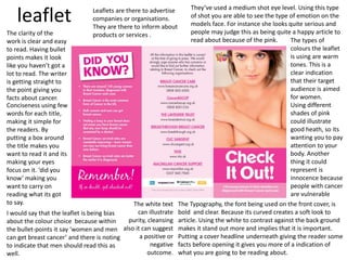
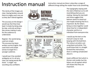
Factual writing
Beth Geldard
leaflet Leaflets are there to advertise
companies or organisations.
They are there to inform about
products or services .
The types of
colours the leaflet
is using are warm
tones. This is a
clear indication
that their target
audience is aimed
for women.
Using different
shades of pink
could illustrate
good heath, so its
wanting you to pay
attention to your
body. Another
thing it could
represent is
innocence because
people with cancer
are vulnerable
They’ve used a medium shot eye level. Using this type
of shot you are able to see the type of emotion on the
models face. For instance she looks quite serious and
people may judge this as being quite a happy article to
read about because of the pink.
The Typography, the font being used on the front cover, is
bold and clear. Because its curved creates a soft look to
article. Using the white to contrast against the back ground
makes it stand out more and implies that it is important.
Putting a cover headline underneath giving the reader some
facts before opening it gives you more of a indication of
what you are going to be reading about.
The white text
can illustrate
purity, cleansing
also it can suggest
a positive or
negative
outcome.
The clarity of the
work is clear and easy
to read. Having bullet
points makes it look
like you haven’t got a
lot to read. The writer
is getting straight to
the point giving you
facts about cancer.
Conciseness using few
words for each title,
making it simple for
the readers. By
putting a box around
the title makes you
want to read it and its
making your eyes
focus on it. ‘did you
know’ making you
want to carry on
reading what its got
to say.
I would say that the leaflet is being bias
about the colour choice because within
the bullet-points it say ‘women and men
can get breast cancer’ and there is noting
to indicate that men should read this as
well.
Instruction manual Instruction manual are there is describe a range of
different things telling the reader how to do something.
The typography staying with
the style of Batman so its still
resembling what you are
making. Having the text bold
and sharp suggest that
batman wants to stand out
and maybe showing that he is
important. By the letters
being so close together could
show how he is independent
character and he is a
individual from everyone else.
I would say the text on the
manual is easy to read
keeping with the bold font.
The colours are plain, just
using black and white. This
could show that it is straight
forward the instructions,
there is nothing complicated
about it.
Used a different font which is
thinner and smaller but the
letters are all capitals which
still shows that they are
important.
The clarity of the images are
clear. Having borders around
them to singles each one out
so they don’t blend together.
The accuracy on the design I
would say that they have
kept it simple by doing step
by step. and only writing a
few senses making it easy
for the audience to
understand.
Register: the words being
used are simple
The accuracy has been
written correct English. But
used short and simple
senses to target for a
younger audience.
I would say it has avoided
ambiguity as it is all very
clear not saying words like ‘I
think’ ‘ it might’ not
sounding very confident.
How to guides
How to guides
give the reader
advice as well as
tips through a
variety of tasks.
The typography being used the font is simple. Using
white so it stands out from the back ground, but I feel
that it is still quite hard to read the text that is a lot
smaller. Using different sizes so you know what to
read first The diagrams show a
clear indications of
how to start and how
it looks at the end.
Conciseness: the writer
has used a lot of words
as It looks like the
poster is aimed for a
older audience.
Readers from the age
13- 30 so covering a
wide range of different
audience. Containing
humor to make the
reader carry on
reading. Using
rhetorical questions,
making the reader
think and engage in
what they are reading.
Talking about
different social
media, implies
that they know
their audience
It has avoiding ambiguity
giving clear steps on what
to do and getting straight
to point. Only giving small
paragraphs so doesn't’t
make the reader feel like
they have to read a lot.
Using speech
marks shows that
‘Duckface’ has
been used a lot
and there
audience will
understand what
the how to guide
is about. Also
using capital letter
will draw peoples
attentions to it
I wouldn't’t say
this work is bias
because It does
not favour one
thing then the
other.
Factual journalism
Typography of the
font is bold and
thick making it a
clear indication on
who the page is
going to be about.
By her covering
over parts of the
text suggest that it
isn't important
and also shows
how people will
know who is is by
just looking at her
face.
The typography has been displayed in
different fonts showing important parts
about the text and makes it stand out
more. Pulling out quotes or heading to the
paragraph you are about to read to make
you intrigued about what she is going to be
talking about in it
By displaying the text around her and
not in rows making it look like you are
not having to read as much.
By using the colour pink for the
back ground creating a girly theme
to attract a female audience to
read this. But it contrast with what
she is wearing.
the black and
white making it
look like she has
a wild side to her.
She is eye level
looking at the
camera which
making you feel
intimidated by her.
She isn't smiling
which makes her
look quite serious
which you could
question on what
you may be
reading about.

Factual writing

  • 1.
  • 2.
    leaflet Leaflets arethere to advertise companies or organisations. They are there to inform about products or services . The types of colours the leaflet is using are warm tones. This is a clear indication that their target audience is aimed for women. Using different shades of pink could illustrate good heath, so its wanting you to pay attention to your body. Another thing it could represent is innocence because people with cancer are vulnerable They’ve used a medium shot eye level. Using this type of shot you are able to see the type of emotion on the models face. For instance she looks quite serious and people may judge this as being quite a happy article to read about because of the pink. The Typography, the font being used on the front cover, is bold and clear. Because its curved creates a soft look to article. Using the white to contrast against the back ground makes it stand out more and implies that it is important. Putting a cover headline underneath giving the reader some facts before opening it gives you more of a indication of what you are going to be reading about. The white text can illustrate purity, cleansing also it can suggest a positive or negative outcome. The clarity of the work is clear and easy to read. Having bullet points makes it look like you haven’t got a lot to read. The writer is getting straight to the point giving you facts about cancer. Conciseness using few words for each title, making it simple for the readers. By putting a box around the title makes you want to read it and its making your eyes focus on it. ‘did you know’ making you want to carry on reading what its got to say. I would say that the leaflet is being bias about the colour choice because within the bullet-points it say ‘women and men can get breast cancer’ and there is noting to indicate that men should read this as well.
  • 3.
    Instruction manual Instructionmanual are there is describe a range of different things telling the reader how to do something. The typography staying with the style of Batman so its still resembling what you are making. Having the text bold and sharp suggest that batman wants to stand out and maybe showing that he is important. By the letters being so close together could show how he is independent character and he is a individual from everyone else. I would say the text on the manual is easy to read keeping with the bold font. The colours are plain, just using black and white. This could show that it is straight forward the instructions, there is nothing complicated about it. Used a different font which is thinner and smaller but the letters are all capitals which still shows that they are important. The clarity of the images are clear. Having borders around them to singles each one out so they don’t blend together. The accuracy on the design I would say that they have kept it simple by doing step by step. and only writing a few senses making it easy for the audience to understand. Register: the words being used are simple The accuracy has been written correct English. But used short and simple senses to target for a younger audience. I would say it has avoided ambiguity as it is all very clear not saying words like ‘I think’ ‘ it might’ not sounding very confident.
  • 4.
    How to guides Howto guides give the reader advice as well as tips through a variety of tasks. The typography being used the font is simple. Using white so it stands out from the back ground, but I feel that it is still quite hard to read the text that is a lot smaller. Using different sizes so you know what to read first The diagrams show a clear indications of how to start and how it looks at the end. Conciseness: the writer has used a lot of words as It looks like the poster is aimed for a older audience. Readers from the age 13- 30 so covering a wide range of different audience. Containing humor to make the reader carry on reading. Using rhetorical questions, making the reader think and engage in what they are reading. Talking about different social media, implies that they know their audience It has avoiding ambiguity giving clear steps on what to do and getting straight to point. Only giving small paragraphs so doesn't’t make the reader feel like they have to read a lot. Using speech marks shows that ‘Duckface’ has been used a lot and there audience will understand what the how to guide is about. Also using capital letter will draw peoples attentions to it I wouldn't’t say this work is bias because It does not favour one thing then the other.
  • 5.
    Factual journalism Typography ofthe font is bold and thick making it a clear indication on who the page is going to be about. By her covering over parts of the text suggest that it isn't important and also shows how people will know who is is by just looking at her face. The typography has been displayed in different fonts showing important parts about the text and makes it stand out more. Pulling out quotes or heading to the paragraph you are about to read to make you intrigued about what she is going to be talking about in it By displaying the text around her and not in rows making it look like you are not having to read as much. By using the colour pink for the back ground creating a girly theme to attract a female audience to read this. But it contrast with what she is wearing. the black and white making it look like she has a wild side to her. She is eye level looking at the camera which making you feel intimidated by her. She isn't smiling which makes her look quite serious which you could question on what you may be reading about.