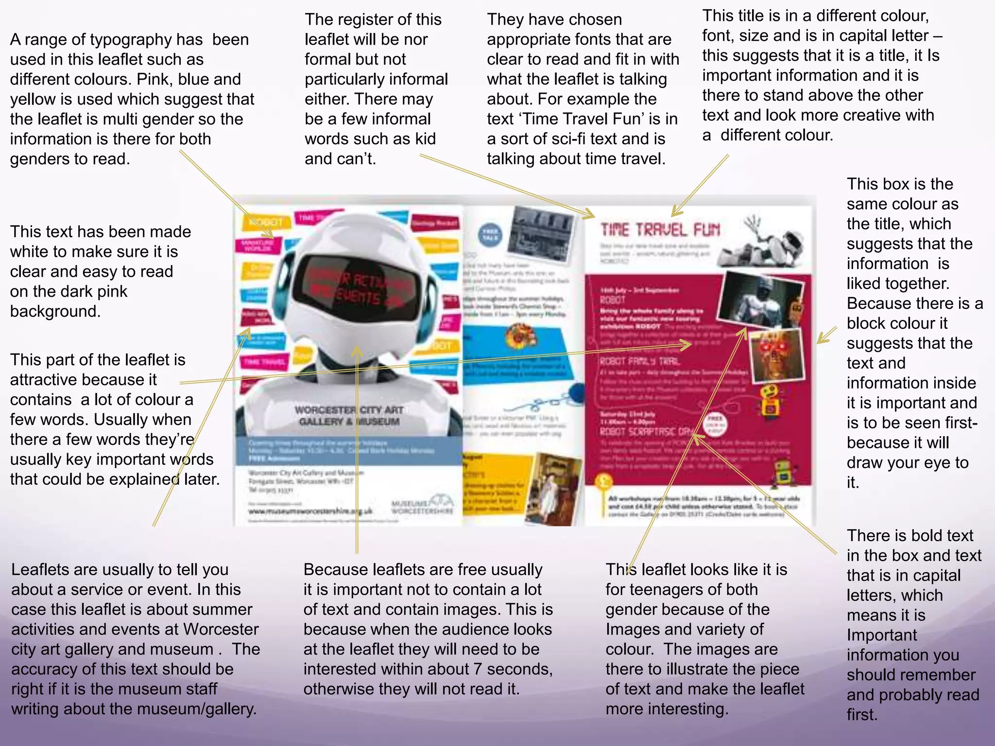
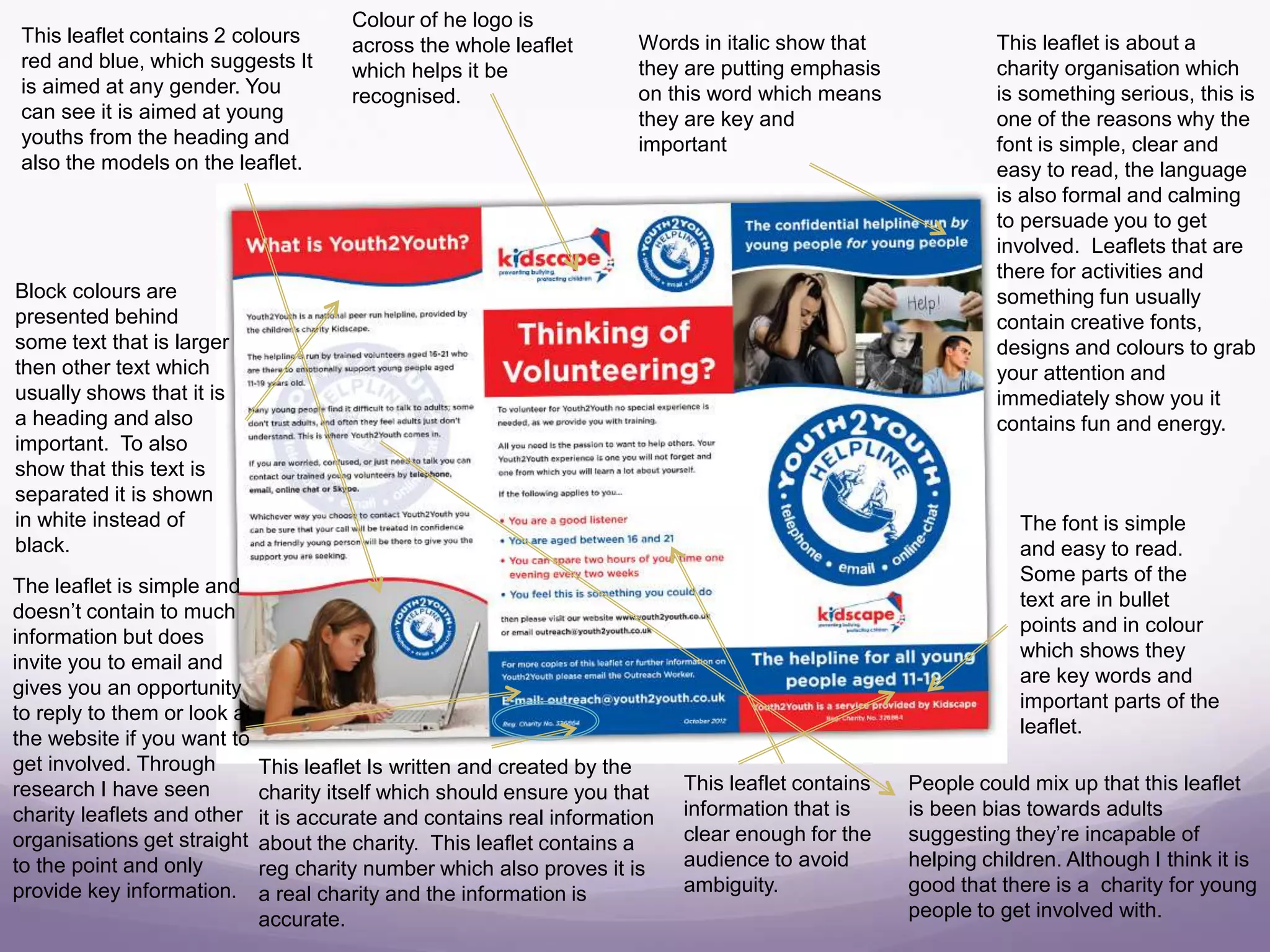
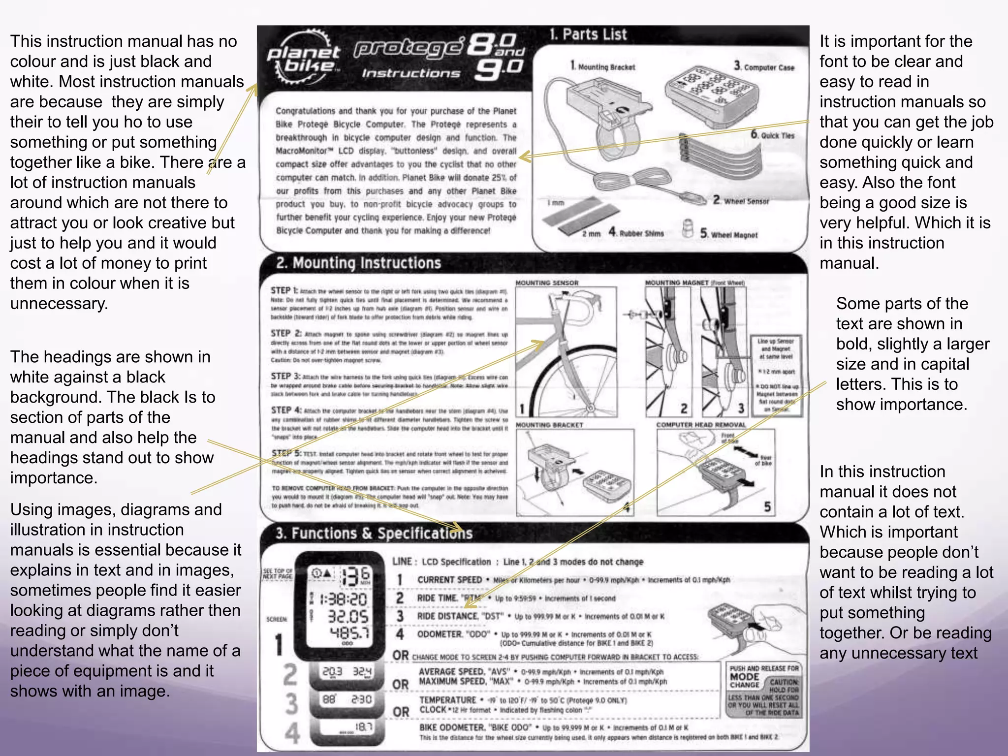
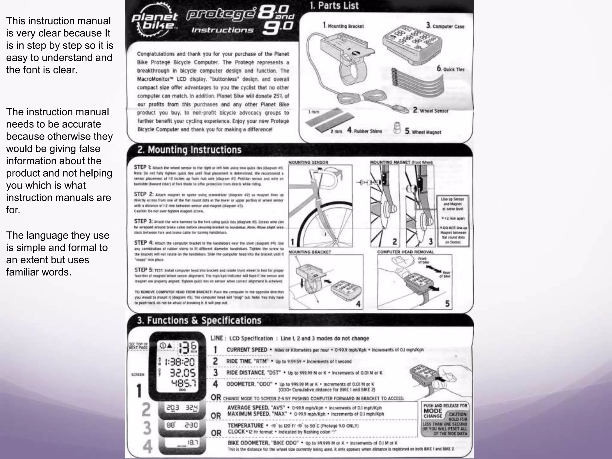
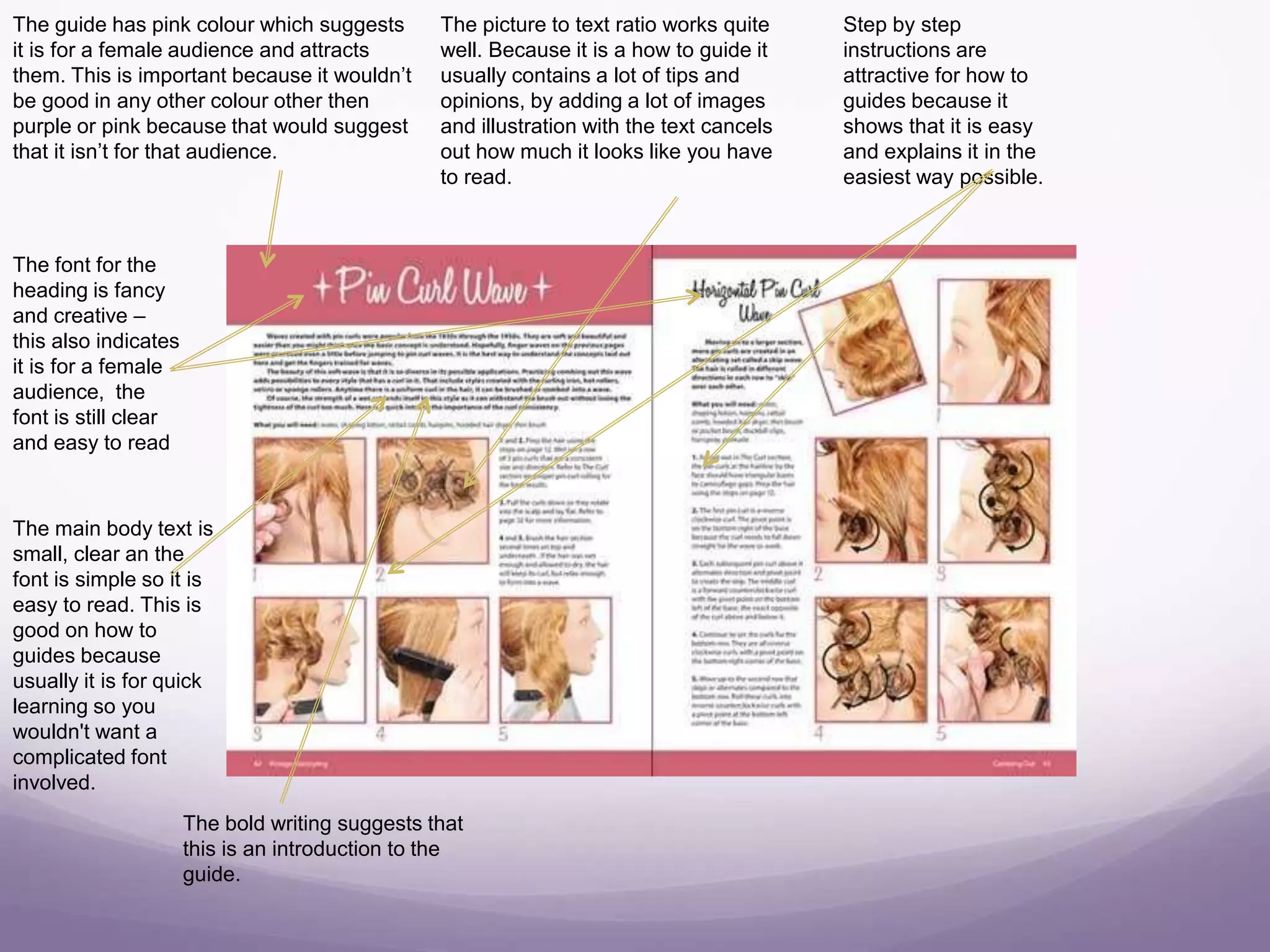
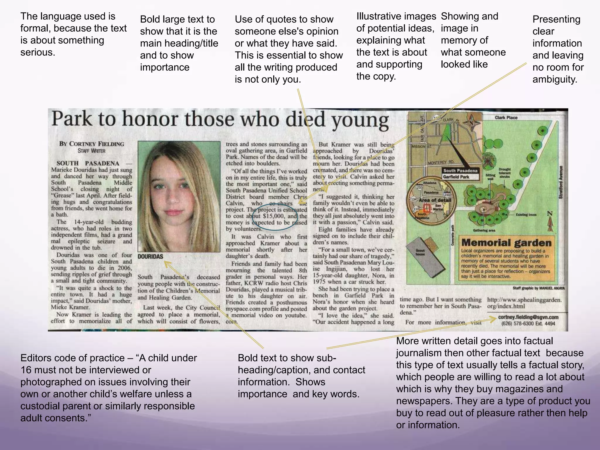
Factual Writing Copy
Abby Downing
A range of typography has been
used in this leaflet such as
different colours. Pink, blue and
yellow is used which suggest that
the leaflet is multi gender so the
information is there for both
genders to read.
This title is in a different colour,
font, size and is in capital letter –
this suggests that it is a title, it Is
important information and it is
there to stand above the other
text and look more creative with
a different colour.
This box is the
same colour as
the title, which
suggests that the
information is
liked together.
Because there is a
block colour it
suggests that the
text and
information inside
it is important and
is to be seen first-
because it will
draw your eye to
it.
There is bold text
in the box and text
that is in capital
letters, which
means it is
Important
information you
should remember
and probably read
first.
This leaflet looks like it is
for teenagers of both
gender because of the
Images and variety of
colour. The images are
there to illustrate the piece
of text and make the leaflet
more interesting.
Because leaflets are free usually
it is important not to contain a lot
of text and contain images. This is
because when the audience looks
at the leaflet they will need to be
interested within about 7 seconds,
otherwise they will not read it.
They have chosen
appropriate fonts that are
clear to read and fit in with
what the leaflet is talking
about. For example the
text ‘Time Travel Fun’ is in
a sort of sci-fi text and is
talking about time travel.
This text has been made
white to make sure it is
clear and easy to read
on the dark pink
background.
This part of the leaflet is
attractive because it
contains a lot of colour a
few words. Usually when
there a few words they’re
usually key important words
that could be explained later.
Leaflets are usually to tell you
about a service or event. In this
case this leaflet is about summer
activities and events at Worcester
city art gallery and museum . The
accuracy of this text should be
right if it is the museum staff
writing about the museum/gallery.
The register of this
leaflet will be nor
formal but not
particularly informal
either. There may
be a few informal
words such as kid
and can’t.
This leaflet contains 2 colours
red and blue, which suggests It
is aimed at any gender. You
can see it is aimed at young
youths from the heading and
also the models on the leaflet.
The font is simple
and easy to read.
Some parts of the
text are in bullet
points and in colour
which shows they
are key words and
important parts of the
leaflet.
Words in italic show that
they are putting emphasis
on this word which means
they are key and
important
Colour of he logo is
across the whole leaflet
which helps it be
recognised.
Block colours are
presented behind
some text that is larger
then other text which
usually shows that it is
a heading and also
important. To also
show that this text is
separated it is shown
in white instead of
black.
This leaflet is about a
charity organisation which
is something serious, this is
one of the reasons why the
font is simple, clear and
easy to read, the language
is also formal and calming
to persuade you to get
involved. Leaflets that are
there for activities and
something fun usually
contain creative fonts,
designs and colours to grab
your attention and
immediately show you it
contains fun and energy.
The leaflet is simple and
doesn’t contain to much
information but does
invite you to email and
gives you an opportunity
to reply to them or look at
the website if you want to
get involved. Through
research I have seen
charity leaflets and other
organisations get straight
to the point and only
provide key information.
This leaflet Is written and created by the
charity itself which should ensure you that
it is accurate and contains real information
about the charity. This leaflet contains a
reg charity number which also proves it is
a real charity and the information is
accurate.
This leaflet contains
information that is
clear enough for the
audience to avoid
ambiguity.
People could mix up that this leaflet
is been bias towards adults
suggesting they’re incapable of
helping children. Although I think it is
good that there is a charity for young
people to get involved with.
This instruction manual has no
colour and is just black and
white. Most instruction manuals
are because they are simply
their to tell you ho to use
something or put something
together like a bike. There are a
lot of instruction manuals
around which are not there to
attract you or look creative but
just to help you and it would
cost a lot of money to print
them in colour when it is
unnecessary.
It is important for the
font to be clear and
easy to read in
instruction manuals so
that you can get the job
done quickly or learn
something quick and
easy. Also the font
being a good size is
very helpful. Which it is
in this instruction
manual.
The headings are shown in
white against a black
background. The black Is to
section of parts of the
manual and also help the
headings stand out to show
importance.
Some parts of the
text are shown in
bold, slightly a larger
size and in capital
letters. This is to
show importance.
In this instruction
manual it does not
contain a lot of text.
Which is important
because people don’t
want to be reading a lot
of text whilst trying to
put something
together. Or be reading
any unnecessary text
Using images, diagrams and
illustration in instruction
manuals is essential because it
explains in text and in images,
sometimes people find it easier
looking at diagrams rather then
reading or simply don’t
understand what the name of a
piece of equipment is and it
shows with an image.
This instruction manual
is very clear because It
is in step by step so it is
easy to understand and
the font is clear.
The instruction manual
needs to be accurate
because otherwise they
would be giving false
information about the
product and not helping
you which is what
instruction manuals are
for.
The language they use
is simple and formal to
an extent but uses
familiar words.
The guide has pink colour which suggests
it is for a female audience and attracts
them. This is important because it wouldn’t
be good in any other colour other then
purple or pink because that would suggest
that it isn’t for that audience.
The font for the
heading is fancy
and creative –
this also indicates
it is for a female
audience, the
font is still clear
and easy to read
The picture to text ratio works quite
well. Because it is a how to guide it
usually contains a lot of tips and
opinions, by adding a lot of images
and illustration with the text cancels
out how much it looks like you have
to read.
Step by step
instructions are
attractive for how to
guides because it
shows that it is easy
and explains it in the
easiest way possible.
The main body text is
small, clear an the
font is simple so it is
easy to read. This is
good on how to
guides because
usually it is for quick
learning so you
wouldn't want a
complicated font
involved.
The bold writing suggests that
this is an introduction to the
guide.
There is some colour In
this guide which is
multi gender so this
suggests its for both
genders. Although, it
contains a lot of red
which I do not think is
very good because it
connotes anger rather
then help and tips.
Green, yellow or blue
would be better.
They have used quotes for advice on
a Smartphone to suggest that the
advice is from more then one
person.
The pictures aren’t
particularly helpful but are
there to make the guide more
interesting, creative and to
grab your attention.
The large font with capital letters
is to show importance.
The font and text is really
clear and easy to read. It
is clearly sectioned of into
3 parts.
There isn’t a lot of text
which is good for a how
to guide because it
only gives you simple
worded tips.
A how to guide could be
Inaccurate to some people
because they’re usually
either peoples opinions or
own thoughts. For
example people may like
smart phones better then
androids and believe
they're better. Which could
include a 2 side argument.
This how to guide is
not bias and simply
gives advice. They
have avoided it well
because it could of
included advice giving
favour more towards
one type of phone.
The language used is
formal in some places
uses clever words
rather then simple
boring words such as
‘identify’.
They haven't advertised a particular
Smartphone which is good because
they're not entitled to (ASA)
Bold large text to
show that it is the
main heading/title
and to show
importance
Showing and
image in
memory of
what someone
looked like
Illustrative images
of potential ideas,
explaining what
the text is about
and supporting
the copy.
Editors code of practice – “A child under
16 must not be interviewed or
photographed on issues involving their
own or another child’s welfare unless a
custodial parent or similarly responsible
adult consents.”
Use of quotes to show
someone else's opinion
or what they have said.
This is essential to show
all the writing produced
is not only you.
Bold text to show sub-
heading/caption, and contact
information. Shows
importance and key words.
More written detail goes into factual
journalism then other factual text because
this type of text usually tells a factual story,
which people are willing to read a lot about
which is why they buy magazines and
newspapers. They are a type of product you
buy to read out of pleasure rather then help
or information.
Presenting
clear
information
and leaving
no room for
ambiguity.
The language used is
formal, because the text
is about something
serious.

Factual writing copy

  • 1.
  • 2.
    A range oftypography has been used in this leaflet such as different colours. Pink, blue and yellow is used which suggest that the leaflet is multi gender so the information is there for both genders to read. This title is in a different colour, font, size and is in capital letter – this suggests that it is a title, it Is important information and it is there to stand above the other text and look more creative with a different colour. This box is the same colour as the title, which suggests that the information is liked together. Because there is a block colour it suggests that the text and information inside it is important and is to be seen first- because it will draw your eye to it. There is bold text in the box and text that is in capital letters, which means it is Important information you should remember and probably read first. This leaflet looks like it is for teenagers of both gender because of the Images and variety of colour. The images are there to illustrate the piece of text and make the leaflet more interesting. Because leaflets are free usually it is important not to contain a lot of text and contain images. This is because when the audience looks at the leaflet they will need to be interested within about 7 seconds, otherwise they will not read it. They have chosen appropriate fonts that are clear to read and fit in with what the leaflet is talking about. For example the text ‘Time Travel Fun’ is in a sort of sci-fi text and is talking about time travel. This text has been made white to make sure it is clear and easy to read on the dark pink background. This part of the leaflet is attractive because it contains a lot of colour a few words. Usually when there a few words they’re usually key important words that could be explained later. Leaflets are usually to tell you about a service or event. In this case this leaflet is about summer activities and events at Worcester city art gallery and museum . The accuracy of this text should be right if it is the museum staff writing about the museum/gallery. The register of this leaflet will be nor formal but not particularly informal either. There may be a few informal words such as kid and can’t.
  • 3.
    This leaflet contains2 colours red and blue, which suggests It is aimed at any gender. You can see it is aimed at young youths from the heading and also the models on the leaflet. The font is simple and easy to read. Some parts of the text are in bullet points and in colour which shows they are key words and important parts of the leaflet. Words in italic show that they are putting emphasis on this word which means they are key and important Colour of he logo is across the whole leaflet which helps it be recognised. Block colours are presented behind some text that is larger then other text which usually shows that it is a heading and also important. To also show that this text is separated it is shown in white instead of black. This leaflet is about a charity organisation which is something serious, this is one of the reasons why the font is simple, clear and easy to read, the language is also formal and calming to persuade you to get involved. Leaflets that are there for activities and something fun usually contain creative fonts, designs and colours to grab your attention and immediately show you it contains fun and energy. The leaflet is simple and doesn’t contain to much information but does invite you to email and gives you an opportunity to reply to them or look at the website if you want to get involved. Through research I have seen charity leaflets and other organisations get straight to the point and only provide key information. This leaflet Is written and created by the charity itself which should ensure you that it is accurate and contains real information about the charity. This leaflet contains a reg charity number which also proves it is a real charity and the information is accurate. This leaflet contains information that is clear enough for the audience to avoid ambiguity. People could mix up that this leaflet is been bias towards adults suggesting they’re incapable of helping children. Although I think it is good that there is a charity for young people to get involved with.
  • 4.
    This instruction manualhas no colour and is just black and white. Most instruction manuals are because they are simply their to tell you ho to use something or put something together like a bike. There are a lot of instruction manuals around which are not there to attract you or look creative but just to help you and it would cost a lot of money to print them in colour when it is unnecessary. It is important for the font to be clear and easy to read in instruction manuals so that you can get the job done quickly or learn something quick and easy. Also the font being a good size is very helpful. Which it is in this instruction manual. The headings are shown in white against a black background. The black Is to section of parts of the manual and also help the headings stand out to show importance. Some parts of the text are shown in bold, slightly a larger size and in capital letters. This is to show importance. In this instruction manual it does not contain a lot of text. Which is important because people don’t want to be reading a lot of text whilst trying to put something together. Or be reading any unnecessary text Using images, diagrams and illustration in instruction manuals is essential because it explains in text and in images, sometimes people find it easier looking at diagrams rather then reading or simply don’t understand what the name of a piece of equipment is and it shows with an image.
  • 5.
    This instruction manual isvery clear because It is in step by step so it is easy to understand and the font is clear. The instruction manual needs to be accurate because otherwise they would be giving false information about the product and not helping you which is what instruction manuals are for. The language they use is simple and formal to an extent but uses familiar words.
  • 6.
    The guide haspink colour which suggests it is for a female audience and attracts them. This is important because it wouldn’t be good in any other colour other then purple or pink because that would suggest that it isn’t for that audience. The font for the heading is fancy and creative – this also indicates it is for a female audience, the font is still clear and easy to read The picture to text ratio works quite well. Because it is a how to guide it usually contains a lot of tips and opinions, by adding a lot of images and illustration with the text cancels out how much it looks like you have to read. Step by step instructions are attractive for how to guides because it shows that it is easy and explains it in the easiest way possible. The main body text is small, clear an the font is simple so it is easy to read. This is good on how to guides because usually it is for quick learning so you wouldn't want a complicated font involved. The bold writing suggests that this is an introduction to the guide.
  • 7.
    There is somecolour In this guide which is multi gender so this suggests its for both genders. Although, it contains a lot of red which I do not think is very good because it connotes anger rather then help and tips. Green, yellow or blue would be better. They have used quotes for advice on a Smartphone to suggest that the advice is from more then one person. The pictures aren’t particularly helpful but are there to make the guide more interesting, creative and to grab your attention. The large font with capital letters is to show importance. The font and text is really clear and easy to read. It is clearly sectioned of into 3 parts. There isn’t a lot of text which is good for a how to guide because it only gives you simple worded tips. A how to guide could be Inaccurate to some people because they’re usually either peoples opinions or own thoughts. For example people may like smart phones better then androids and believe they're better. Which could include a 2 side argument. This how to guide is not bias and simply gives advice. They have avoided it well because it could of included advice giving favour more towards one type of phone. The language used is formal in some places uses clever words rather then simple boring words such as ‘identify’. They haven't advertised a particular Smartphone which is good because they're not entitled to (ASA)
  • 8.
    Bold large textto show that it is the main heading/title and to show importance Showing and image in memory of what someone looked like Illustrative images of potential ideas, explaining what the text is about and supporting the copy. Editors code of practice – “A child under 16 must not be interviewed or photographed on issues involving their own or another child’s welfare unless a custodial parent or similarly responsible adult consents.” Use of quotes to show someone else's opinion or what they have said. This is essential to show all the writing produced is not only you. Bold text to show sub- heading/caption, and contact information. Shows importance and key words. More written detail goes into factual journalism then other factual text because this type of text usually tells a factual story, which people are willing to read a lot about which is why they buy magazines and newspapers. They are a type of product you buy to read out of pleasure rather then help or information. Presenting clear information and leaving no room for ambiguity. The language used is formal, because the text is about something serious.