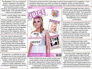
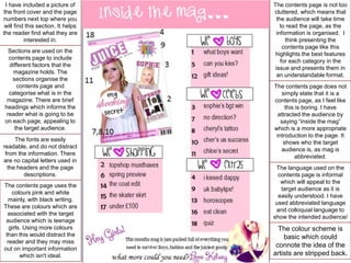
The Masthead: This is an important
factor in drawing in the readers
attention. We have made this bold
and colourful so that it is eye
catching, and positioned it so that it is
easily visible, in the standard top-left
hand corner placement.

The banner at the top of the cover page is used to draw people into the magazine. I have
decided to advertise a quiz which is inside my magazine, which connotes that the
magazine is full of activities and also a true story, which will interest and grip the readers.

Colloquial language has been used on
the front cover, where I have abbreviated
Britain's got talent to BGT. The use of this
language attracts readers into picking up
the magazine, as it is the kind of
language they use in everyday
conversation.

A short, concise slogan that catches
the readers attention
The main image is used to catch the
readers attention and features a well
known celebrity, covered by a brief
introduction to the story. The celebrity
fits in with the genre of the magazine.
The main image also dominates a
large area of the magazine, which in
my magazine is on the left hand side.

Cover lines are essential when making a
magazine, as you do not want to miss
potential readers by not advertising what
else the magazine has to offer other than
the main story. I have used this when
creating my magazine, and kept the
stories short and simple so they are eye
catching and do not take away from the
main focus of the cover page.

The main colours used are pink
purple and white, and by using these
throughout the magazine it gives a
more structured approach. It also
means that they are of stereotypical
colours, therefore another hint at the
target audience. The use of 3 colours
means the reader will not be
distracted.
An exclusive is a definite for a pop
magazine due to there being quite a
few around, you need to sell it to your
readers, and a way to do this is to
include exclusive information or
images on certain celebrities, which
the readers will trust they will not find
elsewhere.

There is no background colour used,
which helps to make the celebrity image
stand out further. It also means that
everything on the page is readable, and
is not wasted by being took away from by
the background.

I have included the issue number and the cost
at the bottom, small, but will be identifiable to
the reader, helping them to keep track of issues
and show them the price of the magazine which
is affordable. The barcode is placed
appropriately, big enough to be scanned.

The footer of the magazine simply lists
other celebrities and artists that will
feature of the magazine. Using the word
PLUS, makes it feel like the magazine is
going to be jam packed full of extra’s,
again drawing in the target audience and
ensuring something will interest them as
they are bound to like one of the celebs.
I have included a picture of
the front cover and the page
numbers next top where you
will find this section. It helps
the reader find what they are
interested in.
Sections are used on the
contents page to include
different factors that the
magazine holds. The
sections organise the
contents page and
categorise what is in the
magazine. There are brief
headings which informs the
reader what is going to be
on each page, appealing to
the target audience.
The fonts are easily
readable, and do not distract
from the information. There
are no capital letters used in
the headers and the page
descriptions.
The contents page uses the
colours pink and white
mainly, with black writing.
These are colours which are
associated with the target
audience which is teenage
girls. Using more colours
than this would distract the
reader and they may miss
out on important information
which isn't ideal.

The contents page is not too
cluttered, which means that
the audience will take time
to read the page, as the
information is organised. I
think presenting the
contents page like this
highlights the best features
for each category in the
issue and presents them in
an understandable format.
The contents page does not
simply state that it is a
contents page, as I feel like
this is boring. I have
attracted the audience by
saying “inside the mag”
which is a more appropriate
introduction to the page. It
shows who the target
audience is, as mag is
abbreviated.
The language used on the
contents page is informal
which will appeal to the
target audience as it is
easily understood. I have
used abbreviated language
and colloquial language to
show the intended audience/

The colour scheme is
basic which could
connote the idea of the
artists are stripped back.
I have included the logo from the front cover
which shows consistency, as it is in the same
position and stands out to the audience. It
also helps to show the audience that this
article is going to be jam packed full of juicy
gossip, which will attract the audience.

The celebrity image takes up the majority of the focus. The model
has direct eye contact with the camera, which addresses the
reader and makes them feel involved. There are three smaller
images, each in a polaroid frame, where the model is again
looking at the camera, this shows that the model is exposed in the
interview.

The artist featured, despite being of young
age is wearing clothes that could be
admired by the audience. Slogan t-shirts
are in fashion, and this is what the model
is wearing. Girls in the target audience
could see the model as style inspiration.

I have decided to use
the word exclusive as
this will entice the
reader into looking at
the article, as they will
believe that they are
receiving a story that
they won’t elsewhere,
therefore trusting in the
magazine that the
story is trustworthy and
100% accurate.
I’ve used an interesting
pull quote that will
attract the readers
attention and hopefully
make them want to
read the entire article. I
have used a black
background to make
this stand out and the
use of the white and
pink font shows
consistency.
The double page spread sticks to three main colours for
the colour scheme, and this is pink, white and black. This
shows the house style throughout the magazine, and is
an effective way of drawing in the audiences attention
right from the beginning.

I have used an interview style for the article, as I think this works best and
fits with the “exclusive” as you are receiving conversation straight from the
featured celebrity, which makes it more accurate and honest. The use of
the interview makes it easier to know more about the chosen celebrity, as
there are questions asked which give you an insight to their life.

By the large
dominating image, it
splits up the text and
the images, so that
there is a balance.
This is appealing to
the target audience
because they do not
like heavily dominated
text pages, and
therefore they will be
more likely to read the
interview if there is a
page of images next
to it. As the article is
made to be
exclusive, the use of
text in the top third
with the different fonts
creates a good effect
as it again, takes
away from the large
body of text and is
eye catching to the
reader.
The page numbers
are easily visible
which is helpful to the
reader, as they can
find the page easily.

Evaluation 5 Media.

  • 1.
    The Masthead: Thisis an important factor in drawing in the readers attention. We have made this bold and colourful so that it is eye catching, and positioned it so that it is easily visible, in the standard top-left hand corner placement. The banner at the top of the cover page is used to draw people into the magazine. I have decided to advertise a quiz which is inside my magazine, which connotes that the magazine is full of activities and also a true story, which will interest and grip the readers. Colloquial language has been used on the front cover, where I have abbreviated Britain's got talent to BGT. The use of this language attracts readers into picking up the magazine, as it is the kind of language they use in everyday conversation. A short, concise slogan that catches the readers attention The main image is used to catch the readers attention and features a well known celebrity, covered by a brief introduction to the story. The celebrity fits in with the genre of the magazine. The main image also dominates a large area of the magazine, which in my magazine is on the left hand side. Cover lines are essential when making a magazine, as you do not want to miss potential readers by not advertising what else the magazine has to offer other than the main story. I have used this when creating my magazine, and kept the stories short and simple so they are eye catching and do not take away from the main focus of the cover page. The main colours used are pink purple and white, and by using these throughout the magazine it gives a more structured approach. It also means that they are of stereotypical colours, therefore another hint at the target audience. The use of 3 colours means the reader will not be distracted. An exclusive is a definite for a pop magazine due to there being quite a few around, you need to sell it to your readers, and a way to do this is to include exclusive information or images on certain celebrities, which the readers will trust they will not find elsewhere. There is no background colour used, which helps to make the celebrity image stand out further. It also means that everything on the page is readable, and is not wasted by being took away from by the background. I have included the issue number and the cost at the bottom, small, but will be identifiable to the reader, helping them to keep track of issues and show them the price of the magazine which is affordable. The barcode is placed appropriately, big enough to be scanned. The footer of the magazine simply lists other celebrities and artists that will feature of the magazine. Using the word PLUS, makes it feel like the magazine is going to be jam packed full of extra’s, again drawing in the target audience and ensuring something will interest them as they are bound to like one of the celebs.
  • 2.
    I have includeda picture of the front cover and the page numbers next top where you will find this section. It helps the reader find what they are interested in. Sections are used on the contents page to include different factors that the magazine holds. The sections organise the contents page and categorise what is in the magazine. There are brief headings which informs the reader what is going to be on each page, appealing to the target audience. The fonts are easily readable, and do not distract from the information. There are no capital letters used in the headers and the page descriptions. The contents page uses the colours pink and white mainly, with black writing. These are colours which are associated with the target audience which is teenage girls. Using more colours than this would distract the reader and they may miss out on important information which isn't ideal. The contents page is not too cluttered, which means that the audience will take time to read the page, as the information is organised. I think presenting the contents page like this highlights the best features for each category in the issue and presents them in an understandable format. The contents page does not simply state that it is a contents page, as I feel like this is boring. I have attracted the audience by saying “inside the mag” which is a more appropriate introduction to the page. It shows who the target audience is, as mag is abbreviated. The language used on the contents page is informal which will appeal to the target audience as it is easily understood. I have used abbreviated language and colloquial language to show the intended audience/ The colour scheme is basic which could connote the idea of the artists are stripped back.
  • 3.
    I have includedthe logo from the front cover which shows consistency, as it is in the same position and stands out to the audience. It also helps to show the audience that this article is going to be jam packed full of juicy gossip, which will attract the audience. The celebrity image takes up the majority of the focus. The model has direct eye contact with the camera, which addresses the reader and makes them feel involved. There are three smaller images, each in a polaroid frame, where the model is again looking at the camera, this shows that the model is exposed in the interview. The artist featured, despite being of young age is wearing clothes that could be admired by the audience. Slogan t-shirts are in fashion, and this is what the model is wearing. Girls in the target audience could see the model as style inspiration. I have decided to use the word exclusive as this will entice the reader into looking at the article, as they will believe that they are receiving a story that they won’t elsewhere, therefore trusting in the magazine that the story is trustworthy and 100% accurate. I’ve used an interesting pull quote that will attract the readers attention and hopefully make them want to read the entire article. I have used a black background to make this stand out and the use of the white and pink font shows consistency. The double page spread sticks to three main colours for the colour scheme, and this is pink, white and black. This shows the house style throughout the magazine, and is an effective way of drawing in the audiences attention right from the beginning. I have used an interview style for the article, as I think this works best and fits with the “exclusive” as you are receiving conversation straight from the featured celebrity, which makes it more accurate and honest. The use of the interview makes it easier to know more about the chosen celebrity, as there are questions asked which give you an insight to their life. By the large dominating image, it splits up the text and the images, so that there is a balance. This is appealing to the target audience because they do not like heavily dominated text pages, and therefore they will be more likely to read the interview if there is a page of images next to it. As the article is made to be exclusive, the use of text in the top third with the different fonts creates a good effect as it again, takes away from the large body of text and is eye catching to the reader. The page numbers are easily visible which is helpful to the reader, as they can find the page easily.