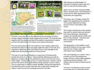
The document discusses different types of leaflets and instruction manuals. It provides examples and analyses of a health information leaflet, a conservation group leaflet, and an instruction manual for assembling a product. The analyses examine typography, formatting, use of images and other design elements. The document emphasizes that instruction manuals and leaflets must be clear, concise, accurate and easy to understand in order to effectively communicate information to target audiences.
This document analyzes the key features of effective factual writing through examining examples of an NHS health check leaflet, product instruction manual, and DIY/how-to guide. It discusses elements like conciseness, clarity, accuracy, avoidance of ambiguity, bias, register, referencing sources, legal considerations, and typography. Overall, the document emphasizes that factual writing must provide essential information in a clear, unambiguous way while avoiding bias and ensuring accuracy of content.
This document summarizes and analyzes several types of informational documents, including a leaflet on alcohol awareness, an instruction manual for a DSLR camera, a how-to guide for painting a pole, and a piece of factual journalism about the Hillsborough disaster inquests. For each document type, it discusses the accuracy, clarity, conciseness, register/tone, illustrations, colors, fonts, and other design elements, assessing how well each document achieves its informational goals.
This newspaper article from The Sun reports on an alleged attack on a former model, Alicia Douvall, by her ex-boyfriend. The headline uses attention-grabbing language to summarize that the ex-boyfriend "battered" Douvall as she drove her car. The article includes a large photo of Douvall with bruises on her face and quotes from her describing the attack. While only telling the story from Douvall's perspective, the article cites her as the source of information and avoids naming the ex-boyfriend since he has only been arrested, not charged, to prevent legal issues like libel.
This document discusses a report submitted on business communication within an organization. The report examines issues related to business communication faced within organizations and employee views on communication. The report includes an introduction on business communication, objectives of the study, methodology, literature review on the topic, analysis of a questionnaire distributed to employees, and conclusions. The methodology section describes collecting primary data through a questionnaire distributed to Tata Consultancy Services employees on topics like business meetings, cross-cultural communication, and interpersonal communication. The literature review briefly summarizes 10 research papers on business communication.
The document presents a group project for a Communication for Business course. The group has 12 members from the Department of Business Administration at Noakhali Science and Technology University. The project covers various topics related to business communication including the basics of effective communication, methods of communication, communication barriers and overcoming culture differences in communication. It discusses communication channels, both oral and written, as well as internal and external communication methods used in businesses.
This document provides initial ideas and development work for the design of an advertising campaign for an energy drink. It includes 5 potential product name ideas and discusses themes, target demographics, and design concepts. Concept development work includes mind maps, copywriting, potential slogans, and storyboard ideas. One idea—"qWake Up"—is developed in more depth, with concepts for the can design explored through multiple iterations refining colors, fonts, and imagery. A flat plan outlines how information would be arranged on the can. The goal is to appeal to a young male demographic interested in extreme sports through provocative advertising implying negative consequences for not using the product.
This document provides details of logo and merchandise designs created for an organization called Surfers Against Sewage.
The logo was transformed from an initial idea of an eye and wave to represent looking after the oceans. There were multiple iterations before arriving at the final design. Merchandise ideas included stickers, badges, t-shirts, and hats featuring the logo to appeal to younger audiences. Mood boards and experiments with initial designs were presented to explore ideas for the different products before final production. The goal was to create low-cost, eye-catching merchandise that would promote the organization's message and goals.
This document provides initial ideas, mind maps, and design development for the packaging of an energy drink. Five initial drink name ideas are presented: qWake Up, Improvise, Limitless, Limbo, and Life Line. qWake Up is selected for further development. Mind maps explore the target demographic of young males interested in extreme sports and the theme of natural disasters. Slogans, scripts, and branding elements like fonts, colors, and imagery are developed with the goal of appealing to this target group through ideas of danger and energy boosts needed for sports. Multiple packaging design concepts are presented incorporating the drink name, fonts, and images meant to imply risk and reward through the product.
This document discusses an experimental photography project exploring the themes of nature and fear. The student began by creating multiple exposure images merging faces into tree bark. They then experimented with 3D effects in Photoshop, creating images that incorporate human body parts like hands into natural landscapes in surreal ways. The student feels they have found clear themes and ideas to develop, and will now focus on taking more relevant photos and improving technical quality as they work to produce a set of high-quality art pieces meeting the project requirements.
Piers Morgan was fired as editor of the Daily Mirror after publishing photos of alleged British soldier abuse of Iraqi prisoners. An investigation found the photos were staged and put British troops in danger. Morgan refused to apologize and was let go from his position. His deputy Roger Goodman will replace him as editor in the short term.
The document discusses whether factual writing should contain bias. It argues that factual writing is meant to inform readers without opinion so they can form their own views based on facts. Bias undermines this goal by selectively presenting information that supports one side over others. Examples are given of media outlets like the BBC and The Independent omitting important details or angles in their coverage of events like the Scottish independence referendum and a terrorist attack in Jerusalem in ways that appeared to show bias. The document concludes that factual writing should not contain bias as the media's role is to fully and fairly inform the public without manipulation.
This document summarizes the logo design and merchandise planning process for Surfers Against Sewage. It describes:
1) The finalized logo design which was created through an iterative process of trials and feedback. The logo depicts an eye representing watching over the oceans.
2) Plans for merchandise including t-shirts, stickers, badges, and hats aimed at a young audience. Simplistic, colorful designs are proposed that prominently feature the logo.
3) Experiments with designing the merchandise through mood boards, exploring existing brands, and mockups on Redbubble. Variations of colors, styles and products are tested to engage different demographics.
The document provides guidelines for writers on their social and cultural responsibilities when reporting stories. It discusses the importance of being fair, unbiased, and respecting differences. It also outlines 12 rules from the National Union of Journalists' code of conduct that writers should follow, such as obtaining accurate information and avoiding intrusion into people's private lives. The rules aim to guide writers to consider topics like terrorism, race, and disability sensitively and avoid producing material that could incite discrimination or hatred.
Surfers Against Sewage is an environmental charity based in the UK that campaigns to protect oceans, beaches and freshwater waves from plastic pollution and other environmental issues. They organize beach cleans, protests, educational events and political lobbying to raise awareness of the problems caused by waste in the natural environment and push for changes to protect natural spaces for future generations to enjoy. Their goal is a clean, healthy and plastic-free ocean for marine life and coastal communities.
This document provides details of logo and merchandise designs created for Surfers Against Sewage, an organization aimed at protecting oceans. The logo was transformed from an initial eye and wave idea to represent watching over oceans. Multiple logo designs were created and colors from the planning stage were kept. Merchandise ideas include stickers, badges, t-shirts, and hats incorporating the logo to appeal to younger audiences. Mood boards were created to explore themes and products. Experiments were done designing logos for hats and t-shirts as well as sticker and badge concepts. Further t-shirt designs were explored using hands to represent waves and incorporating the hashtag.
Piers Morgan was fired as editor of the Daily Mirror after refusing to apologize for publishing fake photos that purported to show British soldiers abusing Iraqi prisoners. The photos caused distress and put British troops in danger by being published. An investigation proved the photos were staged. As a result, the Mirror believed it was inappropriate for Morgan to continue as editor given the sensitive situation.
This marketing plan aims to promote the new folk rock band Glendale and their debut album. The objectives are to develop the band's image and fan base, and sell 2000 albums in the first 2 months and 100,000 albums within two years. The target audience is 23-30 year olds who appreciate folk and rock music. The marketing strategy involves building awareness through radio play, print ads, social media, merchandise, and live performances and festivals. The motivation is to achieve success in the music industry despite the band members' inexperience and older target demographic.
This marketing plan aims to promote the new folk rock band Glendale and their debut album. The objectives are to develop the band's image and fan base, and sell 2000 albums in the first 2 months and 100,000 albums within two years. The target audience is 23-30 year olds who appreciate folk and rock music. The marketing strategy involves building awareness through radio, print media, social media, merchandise, and live performances and festivals to attract this audience and meet sales goals. Motivation comes from the band members' desire to succeed in music after previously working as farmers.
Piers Morgan has long been accused of involvement in phone hacking as the former editor of British tabloids Daily Mirror and News of the World. Multiple witnesses have testified that Morgan outlined phone hacking techniques and boasted of using them to source stories. While Morgan denies any involvement, evidence suggests widespread phone hacking occurred at the newspapers during his time as editor. The police investigations into Morgan have been ongoing for years, and more victims are continuing to come forward, yet he still maintains his innocence despite clear contradictions in his own accounts.
The document discusses the design elements of tabloid newspapers and magazines. It provides examples and screenshots of tabloid front pages from newspapers like The Sun and Daily Mail. It analyzes the use of fonts, images, headlines, layout and other stylistic choices. The document then explores creating a mock front page for a tabloid newspaper covering the topic of Piers Morgan being fired. It shares the planning and experimentation process, including possible headlines, images and font selections. Finally, it discusses how to adapt the design to a magazine format using examples from Time Magazine.
The document discusses numerous controversies and allegations of unethical behavior surrounding Piers Morgan. It alleges that Morgan has often escaped serious punishment for improper actions like using his media influence for financial gain in stock tips and phone hacking. The author is angered by Morgan repeatedly avoiding responsibility and questions why companies continue to employ someone with such a controversial history of running false stories and breaching codes of conduct. Specific cases discussed include a phone hacking incident, inappropriate headlines, profiting off stock tips, and Morgan's long-running feud with Jeremy Clarkson.
The document discusses whether factual writing should contain bias. It argues that factual writing is meant to inform readers without opinion so they can form their own views based on facts. Bias undermines this goal by selectively presenting information that supports one side over others. Examples are given of media outlets like the BBC and The Independent omitting important details or angles in their coverage of events like the Scottish independence referendum and a terrorist attack in Jerusalem in ways that appeared to show bias. The document concludes that factual writing should not contain bias as the media's role is to fully and fairly inform the public without manipulation.
Leaflets, instruction manuals, 'how to' guides, and magazines/newspapers all aim to inform readers through factual writing. However, their styles and purposes differ. Leaflets advertise brands and locations, using persuasive language. Instruction manuals provide step-by-step guidance through diagrams and text. 'How to' guides offer advice and tips through a mix of text and images. Magazine and newspaper articles entertain while informing on various topics, using facts and evidence to back opinions. All must be clearly written and structured to effectively achieve their goals.
This document analyzes design elements used in various informational posters and leaflets. Key elements discussed include using bold fonts and headings to draw attention, bullet points to break up text, consistent colors and formatting to appear professional, illustrations to clarify instructions, and concise language and factual information to engage readers and establish trust. These design choices aim to efficiently communicate important messages and ensure readers understand and retain the information provided.
This document provides guidance on designing effective posters, leaflets, and instructions. It recommends using techniques like question headings, concise text, bullet points, bold formatting, and clear illustrations to engage readers. Specific tips mentioned include using bold fonts and capital letters for important information, keeping colors simple and consistent, and including multiple languages for instructions. The goal is to clearly communicate messages while maintaining readers' interest through visually appealing and easy-to-understand design choices.
This how-to guide provides simple instructions for making paleo pancakes. The guide uses a muted color palette of greys and features images showing each step of the recipe alongside short, clear instructions in a simple font. The images and formatting help make the recipe easy to follow visually and through short, declarative sentences. The guide aims to provide accurate instructions for readers to interpret and follow as they wish to make the paleo pancakes.
Factual Writing of different media forms holly hudson
This leaflet from The Vegan Society aims to promote veganism through clear and concise messaging. It uses simple language and compelling images of animals to convey the key reasons for being vegan - compassion for animals, justice for people, and protecting the planet. The accuracy of the information can be relied on as it comes from a large, reputable organization. The leaflet's presentation with calming colors and striking visuals seeks to portray veganism positively.
This document contains summaries of various types of factual writing documents. It analyzes leaflets, instruction manuals, guides, and journalism articles on their design, formatting, language and content. Key elements summarized include the use of color, images and formatting to attract audiences and highlight important information. Accuracy and avoiding bias are also discussed as important for factual writing.
This document contains summaries of different types of factual writing:
- A how-to guide on photography is evaluated. It uses a semi-formal tone and clear typography but could be more concise. Photos with details support the text.
- A product manual for installing a baby seat is very formal and concise for safety. Illustrations paired with numbered steps leave no ambiguity.
- A newspaper article is shown to have a biased and ambiguous tone that questions its accuracy. It aims to rile readers rather than provide facts.
This document summarizes a how-to guide for making paleo pancakes. The guide uses simple images and minimal text written in an informal register. The color palette is muted greys and the images are emphasized with grey borders. Important text like the title and ingredients are written in a darker, capitalized grey to stand out. Overall, the guide has a simple, easy-to-follow design to clearly instruct readers on the paleo pancake recipe.
This document analyzes the factual writing style used in various documents, including a NHS information leaflet on OCD, instruction manuals, diagrams, and newspaper articles. Key aspects discussed include the use of clear and direct language, balanced perspectives from multiple sources, formal and objective tone, visual elements like diagrams and images to support the text, and protecting privacy through anonymizing or blurring details. Overall, the analysis examines techniques for presenting information factually, objectively and in an accessible manner for readers.
This document summarizes a factual news article. Key details include:
- The article uses different colors and monochrome text to grab readers' attention.
- Intriguing offers are placed in colored boxes at the bottom to entice readers to buy the paper.
- The main title uses an old-fashioned font to relate to the paper's founding in 1937.
- Bold formatting is used for section headings to draw the eye to new stories.
- Emotional headlines are designed to engage readers and make them want to read more.
The document summarizes different methods of presenting information, including leaflets, instruction manuals, "how to" guides, and factual journalism. For leaflets, it discusses font choice, background color, use of boxes and colors to draw attention to important sections. Instruction manuals use imagery, bolding of titles, and bullet points to break down steps. "How to" guides provide tips in addition to steps and use color and bolding. Factual journalism uses colored boxes and a bold font to advertise features and an old font to relate to the paper's history.
This document summarizes and analyzes several types of informational documents, including a leaflet on alcohol awareness, an instruction manual for a DSLR camera, a how-to guide for painting a pole, and a piece of factual journalism about the Hillsborough disaster inquests. For each document type, it discusses the accuracy, clarity, conciseness, register/tone, illustrations, colors, fonts, and other design elements, assessing how well each document achieves its informational goals.
The leaflet uses bold text and headings in bright colors like red to catch passengers' attention. Clear illustrations have also been included. Information is presented concisely in bullet points for easy reading. Legal and safety information is accurately provided to properly inform passengers of policies and procedures. Overall the leaflet effectively communicates important guidelines to passengers in a clear, concise, and legally compliant manner.
This leaflet uses simple colors and fonts to keep the design clean and professional. Key words are highlighted in bold to draw attention and emphasize their importance. Images of children are used to make the message more personal and help people relate to the cause. The clear facts and statements aim to avoid ambiguity and get the key points across effectively.
The instruction manual uses a simple step-by-step layout with clear illustrations and minimal text to guide the reader easily through the assembly process. Bold formatting is used to highlight important details like steps and product names. The clear, unambiguous style leaves no room for misinterpretation.
This how-to guide breaks information into colored sections for easy reading. Important tips are highlighted in bubbles
This factual journalism piece reports on the Hillsborough inquests with a high level of accuracy and clarity. It avoids ambiguity by directly quoting police officers and reports. The register is both formal in its description of legal proceedings and informal when quoting individuals. Accuracy is essential given the sensitivity of reporting on a tragedy where people lost their lives.
This document summarizes and analyzes different types of factual writing, including leaflets, instruction manuals, how-to guides, textbooks, and magazines. It discusses the purpose, language, design elements, potential biases, and legal considerations of each type. Overall, the document demonstrates how the format and style of factual writing must align with its intended audience and objective.
This leaflet uses different fonts and styles to target different audiences. A plain font is used for adults, while a bolder, fun font is used for children alongside illustrations. The leaflet is biased towards nature as it promotes the national trust and environmental protection. It has clear sections and organization to be easily understood by all audiences.
This leaflet uses different fonts and illustrations to target different audiences. A plain font is used for adults, while a bolder, fun font is used for children accompanied by illustrations. The leaflet is biased towards nature as it promotes the national trust. It has clear sections and formatting for easy reading.
This leaflet uses different fonts and illustrations to target different audiences. A plain font is used for adults, while a bolder, fun font is used for children accompanied by illustrations. The leaflet is biased towards nature as it promotes the national trust. It has clear sections and organization to be easily understood by various audiences.
The document contains research and planning for a graphic novel adaptation of Jack and the Beanstalk with a modern twist. It includes exploring layouts, fonts, and content from existing graphic novels for both children and adults. Draft scripts are presented with different dialogue options incorporating more modern language. The proposal outlines plans to create a 4-page graphic novel using photographs edited to look like comic book panels telling the story with humor, such as the giant having an afro. The target audience is identified as 10-15 year olds to make the classic tale appealing again through a twist while keeping the overall story. Schools are identified as a way to market the product to this age group.
The document contains research and planning for a graphic novel adaptation of Jack and the Beanstalk with a modern twist. It includes exploring layouts, fonts, and content from existing graphic novels for both children and adults. Draft script sections modernize the dialogue. The proposal outlines creating a 4-page graphic novel using photographs edited to look like comics. It will target an older audience of 10-15 year olds with humor like the giant having an afro and a guitar being stolen. The goal is to make the classic tale appealing again through a comedic twist.
Charlie, a 0-18 year old male from London, focuses on question 4 where he supports Piers Morgans claims that people who jump in front of trains are “Selfish”. He does not like Morgan but shares Piers Morgan’s opinion on gun crime. He believes that if some people give up guns and a large proportion keep them it does not improve the situation.
Piers Morgan has long been accused of involvement in phone hacking as the former editor of British tabloids Daily Mirror and News of the World. Multiple witnesses have testified that Morgan outlined phone hacking techniques and boasted of using them to source stories. While Morgan denies any involvement, evidence suggests widespread phone hacking occurred at the newspapers during his time as editor. The police investigations into Morgan have been ongoing for years, and more victims are continuing to come forward, yet he still maintains his innocence despite clear contradictions in his own accounts.
Piers Morgan has long been accused of involvement in phone hacking as the former editor of British tabloids Daily Mirror and News of the World. Multiple witnesses have testified that Morgan was aware of, and in some cases directly involved in, phone hacking practices during his time as editor. However, Morgan continues to deny any involvement and knowledge of phone hacking at the newspapers he edited, despite significant evidence to the contrary. The allegations against Morgan span decades and involve the hacking of numerous celebrities and victims of crime.
This document appears to be a resubmitted PowerPoint presentation titled "Social Action" created by Alan Smith. The presentation likely discusses topics related to social action or social issues. More context would be needed to provide a more detailed summary of the content or purpose of this resubmitted PowerPoint presentation.
Surfers Against Sewage is an environmental charity based in the United Kingdom that aims to protect oceans, waves, beaches and wildlife. The organization campaigns on issues like water quality, plastic pollution and the impacts of climate change. Surfers Against Sewage also works to bring environmental issues to public attention through education and engaging communities.
The document provides initial ideas and concepts for the design of an energy drink advertising campaign. The first idea, called qWake, uses an earthquake theme to convey that not purchasing the drink will result in a natural disaster. A mock-up design is created featuring a bike jumping over cracks in the ground. Additional ideas target health-conscious consumers with a drink called Improvise or athletes with Limitless. Mood boards and mind maps are used to explore themes, target audiences, and branding elements. Potential slogans, scripts, and product variations are proposed. Font and color scheme options are tested to match different ideas. The final design features layered earthquake imagery and the Richter scale to reinforce the theme while making the drink name stand out
The document provides initial ideas and concepts for the design of five different energy drink products.
Idea 1 is called "qWake" and uses the theme of an earthquake, featuring an image of a bike jumping over cracks in the ground. The target demographic is young male extreme sports enthusiasts.
Idea 2 is called "Improvise" and aims to provide a healthier alternative, targeting health-conscious consumers. The design would use green colors and natural symbols.
Idea 3 is called "Limitless" and targets top athletes, conveying unlimited energy. The design would use bright colors and feature images of athletes using the drink.
Idea 4 is called "Limbo" and targets dark music
The band Glendale is releasing their first album "Illusion is the first of all pleasures" and aims to target an audience aged 23-30 who appreciate folk and rock music. Objectives for the first year include developing the band's image and fan base through album promotion, concerts, and building a reputation. Merchandise like t-shirts and the use of radio, print media, and social media like Facebook and Twitter will be used to promote the band and drive album sales of 2,000 in two months and 40,000 in the first year. The key message is that Glendale produces meaningful music as down-to-earth former farmers who are still connected to their fans.
This document contains a SWOT analysis for a new MP3 player with Spotify integration. The strengths include having a unique product and knowledge of competitors. Weaknesses are a lack of funding and brand power compared to Apple. Opportunities include a growing market and room for expansion. Threats include strong competitors like Apple releasing new products and lack of resources to compete. The analysis examines internal factors like resources and external factors beyond their control like market trends.
Audi focuses its marketing on quality, performance, and luxury targeting middle to higher income individuals. Its advertisements emphasize the vehicle's technology and design without mentioning price. Ford historically focused on price but is shifting to also emphasize quality to appeal to more customers. Both supermarkets ASDA and Marks & Spencer's target different demographics - ASDA focuses solely on low prices to attract cost-conscious customers while Marks & Spencer's stresses quality even if it means higher prices to appeal to image-conscious consumers. Apple emphasizes innovation and quality over price in its marketing to cultivate an exclusive brand image and attract creative customers, unlike HTC which must compete on price due to reputation issues.
The document provides initial ideas and concepts for the design of five different energy drink products.
Idea 1 is called "qWake" and uses the theme of natural disasters like earthquakes. The target audience is young male extreme sports enthusiasts.
Idea 2 is called "Improvise" and aims to provide a healthier alternative energy drink targeting health-conscious consumers, especially young females.
Idea 3 is called "Limitless" and is designed for top athletes seeking endless energy. Its target audience includes both male and female youth sports players.
Idea 4 is called "Limbo" and targets dark music fans seen as aggressive and passionate. Its target audience includes males aged 18-30.
The document evaluates whether the final pieces created are fit for their intended purpose of promoting awareness of environmental issues for Surfers Against Sewage. It summarizes the design process for logos, merchandise like t-shirts and phone cases, and posters. Various designs were explored and refined before final versions were selected that were simple, visually appealing, and professionally represented the client's needs and target youth audience. Comparisons are made to existing client materials to ensure the new designs meet the required standard.
The document evaluates whether the final design pieces created to promote the environmental organization Surfers Against Sewage are fit for their intended purpose. It determines that the purpose of raising awareness of the organization's issues was achieved through the production of a range of fresh, eye-catching designs aimed at a young audience. An initial logo design with an eye in a jar was deemed too complex and not professional enough, so a simplified design with the eye and waves was created instead. Research into the client's existing products helped ensure the new designs would be suitable and approved.
Main Java[All of the Base Concepts}.docxadhitya5119
This is part 1 of my Java Learning Journey. This Contains Custom methods, classes, constructors, packages, multithreading , try- catch block, finally block and more.
Strategies for Effective Upskilling is a presentation by Chinwendu Peace in a Your Skill Boost Masterclass organisation by the Excellence Foundation for South Sudan on 08th and 09th June 2024 from 1 PM to 3 PM on each day.
How to Build a Module in Odoo 17 Using the Scaffold MethodCeline George
Odoo provides an option for creating a module by using a single line command. By using this command the user can make a whole structure of a module. It is very easy for a beginner to make a module. There is no need to make each file manually. This slide will show how to create a module using the scaffold method.
A workshop hosted by the South African Journal of Science aimed at postgraduate students and early career researchers with little or no experience in writing and publishing journal articles.
This presentation was provided by Steph Pollock of The American Psychological Association’s Journals Program, and Damita Snow, of The American Society of Civil Engineers (ASCE), for the initial session of NISO's 2024 Training Series "DEIA in the Scholarly Landscape." Session One: 'Setting Expectations: a DEIA Primer,' was held June 6, 2024.
Exploiting Artificial Intelligence for Empowering Researchers and Faculty, In...Dr. Vinod Kumar Kanvaria
Exploiting Artificial Intelligence for Empowering Researchers and Faculty,
International FDP on Fundamentals of Research in Social Sciences
at Integral University, Lucknow, 06.06.2024
By Dr. Vinod Kumar Kanvaria
LAND USE LAND COVER AND NDVI OF MIRZAPUR DISTRICT, UPRAHUL
This Dissertation explores the particular circumstances of Mirzapur, a region located in the
core of India. Mirzapur, with its varied terrains and abundant biodiversity, offers an optimal
environment for investigating the changes in vegetation cover dynamics. Our study utilizes
advanced technologies such as GIS (Geographic Information Systems) and Remote sensing to
analyze the transformations that have taken place over the course of a decade.
The complex relationship between human activities and the environment has been the focus
of extensive research and worry. As the global community grapples with swift urbanization,
population expansion, and economic progress, the effects on natural ecosystems are becoming
more evident. A crucial element of this impact is the alteration of vegetation cover, which plays a
significant role in maintaining the ecological equilibrium of our planet.Land serves as the foundation for all human activities and provides the necessary materials for
these activities. As the most crucial natural resource, its utilization by humans results in different
'Land uses,' which are determined by both human activities and the physical characteristics of the
land.
The utilization of land is impacted by human needs and environmental factors. In countries
like India, rapid population growth and the emphasis on extensive resource exploitation can lead
to significant land degradation, adversely affecting the region's land cover.
Therefore, human intervention has significantly influenced land use patterns over many
centuries, evolving its structure over time and space. In the present era, these changes have
accelerated due to factors such as agriculture and urbanization. Information regarding land use and
cover is essential for various planning and management tasks related to the Earth's surface,
providing crucial environmental data for scientific, resource management, policy purposes, and
diverse human activities.
Accurate understanding of land use and cover is imperative for the development planning
of any area. Consequently, a wide range of professionals, including earth system scientists, land
and water managers, and urban planners, are interested in obtaining data on land use and cover
changes, conversion trends, and other related patterns. The spatial dimensions of land use and
cover support policymakers and scientists in making well-informed decisions, as alterations in
these patterns indicate shifts in economic and social conditions. Monitoring such changes with the
help of Advanced technologies like Remote Sensing and Geographic Information Systems is
crucial for coordinated efforts across different administrative levels. Advanced technologies like
Remote Sensing and Geographic Information Systems
9
Changes in vegetation cover refer to variations in the distribution, composition, and overall
structure of plant communities across different temporal and spatial scales. These changes can
occur natural.
This slide is special for master students (MIBS & MIFB) in UUM. Also useful for readers who are interested in the topic of contemporary Islamic banking.
2. Leaflets
A leaflet is defined as a form of paper advertisement intended for wide distribution.
There are many uses, however some could be to provide a service to a business,
persuade or send a political or religious message.
The Oxford dictionary defines a leaflet as A printed sheet of paper containing
information or advertising and usually distributed free.
There is a huge variety of leaflets surrounding many topics, however they all have the
same intent. Leaflets are a way of informing people about the product or service they
have to offer.
Leaflets can be sectioned into two categories for their purpose, advertising a product
with the idea of getting sales. The other category is of informing the public about
important information.
There are many businesses and organisations that use leaflets and I will explore how
they choose their audience and how they aim to entice them by using effects such as
the typography.
Recipe, health, survey, reference, information, study, job, and promotion are different
types of leaflets that can be produced. All of these will differ from each other due to the
variety in audiences.
3. The title for the leaflet is kept in a
large text in order to distinguish the
importance. To keep to the house
style of the NHS, the blue and white is
retained in this leaflet.
In order to grab attention the title was
placed in a different position and
across vertically. The typography is
important in this piece of information
because the audience needs to see
and understand what is being brought
up.
The colour is one aspect that has
been looked into very well. The shade
of black on ‘fast’ contrasts with the
other soft cyan text. This is for the
reader to clearly see what the
outcome is and how quick you can
solve the issue.
The audience needs to be reassured
so using light colours is important,
however a dark piece of text is vital to
explain the results on the work.
‘Fast’ being in italics only helps bring
forward the idea that it is different and
intended to be so it can be
recognised.
The address and telephone number is
in a much larger size to the other text
to make it stand out and grab the
readers attention. Being in black gives
the reader the impression that it has
The leaflet is very clear and concise. There is a lot of information compared
to others on the market, however only the text that is important such as the
Pharmacies. To make the text easy to understand it was split up under bold
headings and of a different shade. The use of bold was good due to making
the information easy to digest.
In terms of effective communication and if the leaflet hits all the criteria I
would say that it is clear, concise, accurate (The pharmacies that are on the
left do support the idea and are participating in the scheme). The text is in a
very formal manner and because it is aimed towards an older audience that
will be reading the text.
The leaflet does not go into vast amount of detail in what is is there for
however as this will be located at places of health such as hospital or
doctors then the audience will be advised to see or be given this to deal
with their issue.
4. Images to support the text are important as they help enhance the idea
behind each point. For the Pharmacies the common logo as been
incorporated. That of the green logo. Using this will give the reader that
extra reassurance as they will recognise that image and know it is an
important and reliable source of imagery.
The second piece of imagery was the yellow circle with the phone in. This
helps go with the contact information above and brings the idea forward
that you need to call. Being yellow suggests that it is not dangerous or
difficult to deal with. When going with the soft colours used it shows that
help is there and you are in control.
The NHS logo found at the bottom right is important to this leaflet. This
straight away provides the audience with that knowledge that this
information will more than likely be important and all the facts and figures
it may include would be true.
The phrase ‘feel better’ is enlarged
because it needs to be very visible to
the audience. This is kept in the same
font and colour as the NHS house style
to make the audience feel more
confident in the leaflet and trust what
they are saying.
This is because the organisation has a
very high reputation across the country
and anything they say should be taken
seriously.
There is no room for ambiguity in the
work as everything is well set out and
has all the required information
explained in a manner that is clear yet
understandable.
The different fonts are used well
throughout the leaflet as not only do
they create a more visually pleasing
piece, but they help break down text for
the older generation that may be
reading.
The font changes in the main title to
show the importance of the heading,
however the colour remains in tact.
The idea that ‘contact your GP’ is
included only enhances that reliable
aspect. This is due to you already
having that trust.
The pieces of text in black is
information that is important and should
5. After looking at health leaflet it is
important to explore another type and
that of a natural informative piece.
Again, this is another important leaflet
that is not taking part in advertising for a
product but to raise awareness for the
cause they are supporting.
The heavy use of imagery makes the
leaflet very appealing to the audience.
This counter balances the heavy
amount of text in the bottom right
corner.
The images included are of the aspects
they want to remain intact and prevent
from being destroyed. Using these
images can instantly tell the reader who
this is aimed towards. Someone who
likes to preserve the natural
environment.
The typography on the leaflet is used
well when looking into the colour of the
text and how it helps make the
information more readable.
The main heading is in a white. This is
to stand out from the background
image. Having a white shade suggests
something soft and delicate. This
reflects upon the idea of preserving the
meadow.
The text in the Meadow history section
is accurate and in a informal manner.
The text is very clear due to the different fonts and shades of colour.
Having imagery helps the reader digest al the content. The blue text that
explains who the people are behind the leaflet is important as it stands
out from the black text on the history and contact information.
The use of the green text for the captions on the imagery helps bring
forwards that idea of nature and again splits the colour of the text up in
importance. Black being the information that is most valuable to the
leaflet and informing the audience of their service.
The map of Lower Burgh Meadow is a good way of showing what
exactly they have to conserve. Having website addresses as well as
telephone numbers allows the audience to reach out to this from much
wider angles. ‘Conservation group’ is in italics because it needs to stand
out from the name of the place without being reduced in size or colour.
This is a good way of making it easily readable. Having this separate to
the other text and on a bold, dark text over a light green background
makes it stand out and the message becomes very clear.
6. Instruction Manuals
Collins Dictionary states an instruction manual to be a booklet or book, usually
accompanying an appliance, device, computer game or vehicle, which contains
written guidelines informing how to use it
The free dictionary explains it to be a manual usually accompanying a technical
device and explaining how to install or operate it.
An ‘Owners Manual’ as it may also be called is found in so many products, cars also
being one of the most common. They contain many pieces such as safety, assemble
instructions, normal usage and troubleshooting.
All of the manuals are designed for a purpose and that of giving you information to a
product you have purchased. These usually have images to support the steps
explained. This is to make it easy to understand and follow.
Including safety instructions is important as the person using the product may not
understand what to use it for and could strike legal issues if not stated.
7. The colour is kept in black and white like the majority of
instruction manuals. This is to show the importance and
display as much text as possible.
Having sections In bold splits up the text to make it easier
to read and understand. Having each point under the
instructions in captain letters is showing its importance and
is making sure the reader looks at each one of them.
The main heading is still in a black shade, however is
enlarged and in a different font to all the other black text.
This is so you can see what the product is and who has
designed it.
The second largest font size is the instruction manual itself,
the text is going from largest being the most important. The
manual is in a different font again, this is to stand out and
make it readable so the audience understands what the text
is about.
Having diagrams of each stage gives the reader that better
understanding of how to build the product they purchased.
Using numbers next to each stage makes it even more
understandable for the audience. The writing is in less
formal manner as it is only advising you on the product you
have bought not a serious issue.
Legal constraints that could occur would be if the
instructions did not state safety warnings and what not to
use the product on, in this case it is found at the bottom of
the page.
Having the warnings in the manual make room for no
ambiguity and makes sure the product is fully covered.
Accuracy is important in relation to the product. If the
8. Instruction manuals come in many forms for different products, this is one for a cash register. Here you can see the
black and white is similar to the last and many more. The text for the work is very clear and easy to understand,
there may be a large amount of text however it is split up into sections that are good to follow.
The use of the boxes to split the text up is a good way of keeping the instructions neat and tidy. The images of each
section to the product is a good way to enhance a point made. Having it underneath the instruction makes it that
much more easier to understand.
Having grey boxes around each sub heading makes it stand out that much more. As the background to the manual
is white, the headings needed something to make them more readable.
The ‘getting started’ heading is in italics to separate it from the text about to follow and keep the readers attention.
Having the name of the brand on the manual is important and making it clear even more so, this is so the reader
knows it is for the product they purchased.
9. How to guides
How to guides are designed to give the reader step by step advice on a wide range of issues. These guides often
include special tips also.
There are many different types of ‘How to’ guides and created for many purposes. Individuals are the most common
creators rather than businesses or organisations.
It is clear from
this small
selection of
‘How to’ guides
that they can be
very formal and
serious and
target an older
market but can
also be very
simplistic and
aim towards a
young
audience.
It is entirely down to
the creator of the
guide.
This suggests that the target audience is
of a young age range. Whereas this is
seen as something designed for a much
older demographic.
The difference between the two is not
just the age range but that ‘New Charter
is in fact a business that is based
around guides such as this.
How to guides are designed to provide a source of information or alert you
to changes and even point out how to do something differently.
Many individuals produce guides that are not in a professional manner
and just strange. ‘How to survive a zombie attack’ is one of multiple how to
editions.
10. The colour used in this how to guide is of a
very bright nature. This is due to the
importance of the content.
The colours chosen were used well as the
green was kept to keep in the theme of
recycling in tact and the blue for ‘Right’ was
in a different shade to stand out and grab the
readers attention.
This implies that people have been seen to
recycle wrong and this is a how to guide on
making sure they understand, hence the
‘Reminder’.
The guide is very clear and concise. The text
that is used is all important and necessary to
get the point across, the use of images helps
get each point across.
Using the symbols of the tick and cross to
indicate what is right and what is wrong is a
good way to replace text and make it easier
to understand for the audience. Having
‘Recycle’ in bold makes it stand out from the
other text and is very clear to the reader
what the guide is about.
The use of capital letters are important here as it is telling the reader not to do something and this suggests it is very
important and should not be taken lightly. Capital letters are used frequently in this guide, for all the headings and
what not to leave in plastic bags. The fact that the ticks and crosses are so large it leaves no room for ambiguity and
misinterpretation of what is being explained.
The minimal text that is used is in black to stand out from the green headings. This suggests that the text is important
and of a serious nature. The use of the red shade is a good way of explaining what not to do as this is seen as a
dangerous colour. The language used is in a formal manner which suggests that the audience is an older age range.
The guide is not bias as it is not suggesting you should or should not recycle.
11. Another example of a ‘How to’ guide. This Is
one of the most common in relation to the
idea of a ‘step by step’ process.
Here you are purchasing a book rather than
a poster or leaflet and this takes you through
all the things you need in order to play the
instrument.
The colours used a very calming rather than
some dark shades or bright reds and
oranges. This gives the reader a first
impression that the book is right for them
and will go through the process in a clear but
in depth way.
Having ‘Guitar’ in a larger text, again implies
what the guide is about and this is what the
reader will see first.
The second largest piece of text is the ‘How
to play’, so straight away the potential buyer
will understand what the guide is and who it
is aimed towards.
The colours are important in this how to
guide because it is vital the reader is kept
drawn to the piece and not overwhelmed by
the possibility of it being difficult. (Which
bright shades may do)
Having relaxed colours makes the reader
feel as if the guide will help them
understand.
The four colours for text have been chosen
well because it keeps the book simplistic yet
This reassures the reader and adds that professionalism to the work.
The use of the rectangular shape to split up the text was a good way
of making it easier for the reader to understand.
The step by step process is reflected in this. It is explaining what you
need to do and is putting you in charge of purchasing the products.
This how to guide gets the reader involved and therefore engages
them and makes them more likely to carry on following what is being
said.
Having capital letters for the black text only enhances the idea of it
being very important to read. The text is split up well with the use of
the blue lines, this small effect makes it so much more clear to read
and understand.
The register is in a manner where it is trying to relate to the reader
and therefore not very formal. Having a section where it explains
about the author is a great way to interact and create that bond with
the reader. The image supports the text by including an actual guitar
and someone playing it. Having a blue rectangle over the image and
12. Factual Journalism
Journalism is defined as the activity or job of collecting, writing, and editing news stories
for newspapers, magazines, television, or radio. Factual Journalism is a type of writing
that focuses on producing a piece that explores real events that have happened.
There are many parts of the media industry that can demonstrate this. It is important
that the media report the correct facts and figures as well as the truth in the articles.
Having bias articles can be very misleading and can be seen as wrong.
Referencing sources is vital when producing an article as it can support where the
information is from and does not out the journalist in legal issues with the other party.
Misquoting can also result in severe consequences.
This article is taken off the internet and
epitomises the industry and where some of the
problems may lie.
Fact, truth, fact, truth, fact is somewhat of a
repetition in many articles. Supporting each point
with a fact is a good way of journalism and can
make a story into a reliable one. When looking at
the NUJ code of conduct it states you should
differentiate between fact and opinion.
However this point that ‘can’t be confirmed’ is a
good example to how you need to check all the
sources that you look into.
13. In the recent Scottish Referendum there was a good example of
potential media bias and from a well established corporation. When
looking into factual Journalism is a good example in relation to being
fair and showing both sides in the same way without choosing one
over the other.
Differentiating opinion and fact is what splits the good journalists with
the bad. Being able to show a balanced argument is important.
The crowds of up to 1000 people were created when the BBC and
‘Mr. Robinson’ were seen to disagree with the idea of Scotland being
independent. The ‘Yes’ voters were angered by this.
Evidence of argument was vital, especially in such a huge potential
independence possible. With the influence the BBC has on the
public, it was important that there was no room for ambiguity in what
was or what was not said on people representing the company.
Number 2 under the NUJ (National Union of Journalists) Code of
conduct states, A journalist strives to ensure that information
disseminated is honestly conveyed, accurate and fair.
This idea of fair was something BBC wanted to explain very quickly
after the accusation. This uproar from the protestors was due to Mr.
Robinson supposedly ‘Heckling’ Mr. Salmon, a representative of the
‘Yes’ campaign and later producing a report that wrongly claimed Mr.
Salmon had rejected one of the questions thrown at him in a press
conference.
Producing something like this without any truth behind it could hinder
any chances of independence for Scotland. Again, the BBC
responded explaining the questions were balanced. One good point
was made when the BBC mentioned that they were within the
Editorial guidelines.
The editorial guidelines are something the BBC have based
themselves around for years, being trustworthy, impartial and fair.
14. Accountability: We are accountable to our audiences and will deal
fairly and openly with them. Their continuing trust in the BBC is a
crucial part of our relationship with them. We will be open in
acknowledging mistakes when they are made and encourage a
culture of willingness to learn from them.
This part of acknowledging mistakes it something that came up when
researching into the values of the guidelines. This is why the the
protestors were gathering, to call for the sack of a high figure within the
BBC. They were obviously very upset by the possible unfairness and
this shows how important factual journalism is and the great need for
fairness within the media.
Editorial Complaints Unit: The Editorial Complaints Unit deals with
serious complaints about breaches of the BBC's editorial
standards in connection with specific programmes or items of
content. It deals with complaints about any BBC service or product
where the BBC has editorial responsibility. This includes international,
public and commercial services and BBC branded magazines.
This idea of having a unit to deal with the complaints is a good way of
showing that the company cares about the content they display. The
BBC’s Guidelines cover a variety of aspects, another being the
important intellectual property rights. Copyright, moral rights,
performers' rights, trade marks, patents and designs rights to prevent
"passing off" and breach of confidence.
Advice must be sought from the Talent and Rights Negotiation Group
(TRNG) in Rights and Business Affairs about the commissioning or
clearance of copyright works for use in BBC programmes or the
contracting of performers. TRNG will generally provide the contracting
service and contact should be made with them in good time.
Having rulings such as these can make the company more reliable and
employees of the business that follow all the guidelines and rules in
their work will produce pieces of work that is fair and accurate.
Referencing sources if pieces are taken is important, especially with
15. This report itself in a aesthetical sense is portrayed in a very formal
manner. Having the text all black and together suggests something
serious.
Having the heading in the same shades of colour but a larger size
makes it very clear what the story is about. The bold heading and
subheading makes it stand out that much more from the other text.
This is due to it explaining what the article is about.
The image is taken in a great way in relation to piece of work, this is
because it is shot from above looking down on the large amount of
people protesting.
As it is looking down it creates the impression of the BBC being a very
big corporation and the sense of the 1000 people still being small when
looking into their importance on the vote. The image makes it look like
the BBC are in a position of power even though there is a huge amount
of protestors.
The links in the text are something many articles include. Having a
hyperlink that takes you to another piece on a relevant topic. This way
it saves having more text than needed and enough for the reader to
digest.
This is a good way of having people read the other articles, this idea of
wanting people to view the page is supported with the ‘Share this page’
aspect at the rear of the piece.
Having quotes in the article make it that much stronger as this is what
people have said in relation to the conflict. ‘We believe our coverage
has been fair and impartial’ a BBC Spokesman said. This way by
quoting themselves rather than saying, ‘we have been impartial’ in the
report they have kept professional and still produced a fair piece that
explains the issues raised by the protests.
This idea of factual journalism comes across well with need to produce
work and provide a service to the public even when it is the BBC being
16. Here is an example of how the heading to a story
is important and how it can manipulate what really
happened. These broadcasting corporations have
a duty to provide factual news and BBC have
failed to do so here.
A Palestinian deliberately drove his car into a
crowd of people disembarking Jerusalem’s Light
Rail, killing a three-month old baby and injuring
several more, in what was clearly a terror attack.
This was quite clearly an act of terror, however the
BBC failed to point this out in the heading both as
soon as the act happened and after when it
became more clear.
This piece was taken from The
independent. This was created the
same time as the previous headlines.
This story of a boy held for 15 minuets
before returning home was in favour of
mentioning the Jewish child that was
killed by a car. This a good example of
how newspapers can be bias towards
certain aspects.
The story about the death of the child
only managed to get one paragraph on
the paper, whereas the child being
taken was covered in a huge amount of
detail.
In a separate incident on Wednesday in
Jerusalem, a Palestinian with a history
of anti-Israel violence slammed his car
into a crowded railway station, killing a
three-month-old baby girl and wounding
eight people in what police called a
terror attack.
http://honestreporting.com/jerusalem-terror-Adapted from: attack-headline-fails/
To look at the headings at the
top will provide a much better
indication on media bias and
how they are not reporting
factual journalism and their
opinions instead.
The first headline is take from
AP, Association Press, based in
America. This was changed
hours after it was created to
“Palestinian kills baby at
Jerusalem station”
4th headline is from the BBC
that focus’ on making it look like
a traffic accident and focus’ on
the vehicle rather than the
person. This can be an
example of bad accuracy as the
real facts are not stated.
17. This image supports the headline well as it is a close
up on the boy with the blind fold on.
The headline is in black with the other text to keep
the article serious. Making it larger and placing it at
the top of the page makes it stand out.
This word
‘Allegedly’ is vital
as the newspaper
is not saying he did
or he didn’t.
Only reporting what
they know and not
opinion.
By mentioning who
published the video
ad referencing
sources covers the
company if they
are sued for
copyright should
they use the video.
‘The group said he
had a learning
disability’
This is not stating
that he has one or
he doesn’t but they
are reporting what
a source has told
them/
They should have gone in more detail about the incident, however they did
report it as an act of violence rather than accident like BBC.
This part is in italics and it is to separate it from the rest of the text. This is
because it is not to do with the article in relation to the Palestinian conflict.
By mentioning there is additional reporting it claims that this is not the only
source of information.