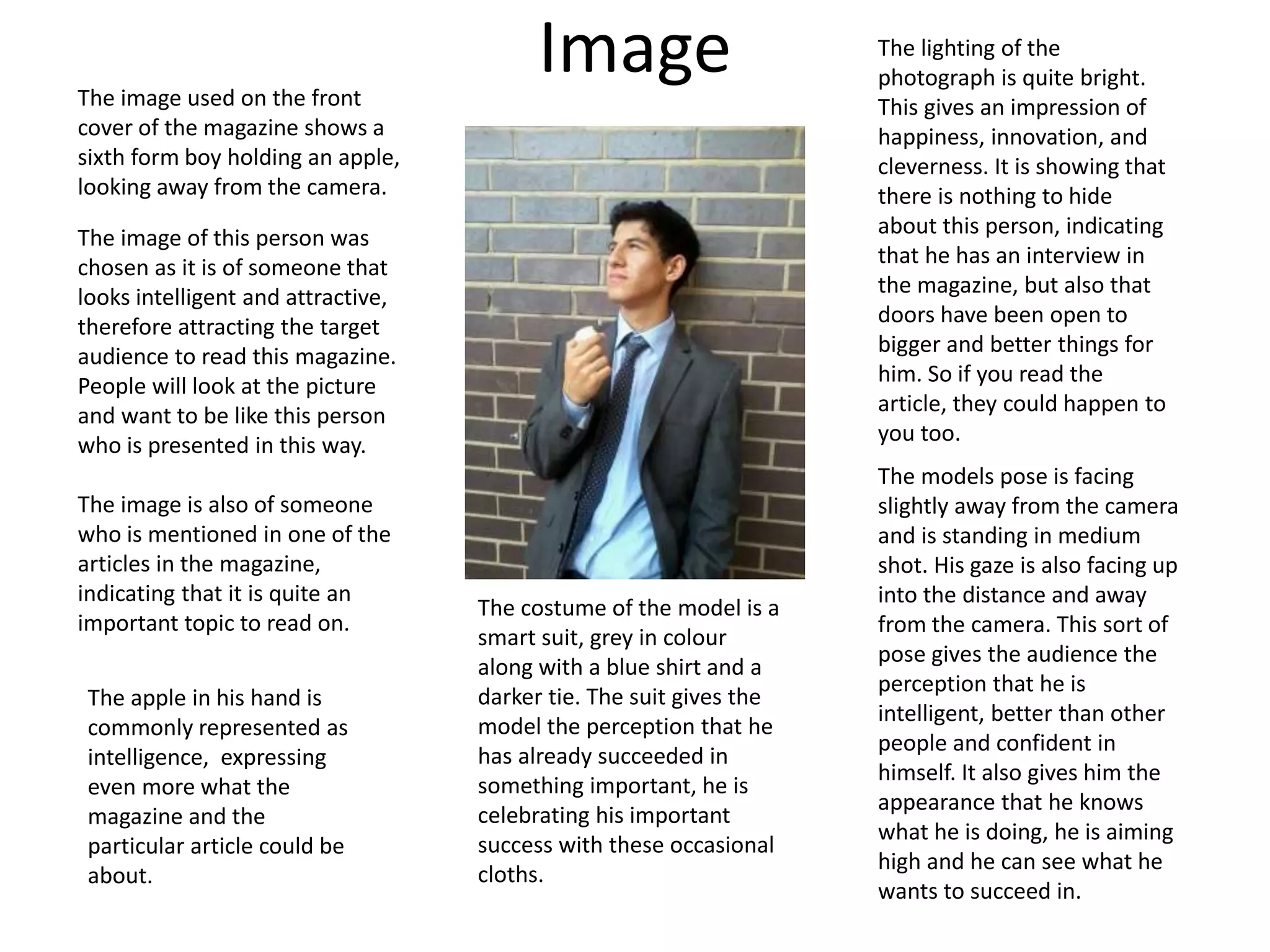
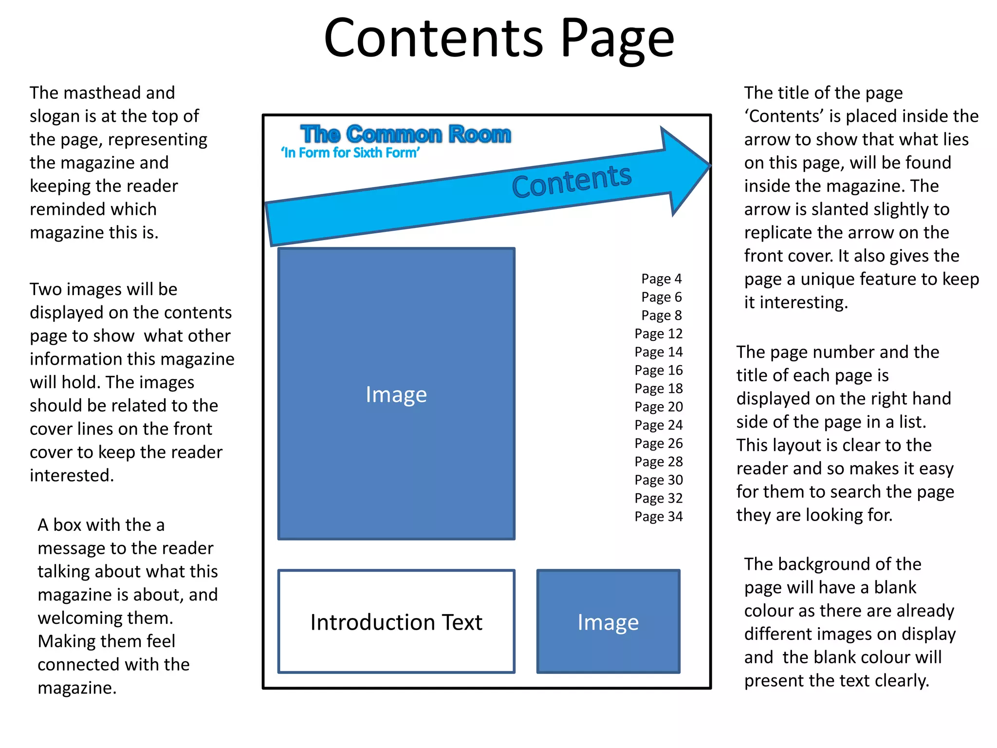
Magazine Mock Up 
By Agatino D’Agate 12R
Layout of Front Cover 
The Masthead is placed 
at the top of the page 
and away from the 
cover lines. The arrow is 
significant because it 
represents forward 
progression through 
education. 
The Main Cover line is 
placed above and 
slightly away from the 
other cover lines to 
show that it is more 
important than the 
rest. 
The Cover Lines are 
set towards the 
bottom giving space 
for the main image 
and showing they 
are not the most 
important points in 
the magazine, but 
still important as 
they are there. 
The slogan is 
underneath the 
masthead as it closely 
relates to the masthead 
describing what the 
general idea of the 
magazine is all about. 
The Main Image 
covers the whole 
page as it is the main 
selling point of the 
magazine and will 
capture the attention 
of the audience 
better. It is also 
strongly related to the 
Main Cover Line. 
The Barcode is placed 
out of the way from 
the other features as 
it is not a selling point 
of the magazine and 
should not attract too 
much attention. 
The colour of the cover lines and 
the colour of the description 
underneath are two different 
colours so that the reader can 
determine the cover line from the 
description. This is also done with 
size difference, the description 
being smaller than the cover line.
Masthead and Slogan 
Cover Lines 
The master head will be given the name ‘The 
Common Room’. This title relates to sixth form 
students as they may spend most of their free 
periods and breaks in the common room at 
school. 
Since a common room is somewhere where 
you would usually talk to others freely, the 
magazine masthead should be given this name 
as it gives the impression that this magazine is 
your friend, something looking out for you and 
helping you during sixth form. 
The masthead will have a Gill Sans 
Ultra Bold font. I chose this because 
the font is quite thick and will stand 
out on the page, clearly showing that 
it is the masthead. This font also has a 
friendly appearance, being quite 
rounded and thick. 
The colour of the masthead is blue as 
blue is a common colour associated 
with school and it is bight, attracting 
readers to the magazine. 
The slogan ‘In Form for Sixth 
Form’ is ideal for this magazine as 
it is reaching out for its target 
audience, Sixth Form students. It 
is also giving you information on 
what the magazine is about. The 
use of the word ‘Form’ twice in 
the slogan makes it catchy. The 
slogan being short makes it easy 
to say and easy to remember as a 
relation to the masthead. 
MARCO 
PETULLA 
HOW TO GET 
THE GRADES 
YOU NEED 
FOR UNI 
DEAL 
WITH IT 
Tips on 
dealing with 
study stress 
LOOKIN’ 
GOOD 
This seasons 
most popular 
sixth form 
clothing 
The main cover line has 
the name of the person 
captured in the image 
and a description of 
what he relates to 
inside the magazine. 
This cover line is the 
largest font size on the 
page, showing that this 
is one of the most 
important articles in the 
magazine. 
The other cover lines are in smaller 
font sizes showing that they are not 
as important as the main cover line. 
With all of the cover lines, the 
heading is in larger sized text to the 
description underneath it. This is 
because the headings are there to 
attract the reader to read about the 
article. The reader wants to know 
what the heading is talking about 
which is why it is very short and 
simple. 
The description 
underneath it 
reveals a little bit 
more about what 
that article is about 
by being very brief 
about the topic. 
This attracts the 
reader even more 
into wanting to read 
on as the 
information is not 
complete unless 
you read the actual 
article.
Image 
The image used on the front 
cover of the magazine shows a 
sixth form boy holding an apple, 
looking away from the camera. 
The image of this person was 
chosen as it is of someone that 
looks intelligent and attractive, 
therefore attracting the target 
audience to read this magazine. 
People will look at the picture 
and want to be like this person 
who is presented in this way. 
The image is also of someone 
who is mentioned in one of the 
articles in the magazine, 
indicating that it is quite an 
important topic to read on. 
The models pose is facing 
slightly away from the camera 
and is standing in medium 
shot. His gaze is also facing up 
into the distance and away 
from the camera. This sort of 
pose gives the audience the 
perception that he is 
intelligent, better than other 
people and confident in 
himself. It also gives him the 
appearance that he knows 
what he is doing, he is aiming 
high and he can see what he 
wants to succeed in. 
The apple in his hand is 
commonly represented as 
intelligence, expressing 
even more what the 
magazine and the 
particular article could be 
about. 
The lighting of the 
photograph is quite bright. 
This gives an impression of 
happiness, innovation, and 
cleverness. It is showing that 
there is nothing to hide 
about this person, indicating 
that he has an interview in 
the magazine, but also that 
doors have been open to 
bigger and better things for 
him. So if you read the 
article, they could happen to 
you too. 
The costume of the model is a 
smart suit, grey in colour 
along with a blue shirt and a 
darker tie. The suit gives the 
model the perception that he 
has already succeeded in 
something important, he is 
celebrating his important 
success with these occasional 
cloths.
Contents Page 
Image 
Page 4 
Page 6 
Page 8 
Page 12 
Page 14 
Page 16 
Page 18 
Page 20 
Page 24 
Page 26 
Page 28 
Page 30 
Page 32 
Page 34 
Introduction Text 
The masthead and 
slogan is at the top of 
the page, representing 
the magazine and 
keeping the reader 
reminded which 
magazine this is. 
The title of the page 
‘Contents’ is placed inside the 
arrow to show that what lies 
on this page, will be found 
inside the magazine. The 
arrow is slanted slightly to 
replicate the arrow on the 
front cover. It also gives the 
page a unique feature to keep 
it interesting. 
The page number and the 
title of each page is 
displayed on the right hand 
side of the page in a list. 
This layout is clear to the 
reader and so makes it easy 
for them to search the page 
they are looking for. 
Two images will be 
displayed on the contents 
page to show what other 
information this magazine 
will hold. The images 
should be related to the 
cover lines on the front 
cover to keep the reader 
interested. 
A box with the a 
message to the reader 
talking about what this 
magazine is about, and 
welcoming them. 
Making them feel 
connected with the 
magazine. 
The background of the 
page will have a blank 
colour as there are already 
different images on display 
and the blank colour will 
present the text clearly. 
Image

Magazine

  • 1.
    Magazine Mock Up By Agatino D’Agate 12R
  • 2.
    Layout of FrontCover The Masthead is placed at the top of the page and away from the cover lines. The arrow is significant because it represents forward progression through education. The Main Cover line is placed above and slightly away from the other cover lines to show that it is more important than the rest. The Cover Lines are set towards the bottom giving space for the main image and showing they are not the most important points in the magazine, but still important as they are there. The slogan is underneath the masthead as it closely relates to the masthead describing what the general idea of the magazine is all about. The Main Image covers the whole page as it is the main selling point of the magazine and will capture the attention of the audience better. It is also strongly related to the Main Cover Line. The Barcode is placed out of the way from the other features as it is not a selling point of the magazine and should not attract too much attention. The colour of the cover lines and the colour of the description underneath are two different colours so that the reader can determine the cover line from the description. This is also done with size difference, the description being smaller than the cover line.
  • 3.
    Masthead and Slogan Cover Lines The master head will be given the name ‘The Common Room’. This title relates to sixth form students as they may spend most of their free periods and breaks in the common room at school. Since a common room is somewhere where you would usually talk to others freely, the magazine masthead should be given this name as it gives the impression that this magazine is your friend, something looking out for you and helping you during sixth form. The masthead will have a Gill Sans Ultra Bold font. I chose this because the font is quite thick and will stand out on the page, clearly showing that it is the masthead. This font also has a friendly appearance, being quite rounded and thick. The colour of the masthead is blue as blue is a common colour associated with school and it is bight, attracting readers to the magazine. The slogan ‘In Form for Sixth Form’ is ideal for this magazine as it is reaching out for its target audience, Sixth Form students. It is also giving you information on what the magazine is about. The use of the word ‘Form’ twice in the slogan makes it catchy. The slogan being short makes it easy to say and easy to remember as a relation to the masthead. MARCO PETULLA HOW TO GET THE GRADES YOU NEED FOR UNI DEAL WITH IT Tips on dealing with study stress LOOKIN’ GOOD This seasons most popular sixth form clothing The main cover line has the name of the person captured in the image and a description of what he relates to inside the magazine. This cover line is the largest font size on the page, showing that this is one of the most important articles in the magazine. The other cover lines are in smaller font sizes showing that they are not as important as the main cover line. With all of the cover lines, the heading is in larger sized text to the description underneath it. This is because the headings are there to attract the reader to read about the article. The reader wants to know what the heading is talking about which is why it is very short and simple. The description underneath it reveals a little bit more about what that article is about by being very brief about the topic. This attracts the reader even more into wanting to read on as the information is not complete unless you read the actual article.
  • 4.
    Image The imageused on the front cover of the magazine shows a sixth form boy holding an apple, looking away from the camera. The image of this person was chosen as it is of someone that looks intelligent and attractive, therefore attracting the target audience to read this magazine. People will look at the picture and want to be like this person who is presented in this way. The image is also of someone who is mentioned in one of the articles in the magazine, indicating that it is quite an important topic to read on. The models pose is facing slightly away from the camera and is standing in medium shot. His gaze is also facing up into the distance and away from the camera. This sort of pose gives the audience the perception that he is intelligent, better than other people and confident in himself. It also gives him the appearance that he knows what he is doing, he is aiming high and he can see what he wants to succeed in. The apple in his hand is commonly represented as intelligence, expressing even more what the magazine and the particular article could be about. The lighting of the photograph is quite bright. This gives an impression of happiness, innovation, and cleverness. It is showing that there is nothing to hide about this person, indicating that he has an interview in the magazine, but also that doors have been open to bigger and better things for him. So if you read the article, they could happen to you too. The costume of the model is a smart suit, grey in colour along with a blue shirt and a darker tie. The suit gives the model the perception that he has already succeeded in something important, he is celebrating his important success with these occasional cloths.
  • 5.
    Contents Page Image Page 4 Page 6 Page 8 Page 12 Page 14 Page 16 Page 18 Page 20 Page 24 Page 26 Page 28 Page 30 Page 32 Page 34 Introduction Text The masthead and slogan is at the top of the page, representing the magazine and keeping the reader reminded which magazine this is. The title of the page ‘Contents’ is placed inside the arrow to show that what lies on this page, will be found inside the magazine. The arrow is slanted slightly to replicate the arrow on the front cover. It also gives the page a unique feature to keep it interesting. The page number and the title of each page is displayed on the right hand side of the page in a list. This layout is clear to the reader and so makes it easy for them to search the page they are looking for. Two images will be displayed on the contents page to show what other information this magazine will hold. The images should be related to the cover lines on the front cover to keep the reader interested. A box with the a message to the reader talking about what this magazine is about, and welcoming them. Making them feel connected with the magazine. The background of the page will have a blank colour as there are already different images on display and the blank colour will present the text clearly. Image