This document summarizes different types of factual writing styles:
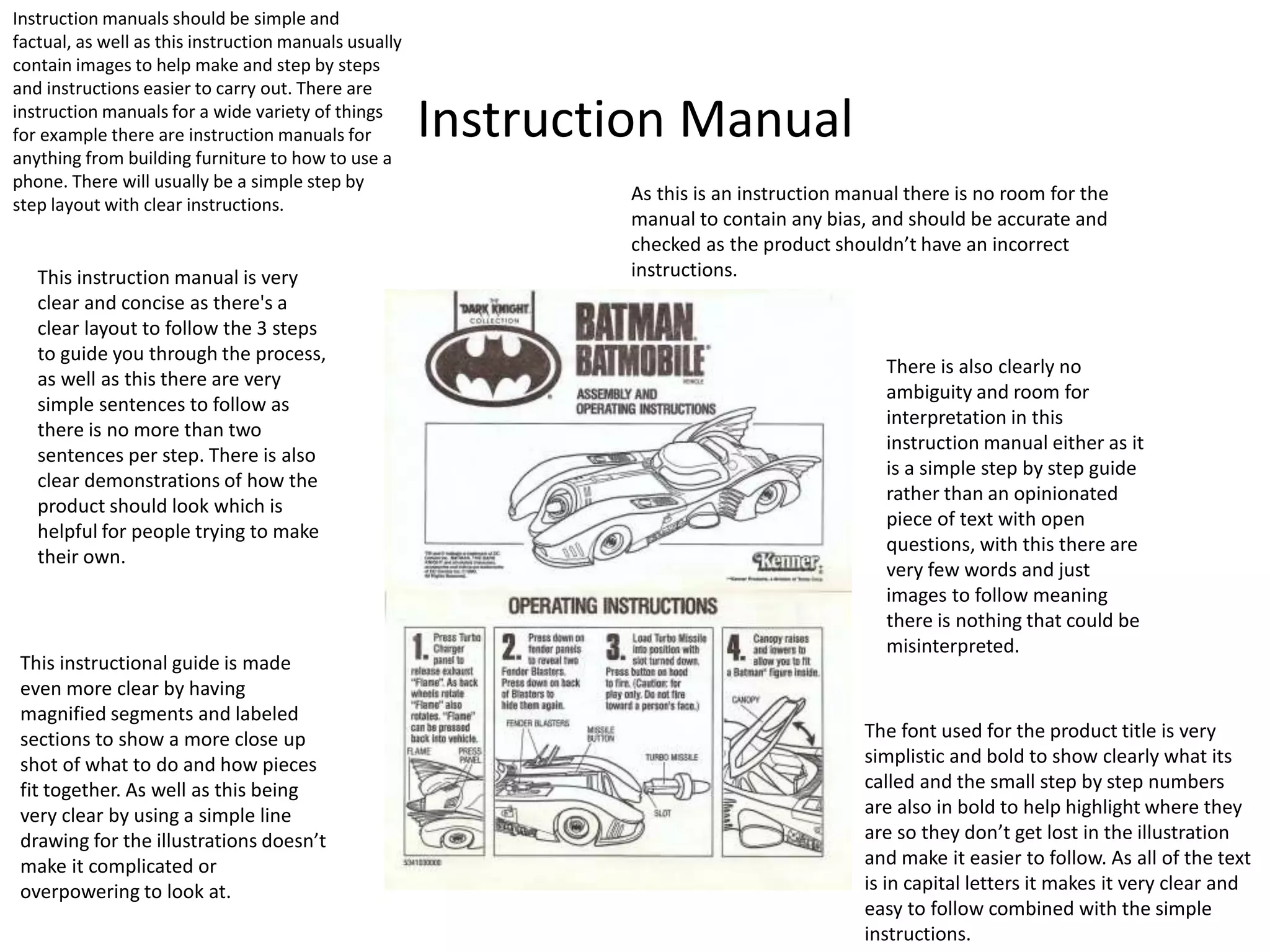
1. Instruction manuals contain step-by-step instructions with images to make the assembly process clear. They avoid bias and ambiguity to accurately guide the user.
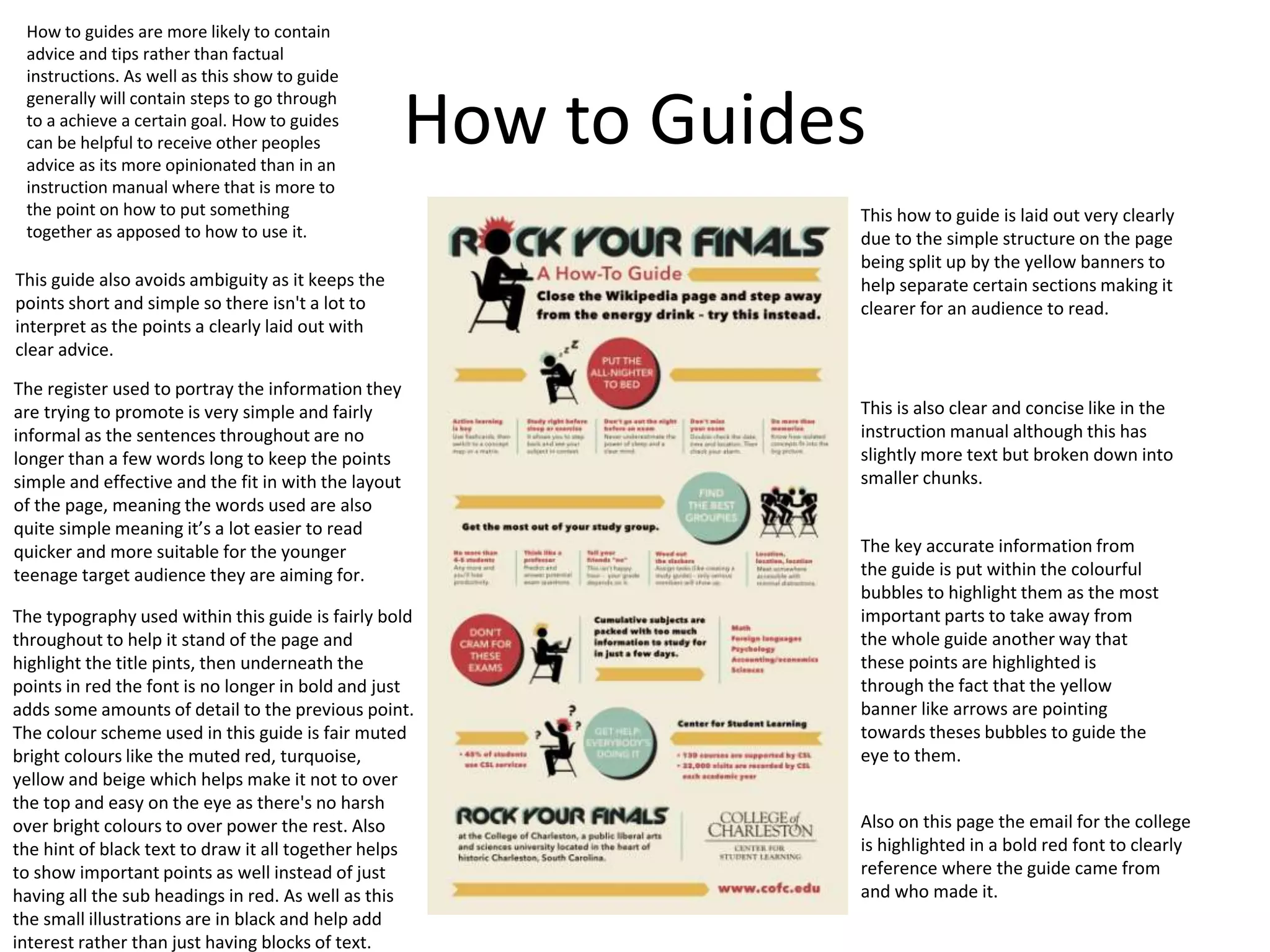
2. How-to guides provide advice and tips through a clear layout with highlighted key points in bubbles or banners. They keep language simple but allow some interpretation.
3. Factual journalism informs on events through longer articles using images to break up text. It relies on interviews but can be biased based on a single perspective without opposition.