The document summarizes the results of a questionnaire about magazine design preferences. Key findings include:
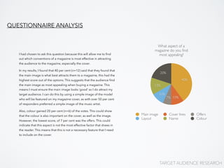
- 40% said the main image is most appealing, suggesting it must look good to attract readers.
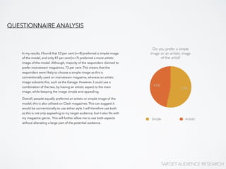
- 53% preferred a simple image of an artist rather than an artistic one.
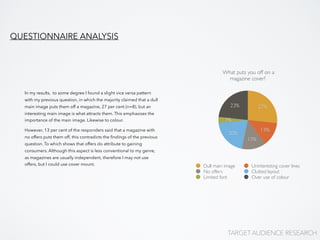
- More people were put off by a dull main image than other factors like offers.
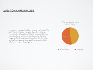
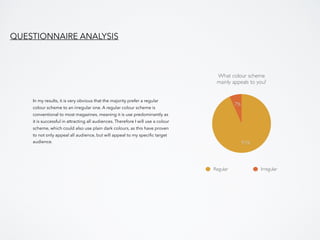
- Plain/dark colors and a regular color scheme were preferred over bright colors and irregular schemes.
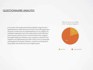
- 80% preferred a light-hearted tone over a serious one.