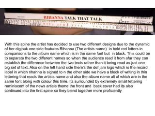
1) The first spine design for a Rihanna album features her name in bold red letters and the album name in black to distinguish the two. It also includes the Def Jam record label logo.
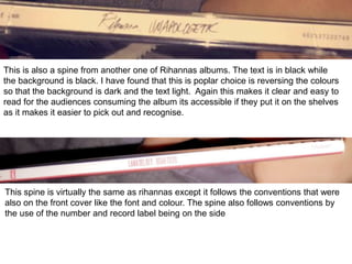
2) The second spine uses black text on a black background for contrast and readability. This is a popular convention.
3) The third spine follows the font and color conventions used on the album cover for consistency. It also includes the album number and record label.