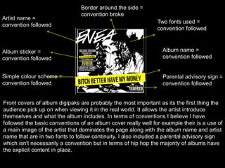
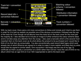
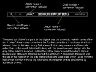
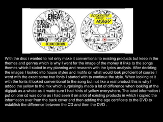
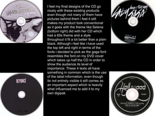
Digipak
With The digipak I tried to be as conventional as possible in
order for it to look real and look connected to the video. I
didn't want to stray away or break away from conventions
too much like the video although I found when making the
digipak it came more naturally to me because I know what
was expected of the genre due to the research I did into
existing products before I started drafting or thinking about
the digipak I found the research I made to be really helpful in
the planning process and producing the video gave me a
better insight to what were the conventions of the genre and
how to follow them correctly
Cover
Artist name =
convention followed
Album name =
convention followed
Parental advisory sign =
convention followed
Album sticker =
convention followed
Two fonts used =
convention followed
Simple colour scheme =
convention followed
Border around the side =
convention broke
Front covers of album digipaks are probably the most important as its the first thing the
audience pick up on when viewing it in the real world. It allows the artist introduce
themselves and what the album includes. In terms of conventions I believe I have
followed the basic conventions of an album cover really well for example their is a use of
a main image of the artist that dominates the page along with the album name and artist
name that are in two fonts to follow continuity. I also included a parental advisory sign
which isn't necessarily a convention but in terms of hip hop the majority of albums have
the explicit content in place.
In terms of it being conventional to
other existing products i think it
goes pretty well with other urban
artists album covers with the arts
theme and surrealistic theme.
Instead of it just being plain
images and texts these artists
have used art and have house
styles that they have used
throughout which is similar to
mine. All three follow a colour
scheme and use similar fonts
which reflects the content of the
album for example Rihanna has
words written over her body which
represents her emotions and
thoughts whereas Nicki uses
colour to present her as colourful
and fun. I believe my product
follows the conventions of danger
which is why i used the black and
yellow colour scheme
Back Cover
Track list = convention
followed
Matching colour
scheme = convention
followed
Record label info =
convention followed
Distribution information
= convention followed
Track numbers =
convention followed
Barcode = convention
followed
With my back cover, there were a lot more conventions to follow and include and I tried to use them
in order for it to look as realistic as possible one of the obvious conventions I followed was the use
of the track list. Even though not all albums have the track list on the back cover for the most part
the majority do. I also decided not to include an image to further enhance the colour scheme ideas
and to not take away any attention from the songs. I also used a barcode which is the second most
important item on the back cover as its what allows the product to be purchased and i would like to
think of my final item as consumable . I've also conventionally used record label logos which exist
already two of which Rihanna are signed to in order to make it more realistic and likely that my artist
would also be signed to similar labels. One convention I did break was the use of my age 15
certificate as that's usually a convention on a DVD rather than CD but i have the use of DVD on my
album which has an age limit on it so I felt it appropriate to add to the back cover
In terms of it being conventional to
other existing products these are the
4 products which I looked towards to
make sure I followed conventions the
top two I think I've used conventions
from well these also follow similar
colour schemes and put their track
lists as the main focal thing that they
want the audience to see. With the
two on the bottom I took conventions
from Rita Ora with her bold choice of
font which still stood out even from
the use of images. With marinas
album I first of liked the centralised
list as it made everything look more
clean and organised. All of these
albums have barcodes along with
some label information or logos of
record companies the artists are
signed too
Spine
Artists name =
convention followed
Record Label logos =
convention followed
Album name =
convention followed
Code number =
convention followed
The spine out of all of the parts of the digipak was the easiest to make in terms of the
fact it doesn't have many conventions but for the conventions it has it was vital that I
followed them to the exact as my first attempt looked very amateur and fan made
rather than professional. I decided to keep with the same fonts and just go with the
grey colour scheme as when I added the yellow border around the album name it
looked out of place and therefore ruined the continuity. A convention I followed was
the use of the number on the side along with record label logos which I used from the
back cover in order to make the full product link together and be established by
audiences as one.
As you can see here I have displayed existing digipaks spines as you can see I
have followed the basic conventions these have and carried them onto mine. I took
the convention of having the artists name and album title in which all of these
existing products have on them. When doing my research for the digipak the
Rihanna talk that talk album was one of my primary resources which is where I got
the idea to have the artists name in a separate font to the album title in order to
separate the two. As we can see above each spine has a number on the side which
i decided to make up in order for it to look more realistic and belivieable to
audiences. I chose purely to put no picture behind it in order to create continuity
with the colour scheme as I feel a picture may of made it look out of place.
Disc
With the disc i wanted to not only make it conventional to existing products but keep in the
themes and genres which is why I went for the image of the money it links to the songs
themes which I stated in my planning and research with the lyrics analysis. After deciding
the images I looked into house styles and motifs on what would look proficient of course I
went with the exact same two fonts I started with to continue the style. When looking at it
with the fonts it looked conventional to the song but not like a real product this is why I
added the yellow to the mix which surprisingly made a lot of difference when looking at the
digipak as a whole as it made sure I had hints of yellow everywhere. The label information i
put on one cd was done as i had seen it on a lot of existing products in which i copied the
information over from the back cover and then adding the age certificate to the DVD to
establish the difference between the CD and then the DVD .
I feel my final designs of the CD go
nicely with these existing products
even though not many of them have
pictures behind them i feel it still
makes my product look conventional
as it goes with the theme like Selena
(bottom right) did with her CD which
had a 60s theme and a style
throughout it fit a lot better than a plain
black. Although i feel like i have used
the top left and right in terms of the
fonts i decided to pick as the gaga font
resembles the font on my DVD cover
which takes up half the CD in order to
show the audience its level of
importance. These 4 texts all have
something in common which is the use
of the label information, even though
its not entirely visible it still comes as
an important aspect which is heavily
what influenced me to add it to my
own digipak
Overall
Overall I feel my digipak has followed conventions
of existing media products quite well i feel the final
product looks effective and realistic . The colour
scheme and fonts have a continuous theme
throughout which is always what I set out to
achieve to create cohesion and overall make a
product that had a purpose I didn't want it to look
like something I had put together in 5 minutes on
Photoshop the aim was to make sure everything
there was for a reason and had a purpose.

evaluation

  • 1.
    Digipak With The digipakI tried to be as conventional as possible in order for it to look real and look connected to the video. I didn't want to stray away or break away from conventions too much like the video although I found when making the digipak it came more naturally to me because I know what was expected of the genre due to the research I did into existing products before I started drafting or thinking about the digipak I found the research I made to be really helpful in the planning process and producing the video gave me a better insight to what were the conventions of the genre and how to follow them correctly
  • 2.
  • 3.
    Artist name = conventionfollowed Album name = convention followed Parental advisory sign = convention followed Album sticker = convention followed Two fonts used = convention followed Simple colour scheme = convention followed Border around the side = convention broke Front covers of album digipaks are probably the most important as its the first thing the audience pick up on when viewing it in the real world. It allows the artist introduce themselves and what the album includes. In terms of conventions I believe I have followed the basic conventions of an album cover really well for example their is a use of a main image of the artist that dominates the page along with the album name and artist name that are in two fonts to follow continuity. I also included a parental advisory sign which isn't necessarily a convention but in terms of hip hop the majority of albums have the explicit content in place.
  • 4.
    In terms ofit being conventional to other existing products i think it goes pretty well with other urban artists album covers with the arts theme and surrealistic theme. Instead of it just being plain images and texts these artists have used art and have house styles that they have used throughout which is similar to mine. All three follow a colour scheme and use similar fonts which reflects the content of the album for example Rihanna has words written over her body which represents her emotions and thoughts whereas Nicki uses colour to present her as colourful and fun. I believe my product follows the conventions of danger which is why i used the black and yellow colour scheme
  • 5.
  • 6.
    Track list =convention followed Matching colour scheme = convention followed Record label info = convention followed Distribution information = convention followed Track numbers = convention followed Barcode = convention followed With my back cover, there were a lot more conventions to follow and include and I tried to use them in order for it to look as realistic as possible one of the obvious conventions I followed was the use of the track list. Even though not all albums have the track list on the back cover for the most part the majority do. I also decided not to include an image to further enhance the colour scheme ideas and to not take away any attention from the songs. I also used a barcode which is the second most important item on the back cover as its what allows the product to be purchased and i would like to think of my final item as consumable . I've also conventionally used record label logos which exist already two of which Rihanna are signed to in order to make it more realistic and likely that my artist would also be signed to similar labels. One convention I did break was the use of my age 15 certificate as that's usually a convention on a DVD rather than CD but i have the use of DVD on my album which has an age limit on it so I felt it appropriate to add to the back cover
  • 7.
    In terms ofit being conventional to other existing products these are the 4 products which I looked towards to make sure I followed conventions the top two I think I've used conventions from well these also follow similar colour schemes and put their track lists as the main focal thing that they want the audience to see. With the two on the bottom I took conventions from Rita Ora with her bold choice of font which still stood out even from the use of images. With marinas album I first of liked the centralised list as it made everything look more clean and organised. All of these albums have barcodes along with some label information or logos of record companies the artists are signed too
  • 8.
  • 9.
    Artists name = conventionfollowed Record Label logos = convention followed Album name = convention followed Code number = convention followed The spine out of all of the parts of the digipak was the easiest to make in terms of the fact it doesn't have many conventions but for the conventions it has it was vital that I followed them to the exact as my first attempt looked very amateur and fan made rather than professional. I decided to keep with the same fonts and just go with the grey colour scheme as when I added the yellow border around the album name it looked out of place and therefore ruined the continuity. A convention I followed was the use of the number on the side along with record label logos which I used from the back cover in order to make the full product link together and be established by audiences as one.
  • 10.
    As you cansee here I have displayed existing digipaks spines as you can see I have followed the basic conventions these have and carried them onto mine. I took the convention of having the artists name and album title in which all of these existing products have on them. When doing my research for the digipak the Rihanna talk that talk album was one of my primary resources which is where I got the idea to have the artists name in a separate font to the album title in order to separate the two. As we can see above each spine has a number on the side which i decided to make up in order for it to look more realistic and belivieable to audiences. I chose purely to put no picture behind it in order to create continuity with the colour scheme as I feel a picture may of made it look out of place.
  • 11.
  • 12.
    With the disci wanted to not only make it conventional to existing products but keep in the themes and genres which is why I went for the image of the money it links to the songs themes which I stated in my planning and research with the lyrics analysis. After deciding the images I looked into house styles and motifs on what would look proficient of course I went with the exact same two fonts I started with to continue the style. When looking at it with the fonts it looked conventional to the song but not like a real product this is why I added the yellow to the mix which surprisingly made a lot of difference when looking at the digipak as a whole as it made sure I had hints of yellow everywhere. The label information i put on one cd was done as i had seen it on a lot of existing products in which i copied the information over from the back cover and then adding the age certificate to the DVD to establish the difference between the CD and then the DVD .
  • 13.
    I feel myfinal designs of the CD go nicely with these existing products even though not many of them have pictures behind them i feel it still makes my product look conventional as it goes with the theme like Selena (bottom right) did with her CD which had a 60s theme and a style throughout it fit a lot better than a plain black. Although i feel like i have used the top left and right in terms of the fonts i decided to pick as the gaga font resembles the font on my DVD cover which takes up half the CD in order to show the audience its level of importance. These 4 texts all have something in common which is the use of the label information, even though its not entirely visible it still comes as an important aspect which is heavily what influenced me to add it to my own digipak
  • 14.
    Overall Overall I feelmy digipak has followed conventions of existing media products quite well i feel the final product looks effective and realistic . The colour scheme and fonts have a continuous theme throughout which is always what I set out to achieve to create cohesion and overall make a product that had a purpose I didn't want it to look like something I had put together in 5 minutes on Photoshop the aim was to make sure everything there was for a reason and had a purpose.