Download to read offline

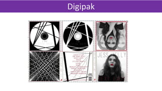


The document discusses the conventions and design elements the author followed in creating a Digipak for a CD. It examines the conventions of the front cover, back cover, spine, CD disks, and inside panels based on research of existing products. For each design element, the author provides examples of conventions they identified (e.g. artist name and image on the front cover). They then explain how their own design incorporates those conventions (e.g. placing the artist's name and image on the front cover) and compare it to inspirational existing products. The goal was to design professional-looking packaging by adhering to standard conventions.


