Download to read offline


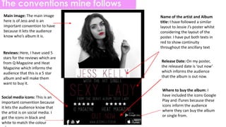

The document discusses the conventions and design elements used across different components of a music album release, including the front and back covers, spine, CD disk, and magazine advertisement. It analyzes existing examples to identify common conventions, such as featuring the artist's name and image prominently on the front cover and track listing on the back. It then describes how the design of its own album components, for an artist named Jess Kelly, follows these conventions to look professional and be consistent with existing products. Key elements included are the artist's name, album title, image of the artist, and information on purchasing.


