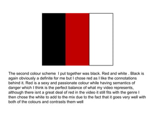
Colour schemes
The first colour schemes i put together was black, light grey and yellow. Black is
obviously a definite colour for me to use which is why its featured in all three
palettes purely because its highly asociated with hip hop and urban culture, but I
chose the light grey in this palette as I wanted something different from white and
to mix things up i like how its almost white but still in the grey palette lastly is the
yellow colour which has some significance to my video as its a reference to the
police warning tape which is apart of the mise en scene
The second colour scheme I put together was black. Red and white . Black is
again obviously a definite for me but I chose red as I like the connotations
behind it. Red is a sexy and passionate colour while having semantics of
danger which I think is the perfect balance of what my video represents,
although there isnt a great deal of red in the video it still fits with the genre I
then chose the white to add to the mix due to the fact that it goes very well with
both of the colours and contrasts them well
The last palette i put together i incorporated a navy blue based on the fact a lot of
the colour in my video are shades of blue its reminiscent of the video and the
lighting which is something i liked the idea of incorporating. Blue although is a sad
colour which is the complete opposite vibe of what the song and video is which is
why i have shed away from it a lot. I then included the lime green colour as a
symbol of money since the album is named after the single and the song is all
about money and greed.
Colour schemes
In the end i decided to go with the first colour palette in which i put together.
This being the fact each colour contrast and work with each other well and for
the fact the black and yellow will be easy to indentify as being done to re create
the vibe of the police warning tape although my other colour palettes had
references to the video I feel this is the easiest for the audience to identify and
will make my product cohesive which is what i set out to achieve

Colour schemes

  • 1.
  • 3.
    The first colourschemes i put together was black, light grey and yellow. Black is obviously a definite colour for me to use which is why its featured in all three palettes purely because its highly asociated with hip hop and urban culture, but I chose the light grey in this palette as I wanted something different from white and to mix things up i like how its almost white but still in the grey palette lastly is the yellow colour which has some significance to my video as its a reference to the police warning tape which is apart of the mise en scene
  • 5.
    The second colourscheme I put together was black. Red and white . Black is again obviously a definite for me but I chose red as I like the connotations behind it. Red is a sexy and passionate colour while having semantics of danger which I think is the perfect balance of what my video represents, although there isnt a great deal of red in the video it still fits with the genre I then chose the white to add to the mix due to the fact that it goes very well with both of the colours and contrasts them well
  • 7.
    The last palettei put together i incorporated a navy blue based on the fact a lot of the colour in my video are shades of blue its reminiscent of the video and the lighting which is something i liked the idea of incorporating. Blue although is a sad colour which is the complete opposite vibe of what the song and video is which is why i have shed away from it a lot. I then included the lime green colour as a symbol of money since the album is named after the single and the song is all about money and greed.
  • 8.
    Colour schemes In theend i decided to go with the first colour palette in which i put together. This being the fact each colour contrast and work with each other well and for the fact the black and yellow will be easy to indentify as being done to re create the vibe of the police warning tape although my other colour palettes had references to the video I feel this is the easiest for the audience to identify and will make my product cohesive which is what i set out to achieve