Downloaded 127 times


![Twitter @blastam Top 50 Tips for What to Test http://bit.ly/top50sessj Email [email_address] Thank you... Please go make some simple changes and make some big profits!](https://image.slidesharecdn.com/smx-west-2010-90daysemfitness-conversion-kayden-kelly-v4-100306143724-phpapp01/85/SMX-West-2010-Conversion-Optimization-Tips-64-320.jpg)

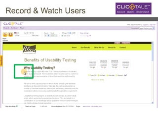
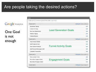
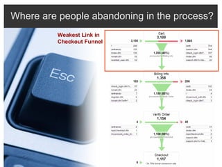
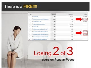
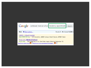
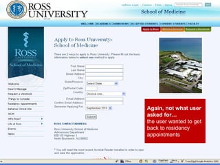
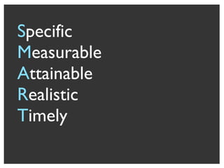
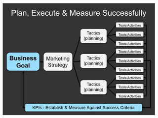
The document outlines a 90-day fitness plan for improving website conversion rates, emphasizing the importance of user-centric design and testing. It provides numerous strategies and best practices, such as optimizing calls to action, designing effective navigation, and utilizing analytics to identify user behavior. The focus is on understanding the customer journey, segmenting users, and continuously testing different elements to enhance overall site performance.


