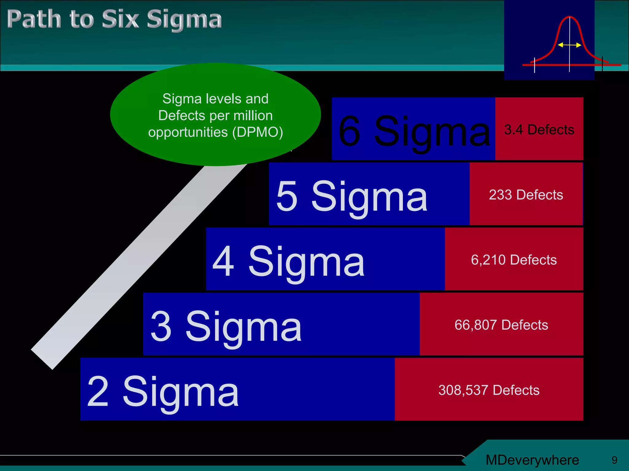
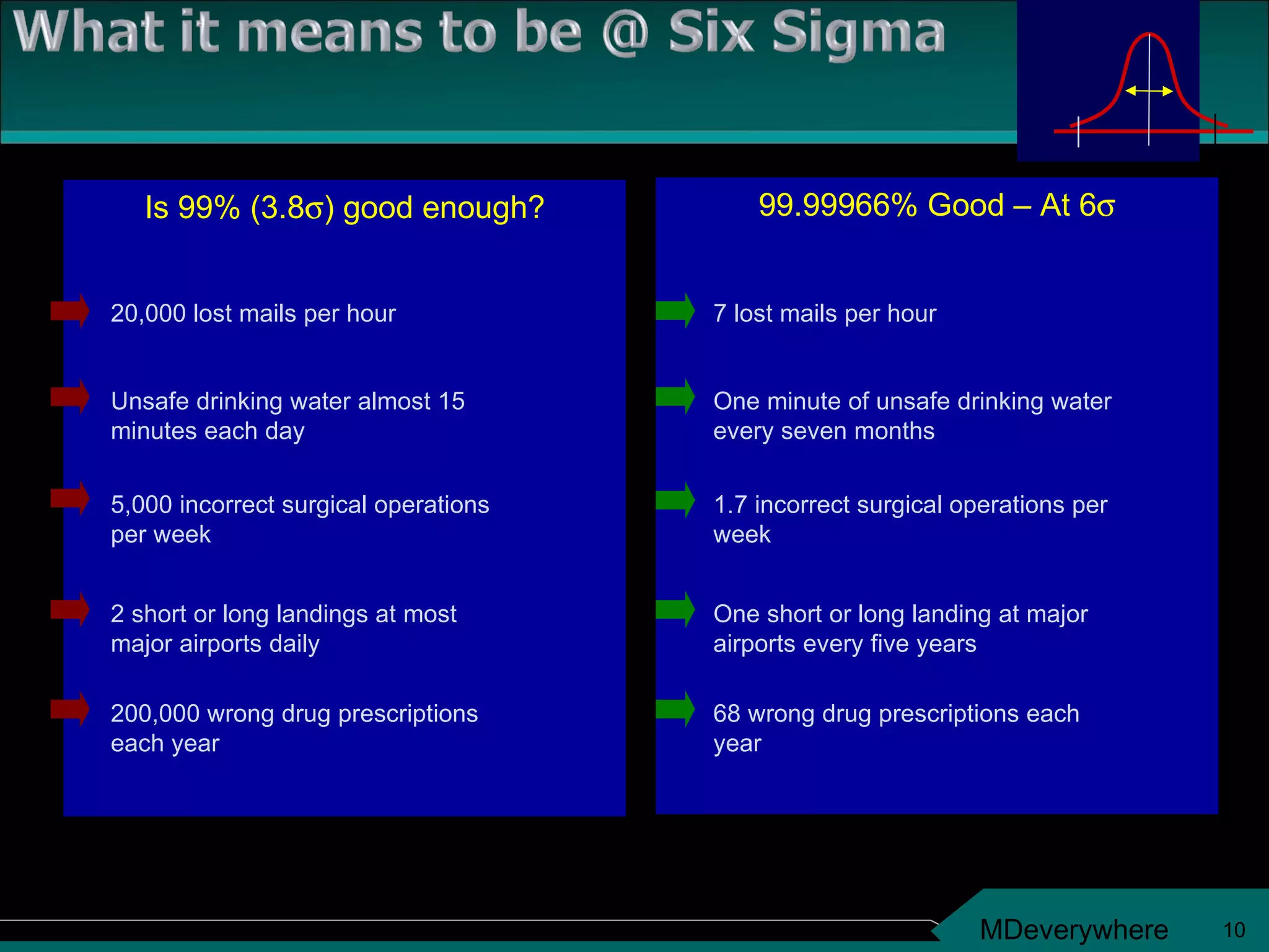
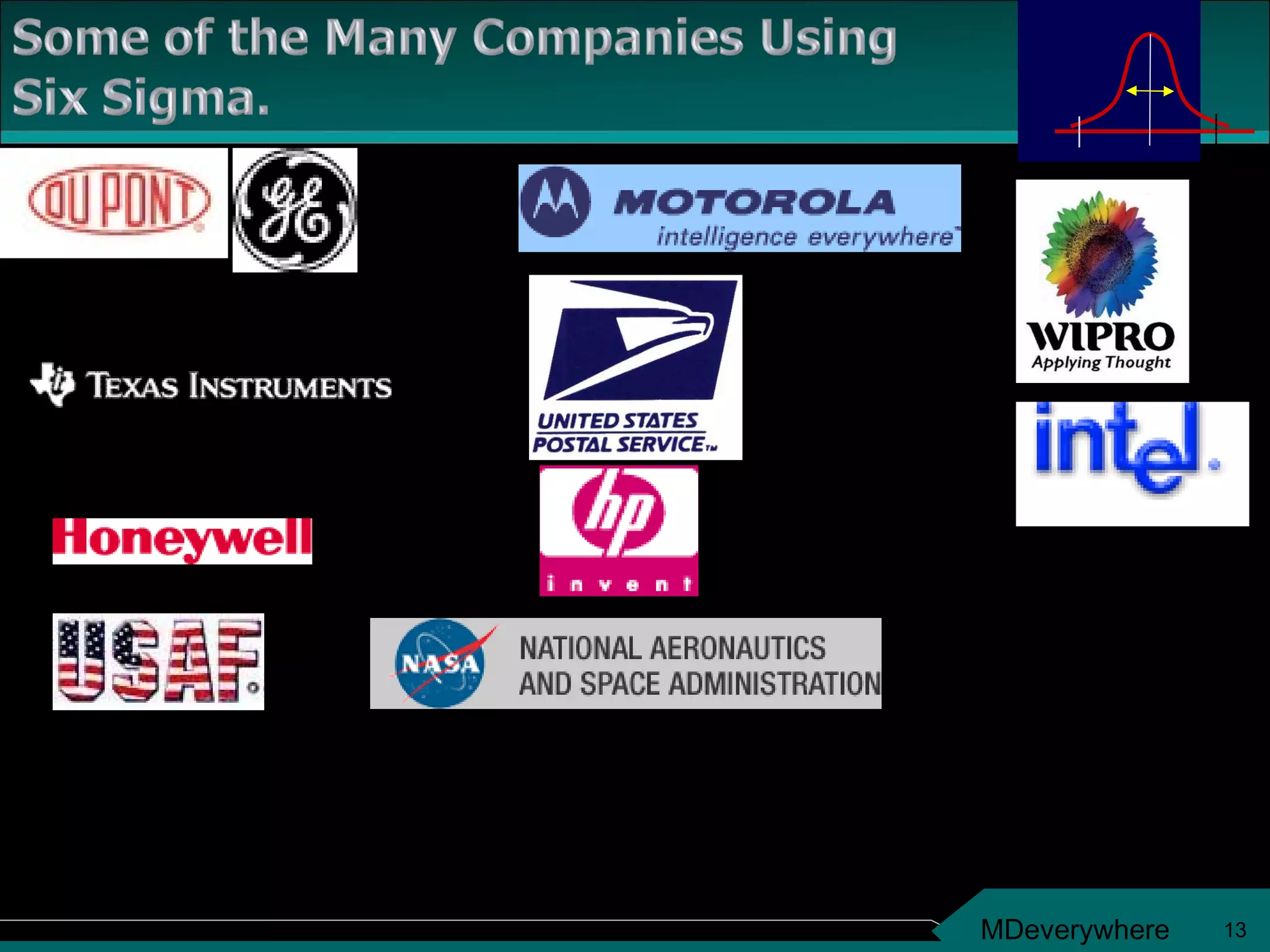
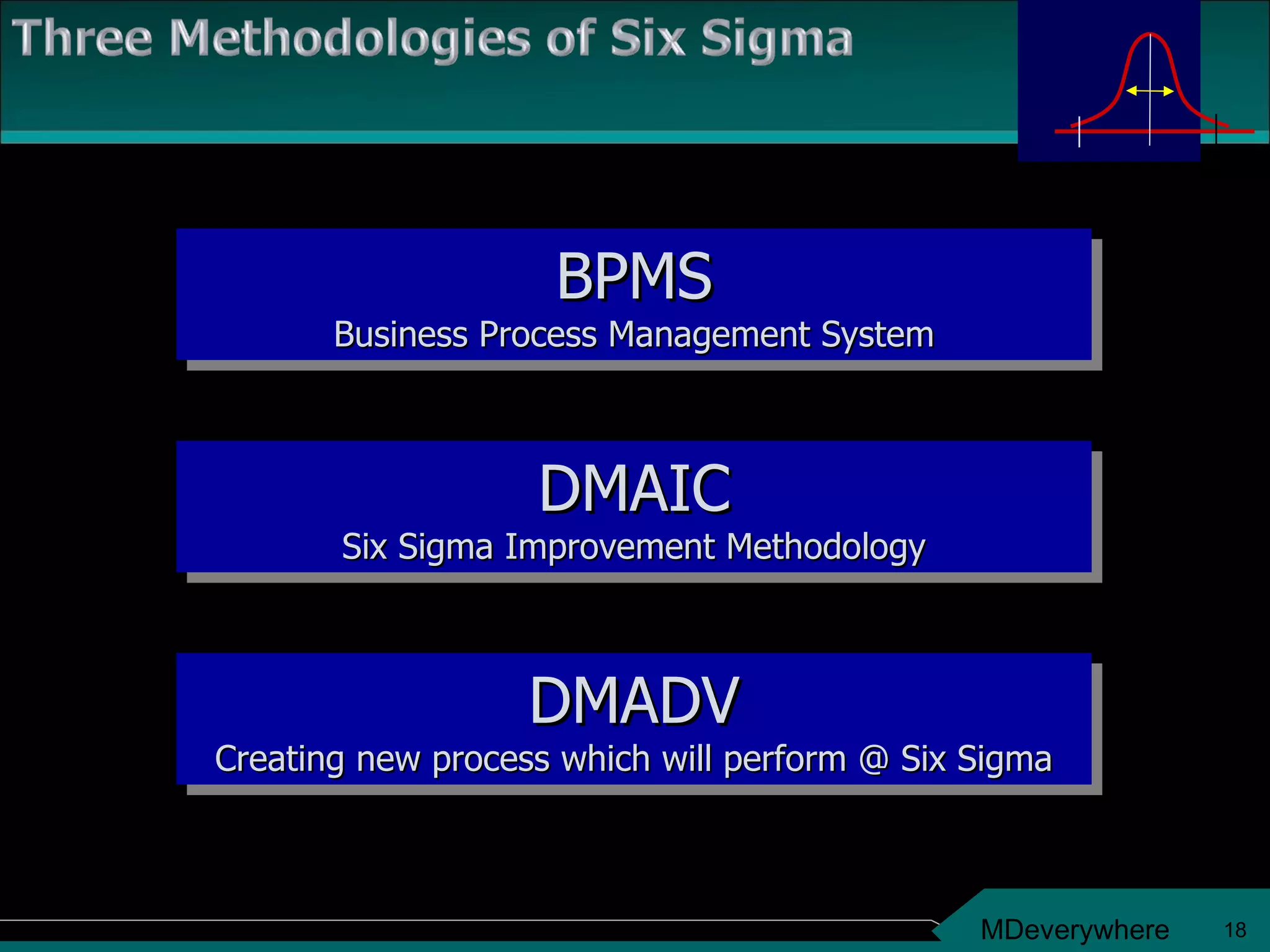
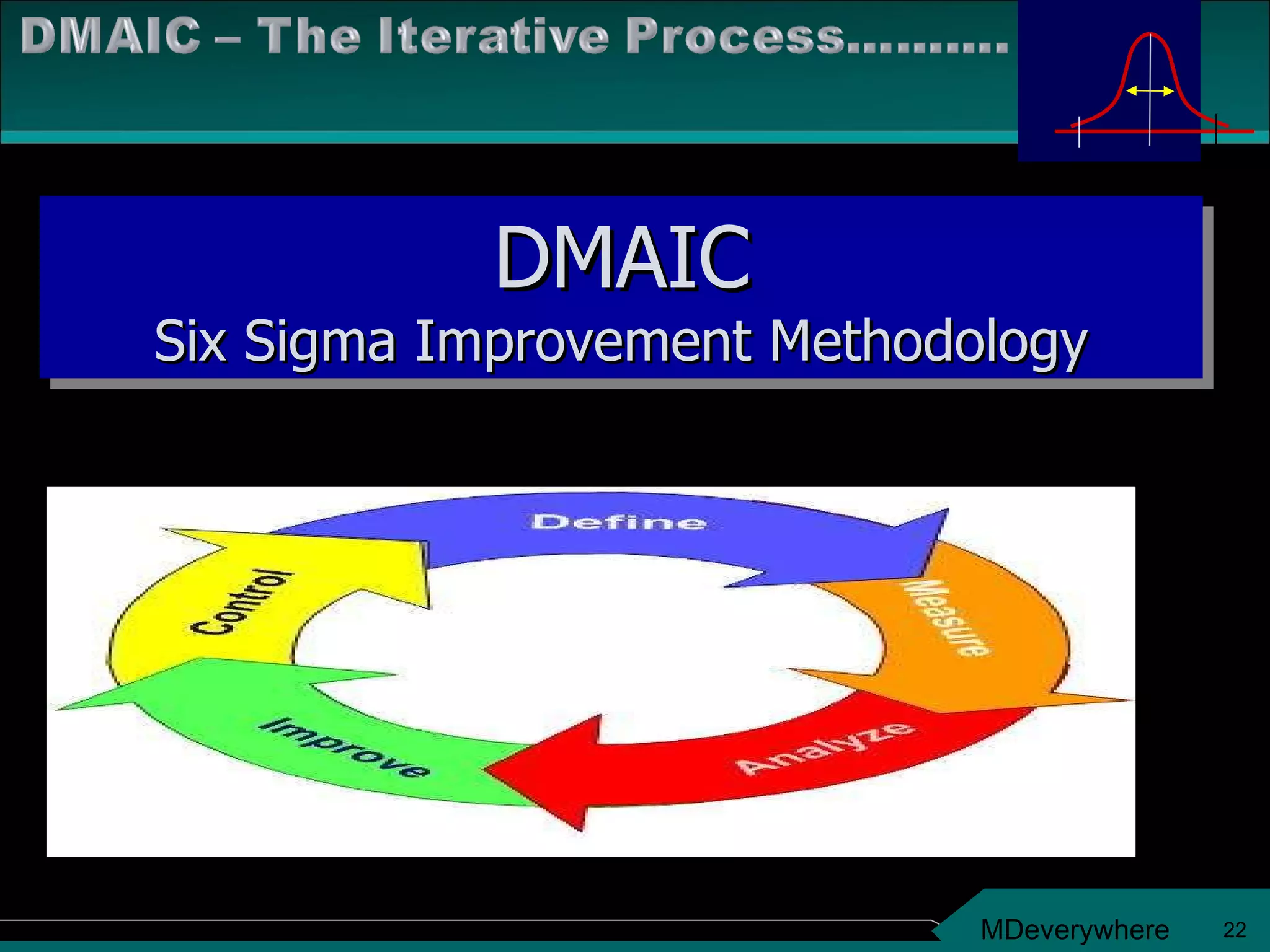
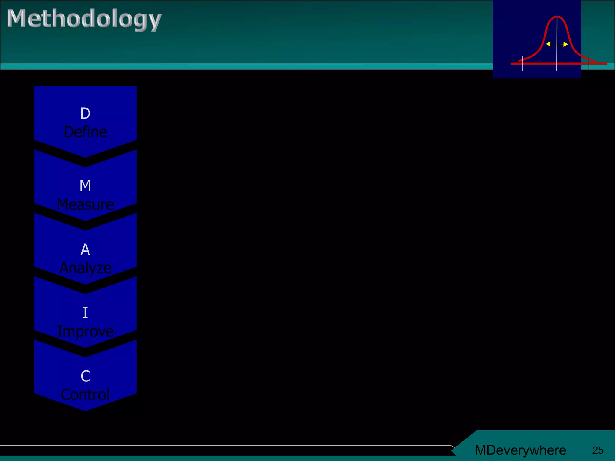
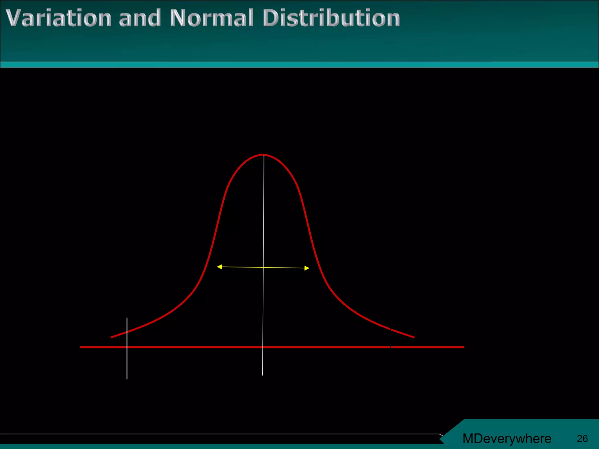
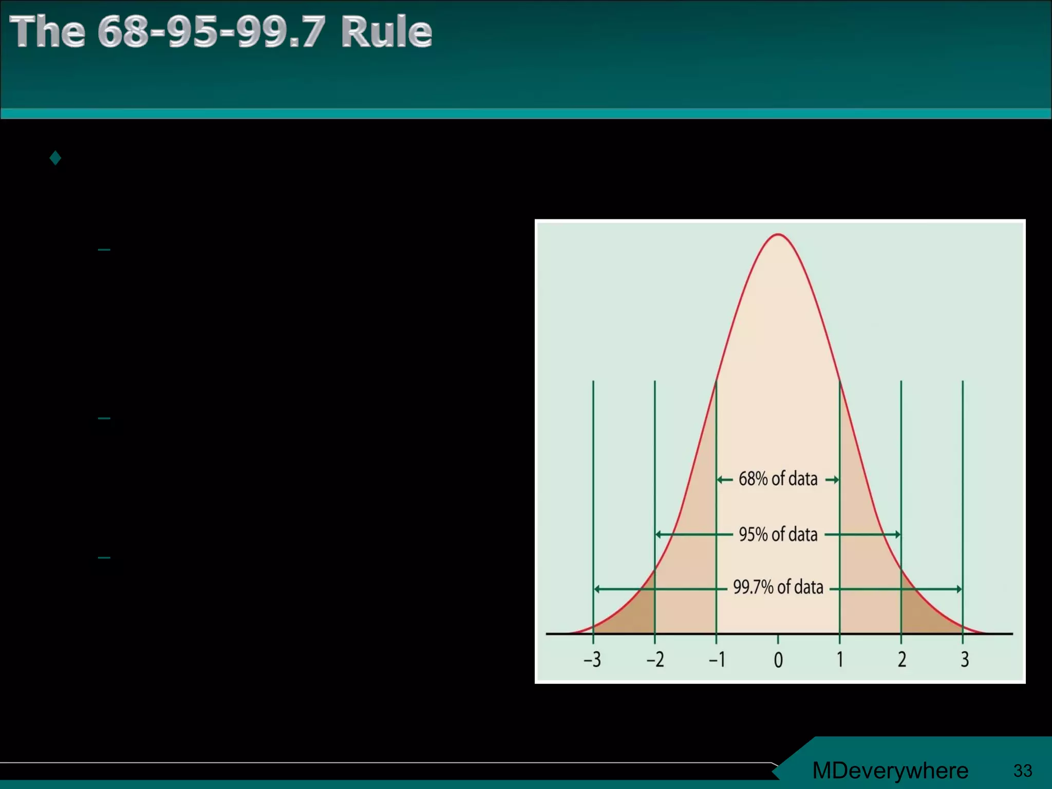
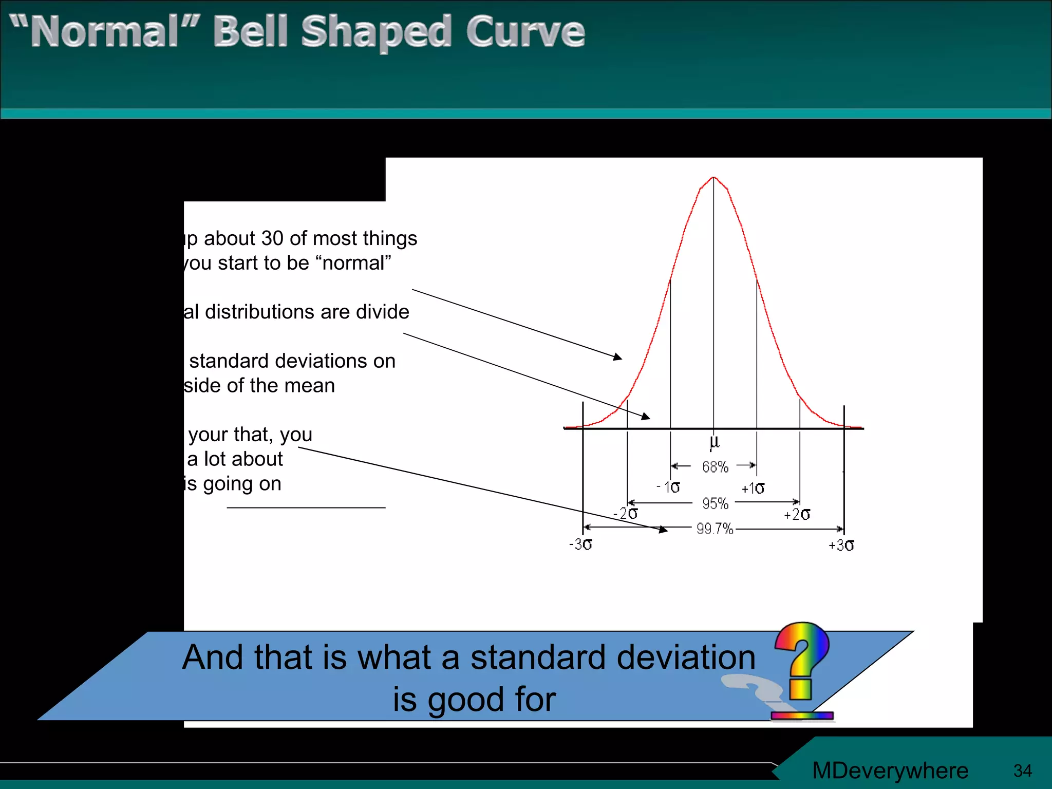
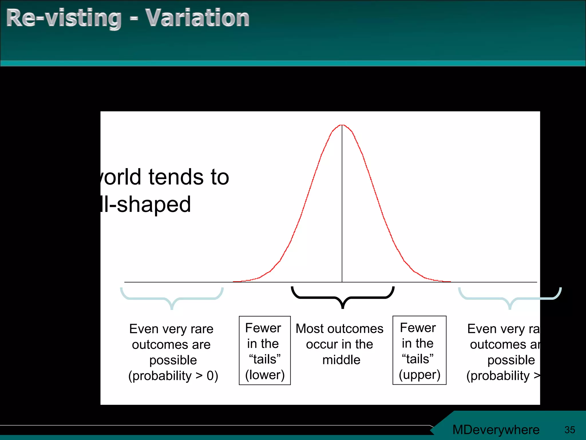
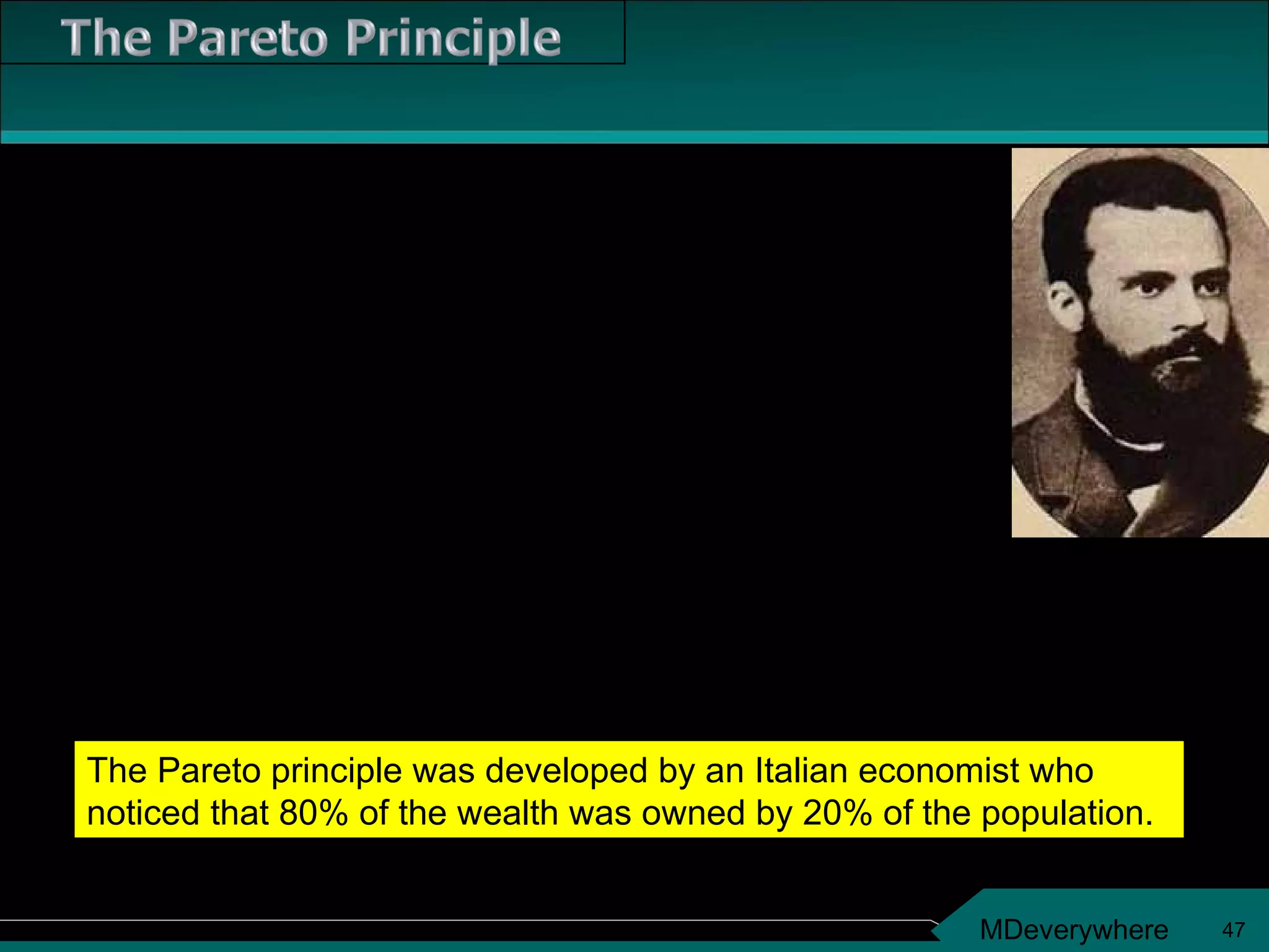
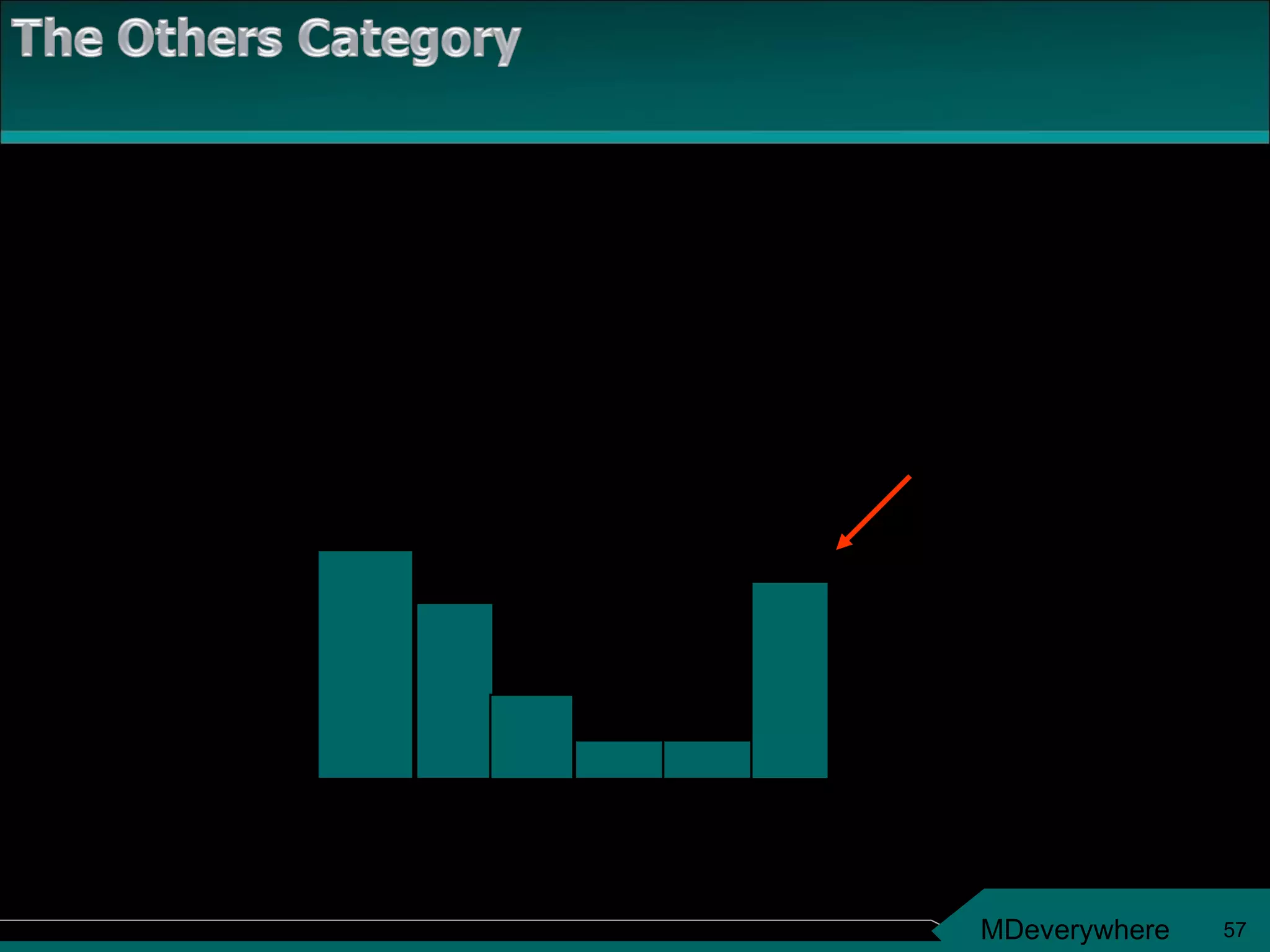
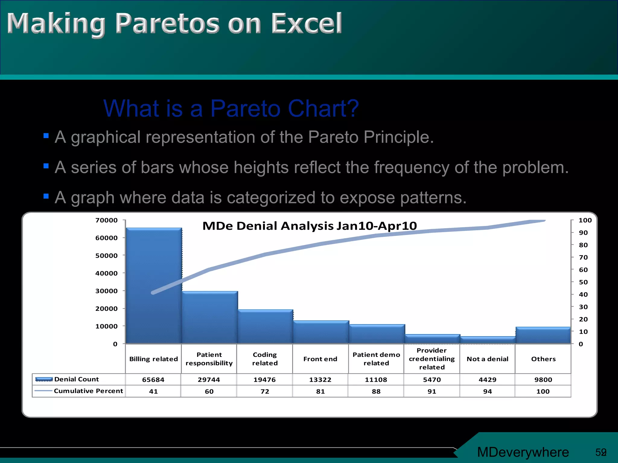
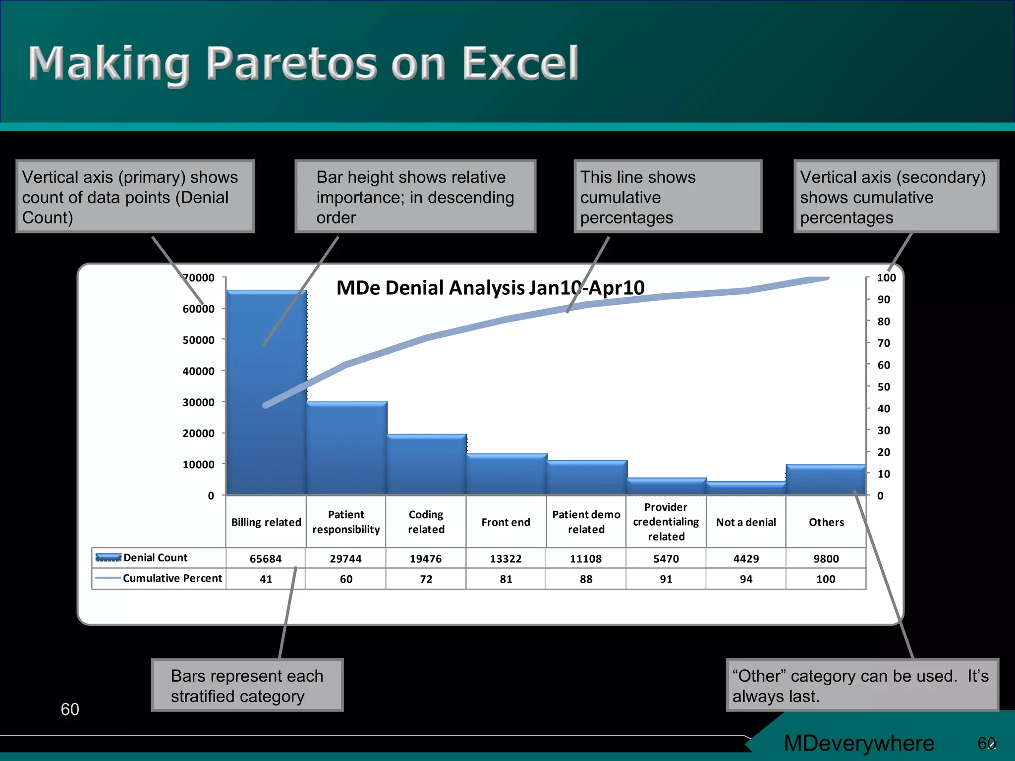
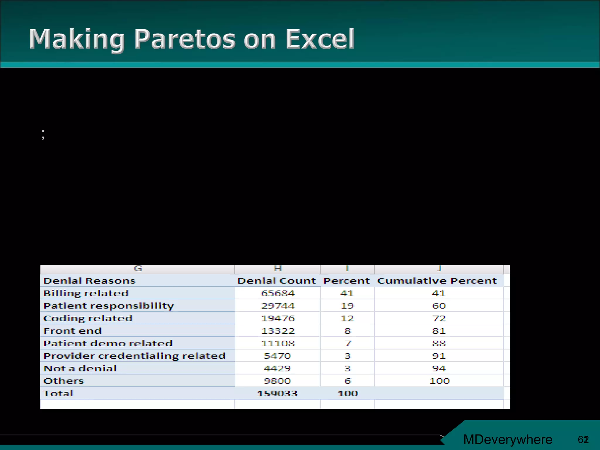
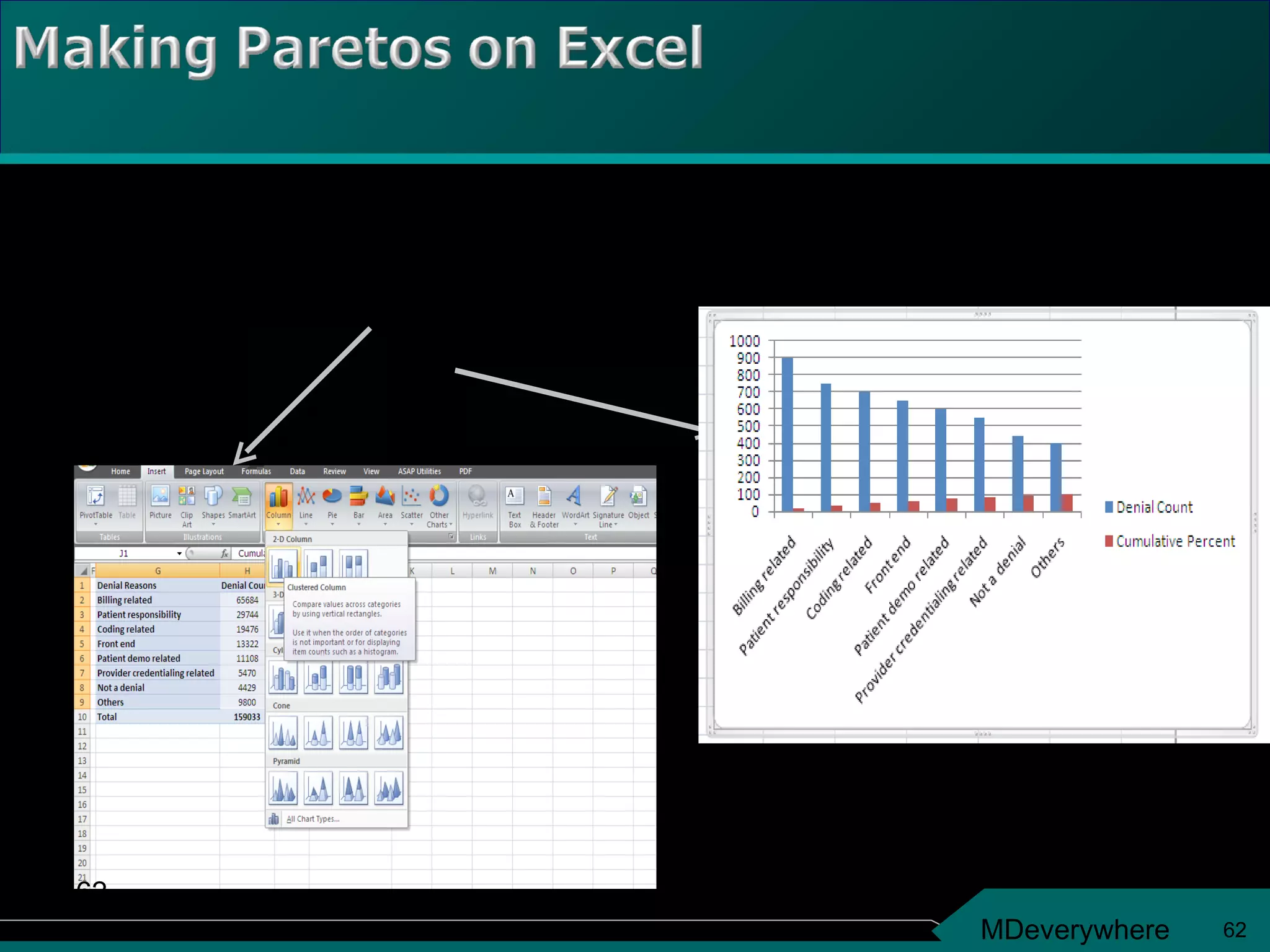
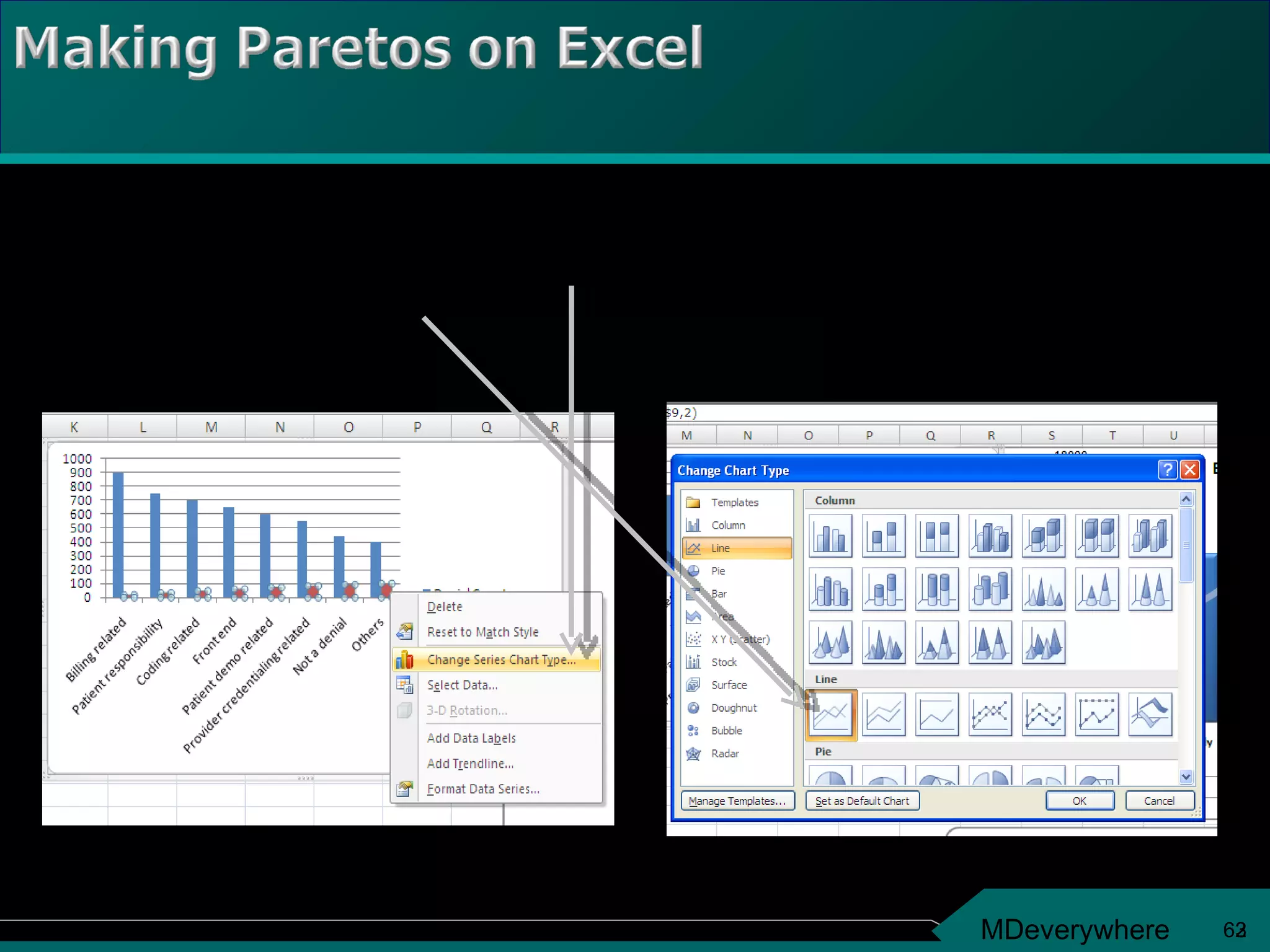
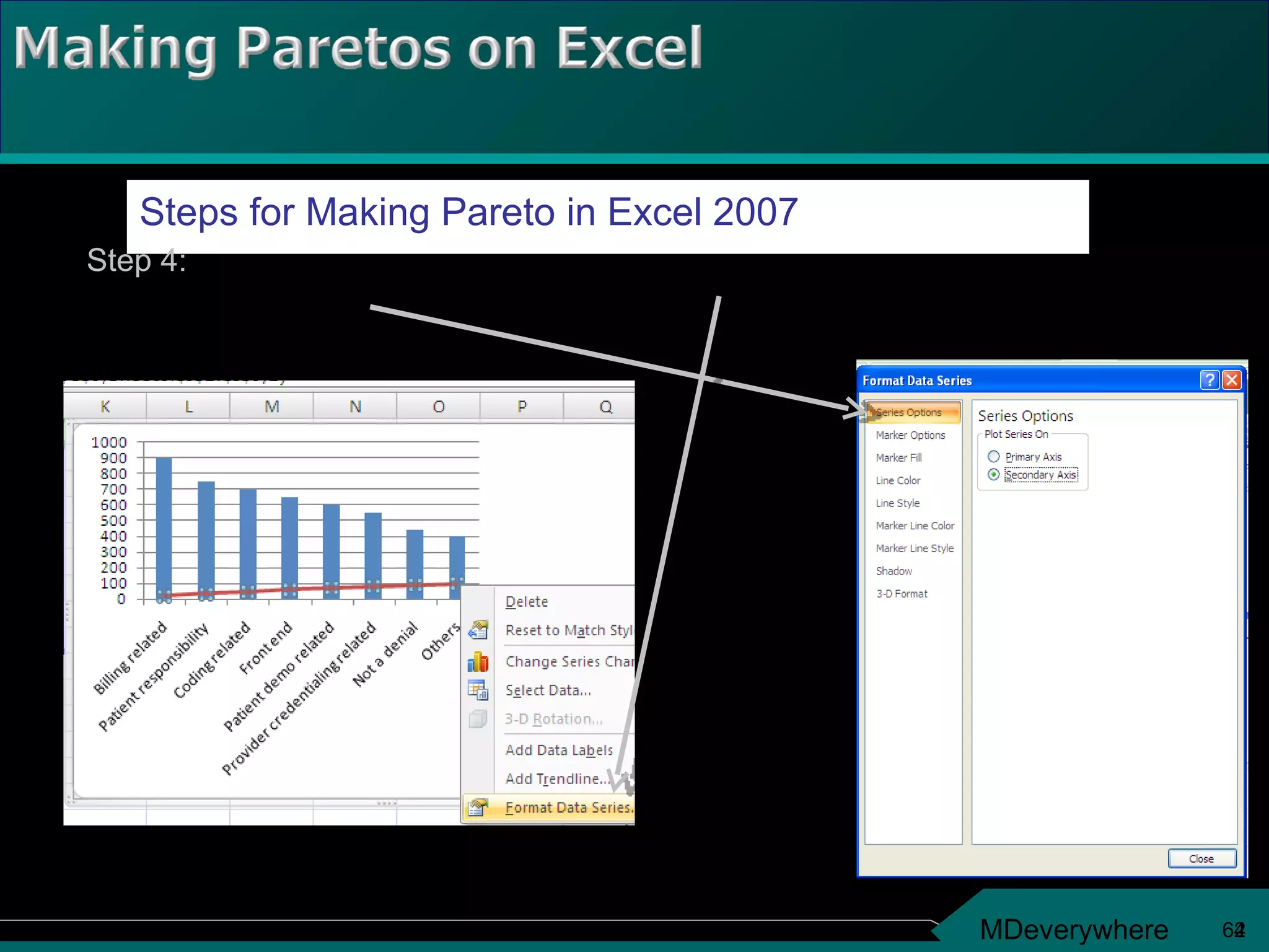
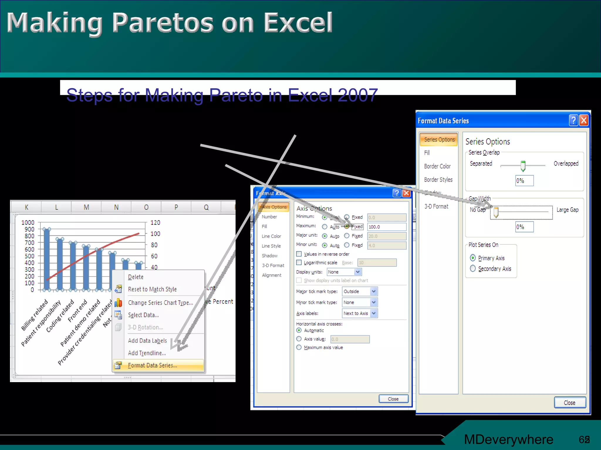
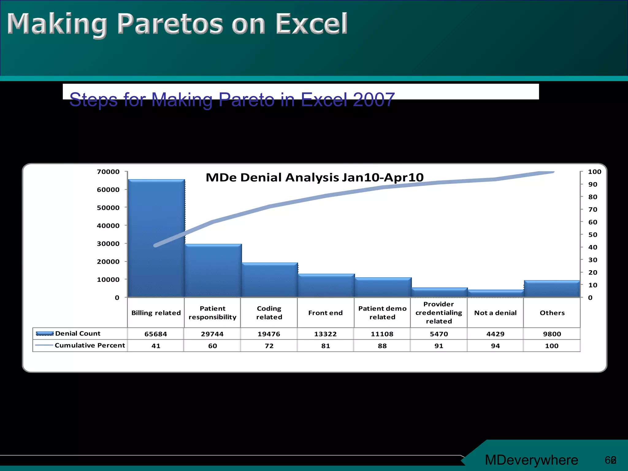
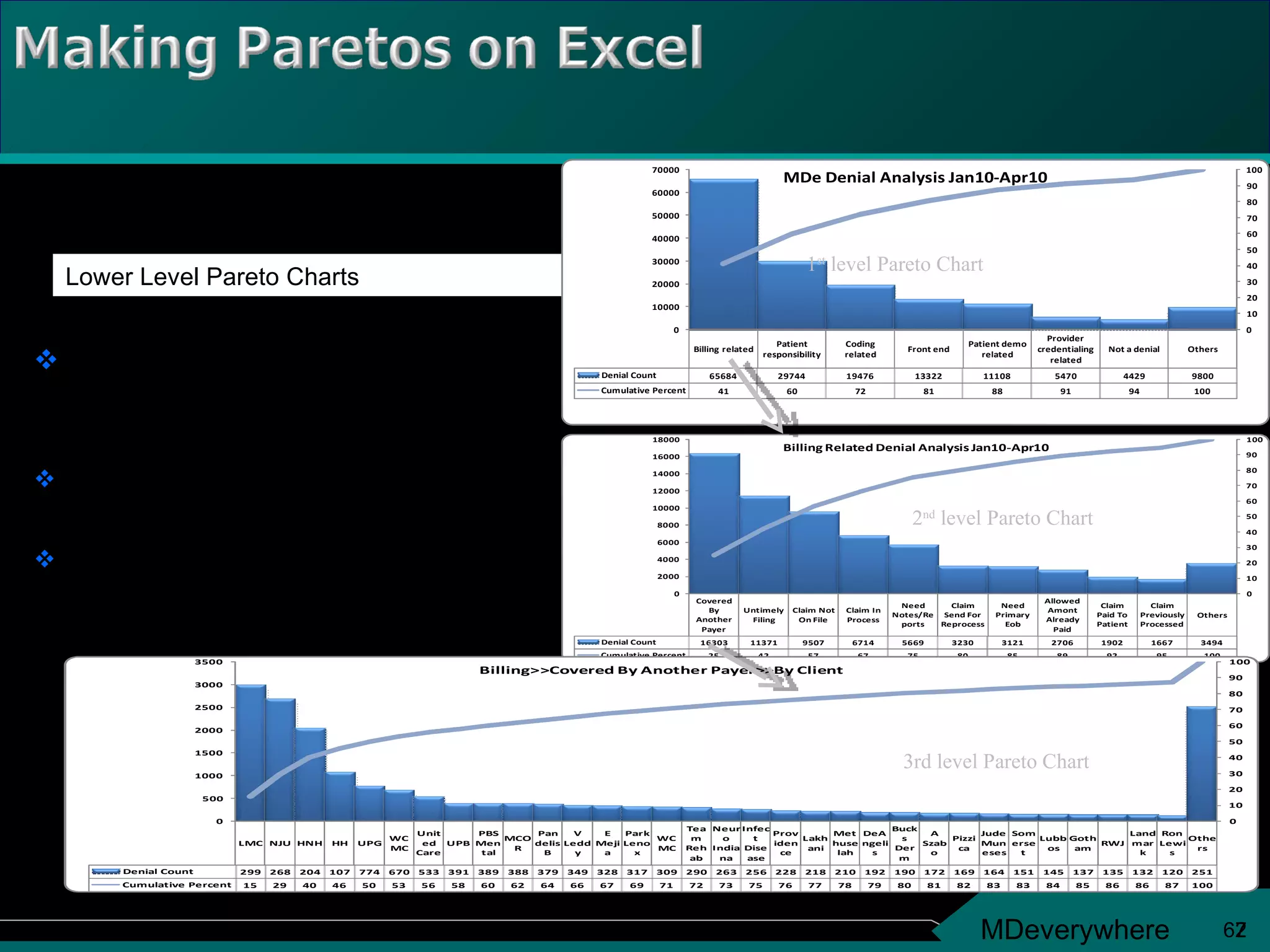
4. Historically Proactive Quality “ Create process that will produce less or no defects” Contemporary Reactive Quality Quality Checks (QC) - Taking the defectives out of what is produced
5. Tools Organization Methodology Driven by customer needs Enabled by quality team. Led by Senior Mgmt Define Measure Analyze Improve Control Process Map Analysis Pareto Chart Process variation LSL USL Upper/Lower specification limits Regression • • • • • • • • • • • • • • • • • • • • • • • • • • • • • • • • • • • • • • • • • • • • • •
6.
7.
8.
9. Sigma levels and Defects per million opportunities (DPMO) 4 Sigma 6,210 Defects 2 Sigma 308,537 Defects 3 Sigma 66,807 Defects 5 Sigma 233 Defects 6 Sigma 3.4 Defects
10. Example quoted from GE Book of Knowledge - copyright GE Is 99% (3.8 ) good enough? 99.99966% Good – At 6 20,000 lost mails per hour 7 lost mails per hour Unsafe drinking water almost 15 minutes each day One minute of unsafe drinking water every seven months 5,000 incorrect surgical operations per week 1.7 incorrect surgical operations per week 2 short or long landings at most major airports daily One short or long landing at major airports every five years 200,000 wrong drug prescriptions each year 68 wrong drug prescriptions each year
18. BPMS Business Process Management System DMAIC Six Sigma Improvement Methodology DMADV Creating new process which will perform @ Six Sigma
19. THE DMAIC MODEL – For attaining Excellence in existing Processes Define Measure Analyze Improve Control Combination of change management & statistical analysis Define Measure Analyze Design Verify THE DMADV MODEL - Setting up New Processes to Deliver @ SIX SIGMA also known as DFSS ( Design For Six Sigma)
20. Define purpose of the process, its goal and its boundaries Identify Critical to Quality and Critical to process Visual representation of performance Map process steps, identify input/ output measures MSA, DCP, indicators and monitors Service excellence and process excellence The DMAIC cycle Define Process Mission Map Process VOC and VOP Build PMS Develop Dashboards Identify Improvement Opportunities
24. Practical Problem Statistical Problem Statistical Solution Practical Solution
25. D Define M Measure A Analyze I Improve C Control Identify and state the practical problem Validate the practical problem by collecting data Convert the practical problem to a statistical one, define statistical goal and identify potential statistical solution Confirm and test the statistical solution Convert the statistical solution to a practical solution Monitor and Sustain implemented solutions / processes and make new processes a way of Life.
26.
27.
28.
29.
30.
31.
32.
33.
34. Add up about 30 of most things and you start to be “normal” Normal distributions are divide up into 3 standard deviations on each side of the mean Once your that, you know a lot about what is going on And that is what a standard deviation is good for
35. The world tends to be bell-shaped Most outcomes occur in the middle Fewer in the “ tails” (lower) Fewer in the “ tails” (upper) Even very rare outcomes are possible (probability > 0) Even very rare outcomes are possible (probability > 0)
36. 4- 1 2 3 4 5 6 7 8 9 10 Sample number Upper control limit Process average Lower control limit Out of control
37.
38.
39.
40.
41.
42.
43.
44.
45. Here is why: Even outcomes that are equally likely (like dice), when you add them up, become bell shaped
51. Bar height shows relative importance; in descending order Bars represent each stratified category Vertical axis shows relative percentages “ Other” category can be used. It’s always last. Vertical axis shows count of data points The line shows cumulative percentages
52. The Pareto Principle applies if one or more categories account for a large percentage of the occurrences. Look for the bars that are much taller than the rest.
53.
54.
55. The Pareto Principle does not apply if all the categories account for an approximately equal percentage of the occurrences. All the bars are about the same height.
56.
57. Occurrences in the “other” category should be redistributed to existing categories or a new category should be created If you create an “other” category ensure that it is not one of the larger bars on the chart.
60. 2 Bar height shows relative importance; in descending order Bars represent each stratified category Vertical axis (secondary) shows cumulative percentages “ Other” category can be used. It’s always last. Vertical axis (primary) shows count of data points (Denial Count) This line shows cumulative percentages
61.
62.
63.
64.
65.
66.
67.
Editor's Notes
Setting the expectation of audience. Following are the topics which would be covered not necessarily in the same order.
The Pareto Chart is named after Vilfredo Pareto, an Italian economist who observed in the early 1900s that the vast majority of wealth was in the possession of only a few people. Dr. Joseph Juran, who published this principle in the 1950s, showed that the principle can be applied to a wide variety of situations, especially quality problems in particular. Applying the principle in the workplace means that the greatest achievements are gained from action when attention is concentrated on the "vital few" problems. The Pareto chart is named after Vilfredo Pareto, an Italian economist, who observed in the early 1900s that a relatively few people held the majority of the wealth. In the 1950s, Dr. Joseph Juran popularized this principle by showing that it applied in a variety of situations, especially quality problems. Applying this principle to our everyday problems means we will get the biggest gains for our efforts if we focus on the “vital few” problems.
These are examples in everyday situations where the Pareto Principle applies. The last example “tardy events” is used in subsequent slides are an example.
Category 0 5000 10000 15000 20000 25000 Amount of Spoilage ($$) Produce Meat Dairy Bakery Other Grocery Store Spoilage by Department October–December 1997 100% 80% 60% 40% 20% Percentage of total Sometimes a “cumulative percentage” line is added to a Pareto chart to help visualize the percentage of the problem contributed by each category Pareto Chart Used for categorical data. Categories must be nonoverlapping and exhaustive of the total problem. That is, each instance sorted can go into one, and only one, category. Height of bar represents relative importance of that category. Bars are arranged in descending order from left to right. The bar for the biggest problem is always on the left. Height of vertical axis represents sum of all occurrences (not just the height of the tallest bar). Some Pareto charts will also show a “cumulative percentage” line. The raw data is converted to “percentage of the total” and a parallel vertical axis drawn on the right side of the chart. For example, in the chart shown, it’s easy to see that produce accounted for close to 50% of the total dollars lost.
The first thing to check on a Pareto chart is whether the Pareto principle holds. A few of the categories should account for most of the problem.
Start with the largest bar, unless you believe that one of the other bars will be much easier to attack. If possible, make a new Pareto chart of the problems that make up the tallest bar. If any of the bars point to problems with simple solutions, by all means attack them, even if these problems are not the tallest bars.
The first thing to check on a Pareto chart is whether the Pareto principle holds. A few of the categories should account for most of the problem.
Analyze the Pareto chart to ensure that the “Other” bar is not one of the taller categories. If so, the data in the “other” category needs to be reanalyzed to see if new categories can be made.