Salford City College
Eccles Centre
AS Media Studies
Foundation Portfolio

olours
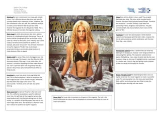
Mastheadthe font is constructed in a strong gold metallic
colour. This is effective because the colour gold typically
connotes wealth and is impressive to own. In addition, the
font is fashioned in the sans seffi. This is effective because
it creates a more feminism feel because it is softer.
However the magazine fits in to the genre of indie. This is
effective because it illustrates the magazine as being
unique
Main imagethe artist demonstrates clear direct address
because she is looking directly into the camera. The use of
sharks could be Iconography for the fact that the artist is
scene as a threat to other artist in the industry. Also I could
create a narrative enema code for the audience. For
example, why is she not scared? This will make them want
to buy the magazine. The fact that she is dressed
proactively introduces a secondary target audience of
males because of the sex appeal.

Colourthere is three distinct colours used. They are gold,
black/grey and white. The colour white connoted purity
however the colour black connotes mystery/danger. Therefore
this introduces a contrast. The black could reflect her
personality of being dangerous and mysterious. The gold
connotes wealth and also symbolises urban music and the
genre of R&B.
Typefacesthe cover liens are displayed in white blocked
capitols witch juxtaposes with the text in italics. However the
text in italics provides an artistic combination with the mast
head that is also in italics.

Photography Lightingthere is a predominate use of low key
lighting in the background, however in the foreground there is
obvious high key lighting. This makes the artist stand out
against the backdrop, it also make the artist look like the most
important image on the cover. It highlight that she is portrayed
in a positive way. Also the high key lighting creates shadows
on the artist body witch displays her muscles.

Model creditthe name of the artistis the biggest cover line
that is on the page. This makes it clear that the artist is the
dominate interest of the page. It is in white colour this
presents a contrast to the background and makes it stand
out. It is in a serif font witch links the genre of R&B. It is
placed in the primary optical area which make it the fist
thing you see.

Design Principles Used?The Guttenberg had been uses as a
typical convention of a music magazine to create a successful
cover. The primary optical area, the strong and weak fallow
field, and the terminal area have been filled to make the,
magazine appear bursting with new stories.

Coverlinesthe cover lines are in the strong fallow field
area. This is effective because it helps the emphasise the
main image because it is the second thing you will look at.
Also they frame the image so the cover is not
overcrounede. The fonts are in serif with clear white
lettering.

Main cover linethe name of the artist is the main cover
line. This is effective becausleaves space for additional
cover lines, this will help sell the magazine because the
target audience will think they are getting more for their
money. It is issued in the primary optical area next to the
main image of the artist. Also because it is the main cover
line it entices the audience to buy the magazine.

House StyleThe house style is consistent in all aspects of the magazine. The font is the
same, furthermore the colours that are displayed are consistent witch helps to create an
urbant atmosphere.

Shakeria roling stones.

  • 1.
    Salford City College EcclesCentre AS Media Studies Foundation Portfolio olours Mastheadthe font is constructed in a strong gold metallic colour. This is effective because the colour gold typically connotes wealth and is impressive to own. In addition, the font is fashioned in the sans seffi. This is effective because it creates a more feminism feel because it is softer. However the magazine fits in to the genre of indie. This is effective because it illustrates the magazine as being unique Main imagethe artist demonstrates clear direct address because she is looking directly into the camera. The use of sharks could be Iconography for the fact that the artist is scene as a threat to other artist in the industry. Also I could create a narrative enema code for the audience. For example, why is she not scared? This will make them want to buy the magazine. The fact that she is dressed proactively introduces a secondary target audience of males because of the sex appeal. Colourthere is three distinct colours used. They are gold, black/grey and white. The colour white connoted purity however the colour black connotes mystery/danger. Therefore this introduces a contrast. The black could reflect her personality of being dangerous and mysterious. The gold connotes wealth and also symbolises urban music and the genre of R&B. Typefacesthe cover liens are displayed in white blocked capitols witch juxtaposes with the text in italics. However the text in italics provides an artistic combination with the mast head that is also in italics. Photography Lightingthere is a predominate use of low key lighting in the background, however in the foreground there is obvious high key lighting. This makes the artist stand out against the backdrop, it also make the artist look like the most important image on the cover. It highlight that she is portrayed in a positive way. Also the high key lighting creates shadows on the artist body witch displays her muscles. Model creditthe name of the artistis the biggest cover line that is on the page. This makes it clear that the artist is the dominate interest of the page. It is in white colour this presents a contrast to the background and makes it stand out. It is in a serif font witch links the genre of R&B. It is placed in the primary optical area which make it the fist thing you see. Design Principles Used?The Guttenberg had been uses as a typical convention of a music magazine to create a successful cover. The primary optical area, the strong and weak fallow field, and the terminal area have been filled to make the, magazine appear bursting with new stories. Coverlinesthe cover lines are in the strong fallow field area. This is effective because it helps the emphasise the main image because it is the second thing you will look at. Also they frame the image so the cover is not overcrounede. The fonts are in serif with clear white lettering. Main cover linethe name of the artist is the main cover line. This is effective becausleaves space for additional cover lines, this will help sell the magazine because the target audience will think they are getting more for their money. It is issued in the primary optical area next to the main image of the artist. Also because it is the main cover line it entices the audience to buy the magazine. House StyleThe house style is consistent in all aspects of the magazine. The font is the same, furthermore the colours that are displayed are consistent witch helps to create an urbant atmosphere.