This document analyzes the design conventions used in a student-created R&B magazine.
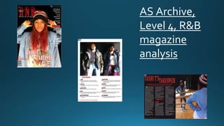
The front cover uses a central image of an artist looking at the camera to engage the viewer. Stereotypical R&B elements like headphones, piercings and jewelry are included. Red, black and white colors are used consistently throughout to brand the magazine.
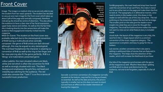
The contents page diverges from conventions by omitting "contents" and using a feature page format and image. Page numbers are in black with descriptions in red to draw the eye.
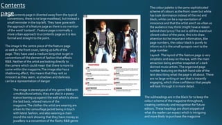
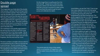
A double-page spread uses a large side profile image of an artist to invite readers into her perspective. Quotes from her discuss deeper lyrics and her desire to