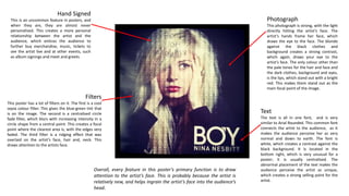
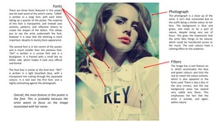
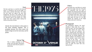
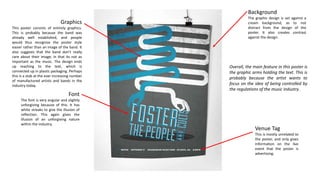
Poster Inspiration 
Analysis
Hand Signed 
This is an uncommon feature in posters, and 
when they are, they are almost never 
personalised. This creates a more personal 
relationship between the artist and the 
audience, which entices the audience to 
further buy merchandise, music, tickets to 
see the artist live and at other events, such 
as album signings and meet and greets. 
Photograph 
This photograph is strong, with the light 
directly hitting the artist’s face. The 
artist’s hands frame her face, which 
draws the eye to the face. The blonde 
against the black clothes and 
background creates a strong contrast, 
which again, draws your eye to the 
artist’s face. The only colour other than 
the pale tones for the hair and face and 
the dark clothes, background and eyes, 
is the lips, which stand out with a bright 
red. This makes them stand out as the 
main focal point of the image. 
Text 
The text is all in one font, and is very 
similar to Arial Rounded. This common font 
connects the artist to the audience, as it 
makes the audience perceive her as very 
normal and down to earth. The font is 
white, which creates a contrast against the 
black background. It is located in the 
bottom right, which is very unusual for a 
poster; it is usually centralised. The 
abnormal placement of the text makes the 
audience perceive the artist as unique, 
which creates a strong selling point for the 
artist. 
Filters 
This poster has a lot of filters on it. The first is a cool 
sepia colour filter. This gives the blue-green tint that 
is on the image. The second is a centralised circle 
fade filter, which blurs with increasing intensity in a 
circle shape from a central point. This creates a focal 
point where the clearest area is, with the edges very 
faded. The third filter is a ridging effect that was 
overlaid on the artist’s face, hair and, neck. This 
draws attention to the artists face. 
Overall, every feature in this poster’s primary function is to draw 
attention to the artist’s face. This is probably because the artist is 
relatively new, and helps ingrain the artist’s face into the audience’s 
head.
Fonts 
There are three fonts featured in this poster, 
one for each word of the artist’s name. “LANA” 
is written in a large font, with each letter 
taking up a quarter of the poster. The majority 
of this font is transparent, and instead uses 
outlines, patterns, and reflective sheens to 
create the shapes of the letters. This allows 
you to see the artist underneath the font, 
however it is clear that the lettering is more 
important, despite its barely there appearance. 
The second font is in the centre of the poster, 
and is much smaller than the previous font. 
“Del” is written is a cursive font and is a 
blue/green. It is framed with a small dot on 
either side, which makes it look very official 
and formal. 
The final font is similar to the Arial font. “REY” 
is written in a light blue/dark blue, with a 
transparent line cutting through the separated 
colours. It is laid over the first font, and is 
highly contrasting against the photograph. 
Photograph 
The photograph is a close up of the 
artist. It isn’t that contrasted due to 
the outfit being a similar colour to her 
face. The background is blue and 
green, and looks to be a part of 
nature, despite being very out of 
focus. This gives the impression that 
the artist likes things to be natural, 
which could be transferred across to 
her music. The cool colours have a 
calming effect on the audience. 
Filters 
The image has a cool feature on 
it, which accentuates the blue 
and green colours, and tints the 
rest to match the colour scheme, 
which is also apparent in the 
fonts used. There is also a blur in 
the very corners, and the top 
background areas has several 
very subtle lens flares. This 
emphasises the fact that the 
artist is outside, and again, 
within nature. 
Overall, the main feature in this poster is 
the font. This is probably because the 
artist wants to focus on the image 
associated with her name.
Filters 
The poster has a cool filter on it, which 
gives the image a blue tint. This gives 
the impression that the band is 
relaxed, and subconsciously makes the 
audience relax with the band, creating 
a connection with them. There is also 
a lens flare across the entire image, 
which gives the idea of a lot light, 
despite the majority of the image 
being mostly cast in darkness. 
Photograph 
The photograph features the band 
standing in what looks like a multi-storey 
car park. The strip halogen bulb 
casts light behind the band, which 
throws the band into darkness. The 
band is wearing blue and black, and 
each war their individual style while still 
looking like the belong together. The 
band is sanding in the forefront of the 
picture, leaving a space which shows 
the roof of the room. The dark 
appearance would usually seem to be 
uninviting, however, the image does 
seem to make the band look very 
approachable. 
Font 
The font used here is a motif for the featured 
band. It is overlaid on top of the image, in a 
white colour, outlined with black. This makes 
the text stand out against the dark blue 
background. The font is very broken up, with 
sections of each character missing. This makes 
the audience stare at the poster for a little 
longer than they usually would; making the 
chance of purchase increase 
Overall, the main feature in this poster is 
the band standing together. This is 
probably because the artist wants the 
band’s image to be the main focus of the 
poster. 
Venue Tag 
This is mostly unrelated to the 
poster, and only gives information 
on the live event that the poster is 
advertising.
Graphics 
This poster consists of entirely graphics. 
This is probably because the band was 
already well established, and people 
would thus recognise the poster style 
easier rather than an image of the band. It 
also suggests that the band don’t really 
care about their image; in that its not as 
important as the music. The design ends 
up reaching to the text, which is 
connected up in plastic packaging. Perhaps 
this is a stab at the ever increasing number 
of manufactured artists and bands in the 
industry today. 
Font 
The font is very angular and slightly 
unforgiving because of this. It has 
white streaks to give the illusion of 
reflection. This again gives the 
illusion of an unforgiving nature 
within the industry. 
Background 
The graphic design is set against a 
cream background, as to not 
distract from the design of the 
poster. It also creates contrast 
against the design. 
Overall, the main feature in this poster is 
the graphic arms holding the text. This is 
probably because the artist wants to 
focus on the idea of being controlled by 
the regulations of the music industry. 
Venue Tag 
This is mostly unrelated to 
the poster, and only gives 
information on the live 
event that the poster is 
advertising.

Poster Analysis

  • 1.
  • 2.
    Hand Signed Thisis an uncommon feature in posters, and when they are, they are almost never personalised. This creates a more personal relationship between the artist and the audience, which entices the audience to further buy merchandise, music, tickets to see the artist live and at other events, such as album signings and meet and greets. Photograph This photograph is strong, with the light directly hitting the artist’s face. The artist’s hands frame her face, which draws the eye to the face. The blonde against the black clothes and background creates a strong contrast, which again, draws your eye to the artist’s face. The only colour other than the pale tones for the hair and face and the dark clothes, background and eyes, is the lips, which stand out with a bright red. This makes them stand out as the main focal point of the image. Text The text is all in one font, and is very similar to Arial Rounded. This common font connects the artist to the audience, as it makes the audience perceive her as very normal and down to earth. The font is white, which creates a contrast against the black background. It is located in the bottom right, which is very unusual for a poster; it is usually centralised. The abnormal placement of the text makes the audience perceive the artist as unique, which creates a strong selling point for the artist. Filters This poster has a lot of filters on it. The first is a cool sepia colour filter. This gives the blue-green tint that is on the image. The second is a centralised circle fade filter, which blurs with increasing intensity in a circle shape from a central point. This creates a focal point where the clearest area is, with the edges very faded. The third filter is a ridging effect that was overlaid on the artist’s face, hair and, neck. This draws attention to the artists face. Overall, every feature in this poster’s primary function is to draw attention to the artist’s face. This is probably because the artist is relatively new, and helps ingrain the artist’s face into the audience’s head.
  • 3.
    Fonts There arethree fonts featured in this poster, one for each word of the artist’s name. “LANA” is written in a large font, with each letter taking up a quarter of the poster. The majority of this font is transparent, and instead uses outlines, patterns, and reflective sheens to create the shapes of the letters. This allows you to see the artist underneath the font, however it is clear that the lettering is more important, despite its barely there appearance. The second font is in the centre of the poster, and is much smaller than the previous font. “Del” is written is a cursive font and is a blue/green. It is framed with a small dot on either side, which makes it look very official and formal. The final font is similar to the Arial font. “REY” is written in a light blue/dark blue, with a transparent line cutting through the separated colours. It is laid over the first font, and is highly contrasting against the photograph. Photograph The photograph is a close up of the artist. It isn’t that contrasted due to the outfit being a similar colour to her face. The background is blue and green, and looks to be a part of nature, despite being very out of focus. This gives the impression that the artist likes things to be natural, which could be transferred across to her music. The cool colours have a calming effect on the audience. Filters The image has a cool feature on it, which accentuates the blue and green colours, and tints the rest to match the colour scheme, which is also apparent in the fonts used. There is also a blur in the very corners, and the top background areas has several very subtle lens flares. This emphasises the fact that the artist is outside, and again, within nature. Overall, the main feature in this poster is the font. This is probably because the artist wants to focus on the image associated with her name.
  • 4.
    Filters The posterhas a cool filter on it, which gives the image a blue tint. This gives the impression that the band is relaxed, and subconsciously makes the audience relax with the band, creating a connection with them. There is also a lens flare across the entire image, which gives the idea of a lot light, despite the majority of the image being mostly cast in darkness. Photograph The photograph features the band standing in what looks like a multi-storey car park. The strip halogen bulb casts light behind the band, which throws the band into darkness. The band is wearing blue and black, and each war their individual style while still looking like the belong together. The band is sanding in the forefront of the picture, leaving a space which shows the roof of the room. The dark appearance would usually seem to be uninviting, however, the image does seem to make the band look very approachable. Font The font used here is a motif for the featured band. It is overlaid on top of the image, in a white colour, outlined with black. This makes the text stand out against the dark blue background. The font is very broken up, with sections of each character missing. This makes the audience stare at the poster for a little longer than they usually would; making the chance of purchase increase Overall, the main feature in this poster is the band standing together. This is probably because the artist wants the band’s image to be the main focus of the poster. Venue Tag This is mostly unrelated to the poster, and only gives information on the live event that the poster is advertising.
  • 5.
    Graphics This posterconsists of entirely graphics. This is probably because the band was already well established, and people would thus recognise the poster style easier rather than an image of the band. It also suggests that the band don’t really care about their image; in that its not as important as the music. The design ends up reaching to the text, which is connected up in plastic packaging. Perhaps this is a stab at the ever increasing number of manufactured artists and bands in the industry today. Font The font is very angular and slightly unforgiving because of this. It has white streaks to give the illusion of reflection. This again gives the illusion of an unforgiving nature within the industry. Background The graphic design is set against a cream background, as to not distract from the design of the poster. It also creates contrast against the design. Overall, the main feature in this poster is the graphic arms holding the text. This is probably because the artist wants to focus on the idea of being controlled by the regulations of the music industry. Venue Tag This is mostly unrelated to the poster, and only gives information on the live event that the poster is advertising.