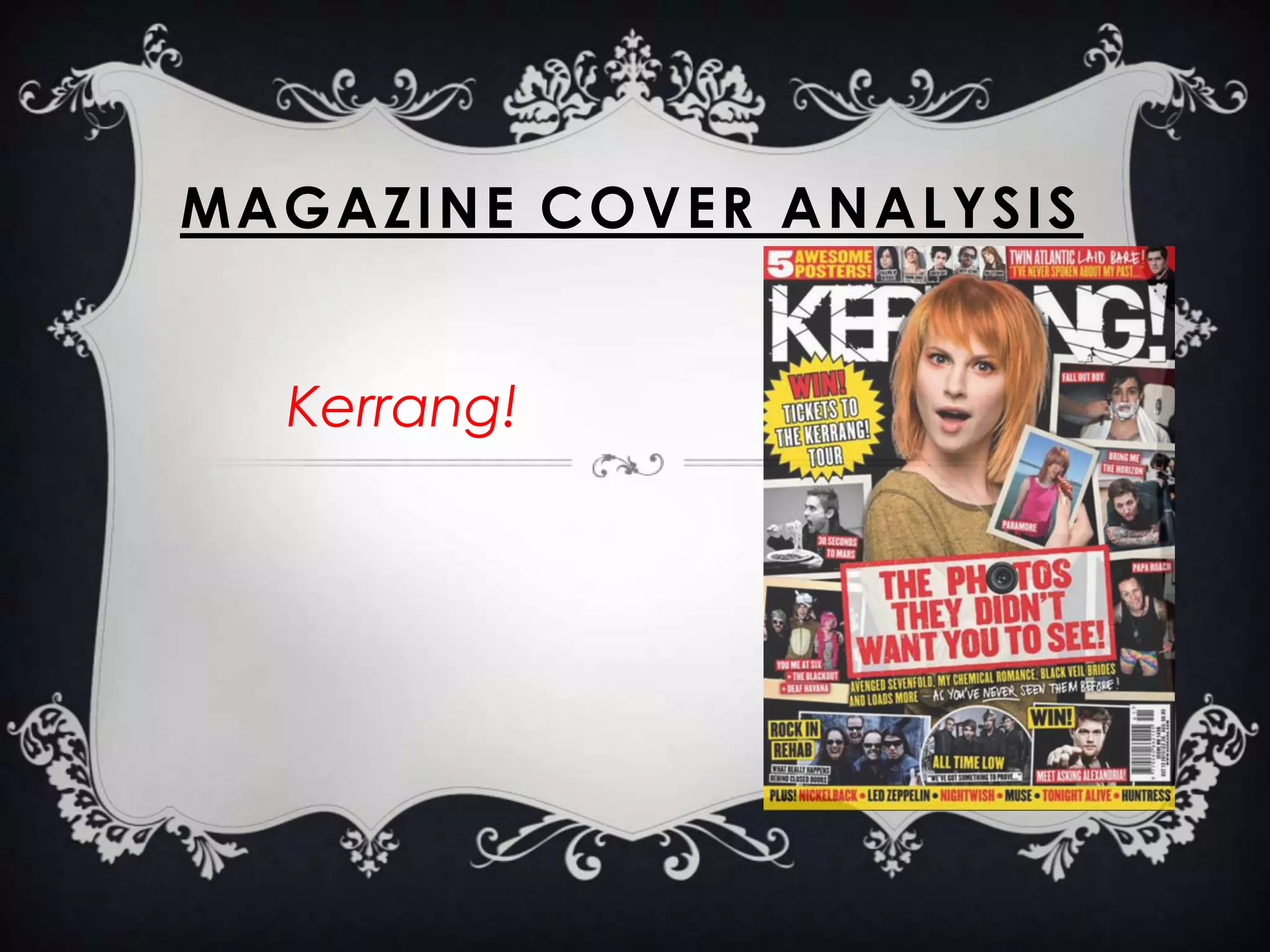
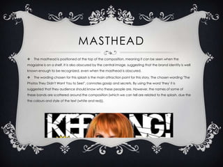
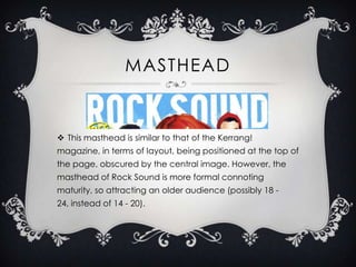
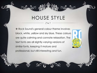
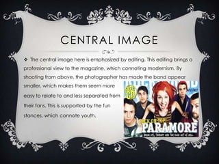
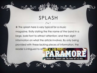
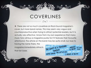
This document analyzes and compares the cover designs of two rock music magazines: Kerrang! and Rock Sound. For Kerrang!, the masthead is obscured by the central image of Paramore's Hayley Williams, implying brand recognition. Intriguing text and band names scattered around draw readers' attention. Rock Sound uses a calming color scheme and varying fonts to seem mature yet fun. Its central image emphasizes an above-shot band to appear relatable. Both magazines attract readers through prominent placement of band names rather than extensive coverlines.