Manfaat filter air Dr.Toya sbb:
Air menjadi bersih sepanjang hari
Terhindar dari kemungkinan datangnya penyakit yang disebabkan oleh air
Pakaian dan perabotan rumah lebih awet
Bebas bau,keruh,kuning dan karat
Dan masih banyak lainya
1. Salford City College
Eccles Centre
AS Media Studies
Foundation Portfolio
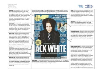
Masthead: The masthead is in a bold, sans serif font
with a slight black outline. This and its light yellow
colour against the blue background allow it to stand
out and grab the reader’s attention from a distance.
The use of three letters ‘NME’ for the masthead makes
it short and simple and easy for an audience to
remember. ‘NME’ is an abbreviation of ‘New Musical
Express’ which directly relates to what it is selling, a
music magazine.
Comment on how the design of the magazine cover attracts the target audience:The design
attracts a target audience of teenagers to middle aged adults as it covers several music genres
and therefore could appeal to several different age groups and genders.
Typefaces: Sans serif typefaces are used to imply that the
genres of music covered by the magazine may not be
serious or classical which a serif font may imply. They are
also very bold and striking which draws in the reader’s eye.
Main image: The model is in the centre of the page
and he fills most of it, drawing all of the attention to
him. This use of space suggests that the main article in
the magazine is going to be about him which draws in
an audience of his fan base. He is also looking into the
camera which directly addresses the audience and
attracts them to buy the magazine.
Photography Lighting: The model is looking into the camera
and directly addressing the audience which persuades them
to buy the magazine. He is also lit from the front directly
onto his face which, along with the make-up used, makes
his eyes look sunken and his face serious. This could
concern his fans and make them buy the magazine to read
on.
Model credit: The artist’s name is in bold, sans serif
font across the bottom of the page. It is in the same
colour and font as the masthead suggesting that he is
important and a main feature in the magazine. The
sans serif font suggests that he is not to be taken too
seriously but his facial expression suggests otherwise
which may be revealed in his interview. Fans of the
artist are persuaded to buy the magazine to read on
and find out about him because if this.
Design Principles Used?The masthead and main coverline
are both in the primary optical area which immediately
draws the reader’s attention to them. The model’s face also
covers part of the masthead which shows that he is the
main focus of the magazine as he is dominant.
Coverlines: The coverlines are in the same font as the
masthead and model credit yet they are in a more
subtle colour. This reveals that they are less important.
They are located in the primary optical and strong
fallow areas. This allows them to grab the reader’s
attention as they are the places that they will look after
the masthead and model.
Main cover line: The main coverline is located in the
primary optical area directly beneath the masthead.
This automatically draws attention to it as it is usually
the first place that a reader will look when they pick up
a magazine. It is also in bold font and is slightly larger
than the other coverlines which makes it stand out
from the rest.
Colour: The dominant colours on the page are blues which
suggests the coverage of several genres of music as it is a
neutral colour. Other colours used are whites and yellows.
The masthead and bubble which reads ‘Exclusive’ are in
yellow which catches the reader’s attention as it stands out
against the blues and whites.
House Style: The house style is blues and pale yellows with bold, sans serif font. This suggests a
neutral tone to the magazine and that it covers several genres of music and not just one. Whites
are also used on the descriptive text surrounding the coverlines.
The coverlines are in the strong fallow area which the
second place that the reader will look to when is deciding
whether or not to buy the magazine. Photographs are
included to support the coverlines and are also included in
the strong fallow area which draws attention to them as
they are bold and colourful against the blue background.
The weak fallow and terminal areas contain very little
information apart from the model credit which is in very
large font and is very eye catching which makes the reader
want to buy the magazine to read about the featured artist.