The document summarizes the design elements of a magazine cover for an R&B artist. It discusses how the masthead, colors, typefaces, cover lines, and central image attract the target audience. Red, black, gold and white colors are used to connote danger, lust, and royalty. A bold serif masthead establishes it as an R&B magazine. The central image uses rule of thirds and shows the artist wearing expensive clothes to create aspiration. Cover lines are in bold fonts and gold to stand out against the white background. Consistent design and manipulation of the central image through contrast and lighting create an effective house style.
1. Salford City College
Eccles Centre
AS Media Studies
Foundation Portfolio
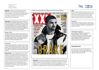
MastheadIt is placed in the primary optical area, this is
effective because it is the fist sight of the magazine you
subconsciously look at. The font of the mast head is bold and is
in serif font. This is a typical convention for this particular
genre of R&B. it shows that the music is loud and
overpowering but in a positive way.
Comment on how the design of the magazine cover attracts the target audience:
Colour
the colour pallet is expected for the genre of music. This is
because it consists of red, black gold and white colours. This
colour scheme is effective because the black and white
introduces a contrast between the red and gold. Gold
typically royalty and red usually connotes danger and lust.
Typefaces
Main imagethe dominating image follows the technique of
rule of thirds. This is effective because there is a sector or the
artist in each segment of the magazine. The artist is wearing
an expensive designer coat which creates an aspiration or a
role model for the males who are reading the magazine. The
fact that direct address has not been used could suggest an
enigma code for the audience to question his appearance and
makes them more intrigued to read the magazine.
Bold fonts which are long and narrow are used to create a
more modern tone so he target audience can relate more. It
is more current that the type face is no congested and it is
simple and consistent
Photography Lighting
Model credit
High key lighting to highlight his clothing and well
groomed appearance. High key images are
considered ‘’happy’’ this is contradicted by is serious
facial expression. Additionally, the use of unnatural
high key lighting puts etherise on the artist. As a
result it illustrates the artist as being the most
important aspect of the magazine.
The letters are spread out and bold. They are located in the
weak fallow area and terminal area, this is effective because
the image of the artist id not distracted from. The lettering is
in a predominate gold colour. This is effective because the
gold colour connotes royalty and high class. This is also a
stereotypical convention of the genre of R&B.
Coverlines
The cover lines are displayed as consistent on the front cover.
The is illustrated by the colours and the font witch is in bold
lettering. This is effective because it gives a professional feel
to the magazine. Additionally, it fames the dominating image
of the artist; this will help to sell the magazine to the target
audience.
Main cover lineis also in a strong gold colour, this is effective
because it creates a subtle contrast from the plain white
background. This makes the main cover line stand out and is
more eye Appling for the target audience. It is situated in at
the bottom of the page; this works because it is the last place
you automatically look. However because of the bold font it
sands out. The main cover line is also the model credit, this is
effective because it gives the target audience a strong
understanding that the artist is the predominate aspect of
the magazine. This ill also encourage the target audience to
purchase the magazine.
Design Principles Used?
Cover linesin columns to hold the pages together and
film negative space. There are larger headlines and
makes the magazine understandable. There is a large
image which is the focal point of XXL.
House Stylethe houses style us consistent over the front cover because all aspects of the
magazine follows the codes and conventions of a traditional music magazine. For example
the cover lines frames the dominating image witch helps sell the magazine. Also in the
editing proses, it is clear that the central image has been manipulated because it is in black
and white. This is effective because it creates a contrast between the bright colours.