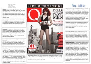
This document provides an analysis of the design elements on a music magazine cover. It discusses the color palette of red, white, and black and how they establish contrast and connote genres like indie/rock. The masthead takes up the full top left grid square and uses a bold red color and font to draw emphasis. The main cover line is in black lettering for contrast and catches the eye. A variety of sans serif fonts are used to make the cover more modern. The main image is a full-page photo of the featured artist placed in the center using techniques like direct address to engage the audience. Design principles like the rule of thirds and Gutenberg diagram are employed to draw attention to key elements.


![Cover page essay[1]](https://cdn.slidesharecdn.com/ss_thumbnails/coverpageessay1-120306090038-phpapp01-thumbnail.jpg?width=640&height=640&fit=bounds)


