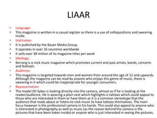
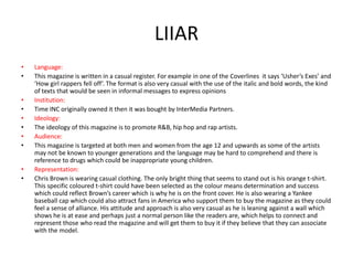
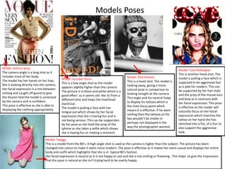
Research
By Evie Theodore
Secondary images
These help to intrigue
the reader as they are
able to see who else
will feature in the
magazine. The reader
will see the text
advertising the
posters and if they like
a particular band
within the magazine
they will buy it for
them.
Main Image
This is a mid shot image
of the singer Oli Sykes
(as displayed in the
model credit). He is
holding a camera which
reflects what the main
story is about.
Footer bar.
This gives more
information and highlights
key points. The placing is
effective because of the
rules of eye flow as people
will naturally read from top
to bottom

Masthead.
This helps the magazine
become identifiable to
both frequent readers
and new readers because
of the sense of
consistency in the style.
Model Credit
This is telling readers
who the model is, in case
people are unaware
perhaps because they
may not follow his band
or read this magazine
Main Cover Line
Matches the Main image as
it relates to the camera.
Coverlines
These are telling the reader
more about what will be inside.
The use of the word ‘Starring’
gives it a sense of exclusivity as
these acts will only be seen
inside this magazine.
Barcode and Price
This stands out and is a
convenient place to put the
price as it is easy to find.
LIAAR
•
•
•
•
•
•
•
•
•
•
•
•

Language:
This magazine is written in a casual register as there is a use of colloquialisms and swearing
inside.
Institution:
It is published by the Bauer Media Group.
It operates in over 16 countries worldwide
It sells over 38 million of its magazine titles per week
Ideology:
Kerrang is a rock music magazine which promotes current and past artists, bands, concerts
and festivals.
Audience:
This magazine is targeted towards men and women from around the age of 12 and upwards.
Although the magazine can be read by anyone who enjoys this genre of music, there is
swearing in it which could be inappropriate for younger consumers.
Representation:
The model Oli Sykes is looking directly into the camera, almost as if he is looking at the
reader/audience. He is wearing a plain vest which highlights is tattoos which could appeal to
those who are interested in them or have them as it is a common stereotype that the
audience that reads about or listens to rock music to have tattoos themselves. The main
focus however is the professional camera in his hands. This could also appeal to anyone who
is interested in photography as well as music (as the reason behind the camera is the
pictures that have been taken inside) or anyone who is just interested in seeing the pictures.
Masthead.
This helps the magazine become identifiable to both frequent readers and new
readers because of the sense of consistency in the style.
Selling Line
‘Discover Great Music’ helps
identify the genre of the
magazine.
Plug
The plug is large, in another
colour and underneath the
Masthead to make sure people
can find it. It is promoting the
300th issue which may get people
to buy it for sentimental reasons
if they are a reoccurring reader or
a collector.
Coverlines
These Coverlines are promoting the
other articles of different music
artists inside. They are in different
colours to stand out from the main
focus point which is Adele
Barcode and Price
This is on the left side of the
magazine which is appropriate
because of the rules of eye flow and
people naturally read from left to
right, so they will be able to find the
price better

Main Image
This is a medium
close up of the
singer Adele.
Main pull quote
This suggests that there will
be more about the model
inside the magazine e.g an
article. It is positioned on the
top of the Main Cover line
which is the artists name to
show what she has to say. The
text is in white to give the
magazine ‘breath’ and to
match the Main Coverline. It is
also all in capitals to stand out
and to show that what Adele
has to say is important. The
use of the ellipses makes the
reader intrigued to read more
which they can only do if they
buy and read the magazine.

Main Coverline
The Main Coverline is the
models name. This shows
how she will be the main
topic in the magazine
LIIAR
•
•

•
•
•
•

Language:
This magazine is written in a casual register as there is a use of colloquialisms. For example ‘Blows
us away’ sounds very casual and language that someone who is apart of a particular group of
people that may read this magazine (especially through the use of the word ‘us’) would
understand.
Institution:
It is published by the Bauer Media Group.
It operates in over 16 countries worldwide
It sells over 38 million of its magazine titles per week

•
•

Ideology:
The ideology of the magazine is to promote artists of all genres and their music.

•
•

Audience:
This magazine is targeted at both men and women from the age 12 and upwards as some of the
artists may not be known to younger generations and the language may be hard to comprehend.
Representation:
The model is wearing makeup and her hair is being blown slightly behind her to show her face
more. This could be to represent women in particular to show how women of Adele’s age group
can look glamorous. Her quote ‘ If you’ve got, it flaunt it…’ can support this as she is talking about
her appearance. This could encourage women from her age range, or any women who admires
Adele to read to see what she has to say about her image as well as her music.

•
•
Main Coverline
This is in white to match the
Masthead. The colour white
makes it both stand out and gives
it breath. The word ‘that’ is in
italics to give a sense of
informality as it appears to be
casual text that may be sent as a
message in the form of how
someone would speak as if they
were shocked.
The models name is in capitals to
make it stand out to both show
who the model is and to further
support the fact that the speaker/
reader is and should be surprised
Main pull quote
This is a quote of something Chris
Brown has said, which may
encourage people to buy the
magazine if they think there will
be more interesting information
within the article inside the
magazine.
Barcode and Price
This is on the left side of the
magazine which is appropriate
because of the rules of eye
flow and people naturally read
from left to right, so they will
be able to find the price better

Plug
This is promoting
a special issue
that Vibe is selling
in order to attract
people to buy it.

Skyline/ tagline
This is showing another main article within the magazine. It is
positioned at the top above the Masthead as it is of great
importance and interest so it must be seen, but not overshadow
the main image and Main Coverline which is why it is still the
same colour as the other Coverlines and it isn't bigger than the
Masthead.

Masthead.
This helps the magazine
become identifiable to
both frequent readers
and new readers because
of the sense of
consistency in the style.
Coverlines
These inform the
reader of what else will
be included inside the
magazine and
encourage them to buy
it if there is something
of particular interest
inside
Main Image
This is a
mid shot of
Chris
Brown.
LIIAR
•
•
•
•
•
•
•
•
•
•

Language:
This magazine is written in a casual register. For example in one of the Coverlines it says ‘Usher’s Exes’ and
‘How girl rappers fell off’. The format is also very casual with the use of the italic and bold words, the kind
of texts that would be seen in informal messages to express opinions
Institution:
Time INC originally owned it then it was bought by InterMedia Partners.
Ideology:
The ideology of this magazine is to promote R&B, hip hop and rap artists.
Audience:
This magazine is targeted at both men and women from the age 12 and upwards as some of the artists
may not be known to younger generations and the language may be hard to comprehend and there is
reference to drugs which could be inappropriate young children.
Representation:
Chris Brown is wearing casual clothing. The only bright thing that seems to stand out is his orange t-shirt.
This specific coloured t-shirt could have been selected as the colour means determination and success
which could reflect Brown’s career which is why he is on the front cover. He is also wearing a Yankee
baseball cap which could also attract fans in America who support them to buy the magazine as they could
feel a sense of alliance. His attitude and approach is also very casual as he is leaning against a wall which
shows he is at ease and perhaps just a normal person like the readers are, which helps to connect and
represent those who read the magazine and will get them to buy it if they believe that they can associate
with the model.
DPS-(Double Page Spread)

Main Image.
This is a mid shot.
The singer,
Gerard Way, is in
dark clothing
which has been
made darker
through the use
of the black and
white effect. He
is gripping the
microphone and
his head is turned
away with his
hair falling in his
eyes as he looks
down. This could
reflect a struggle
or a problem,
especially related
to the title.

The text is very plain and simple in white so that it
can be read and to match the other texts. At the
start of the article the letter ‘M’ is in bold and in
red which is an appropriate convention used in
articles

Quote from the band members
from the article. The sentence
‘The Best MCR’ is bigger from
the rest of the text and in white
instead of read in order to stand
out and highlight the main point
of the article. The text is slightly
faded to match the Kerrang
Masthead.

These a sub
images, placed to
show the band
performing in the
recording studio
as the article says.
The last picture on
the right is of the
lead singer in the
recording booth.
Although he is
singing it appears
he is screaming
with an emotional
facial expression
which could also
reflect the title
and the sense of a
struggle.
The main image is of the singer Ed Sheeran.
He appears to be casual in a dark hoodie and
jeans . His hands are in his pockets and he is
looking in the distance somewhere, making
the image appear natural. Because he is in
front of popular land marks in London alone
with his back turned to them, he seems as
though he isn't doing anything important.

DPS-(Double Page Spread)
The text is very plain and simple in blue so that it can be read and to
match the other texts. Because it is blue and the other colour are red
and white, they make up the British flag which reflects the Big Ben
landmark in the background. At the start of the article the letter ‘I’ is
in bold and in white in a red box to match the Q House style. This is
an appropriate convention used in articles
This Q’S ‘The
Lowdown’
column, which
is separate
from the
article, but
still relates to
it. This is
promoting Ed
Sheeran’s
album

The word
‘Ginger’
stands out
in red to
match the
connotation

His guitar is next to him which shows he is a musician

This is the
official Q
magazine
logo, which
reminds
people of the
magazines
identity when
going through
the magazine
This is the editors note accompanied by
an image of the magazine front cover.
This is here to address the reader on the
ideas and themes

Table of contents

Main image. This is posed with a head shot
of the singer looking down and away from
the camera so it seems as though her
doesn’t notice or care about the cameras
and that he is in deep thought so it appears
natural.
The title is the same colour as the
subheadings. It informs the readers of
what the purpose of this page is. It is
bold and bright to stand out

These are sub headings which divide up the table
into different content sections that the articles
would fall under to make it easier for the reader to
find what they are looking for They are in a coloured
box so that they can stand out to the reader

These are the main features that can be found in the
magazine. There is a number which is the page
reference so the reader can find what they are
looking for easily followed by a simple title to tell
the reader what is on that page
These are secondary images used to give a visual
aid to show reader what will be in the magazine
on the specific pages so that much reading is not
required and readers can find articles of interest
faster.
NME Masthead
This is the same as the NME masthead
from the front cover. This gives a sense
of continuity.

This is the
band index
which
informs the
readers of
what bands
are playing
and on which
page they
can be found
to make
navigation
easier for the
reader.
This further
illuminates
the fact that
it is a music
magazine

Table of contents

This is the main image of a rock star
performing. It matches the kicker.
Also shows that this is a rock music
genre magazine.
This is the dateline.
This tells the reader
which issue this is so
they can be up to
date with what they
are reading.

These are sub headings which
divide up the table into
different content sections that
the articles would fall under to
make it easier for the reader to
find what they are looking for.
They are in a coloured box so
that they can stand out to the
reader
Here is an offer to promote the past and
future editions of NME with a money
saving deal.

It also makes the magazine more
available to e contacted because it gives
a phone number and a website which
further promotes the magazine
Models Poses

Model: Arlenis Sosa.
The camera angle is a long shot as it
includes most of her body.
The model has her hands on her hips.
She is looking directly into the camera.
Her facial expression is a mix between
smiling and caught off guard to give
the illusion that the model is unnerved
by the camera and is confident.
This pose is effective as she is able to
displaying the clothing appropriately.

Model: Jourdan Dunn
This is a low angle shot as the model
appears slightly higher than the camera.
The picture is in black and white which is a
good effect as it seems old like its from a
different time and helps the masthead
stand out.
The model is pulling a face with her
tongue out which shows by her facial
expression that she is having fun and is
not being serious. This can be supporsten
by her pose as she hold the prop of the
iphone as she takes a selfie which shows
she is having fun or making a moment.

Model: Rick Genest
This is a head shot. The model is
looking away, giving a more
natural pose in comparison to
looking straight at the camera.
This angle and his neutral helps
to display his tattoos which is
the main focus point which
means it is effective. If he were
smiling then the tattoos on his
lips wouldn’t be visible or
perhaps not displayed in the
way the photographer wanted.

Model: Cara Delevigne
This is another head shot. The
model is pulling a face which is
supposed to be aggressive but
as a joke for readers. This can
be supported by her hair style
and the prop of the mouse ears
and bow as it contrasts with
her facial expression. This pose
is effective as the reader will
naturally focus on her facial
expression which matches the
tattoo on her hand she has
clenched into a fist, of a lion to
also support the aggressive
look.

Model: Twiggy
This is a model from the 80’s. A high angle shot is used as the camera is higher than the subject. The picture has been
changed into colour to make it seem more modern. The pose is effective as it makes her seem casual and displays her entire
body and outfit which highlights that she is in typical 80’s fashion.
Her facial expression is neutral as it is not happy or sad and she is not smiling or frowning . This helps to give the impression
that the pose is natural as she isn't trying hard to be overly happy.
Planned Photoshoot
Model: Kristen Bell
Mise en scene: The location is a room within a house. There are
flowers placed around the room, The colours are yellow and pink
which help to brighten up the room as the lighting in the
background is quite dim. Similarly the white chair has been
chosen also for this reason as it brings attention to the model in
the room and makes her the focus point. Her purple dress has
been chosen as it is purple with a black pattern, making it a blend
of a deep purple and a darker colour, helping her stand out
against the chair and the flowers next to her. The cupboard in the
background supports the other objects, giving the room a
vintage/rustic image, making it appear even more like an old
home.
Angle: It seems as though this is a high angle shot as the camera
seems higher than the subject. The level of the floor also makes
it appear that the subject is lower than the camera as it looks like
it is uneven and slanted.
Photoshoot Plan
Item/Model

Shot type/angle/
distance

The model will be
holding an electric guitar
and striking a pose,
looking straight into the
camera.

Long shot.

The model will be
playing the guitar but
looking to the side to
make it appear as if it is a
natural pose.

Medium Close up

Macro,
Flash and Lighting

Two pictures will
be taken, one with
flash and one
without in order to
compare which
gives the best
overall effect. There
will be natural
lighting from
outside

The model will be sitting High Angel shot
down with the electric
guitar in their lap, looking
up at the camera to make
it appear that they have
been taken by surprise.

Background

Positioning on front
cover/TOC

Background of a
In the centre
graffiti wall with angels
wings.

Two pictures will be Background of a
taken, one with flash normal red brick wall.
and one without in
order to compare
which gives the best
overall effect. There
will be natural
lighting from
outside

In the centre

Two pictures will be The background will be In the centre
taken, one with flash removed.
and one without in
order to compare
which gives the best
overall effect. There
will be natural
lighting from
outside

Details of editing

I will edit any
imperfections of the
model or background. I
will crop out any
distractions if necessary.

I will make sure that
there are no dark
shadows cast by the
model through editing in
Photoshop to lighten the
image.

The background will be
removed and a plain
white one will be in
place instead
Quiz
I designed a quiz on www.surveymonkey.com
I then distributed it to ten different people, asking them questions on what they
would like out of a standard music magazine. For example the price.
Question 1

From analysing the data shown on the pie chart from the results of my questionnaire, I am
able to see that the majority of the group were willing to pay the maximum fee of £2.01 to
£2.50. This is beneficial to my construction of a magazine as I will now be aware of how much
an average person would be willing to spend which has now given me an idea of how much
money I should charge for my magazine in order to attract readers and make a profit.
Question 2

From analysing the data shown on the pie chart from the results of my questionnaire, I am able
to see that the majority of the group at 80%, were more likely to purchase a magazine if there
was some kind of promotion such as a free prize or the chance to win something with the
magazine. This has shown me that in order to attract customers there must be something
additional involved to get people’s attention and to persuade them to buy the product.
Question 3

From analysing the data shown on the pie chart from the results of my questionnaire, I am able
to see that the majority of the group at 70% liked to receive subscription plans within their
magazines along with special plans. This could be beneficial knowledge to me when constructing
my own magazine as I will be able to think about additional things to include to make the
product seem professional and welcoming to readers when they look at it as it will offer them
the chance to become more closely associated with the magazine if they were interested in
subscribing. The special offer on subscription may also persuade someone to buy a plan.
Question 4

From analysing the data shown on the pie chart from the results of my questionnaire, I am able
to see that there is no determining result to look at as there was a 50% result of a light colour
scheme and a 50% vote for a dark colour scheme.
In order to appeal to both groups I will try to make the colour scheme in between light and dark
so that everyone will be able to enjoy the colours.
Question 5

From analysing the data shown on the pie chart from the results of my questionnaire, I am able
to see that the majority of the group at 44.4% wanted a mixture of a neat but filled front cover
for a magazine. I find that this is probably the best way to appeal to most people’s tastes as a
balance should be able to fit in a lot of interesting pictures and coverlines etc. without it
becoming cluttered or messy.
Question 6

From analysing the data shown on the pie chart from the results of my questionnaire, I am able to see that
the majority of the group at 88.8% wanted the magazine to be informally written in a casual register. This is
perhaps because as the question states, it is a ‘casual, everyday style’ which would be easier for a target
audience to understand and relate to. From these results I have decided to write in a Casual register instead
of a Formal or Consultative register despite the 11.1% vote in it’s favour, as the majority of people, both
from the questionnaire group and a general target audience, will not appreciate the impersonal feel,
however a something such as an Intimate register would be too casual and inappropriate.
Question 7

From analysing the data shown on the pie chart from the results of my questionnaire, I am able to see that the majority of
the group at 50%, said that they would like a mix of Interviews, Reviews and Quiz’s in a magazine. This will benefit my
construction of my own magazine as it will enable me to understand what people would like to get out of a magazine and
what they enjoy the most. A mix is the most fair way to enable everyone within a target audience to feel as though they can
get what they want when buying the product.
However 30% did say that they would like more Interviews and it would be unconventional to include more quiz’s than
interviews with musicians as it would defeat the purpose of the product which to inform readers of musical artists and their
work. Therefore, although there will be a mix of all three options, there will maybe be more of one thing e.g. interviews
than other things.
•
•
•
•
•
•

•

•
•
•
•

Decision

What music genre and why?
I have chosen to do a rock music magazine because I would like to use instruments and models to highlight
that it is a music magazine.
Who is your target audience and why?
My target audience will be for anyone who is thirteen and above and enjoys rock music. This is because for
younger children who cant read or be able to understand the content will not benefit from the magazine.
What research have you done to provide evidence of your decision?
I have taken a look at numerous magazine and I have made the decision based on the display of the rock
music magazines that I have seen as they appear to be bright, interesting and full of information. Based on my
questionnaire, the overall majority (44%) said that they would like a majority spread of a full and spaced out
front cover, which I believe I will be able to produce to a better standard if it is a rock genre music magazine.
For example I will be able to include props such as guitars and excessive makeup to create a stereotype of a
typical Goth that would listen to rock music. Also the backgrounds that I am thinking about e.g. graffiti wall
backdrops, will create and urban/ underground feel.
The type of acts that I will be able to create to include in the magazine will be easy to make an image for e.g.
Goth. I will make a rock band/ musician to feature in the magazine as it will make it appear more realistic. I
will also construct an interview and story to go with the main headline. In my questionnaire 50% of people
said that they would like a mix of
How much will the magazine cost?
Based on the results from my questionnaire (the majority of 40%)and the appropriate price to make a profit
from the magazine, I have decided to set the price at £2.50.
Colour Scheme
From analysing the data on the pie chart in question 4 , I am able to see that there is no determining result to
look at as there was a 50% result of a light colour scheme and a 50% vote for a dark colour scheme.
In order to appeal to both groups I will try to make the colour scheme in between light and dark so that
everyone will be able to enjoy the colours. For example I could use primary colours such as red, yellow and
blue , but in a darker tone and use black and white to give a neutral blend.
LIAAR
•
•
•
•

•
•
•
•

•
•

•
•

•

Language
I will chose a casual register to relate to the target audience of people from the age of 13 and over as it will appeal to them and
anyone of a younger age may not understand or relate to the content or style of writing
Institution.
I would chose the Bauer Media Group to publish the magazine as they already own two successful rock magazines such as
Kerrang and Q. In my research I have found that they sell over 38 million of its magazine titles per week and operate in over 16
countries worldwide. This would benefit my magazine as it could launch it globally and attract readers around the world and
sell many copies
Ideology:
The ideology of the magazine will be to promote new and current rock bands and their music and advertise concerts and
festivals. There is not a particular message or moral value reflected within the magazine.
Audience:
The target audience is males and females from the age range of 13 and above as some of the content e.g. certain musicians,
will be un-relatable to anyone of a younger age. Also the themes may not be relevant or comprehendible by a younger
audience. The reason the audience is open to both genders is that the content of the magazine and the genre can be enjoyed
by both genders so therefore does not need to exclude a certain one.
Representation:
My magazine will aim to represent both a male and female audience as it is not specifically targeted at either. This will be done
by creating articles that include both genders and representing them within images throughout the magazine. The stereotypes
that will probably be represented most will be Goths and Punks through the images of the models and Mise en scene. For
example:
-Clothing: Gothic models will be wearing dark clothing e.g. black with typical footwear e.g. Underground Creeper shoes to
represent the stereotype of how Goths dress as they prefer dark clothes that reflect their personalities.
-Makeup: Gothic models will have heavy eyeliner and mascara to emphasise their eyes in order to emphasise them and the
emotionless expression they may have to create the stereotype that Goths don’t have feelings or emotions. Female models
will have dark red lipstick to stand out from the black to create some colour in contrast with the make up they will wear to
make their faces pale. This will also represent the stereotype that Goths don’t like to be in the sunlight as they prefer darkness.
-Location: There will be simple backdrops e.g. a plain dark red brick wall which doesn’t take away the focus of the model and
doesn’t serve as a distraction but is able to set a scene e.g. an alley way or just a normal street to give the illusion that Goths
do are not particularly interesting or exciting because of their lack of emotion. There will be nobody in the background either.
This will all highlight the fact that Goths are ‘outcasts’ and do not seek to be in fun situations with the rest of society.
Mood Board

This is an image of my Mood Board. I selected images and texts from music magazines such as Q and Kerrang, as they are
similar to what I hope to produce, and put them together in order to see what makes a good magazine. I have found that for
the rock music genre magazine uses dark colours such as black but also lighter colours to balance it out. These colours are
noticeably the primary colours: red, yellow and blue.
Most models pose for main images, however some are taken with a more natural approach. For example the image of the
subject pointing in the middle of the left hand side appears as though he isn't even aware of the camera’s presence and it is
made to seem as though he is laughing with a friend.
Big bold texts are used in order to seize the audience’s attention, particularly if something is of great importance or interest.
For example the words in the blue in the centre: ‘Get Social’ could be particularly important as there might be something
announced on a social media sight which will be announced. The title is in blue to stand out from the Masthead to make
sure people take notice of it.
This task will help me when constructing my magazine as I have now been able to see a difference in a variety of styles used
across different magazines, for example variations between House Styles, model poses, representation etc.
An example of something I have learned from this task is the use of white font (on the Kerrang Masthead in the middle)
helps to give the black background ‘breath’ as it makes it appear less cluttered, dark, and easier to read, I will try to
incorporate the use of the white colour or font in my own magazine.

Research and Planning- Media Studies- Main Task

  • 1.
  • 2.
    Secondary images These helpto intrigue the reader as they are able to see who else will feature in the magazine. The reader will see the text advertising the posters and if they like a particular band within the magazine they will buy it for them. Main Image This is a mid shot image of the singer Oli Sykes (as displayed in the model credit). He is holding a camera which reflects what the main story is about. Footer bar. This gives more information and highlights key points. The placing is effective because of the rules of eye flow as people will naturally read from top to bottom Masthead. This helps the magazine become identifiable to both frequent readers and new readers because of the sense of consistency in the style. Model Credit This is telling readers who the model is, in case people are unaware perhaps because they may not follow his band or read this magazine Main Cover Line Matches the Main image as it relates to the camera. Coverlines These are telling the reader more about what will be inside. The use of the word ‘Starring’ gives it a sense of exclusivity as these acts will only be seen inside this magazine. Barcode and Price This stands out and is a convenient place to put the price as it is easy to find.
  • 3.
    LIAAR • • • • • • • • • • • • Language: This magazine iswritten in a casual register as there is a use of colloquialisms and swearing inside. Institution: It is published by the Bauer Media Group. It operates in over 16 countries worldwide It sells over 38 million of its magazine titles per week Ideology: Kerrang is a rock music magazine which promotes current and past artists, bands, concerts and festivals. Audience: This magazine is targeted towards men and women from around the age of 12 and upwards. Although the magazine can be read by anyone who enjoys this genre of music, there is swearing in it which could be inappropriate for younger consumers. Representation: The model Oli Sykes is looking directly into the camera, almost as if he is looking at the reader/audience. He is wearing a plain vest which highlights is tattoos which could appeal to those who are interested in them or have them as it is a common stereotype that the audience that reads about or listens to rock music to have tattoos themselves. The main focus however is the professional camera in his hands. This could also appeal to anyone who is interested in photography as well as music (as the reason behind the camera is the pictures that have been taken inside) or anyone who is just interested in seeing the pictures.
  • 4.
    Masthead. This helps themagazine become identifiable to both frequent readers and new readers because of the sense of consistency in the style. Selling Line ‘Discover Great Music’ helps identify the genre of the magazine. Plug The plug is large, in another colour and underneath the Masthead to make sure people can find it. It is promoting the 300th issue which may get people to buy it for sentimental reasons if they are a reoccurring reader or a collector. Coverlines These Coverlines are promoting the other articles of different music artists inside. They are in different colours to stand out from the main focus point which is Adele Barcode and Price This is on the left side of the magazine which is appropriate because of the rules of eye flow and people naturally read from left to right, so they will be able to find the price better Main Image This is a medium close up of the singer Adele. Main pull quote This suggests that there will be more about the model inside the magazine e.g an article. It is positioned on the top of the Main Cover line which is the artists name to show what she has to say. The text is in white to give the magazine ‘breath’ and to match the Main Coverline. It is also all in capitals to stand out and to show that what Adele has to say is important. The use of the ellipses makes the reader intrigued to read more which they can only do if they buy and read the magazine. Main Coverline The Main Coverline is the models name. This shows how she will be the main topic in the magazine
  • 5.
    LIIAR • • • • • • Language: This magazine iswritten in a casual register as there is a use of colloquialisms. For example ‘Blows us away’ sounds very casual and language that someone who is apart of a particular group of people that may read this magazine (especially through the use of the word ‘us’) would understand. Institution: It is published by the Bauer Media Group. It operates in over 16 countries worldwide It sells over 38 million of its magazine titles per week • • Ideology: The ideology of the magazine is to promote artists of all genres and their music. • • Audience: This magazine is targeted at both men and women from the age 12 and upwards as some of the artists may not be known to younger generations and the language may be hard to comprehend. Representation: The model is wearing makeup and her hair is being blown slightly behind her to show her face more. This could be to represent women in particular to show how women of Adele’s age group can look glamorous. Her quote ‘ If you’ve got, it flaunt it…’ can support this as she is talking about her appearance. This could encourage women from her age range, or any women who admires Adele to read to see what she has to say about her image as well as her music. • •
  • 6.
    Main Coverline This isin white to match the Masthead. The colour white makes it both stand out and gives it breath. The word ‘that’ is in italics to give a sense of informality as it appears to be casual text that may be sent as a message in the form of how someone would speak as if they were shocked. The models name is in capitals to make it stand out to both show who the model is and to further support the fact that the speaker/ reader is and should be surprised Main pull quote This is a quote of something Chris Brown has said, which may encourage people to buy the magazine if they think there will be more interesting information within the article inside the magazine. Barcode and Price This is on the left side of the magazine which is appropriate because of the rules of eye flow and people naturally read from left to right, so they will be able to find the price better Plug This is promoting a special issue that Vibe is selling in order to attract people to buy it. Skyline/ tagline This is showing another main article within the magazine. It is positioned at the top above the Masthead as it is of great importance and interest so it must be seen, but not overshadow the main image and Main Coverline which is why it is still the same colour as the other Coverlines and it isn't bigger than the Masthead. Masthead. This helps the magazine become identifiable to both frequent readers and new readers because of the sense of consistency in the style. Coverlines These inform the reader of what else will be included inside the magazine and encourage them to buy it if there is something of particular interest inside Main Image This is a mid shot of Chris Brown.
  • 7.
    LIIAR • • • • • • • • • • Language: This magazine iswritten in a casual register. For example in one of the Coverlines it says ‘Usher’s Exes’ and ‘How girl rappers fell off’. The format is also very casual with the use of the italic and bold words, the kind of texts that would be seen in informal messages to express opinions Institution: Time INC originally owned it then it was bought by InterMedia Partners. Ideology: The ideology of this magazine is to promote R&B, hip hop and rap artists. Audience: This magazine is targeted at both men and women from the age 12 and upwards as some of the artists may not be known to younger generations and the language may be hard to comprehend and there is reference to drugs which could be inappropriate young children. Representation: Chris Brown is wearing casual clothing. The only bright thing that seems to stand out is his orange t-shirt. This specific coloured t-shirt could have been selected as the colour means determination and success which could reflect Brown’s career which is why he is on the front cover. He is also wearing a Yankee baseball cap which could also attract fans in America who support them to buy the magazine as they could feel a sense of alliance. His attitude and approach is also very casual as he is leaning against a wall which shows he is at ease and perhaps just a normal person like the readers are, which helps to connect and represent those who read the magazine and will get them to buy it if they believe that they can associate with the model.
  • 8.
    DPS-(Double Page Spread) MainImage. This is a mid shot. The singer, Gerard Way, is in dark clothing which has been made darker through the use of the black and white effect. He is gripping the microphone and his head is turned away with his hair falling in his eyes as he looks down. This could reflect a struggle or a problem, especially related to the title. The text is very plain and simple in white so that it can be read and to match the other texts. At the start of the article the letter ‘M’ is in bold and in red which is an appropriate convention used in articles Quote from the band members from the article. The sentence ‘The Best MCR’ is bigger from the rest of the text and in white instead of read in order to stand out and highlight the main point of the article. The text is slightly faded to match the Kerrang Masthead. These a sub images, placed to show the band performing in the recording studio as the article says. The last picture on the right is of the lead singer in the recording booth. Although he is singing it appears he is screaming with an emotional facial expression which could also reflect the title and the sense of a struggle.
  • 9.
    The main imageis of the singer Ed Sheeran. He appears to be casual in a dark hoodie and jeans . His hands are in his pockets and he is looking in the distance somewhere, making the image appear natural. Because he is in front of popular land marks in London alone with his back turned to them, he seems as though he isn't doing anything important. DPS-(Double Page Spread) The text is very plain and simple in blue so that it can be read and to match the other texts. Because it is blue and the other colour are red and white, they make up the British flag which reflects the Big Ben landmark in the background. At the start of the article the letter ‘I’ is in bold and in white in a red box to match the Q House style. This is an appropriate convention used in articles This Q’S ‘The Lowdown’ column, which is separate from the article, but still relates to it. This is promoting Ed Sheeran’s album The word ‘Ginger’ stands out in red to match the connotation His guitar is next to him which shows he is a musician This is the official Q magazine logo, which reminds people of the magazines identity when going through the magazine
  • 10.
    This is theeditors note accompanied by an image of the magazine front cover. This is here to address the reader on the ideas and themes Table of contents Main image. This is posed with a head shot of the singer looking down and away from the camera so it seems as though her doesn’t notice or care about the cameras and that he is in deep thought so it appears natural. The title is the same colour as the subheadings. It informs the readers of what the purpose of this page is. It is bold and bright to stand out These are sub headings which divide up the table into different content sections that the articles would fall under to make it easier for the reader to find what they are looking for They are in a coloured box so that they can stand out to the reader These are the main features that can be found in the magazine. There is a number which is the page reference so the reader can find what they are looking for easily followed by a simple title to tell the reader what is on that page These are secondary images used to give a visual aid to show reader what will be in the magazine on the specific pages so that much reading is not required and readers can find articles of interest faster.
  • 11.
    NME Masthead This isthe same as the NME masthead from the front cover. This gives a sense of continuity. This is the band index which informs the readers of what bands are playing and on which page they can be found to make navigation easier for the reader. This further illuminates the fact that it is a music magazine Table of contents This is the main image of a rock star performing. It matches the kicker. Also shows that this is a rock music genre magazine. This is the dateline. This tells the reader which issue this is so they can be up to date with what they are reading. These are sub headings which divide up the table into different content sections that the articles would fall under to make it easier for the reader to find what they are looking for. They are in a coloured box so that they can stand out to the reader Here is an offer to promote the past and future editions of NME with a money saving deal. It also makes the magazine more available to e contacted because it gives a phone number and a website which further promotes the magazine
  • 12.
    Models Poses Model: ArlenisSosa. The camera angle is a long shot as it includes most of her body. The model has her hands on her hips. She is looking directly into the camera. Her facial expression is a mix between smiling and caught off guard to give the illusion that the model is unnerved by the camera and is confident. This pose is effective as she is able to displaying the clothing appropriately. Model: Jourdan Dunn This is a low angle shot as the model appears slightly higher than the camera. The picture is in black and white which is a good effect as it seems old like its from a different time and helps the masthead stand out. The model is pulling a face with her tongue out which shows by her facial expression that she is having fun and is not being serious. This can be supporsten by her pose as she hold the prop of the iphone as she takes a selfie which shows she is having fun or making a moment. Model: Rick Genest This is a head shot. The model is looking away, giving a more natural pose in comparison to looking straight at the camera. This angle and his neutral helps to display his tattoos which is the main focus point which means it is effective. If he were smiling then the tattoos on his lips wouldn’t be visible or perhaps not displayed in the way the photographer wanted. Model: Cara Delevigne This is another head shot. The model is pulling a face which is supposed to be aggressive but as a joke for readers. This can be supported by her hair style and the prop of the mouse ears and bow as it contrasts with her facial expression. This pose is effective as the reader will naturally focus on her facial expression which matches the tattoo on her hand she has clenched into a fist, of a lion to also support the aggressive look. Model: Twiggy This is a model from the 80’s. A high angle shot is used as the camera is higher than the subject. The picture has been changed into colour to make it seem more modern. The pose is effective as it makes her seem casual and displays her entire body and outfit which highlights that she is in typical 80’s fashion. Her facial expression is neutral as it is not happy or sad and she is not smiling or frowning . This helps to give the impression that the pose is natural as she isn't trying hard to be overly happy.
  • 13.
    Planned Photoshoot Model: KristenBell Mise en scene: The location is a room within a house. There are flowers placed around the room, The colours are yellow and pink which help to brighten up the room as the lighting in the background is quite dim. Similarly the white chair has been chosen also for this reason as it brings attention to the model in the room and makes her the focus point. Her purple dress has been chosen as it is purple with a black pattern, making it a blend of a deep purple and a darker colour, helping her stand out against the chair and the flowers next to her. The cupboard in the background supports the other objects, giving the room a vintage/rustic image, making it appear even more like an old home. Angle: It seems as though this is a high angle shot as the camera seems higher than the subject. The level of the floor also makes it appear that the subject is lower than the camera as it looks like it is uneven and slanted.
  • 14.
    Photoshoot Plan Item/Model Shot type/angle/ distance Themodel will be holding an electric guitar and striking a pose, looking straight into the camera. Long shot. The model will be playing the guitar but looking to the side to make it appear as if it is a natural pose. Medium Close up Macro, Flash and Lighting Two pictures will be taken, one with flash and one without in order to compare which gives the best overall effect. There will be natural lighting from outside The model will be sitting High Angel shot down with the electric guitar in their lap, looking up at the camera to make it appear that they have been taken by surprise. Background Positioning on front cover/TOC Background of a In the centre graffiti wall with angels wings. Two pictures will be Background of a taken, one with flash normal red brick wall. and one without in order to compare which gives the best overall effect. There will be natural lighting from outside In the centre Two pictures will be The background will be In the centre taken, one with flash removed. and one without in order to compare which gives the best overall effect. There will be natural lighting from outside Details of editing I will edit any imperfections of the model or background. I will crop out any distractions if necessary. I will make sure that there are no dark shadows cast by the model through editing in Photoshop to lighten the image. The background will be removed and a plain white one will be in place instead
  • 15.
    Quiz I designed aquiz on www.surveymonkey.com I then distributed it to ten different people, asking them questions on what they would like out of a standard music magazine. For example the price.
  • 16.
    Question 1 From analysingthe data shown on the pie chart from the results of my questionnaire, I am able to see that the majority of the group were willing to pay the maximum fee of £2.01 to £2.50. This is beneficial to my construction of a magazine as I will now be aware of how much an average person would be willing to spend which has now given me an idea of how much money I should charge for my magazine in order to attract readers and make a profit.
  • 17.
    Question 2 From analysingthe data shown on the pie chart from the results of my questionnaire, I am able to see that the majority of the group at 80%, were more likely to purchase a magazine if there was some kind of promotion such as a free prize or the chance to win something with the magazine. This has shown me that in order to attract customers there must be something additional involved to get people’s attention and to persuade them to buy the product.
  • 18.
    Question 3 From analysingthe data shown on the pie chart from the results of my questionnaire, I am able to see that the majority of the group at 70% liked to receive subscription plans within their magazines along with special plans. This could be beneficial knowledge to me when constructing my own magazine as I will be able to think about additional things to include to make the product seem professional and welcoming to readers when they look at it as it will offer them the chance to become more closely associated with the magazine if they were interested in subscribing. The special offer on subscription may also persuade someone to buy a plan.
  • 19.
    Question 4 From analysingthe data shown on the pie chart from the results of my questionnaire, I am able to see that there is no determining result to look at as there was a 50% result of a light colour scheme and a 50% vote for a dark colour scheme. In order to appeal to both groups I will try to make the colour scheme in between light and dark so that everyone will be able to enjoy the colours.
  • 20.
    Question 5 From analysingthe data shown on the pie chart from the results of my questionnaire, I am able to see that the majority of the group at 44.4% wanted a mixture of a neat but filled front cover for a magazine. I find that this is probably the best way to appeal to most people’s tastes as a balance should be able to fit in a lot of interesting pictures and coverlines etc. without it becoming cluttered or messy.
  • 21.
    Question 6 From analysingthe data shown on the pie chart from the results of my questionnaire, I am able to see that the majority of the group at 88.8% wanted the magazine to be informally written in a casual register. This is perhaps because as the question states, it is a ‘casual, everyday style’ which would be easier for a target audience to understand and relate to. From these results I have decided to write in a Casual register instead of a Formal or Consultative register despite the 11.1% vote in it’s favour, as the majority of people, both from the questionnaire group and a general target audience, will not appreciate the impersonal feel, however a something such as an Intimate register would be too casual and inappropriate.
  • 22.
    Question 7 From analysingthe data shown on the pie chart from the results of my questionnaire, I am able to see that the majority of the group at 50%, said that they would like a mix of Interviews, Reviews and Quiz’s in a magazine. This will benefit my construction of my own magazine as it will enable me to understand what people would like to get out of a magazine and what they enjoy the most. A mix is the most fair way to enable everyone within a target audience to feel as though they can get what they want when buying the product. However 30% did say that they would like more Interviews and it would be unconventional to include more quiz’s than interviews with musicians as it would defeat the purpose of the product which to inform readers of musical artists and their work. Therefore, although there will be a mix of all three options, there will maybe be more of one thing e.g. interviews than other things.
  • 23.
    • • • • • • • • • • • Decision What music genreand why? I have chosen to do a rock music magazine because I would like to use instruments and models to highlight that it is a music magazine. Who is your target audience and why? My target audience will be for anyone who is thirteen and above and enjoys rock music. This is because for younger children who cant read or be able to understand the content will not benefit from the magazine. What research have you done to provide evidence of your decision? I have taken a look at numerous magazine and I have made the decision based on the display of the rock music magazines that I have seen as they appear to be bright, interesting and full of information. Based on my questionnaire, the overall majority (44%) said that they would like a majority spread of a full and spaced out front cover, which I believe I will be able to produce to a better standard if it is a rock genre music magazine. For example I will be able to include props such as guitars and excessive makeup to create a stereotype of a typical Goth that would listen to rock music. Also the backgrounds that I am thinking about e.g. graffiti wall backdrops, will create and urban/ underground feel. The type of acts that I will be able to create to include in the magazine will be easy to make an image for e.g. Goth. I will make a rock band/ musician to feature in the magazine as it will make it appear more realistic. I will also construct an interview and story to go with the main headline. In my questionnaire 50% of people said that they would like a mix of How much will the magazine cost? Based on the results from my questionnaire (the majority of 40%)and the appropriate price to make a profit from the magazine, I have decided to set the price at £2.50. Colour Scheme From analysing the data on the pie chart in question 4 , I am able to see that there is no determining result to look at as there was a 50% result of a light colour scheme and a 50% vote for a dark colour scheme. In order to appeal to both groups I will try to make the colour scheme in between light and dark so that everyone will be able to enjoy the colours. For example I could use primary colours such as red, yellow and blue , but in a darker tone and use black and white to give a neutral blend.
  • 24.
    LIAAR • • • • • • • • • • • • • Language I will chosea casual register to relate to the target audience of people from the age of 13 and over as it will appeal to them and anyone of a younger age may not understand or relate to the content or style of writing Institution. I would chose the Bauer Media Group to publish the magazine as they already own two successful rock magazines such as Kerrang and Q. In my research I have found that they sell over 38 million of its magazine titles per week and operate in over 16 countries worldwide. This would benefit my magazine as it could launch it globally and attract readers around the world and sell many copies Ideology: The ideology of the magazine will be to promote new and current rock bands and their music and advertise concerts and festivals. There is not a particular message or moral value reflected within the magazine. Audience: The target audience is males and females from the age range of 13 and above as some of the content e.g. certain musicians, will be un-relatable to anyone of a younger age. Also the themes may not be relevant or comprehendible by a younger audience. The reason the audience is open to both genders is that the content of the magazine and the genre can be enjoyed by both genders so therefore does not need to exclude a certain one. Representation: My magazine will aim to represent both a male and female audience as it is not specifically targeted at either. This will be done by creating articles that include both genders and representing them within images throughout the magazine. The stereotypes that will probably be represented most will be Goths and Punks through the images of the models and Mise en scene. For example: -Clothing: Gothic models will be wearing dark clothing e.g. black with typical footwear e.g. Underground Creeper shoes to represent the stereotype of how Goths dress as they prefer dark clothes that reflect their personalities. -Makeup: Gothic models will have heavy eyeliner and mascara to emphasise their eyes in order to emphasise them and the emotionless expression they may have to create the stereotype that Goths don’t have feelings or emotions. Female models will have dark red lipstick to stand out from the black to create some colour in contrast with the make up they will wear to make their faces pale. This will also represent the stereotype that Goths don’t like to be in the sunlight as they prefer darkness. -Location: There will be simple backdrops e.g. a plain dark red brick wall which doesn’t take away the focus of the model and doesn’t serve as a distraction but is able to set a scene e.g. an alley way or just a normal street to give the illusion that Goths do are not particularly interesting or exciting because of their lack of emotion. There will be nobody in the background either. This will all highlight the fact that Goths are ‘outcasts’ and do not seek to be in fun situations with the rest of society.
  • 25.
    Mood Board This isan image of my Mood Board. I selected images and texts from music magazines such as Q and Kerrang, as they are similar to what I hope to produce, and put them together in order to see what makes a good magazine. I have found that for the rock music genre magazine uses dark colours such as black but also lighter colours to balance it out. These colours are noticeably the primary colours: red, yellow and blue. Most models pose for main images, however some are taken with a more natural approach. For example the image of the subject pointing in the middle of the left hand side appears as though he isn't even aware of the camera’s presence and it is made to seem as though he is laughing with a friend. Big bold texts are used in order to seize the audience’s attention, particularly if something is of great importance or interest. For example the words in the blue in the centre: ‘Get Social’ could be particularly important as there might be something announced on a social media sight which will be announced. The title is in blue to stand out from the Masthead to make sure people take notice of it. This task will help me when constructing my magazine as I have now been able to see a difference in a variety of styles used across different magazines, for example variations between House Styles, model poses, representation etc. An example of something I have learned from this task is the use of white font (on the Kerrang Masthead in the middle) helps to give the black background ‘breath’ as it makes it appear less cluttered, dark, and easier to read, I will try to incorporate the use of the white colour or font in my own magazine.