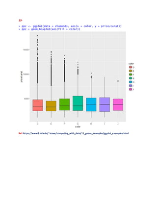
Downloaded 22 times
![14-
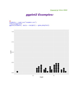
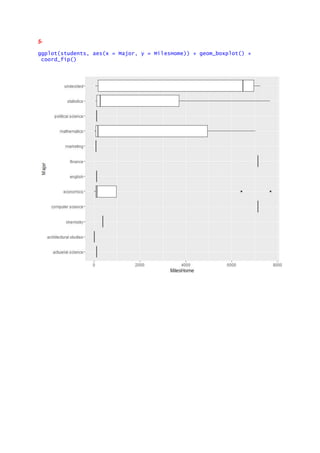
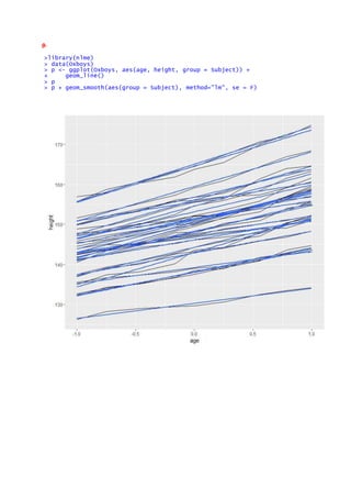
morph <- read.csv("Morph_for_Sato.csv")
names(morph) <- tolower(names(morph)) # make columns names lowercase
morph <- subset(morph, islandid == "Flor_Chrl") # take only one island morph <-
morph[,c("taxonorig", "sex", "wingl", "beakh", "ubeakl")] # only keep these
names(morph)[1] <- "taxon" morph <- data.frame(na.omit(morph)) # remove all rows
morph$taxon <- factor(morph$taxon) # remove extra remaining factor levels
morph$sex <- factor(morph$sex) # remove extra remaining factor levels
row.names(morph)
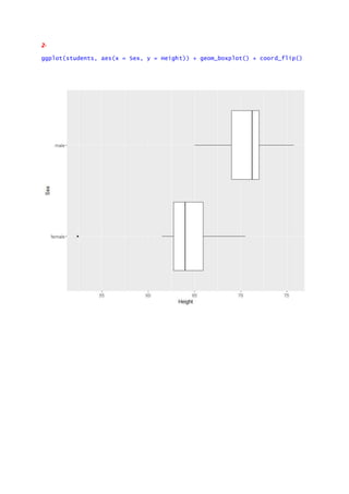
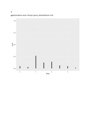
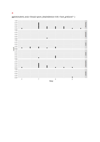
ggplot(morph, aes(taxon, wingl)) + geom_boxplot() + coord_flip()
Ref: http://seananderson.ca/ggplot2-FISH554/](https://image.slidesharecdn.com/ggplot2examples-161020200648/85/R-ggplot2-package-Examples-14-320.jpg)

![16.
library("dplyr")
> morph_quant <-
morph %>%
+ group_by(taxon) %>%
+ summarise(
+ l = quantile(wingl, 0.25)[[1]],
+ m = median(wingl),
+ u = quantile(wingl, 0.75)[[1]]) %>%
+ # re-order factor levels by median for plotting:
+ mutate(taxon = reorder(taxon, m, function(x) x))
>ggplot(morph_quant, aes(x = taxon, y = m, ymin = l, ymax = u)) +
geom_pointrange() + coord_flip() + ylab("Wing length") + xlab("")
Ref: http://seananderson.ca/ggplot2-FISH554/](https://image.slidesharecdn.com/ggplot2examples-161020200648/85/R-ggplot2-package-Examples-16-320.jpg)

This document provides various examples of using the ggplot2 package in R for data visualization, including creating dot plots, box plots, and histograms with different datasets such as student data and diamonds. It includes code snippets for visualizing data based on specific attributes, applying faceting, and modifying themes. References to additional resources and materials on ggplot2 are also included.


![Some R Examples[R table and Graphics] -Advanced Data Visualization in R (Some...](https://cdn.slidesharecdn.com/ss_thumbnails/exampless-160922204223-thumbnail.jpg?width=640&height=640&fit=bounds)


![[DSC Europe 25] Slobodan Dolinic - Smart and Intelligent Green Region.pptx](https://cdn.slidesharecdn.com/ss_thumbnails/0bribinjsp6ghwtvsvor-2-sigre-slobodan-dolinic-260115093812-c9c10e90-thumbnail.jpg?width=640&height=640&fit=bounds)


