Downloaded 22 times
![Since the dataset contain around more than 50000 rows we will use a small sample of the
data around 250 randomly selected rows to analyse and visualize. To select a random
sample from the data use
>dsmall <- diamonds[sample(nrow(diamonds), 250), ]
>dsmall # dsmall contains the sampled data from diamond dataset.
Plotting the data with qplot()
The general syntax of a simple call to qplot is as follows:
> qplot(x = ???, y = ???, data = ???, color = ???, shape = ???, geom =
???, main = "my plot title").
The arguments are:
x - The x values to plot; they must be a variable in the data frame you specify and there are no quotes
around the name.N ote that if you give only x values (no y values), you are plotting univariate data and
qplot figures this out.However, you have to give a geom that makes sense for univariate data.
y- The y values to plot; they must be a variable in the data frame you specify, and again, no quotes
around the name. If you are providing y values, you have to specify a geom that makes sense with
bivariate data. The name of data frame which contains the x and y values.
Color- Perhaps surprisingly, not a set of colors to use, but rather a "mapping" of the color scheme onto
some variable in your data frame. You are basically telling qplot to use different colors for different
values of the variable you specify; hence this variable should be a factor, not a number. qplot decides
which colors to use.
Shape- Exactly as for color, except different symbols will be used for each value of the variable you
specify. Note that you can use either color = ?? or shape = ?? or both, depending upon how you want
your plot to look. Qplot decides which symbols to use.
Geom- A "geom" specication, which is basically a list of keywords describing what to plot. Common
examples are "histogram", "density", "line", "point" which pretty much do what they say. The geom must
make sense for the kind of data you are supplying.
Main- The title for the plot.
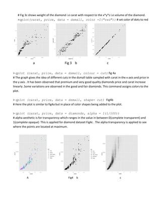
> qplot(price, carat, data = dsmall) # price is taken in x axis and carat in y axis fig 3 a
#Fig 3a shows the distribution of diamonds price and carat. As the carat (weight) increases the price also
increases
> qplot(log(price),log(carat), data = dsmall) # taking log of the data. fig 3 b
#Fig3b shows the logarithmic scale of the data. Logarithmic scales are used when amount of data is huge
so as the range.The figure shows a linear relationship of data in logarithmic scale.
>qplot(carat,x*y*z,data=dsmall) # x*y*z indicates the volume of the diamond. fig 3 c](https://image.slidesharecdn.com/qplottutorial-120125003937-phpapp02/85/Q-plot-tutorial-3-320.jpg)
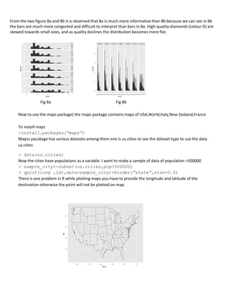


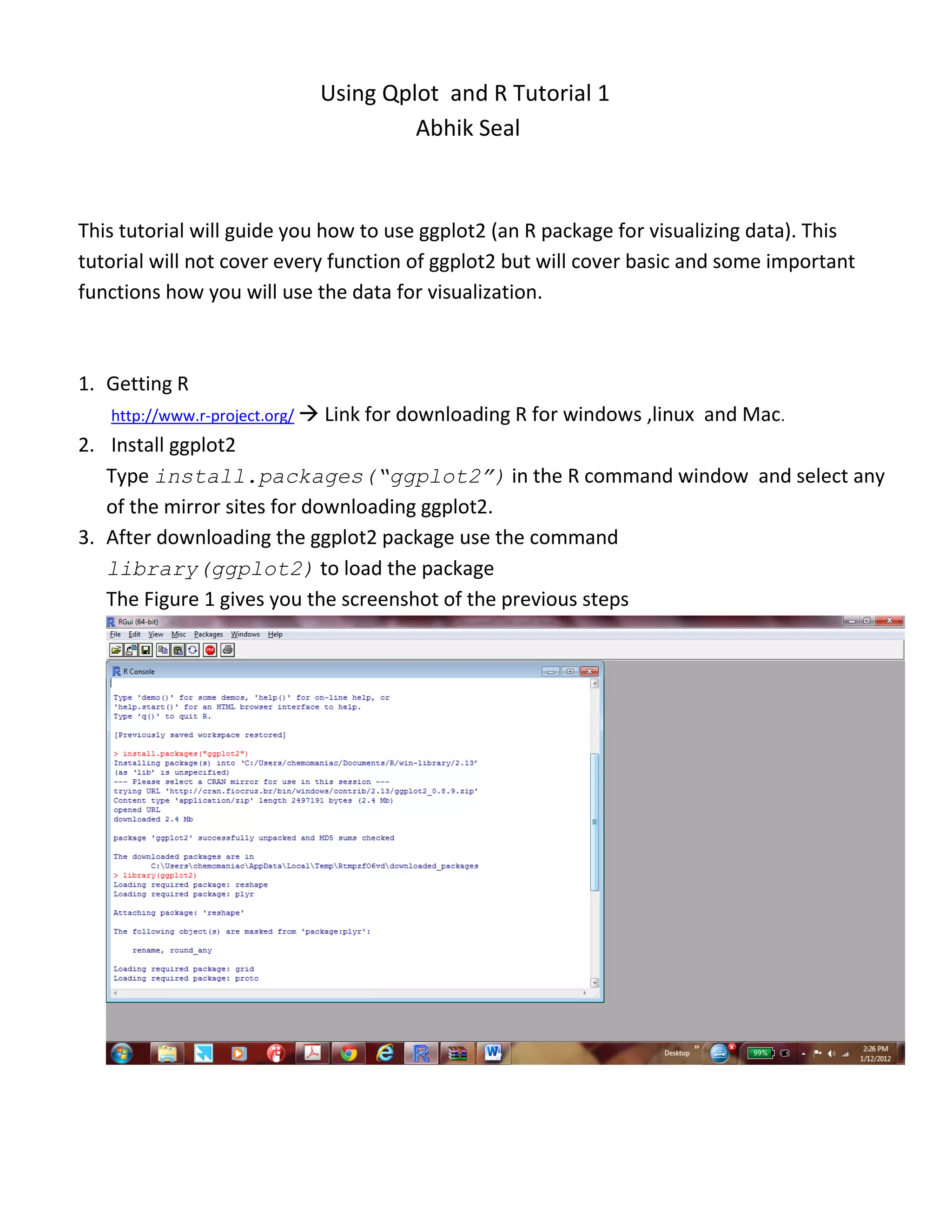
1. This tutorial covers using the ggplot2 package in R to visualize data. It demonstrates basic functions like qplot() to produce plots with a single line of code. 2. qplot() is used to visualize relationships in the diamonds dataset between variables like price and carat using scatter plots. Additional parameters like color and shape map variables to different plot aspects. 3. Other geoms like smooth, boxplot, and histogram are used to add trends, summarize distributions, and compare groups in the data. Faceting allows splitting plots by variables. Maps from other packages can also be visualized.