The document provides information on using different geom functions in ggplot2 to visualize data. It explains that geoms are used to represent data points and their aesthetic properties can represent variables. It then lists various geom functions for visualizing one, two, or three variables including points, lines, histograms, density plots, and maps. It also describes how to add layers with different geoms to build graphs and visualize relationships in the data.
TYBSC IT PGIS Unit I Chapter II Geographic Information and Spacial DatabaseArti Parab Academics
Geographic Information and Spatial Database Models and Representations of the real world Geographic Phenomena: Defining geographic phenomena, types of geographic phenomena, Geographic fields, Geographic objects, Boundaries Computer Representations of Geographic Information: Regular tessellations, irregular tessellations, Vector representations, Topology and Spatial relationships, Scale and Resolution, Representation of Geographic fields, Representation of Geographic objects Organizing and Managing Spatial Data The Temporal Dimension
TYBSC IT PGIS Unit I Chapter I- Introduction to Geographic Information SystemsArti Parab Academics
A Gentle Introduction to GIS The nature of GIS: Some fundamental observations, Defining GIS, GISystems, GIScience and GIApplications, Spatial data and Geoinformation. The real world and representations of it: Models and modelling, Maps, Databases, Spatial databases and spatial analysis
Prepared as part of the IT for Business Intelligence course of MBA @VGSOM, IIT Kharagpur. The tutorial describes how to represent vector data on a map using the open source software QGIS.
Overview and about R, R Studio Installation, Fundamentals of R Programming: Data Structures and Data Types, Operators, Control Statements, Loop Statements, Functions,
Descriptive Analysis using R: Maximum, Minimum, Range, Mean, Median and Mode, Variance, Standard Deviation, Quantiles, IQR, Summary
Symbology and Classifying data in ARC GISKU Leuven
Right-click the geostatistical layer in the ArcMap table of contents that you want to classify and click Properties.
Click the Symbology tab.
Click Classify.
Click the Method arrow and choose a classification method.
Polyglot Persistence with MongoDB and Neo4jCorie Pollock
Learn how to enhance your application by using Neo4j and MongoDB together. Polyglot persistence is the concept of taking advantage of the strengths of different database technologies to improve functionality and enhance your application. In this webinar we will examine some use cases where it makes sense to use a document database (MongoDB) with a graph database (Neo4j) in a single application. Specifically, we will show how MongoDB can be used to provide search and browsing functionality for a product catalog while using Neo4j to provide personalized product recommendations. Finally we will look at the Neo4j Doc Manager project which facilitates syncing data from MongoDB to Neo4j to make polyglot persistence with MongoDB and Neo4j much easier.
Spatial data is comprised of objects in multi-dimensional space.
Storing spatial data in a standard database would require excessive amounts of space.Queries to retrieve and analyze spatial data from a standard database would be long and cumbersome leaving a lot of room for error.
Spatial databases provide much more efficient storage, retrieval, and analysis of spatial data.
TYBSC IT PGIS Unit II Chapter I Data Management and Processing SystemsArti Parab Academics
Data Management and Processing Systems Hardware and Software Trends Geographic Information Systems: GIS Software, GIS Architecture and functionality, Spatial Data Infrastructure (SDI) Stages of Spatial Data handling: Spatial data handling and preparation, Spatial Data Storage and maintenance, Spatial Query and Analysis, Spatial Data Presentation. Database management Systems: Reasons for using a DBMS, Alternatives for data management, The relational data model, Querying the relational database. GIS and Spatial Databases: Linking GIS and DBMS, Spatial database functionality.
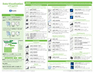
ggplot2 is based on the grammar of graphics, the idea
that you can build every graph from the same
components: a data set, a coordinate system,
and geoms—visual marks that represent data points.
ggplot2: An Extensible Platform for Publication-quality GraphicsClaus Wilke
Talk given at the Symposium on Data Science and Statistics in Bellevue, Washington, May 29 - June 1, 2019, organized by the American Statistical Association and Interface Foundation of North America.
r for data science 2. grammar of graphics (ggplot2) clean -refMin-hyung Kim
REFERENCES
#1. RStudio Official Documentations (Help & Cheat Sheet)
Free Webpage) https://www.rstudio.com/resources/cheatsheets/
#2. Wickham, H. and Grolemund, G., 2016.R for data science: import, tidy, transform, visualize, and model data. O'Reilly.
Free Webpage) https://r4ds.had.co.nz/
Cf) Tidyverse syntax (www.tidyverse.org), rather than R Base syntax
Cf) Hadley Wickham: Chief Scientist at RStudio. Adjunct Professor of Statistics at the University of Auckland, Stanford University, and Rice University
Desk reference for data visualization in Stata. Co-authored with Tim Essam(@StataRGIS, linkedin.com/in/timessam). See all cheat sheets at http://bit.ly/statacheatsheets. Updated 2016/06/03
Data visualization using the grammar of graphicsRupak Roy
Well-documented data visualization using ggplot2, geom_density2d, stat_density_2d, geom_smooth, stat_ellipse, scatterplot and much more. Let me know if anything is required. Ping me at google #bobrupakroy
Explore our comprehensive data analysis project presentation on predicting product ad campaign performance. Learn how data-driven insights can optimize your marketing strategies and enhance campaign effectiveness. Perfect for professionals and students looking to understand the power of data analysis in advertising. for more details visit: https://bostoninstituteofanalytics.org/data-science-and-artificial-intelligence/
Levelwise PageRank with Loop-Based Dead End Handling Strategy : SHORT REPORT ...Subhajit Sahu
Abstract — Levelwise PageRank is an alternative method of PageRank computation which decomposes the input graph into a directed acyclic block-graph of strongly connected components, and processes them in topological order, one level at a time. This enables calculation for ranks in a distributed fashion without per-iteration communication, unlike the standard method where all vertices are processed in each iteration. It however comes with a precondition of the absence of dead ends in the input graph. Here, the native non-distributed performance of Levelwise PageRank was compared against Monolithic PageRank on a CPU as well as a GPU. To ensure a fair comparison, Monolithic PageRank was also performed on a graph where vertices were split by components. Results indicate that Levelwise PageRank is about as fast as Monolithic PageRank on the CPU, but quite a bit slower on the GPU. Slowdown on the GPU is likely caused by a large submission of small workloads, and expected to be non-issue when the computation is performed on massive graphs.
Show drafts
volume_up
Empowering the Data Analytics Ecosystem: A Laser Focus on Value
The data analytics ecosystem thrives when every component functions at its peak, unlocking the true potential of data. Here's a laser focus on key areas for an empowered ecosystem:
1. Democratize Access, Not Data:
Granular Access Controls: Provide users with self-service tools tailored to their specific needs, preventing data overload and misuse.
Data Catalogs: Implement robust data catalogs for easy discovery and understanding of available data sources.
2. Foster Collaboration with Clear Roles:
Data Mesh Architecture: Break down data silos by creating a distributed data ownership model with clear ownership and responsibilities.
Collaborative Workspaces: Utilize interactive platforms where data scientists, analysts, and domain experts can work seamlessly together.
3. Leverage Advanced Analytics Strategically:
AI-powered Automation: Automate repetitive tasks like data cleaning and feature engineering, freeing up data talent for higher-level analysis.
Right-Tool Selection: Strategically choose the most effective advanced analytics techniques (e.g., AI, ML) based on specific business problems.
4. Prioritize Data Quality with Automation:
Automated Data Validation: Implement automated data quality checks to identify and rectify errors at the source, minimizing downstream issues.
Data Lineage Tracking: Track the flow of data throughout the ecosystem, ensuring transparency and facilitating root cause analysis for errors.
5. Cultivate a Data-Driven Mindset:
Metrics-Driven Performance Management: Align KPIs and performance metrics with data-driven insights to ensure actionable decision making.
Data Storytelling Workshops: Equip stakeholders with the skills to translate complex data findings into compelling narratives that drive action.
Benefits of a Precise Ecosystem:
Sharpened Focus: Precise access and clear roles ensure everyone works with the most relevant data, maximizing efficiency.
Actionable Insights: Strategic analytics and automated quality checks lead to more reliable and actionable data insights.
Continuous Improvement: Data-driven performance management fosters a culture of learning and continuous improvement.
Sustainable Growth: Empowered by data, organizations can make informed decisions to drive sustainable growth and innovation.
By focusing on these precise actions, organizations can create an empowered data analytics ecosystem that delivers real value by driving data-driven decisions and maximizing the return on their data investment.
Adjusting primitives for graph : SHORT REPORT / NOTESSubhajit Sahu
Graph algorithms, like PageRank Compressed Sparse Row (CSR) is an adjacency-list based graph representation that is
Multiply with different modes (map)
1. Performance of sequential execution based vs OpenMP based vector multiply.
2. Comparing various launch configs for CUDA based vector multiply.
Sum with different storage types (reduce)
1. Performance of vector element sum using float vs bfloat16 as the storage type.
Sum with different modes (reduce)
1. Performance of sequential execution based vs OpenMP based vector element sum.
2. Performance of memcpy vs in-place based CUDA based vector element sum.
3. Comparing various launch configs for CUDA based vector element sum (memcpy).
4. Comparing various launch configs for CUDA based vector element sum (in-place).
Sum with in-place strategies of CUDA mode (reduce)
1. Comparing various launch configs for CUDA based vector element sum (in-place).
Chatty Kathy - UNC Bootcamp Final Project Presentation - Final Version - 5.23...John Andrews
SlideShare Description for "Chatty Kathy - UNC Bootcamp Final Project Presentation"
Title: Chatty Kathy: Enhancing Physical Activity Among Older Adults
Description:
Discover how Chatty Kathy, an innovative project developed at the UNC Bootcamp, aims to tackle the challenge of low physical activity among older adults. Our AI-driven solution uses peer interaction to boost and sustain exercise levels, significantly improving health outcomes. This presentation covers our problem statement, the rationale behind Chatty Kathy, synthetic data and persona creation, model performance metrics, a visual demonstration of the project, and potential future developments. Join us for an insightful Q&A session to explore the potential of this groundbreaking project.
Project Team: Jay Requarth, Jana Avery, John Andrews, Dr. Dick Davis II, Nee Buntoum, Nam Yeongjin & Mat Nicholas
Techniques to optimize the pagerank algorithm usually fall in two categories. One is to try reducing the work per iteration, and the other is to try reducing the number of iterations. These goals are often at odds with one another. Skipping computation on vertices which have already converged has the potential to save iteration time. Skipping in-identical vertices, with the same in-links, helps reduce duplicate computations and thus could help reduce iteration time. Road networks often have chains which can be short-circuited before pagerank computation to improve performance. Final ranks of chain nodes can be easily calculated. This could reduce both the iteration time, and the number of iterations. If a graph has no dangling nodes, pagerank of each strongly connected component can be computed in topological order. This could help reduce the iteration time, no. of iterations, and also enable multi-iteration concurrency in pagerank computation. The combination of all of the above methods is the STICD algorithm. [sticd] For dynamic graphs, unchanged components whose ranks are unaffected can be skipped altogether.
Algorithmic optimizations for Dynamic Levelwise PageRank (from STICD) : SHORT...
Ggplot2 cheatsheet-2.1
1. Geoms - Use a geom function to represent data points, use the geom’s aesthetic properties to represent variables. Each function returns a layer.
Three Variables
l + geom_contour(aes(z = z))
x, y, z, alpha, colour, group, linetype, size,
weight
seals$z <- with(seals, sqrt(delta_long^2 + delta_lat^2))
l <- ggplot(seals, aes(long, lat))
l + geom_raster(aes(fill = z), hjust=0.5,
vjust=0.5, interpolate=FALSE)
x, y, alpha, fill
l + geom_tile(aes(fill = z))
x, y, alpha, color, fill, linetype, size, width
Two Variables
Discrete X, Discrete Y
g <- ggplot(diamonds, aes(cut, color))
g + geom_count()
x, y, alpha, color, fill, shape, size, stroke
Discrete X, Continuous Y
f <- ggplot(mpg, aes(class, hwy))
f + geom_col()
x, y, alpha, color, fill, group, linetype, size
f + geom_boxplot()
x, y, lower, middle, upper, ymax, ymin, alpha,
color, fill, group, linetype, shape, size, weight
f + geom_dotplot(binaxis = "y",
stackdir = "center")
x, y, alpha, color, fill, group
f + geom_violin(scale = "area")
x, y, alpha, color, fill, group, linetype, size,
weight
Continuous X, Continuous Y
e <- ggplot(mpg, aes(cty, hwy))
e + geom_label(aes(label = cty), nudge_x = 1,
nudge_y = 1, check_overlap = TRUE)
x, y, label, alpha, angle, color, family, fontface,
hjust, lineheight, size, vjust
e + geom_jitter(height = 2, width = 2)
x, y, alpha, color, fill, shape, size
e + geom_point()
x, y, alpha, color, fill, shape, size, stroke
e + geom_quantile()
x, y, alpha, color, group, linetype, size, weight
e + geom_rug(sides = "bl")
x, y, alpha, color, linetype, size
e + geom_smooth(method = lm)
x, y, alpha, color, fill, group, linetype, size, weight
e + geom_text(aes(label = cty), nudge_x = 1,
nudge_y = 1, check_overlap = TRUE)
x, y, label, alpha, angle, color, family, fontface,
hjust, lineheight, size, vjust
AB
C
A
B
C
Continuous Function
i <- ggplot(economics, aes(date, unemploy))
i + geom_area()
x, y, alpha, color, fill, linetype, size
i + geom_line()
x, y, alpha, color, group, linetype, size
i + geom_step(direction = "hv")
x, y, alpha, color, group, linetype, size
Continuous Bivariate Distribution
h <- ggplot(diamonds, aes(carat, price))
j + geom_crossbar(fatten = 2)
x, y, ymax, ymin, alpha, color, fill, group,
linetype, size
j + geom_errorbar()
x, ymax, ymin, alpha, color, group, linetype,
size, width (also geom_errorbarh())
j + geom_linerange()
x, ymin, ymax, alpha, color, group, linetype, size
j + geom_pointrange()
x, y, ymin, ymax, alpha, color, fill, group,
linetype, shape, size
Visualizing error
df <- data.frame(grp = c("A", "B"), fit = 4:5, se = 1:2)
j <- ggplot(df, aes(grp, fit, ymin = fit-se, ymax = fit+se))
data <- data.frame(murder = USArrests$Murder,
state = tolower(rownames(USArrests)))
map <- map_data("state")
k <- ggplot(data, aes(fill = murder))
k + geom_map(aes(map_id = state), map = map) +
expand_limits(x = map$long, y = map$lat)
map_id, alpha, color, fill, linetype, size
Maps
h + geom_bin2d(binwidth = c(0.25, 500))
x, y, alpha, color, fill, linetype, size, weight
h + geom_density2d()
x, y, alpha, colour, group, linetype, size
h + geom_hex()
x, y, alpha, colour, fill, size
Data Visualization
with ggplot2
Cheat Sheet
RStudio® is a trademark of RStudio, Inc. • CC BY RStudio • info@rstudio.com • 844-448-1212 • rstudio.com Learn more at docs.ggplot2.org and www.ggplot2-exts.org • ggplot2 2.1.0 • Updated: 11/16
ggplot(data = mpg, aes(x = cty, y = hwy))
Begins a plot that you finish by adding layers to.
Add one geom function per layer.
Basics
Complete the template below to build a graph.
ggplot2 is based on the grammar of graphics, the
idea that you can build every graph from the same
components: a data set, a coordinate system, and
geoms—visual marks that represent data points.
To display values, map variables in the data to visual
properties of the geom (aesthetics) like size, color,
and x and y locations.
Graphical Primitives
Data Visualization
with ggplot2
Cheat Sheet
RStudio® is a trademark of RStudio, Inc. • CC BY RStudio • info@rstudio.com • 844-448-1212 • rstudio.com Learn more at docs.ggplot2.org • ggplot2 0.9.3.1 • Updated: 3/15
Geoms - Use a geom to represent data points, use the geom’s aesthetic properties to represent variables
Basics
One Variable
a + geom_area(stat = "bin")
x, y, alpha, color, fill, linetype, size
b + geom_area(aes(y = ..density..), stat = "bin")
a + geom_density(kernal = "gaussian")
x, y, alpha, color, fill, linetype, size, weight
b + geom_density(aes(y = ..county..))
a+ geom_dotplot()
x, y, alpha, color, fill
a + geom_freqpoly()
x, y, alpha, color, linetype, size
b + geom_freqpoly(aes(y = ..density..))
a + geom_histogram(binwidth = 5)
x, y, alpha, color, fill, linetype, size, weight
b + geom_histogram(aes(y = ..density..))
Discrete
a <- ggplot(mpg, aes(fl))
b + geom_bar()
x, alpha, color, fill, linetype, size, weight
Continuous
a <- ggplot(mpg, aes(hwy))
Two Variables
Discrete X, Discrete Y
h <- ggplot(diamonds, aes(cut, color))
h + geom_jitter()
x, y, alpha, color, fill, shape, size
Discrete X, Continuous Y
g <- ggplot(mpg, aes(class, hwy))
g + geom_bar(stat = "identity")
x, y, alpha, color, fill, linetype, size, weight
g + geom_boxplot()
lower, middle, upper, x, ymax, ymin, alpha,
color, fill, linetype, shape, size, weight
g + geom_dotplot(binaxis = "y",
stackdir = "center")
x, y, alpha, color, fill
g + geom_violin(scale = "area")
x, y, alpha, color, fill, linetype, size, weight
Continuous X, Continuous Y
f <- ggplot(mpg, aes(cty, hwy))
f + geom_blank()
f + geom_jitter()
x, y, alpha, color, fill, shape, size
f + geom_point()
x, y, alpha, color, fill, shape, size
f + geom_quantile()
x, y, alpha, color, linetype, size, weight
f + geom_rug(sides = "bl")
alpha, color, linetype, size
f + geom_smooth(model = lm)
x, y, alpha, color, fill, linetype, size, weight
f + geom_text(aes(label = cty))
x, y, label, alpha, angle, color, family, fontface,
hjust, lineheight, size, vjust
Three Variables
i + geom_contour(aes(z = z))
x, y, z, alpha, colour, linetype, size, weight
seals$z <- with(seals, sqrt(delta_long^2 + delta_lat^2))
i <- ggplot(seals, aes(long, lat))
g <- ggplot(economics, aes(date, unemploy))
Continuous Function
g + geom_area()
x, y, alpha, color, fill, linetype, size
g + geom_line()
x, y, alpha, color, linetype, size
g + geom_step(direction = "hv")
x, y, alpha, color, linetype, size
Continuous Bivariate Distribution
h <- ggplot(movies, aes(year, rating))
h + geom_bin2d(binwidth = c(5, 0.5))
xmax, xmin, ymax, ymin, alpha, color, fill,
linetype, size, weight
h + geom_density2d()
x, y, alpha, colour, linetype, size
h + geom_hex()
x, y, alpha, colour, fill size
d + geom_segment(aes(
xend = long + delta_long,
yend = lat + delta_lat))
x, xend, y, yend, alpha, color, linetype, size
d + geom_rect(aes(xmin = long, ymin = lat,
xmax= long + delta_long,
ymax = lat + delta_lat))
xmax, xmin, ymax, ymin, alpha, color, fill,
linetype, size
c + geom_polygon(aes(group = group))
x, y, alpha, color, fill, linetype, size
d<- ggplot(seals, aes(x = long, y = lat))
i + geom_raster(aes(fill = z), hjust=0.5,
vjust=0.5, interpolate=FALSE)
x, y, alpha, fill
i + geom_tile(aes(fill = z))
x, y, alpha, color, fill, linetype, size
e + geom_crossbar(fatten = 2)
x, y, ymax, ymin, alpha, color, fill, linetype,
size
e + geom_errorbar()
x, ymax, ymin, alpha, color, linetype, size,
width (also geom_errorbarh())
e + geom_linerange()
x, ymin, ymax, alpha, color, linetype, size
e + geom_pointrange()
x, y, ymin, ymax, alpha, color, fill, linetype,
shape, size
Visualizing error
df <- data.frame(grp = c("A", "B"), fit = 4:5, se = 1:2)
e <- ggplot(df, aes(grp, fit, ymin = fit-se, ymax = fit+se))
g + geom_path(lineend="butt",
linejoin="round’, linemitre=1)
x, y, alpha, color, linetype, size
g + geom_ribbon(aes(ymin=unemploy - 900,
ymax=unemploy + 900))
x, ymax, ymin, alpha, color, fill, linetype, size
g <- ggplot(economics, aes(date, unemploy))
c <- ggplot(map, aes(long, lat))
data <- data.frame(murder = USArrests$Murder,
state = tolower(rownames(USArrests)))
map <- map_data("state")
e <- ggplot(data, aes(fill = murder))
e + geom_map(aes(map_id = state), map = map) +
expand_limits(x = map$long, y = map$lat)
map_id, alpha, color, fill, linetype, size
Maps
F M A
= 1
2
3
0
0 1 2 3 4
4
1
2
3
0
0 1 2 3 4
4
+
data geom coordinate
system
plot
+
F M A
= 1
2
3
0
0 1 2 3 4
4
1
2
3
0
0 1 2 3 4
4
data geom coordinate
system
plot
x = F
y = A
color = F
size = A
1
2
3
0
0 1 2 3 4
4
plot
+
F M A
=1
2
3
0
0 1 2 3 4
4
data geom coordinate
systemx = F
y = A
x = F
y = A
ggsave("plot.png", width = 5, height = 5)
Saves last plot as 5’ x 5’ file named "plot.png" in
working directory. Matches file type to file extension.
qplot(x = cty, y = hwy, data = mpg, geom = "point")
Creates a complete plot with given data, geom, and
mappings. Supplies many useful defaults.
aesthetic mappings data geom
last_plot()
Returns the last plot
ggplot(data = <DATA >) +
<GEOM_FUNCTION> (
mapping = aes(<MAPPINGS> ),
stat = <STAT> ,
position = <POSITION>
) +
<COORDINATE_FUNCTION> +
<FACET_FUNCTION> +
<SCALE_FUNCTION> +
<THEME_FUNCTION><THEME_FUNCTION>
<SCALE_FUNCTION>
<FACET_FUNCTION>
<COORDINATE_FUNCTION>
<POSITION>
<STAT>
<MAPPINGS>
<GEOM_FUNCTION>
<DATA> Required
Not
required,
sensible
defaults
supplied
Graphical Primitives
a <- ggplot(economics, aes(date, unemploy))
b <- ggplot(seals, aes(x = long, y = lat))
a + geom_blank()
(Useful for expanding limits)
b + geom_curve(aes(yend = lat + 1,
xend=long+1,curvature=z)) - x, xend, y, yend,
alpha, angle, color, curvature, linetype, size
a + geom_path(lineend="butt",
linejoin="round’, linemitre=1)
x, y, alpha, color, group, linetype, size
a + geom_polygon(aes(group = group))
x, y, alpha, color, fill, group, linetype, size
b + geom_rect(aes(xmin = long, ymin=lat,
xmax= long + 1, ymax = lat + 1)) - xmax, xmin,
ymax, ymin, alpha, color, fill, linetype, size
a + geom_ribbon(aes(ymin=unemploy - 900,
ymax=unemploy + 900)) - x, ymax, ymin
alpha, color, fill, group, linetype, size
Line Segments
common aesthetics: x, y, alpha, color, linetype, size
b + geom_abline(aes(intercept=0, slope=1))
b + geom_hline(aes(yintercept = lat))
b + geom_vline(aes(xintercept = long))
b + geom_segment(aes(yend=lat+1, xend=long+1))
b + geom_spoke(aes(angle = 1:1155, radius = 1))
One Variable
c + geom_area(stat = "bin")
x, y, alpha, color, fill, linetype, size
c + geom_density(kernel = "gaussian")
x, y, alpha, color, fill, group, linetype, size, weight
c + geom_dotplot()
x, y, alpha, color, fill
c + geom_freqpoly()
x, y, alpha, color, group, linetype, size
c + geom_histogram(binwidth = 5)
x, y, alpha, color, fill, linetype, size, weight
c2 + geom_qq(aes(sample = hwy))
x, y, alpha, color, fill, linetype, size, weight
Discrete
d <- ggplot(mpg, aes(fl))
d + geom_bar()
x, alpha, color, fill, linetype, size, weight
Continuous
c <- ggplot(mpg, aes(hwy)); c2 <- ggplot(mpg)
2. RStudio® is a trademark of RStudio, Inc. • CC BY RStudio • info@rstudio.com • 844-448-1212 • rstudio.com
Coordinate Systems
60
long
lat
π + coord_quickmap()
π + coord_map(projection = "ortho",
orientation=c(41, -74, 0))
projection, orientation, xlim, ylim
Map projections from the mapproj package
(mercator (default), azequalarea, lagrange, etc.)
r + coord_cartesian(xlim = c(0, 5))
xlim, ylim
The default cartesian coordinate system
r + coord_fixed(ratio = 1/2)
ratio, xlim, ylim
Cartesian coordinates with fixed aspect
ratio between x and y units
r + coord_flip()
xlim, ylim
Flipped Cartesian coordinates
r + coord_polar(theta = "x", direction=1 )
theta, start, direction
Polar coordinates
r + coord_trans(ytrans = "sqrt")
xtrans, ytrans, limx, limy
Transformed cartesian coordinates. Set
xtrans and ytrans to the name
of a window function.
r <- d + geom_bar()
Position Adjustments
s + geom_bar(position = "dodge")
Arrange elements side by side
s + geom_bar(position = "fill")
Stack elements on top of one another,
normalize height
e + geom_point(position = "jitter")
Add random noise to X and Y position of each
element to avoid overplotting
e + geom_label(position = "nudge")
Nudge labels away from points
s + geom_bar(position = "stack")
Stack elements on top of one another
s <- ggplot(mpg, aes(fl, fill = drv))
Position adjustments determine how to arrange
geoms that would otherwise occupy the same space.
Each position adjustment can be recast as a function
with manual width and height arguments
s + geom_bar(position = position_dodge(width = 1))
A
B
Themes
r + theme_classic()
r + theme_light()
r + theme_linedraw()
r + theme_minimal()
Minimal themes
r + theme_void()
Empty theme
0
50
100
150
c d e p r
fl
count
0
50
100
150
c d e p r
fl
count
0
50
100
150
c d e p r
fl
count
0
50
100
150
c d e p r
fl
count
r + theme_bw()
White background
with grid lines
r + theme_gray()
Grey background
(default theme)
r + theme_dark()
dark for contrast0
50
100
150
c d e p r
fl
count
Zooming
t + coord_cartesian(
xlim = c(0, 100), ylim = c(10, 20))
With clipping (removes unseen data points)
t + xlim(0, 100) + ylim(10, 20)
t + scale_x_continuous(limits = c(0, 100)) +
scale_y_continuous(limits = c(0, 100))
Without clipping (preferred)
Legends
n + theme(legend.position = "bottom")
Place legend at "bottom", "top", "left", or "right"
n + guides(fill = "none")
Set legend type for each aesthetic: colorbar, legend,
or none (no legend)
n + scale_fill_discrete(name = "Title",
labels = c("A", "B", "C", "D", "E"))
Set legend title and labels with a scale function.
Faceting
t <- ggplot(mpg, aes(cty, hwy)) + geom_point()
Facets divide a plot into subplots based on the values
of one or more discrete variables.
t + facet_grid(. ~ fl)
facet into columns based on fl
t + facet_grid(year ~ .)
facet into rows based on year
t + facet_grid(year ~ fl)
facet into both rows and columns
t + facet_wrap(~ fl)
wrap facets into a rectangular layout
Set scales to let axis limits vary across facets
t + facet_grid(drv ~ fl, scales = "free")
x and y axis limits adjust to individual facets
• "free_x" - x axis limits adjust
• "free_y" - y axis limits adjust
Set labeller to adjust facet labels
t + facet_grid(. ~ fl, labeller = label_both)
t + facet_grid(fl ~ ., labeller = label_bquote(alpha ^ .(fl)))
t + facet_grid(. ~ fl, labeller = label_parsed)
fl: c fl: d fl: e fl: p fl: r
c d e p r
↵c
↵d ↵e
↵p
↵r
Learn more at docs.ggplot2.org and www.ggplot2-exts.org • ggplot2 2.1.0 • Updated: 11/16
c + stat_bin(binwidth = 1, origin = 10)
x, y | ..count.., ..ncount.., ..density.., ..ndensity..
c + stat_count(width = 1) x, y, | ..count.., ..prop..
c + stat_density(adjust = 1, kernel = "gaussian")
x, y, | ..count.., ..density.., ..scaled..
e + stat_bin_2d(bins = 30, drop = T)
x, y, fill | ..count.., ..density..
e + stat_bin_hex(bins=30) x, y, fill | ..count.., ..density..
e + stat_density_2d(contour = TRUE, n = 100)
x, y, color, size | ..level..
e + stat_ellipse(level = 0.95, segments = 51, type = "t")
l + stat_contour(aes(z = z)) x, y, z, order | ..level..
l + stat_summary_hex(aes(z = z), bins = 30, fun = max)
x, y, z, fill | ..value..
l + stat_summary_2d(aes(z = z), bins = 30, fun = mean)
x, y, z, fill | ..value..
f + stat_boxplot(coef = 1.5)
x, y | ..lower.., ..middle.., ..upper.., ..width.. , ..ymin.., ..ymax..
f + stat_ydensity(kernel = "gaussian", scale = "area")
x, y | ..density.., ..scaled.., ..count.., ..n.., ..violinwidth.., ..width..
e + stat_ecdf(n = 40) x, y | ..x.., ..y..
e + stat_quantile(quantiles = c(0.1, 0.9),
formula = y ~ log(x), method = "rq") x, y | ..quantile..
e + stat_smooth(method = "lm", formula = y ~ x,
se=T, level=0.95) x, y | ..se.., ..x.., ..y.., ..ymin.., ..ymax..
ggplot() + stat_function(aes(x = -3:3), n = 99,
fun = dnorm, args = list(sd=0.5)) x | ..x.., ..y..
e + stat_identity(na.rm = TRUE)
ggplot() + stat_qq(aes(sample=1:100), dist = qt,
dparam=list(df=5)) sample, x, y | ..sample.., ..theoretical..
e + stat_sum() x, y, size | ..n.., ..prop..
e + stat_summary(fun.data = "mean_cl_boot")
h + stat_summary_bin(fun.y = "mean", geom = "bar")
e + stat_unique()
Stats - An alternative way to build a layer
+
x ..count..
= 1
2
3
0
0 1 2 3 4
4
1
2
3
0
0 1 2 3 4
4
data geom coordinate
system
plot
x = x
y = ..count..
fl cty cyl
stat
A stat builds new variables to plot (e.g., count, prop).
Visualize a stat by changing the default stat of a geom
function, geom_bar(stat="count") or by using a stat
function, stat_count(geom="bar"), which calls a default
geom to make a layer (equivalent to a geom function).
Use ..name.. syntax to map stat variables to aesthetics.
i + stat_density2d(aes(fill = ..level..),
geom = "polygon")
stat function geom mappings
variable created by stat
geom to use
1D distributions
2D distributions
3 Variables
Comparisons
Functions
General Purpose
Labels
t + labs( x = "New x axis label", y = "New y axis label",
title ="Add a title above the plot",
subtitle = "Add a subtitle below title",
caption = "Add a caption below plot",
<aes> = "New <aes> legend title")
Use scale
functions
to update
legend labels
<AES> <AES>
t + annotate(geom = "text", x = 8, y = 9, label = "A")
geom to place manual values for geom’s aesthetics
o + scale_fill_distiller(palette = "Blues")
o + scale_fill_gradient(low="red", high="yellow")
o + scale_fill_gradient2(low="red", high="blue",
mid = "white", midpoint = 25)
o + scale_fill_gradientn(colours=topo.colors(6))
Also: rainbow(), heat.colors(), terrain.colors(),
cm.colors(), RColorBrewer::brewer.pal()
Scales
Scales map data values to the visual values of an
aesthetic. To change a mapping, add a new scale.
(n <- d + geom_bar(aes(fill = fl)))
n + scale_fill_manual(
values = c("skyblue", "royalblue", "blue", "navy"),
limits = c("d", "e", "p", "r"), breaks =c("d", "e", "p", "r"),
name = "fuel", labels = c("D", "E", "P", "R"))
scale_
aesthetic
to adjust
prepackaged
scale to use
scale specific
arguments
range of values to
include in mapping
title to use in
legend/axis
labels to use in
legend/axis
breaks to use in
legend/axis
General Purpose scales
Use with most aesthetics
scale_*_continuous() - map cont’ values to visual ones
scale_*_discrete() - map discrete values to visual ones
scale_*_identity() - use data values as visual ones
scale_*_manual(values = c()) - map discrete values to
manually chosen visual ones
scale_*_date(date_labels = "%m/%d"),
date_breaks = "2 weeks") - treat data values as dates.
scale_*_datetime() - treat data x values as date times.
Use same arguments as scale_x_date().
See ?strptime for label formats.
X and Y location scales
Color and fill scales (Discrete)
Shape and size scales
Use with x or y aesthetics (x shown here)
scale_x_log10() - Plot x on log10 scale
scale_x_reverse() - Reverse direction of x axis
scale_x_sqrt() - Plot x on square root scale
n <- d + geom_bar(aes(fill = fl))
n + scale_fill_brewer(palette = "Blues")
For palette choices: RColorBrewer::display.brewer.all()
n + scale_fill_grey(start = 0.2, end = 0.8, na.value
= "red")
p + scale_shape() + scale_size()
p + scale_shape_manual(values = c(3:7))
Color and fill scales (Continuous)
o <- c + geom_dotplot(aes(fill = ..x..))
p <- e + geom_point(aes(shape = fl, size = cyl))
p + scale_radius(range = c(1,6))
p + scale_size_area(max_size = 6)
Maps to radius of
circle, or area
c(-1, 26)
0:1
0 1 2 3 4 5 6 7 8 9 10 11 12 13 14 15 16 17 18 19 20 21 22 23 24 25
Manual shape values