Database Structures – Relational, Object Oriented – ER diagram - spatial data models – Raster Data Structures – Raster Data Compression - Vector Data Structures - Raster vs Vector Models TIN and GRID data models - OGC standards - Data Quality.
this presentation is an introduction to R programming language.we will talk about usage, history, data structure and feathers of R programming language.
Databases have been around for decades and were highly optimised for data aggregations during that time. Not only Big data has changed the landscape of databases massively in the past years - we nowadays can find many Open Source projects among the most popular dbs.
After this talk you will be enabled to decide if a database can make your work more efficient and which direction to look to.
Select a folder or folder connection in the Catalog tree.
Click the File menu, point to New, then click Shapefile.
Click in the Name text box and type a name for the new shapefile.
Click the Feature Type drop-down arrow and click the type of geometry the shapefile will contain.
Prepared as part of the IT for Business Intelligence course of MBA @VGSOM, IIT Kharagpur. The tutorial describes how to represent vector data on a map using the open source software QGIS.
Here you can find 1000's of Multiple Choice Questions(MCQs) of Database Management System(DBMS) includes the MCQs of fundamental of Database Management System(DBMS), introduction of Database Model, Relational Database Model, Constrants, Relational Algebra, Definition and types of Structured Query Language(SQL), Embedded SQL, Database Normalization (1NF, 2NF, 3NF, BCNF, 4NF, 5NF and DKNF) and Data Storage Devices, Architecture of DBMS and Database Security, Integrity and Quality
Chart and graphs in R programming language CHANDAN KUMAR
This slide contains basics of charts and graphs in R programming language. I also focused on practical knowledge so I tried to give maximum example to understand the concepts.
ggplot2 is based on the grammar of graphics, the idea
that you can build every graph from the same
components: a data set, a coordinate system,
and geoms—visual marks that represent data points.
r for data science 2. grammar of graphics (ggplot2) clean -refMin-hyung Kim
REFERENCES
#1. RStudio Official Documentations (Help & Cheat Sheet)
Free Webpage) https://www.rstudio.com/resources/cheatsheets/
#2. Wickham, H. and Grolemund, G., 2016.R for data science: import, tidy, transform, visualize, and model data. O'Reilly.
Free Webpage) https://r4ds.had.co.nz/
Cf) Tidyverse syntax (www.tidyverse.org), rather than R Base syntax
Cf) Hadley Wickham: Chief Scientist at RStudio. Adjunct Professor of Statistics at the University of Auckland, Stanford University, and Rice University
ggplot2: An Extensible Platform for Publication-quality GraphicsClaus Wilke
Talk given at the Symposium on Data Science and Statistics in Bellevue, Washington, May 29 - June 1, 2019, organized by the American Statistical Association and Interface Foundation of North America.
Desk reference for data visualization in Stata. Co-authored with Tim Essam(@StataRGIS, linkedin.com/in/timessam). See all cheat sheets at http://bit.ly/statacheatsheets. Updated 2016/06/03
Data visualization using the grammar of graphicsRupak Roy
Well-documented data visualization using ggplot2, geom_density2d, stat_density_2d, geom_smooth, stat_ellipse, scatterplot and much more. Let me know if anything is required. Ping me at google #bobrupakroy
Adjusting primitives for graph : SHORT REPORT / NOTESSubhajit Sahu
Graph algorithms, like PageRank Compressed Sparse Row (CSR) is an adjacency-list based graph representation that is
Multiply with different modes (map)
1. Performance of sequential execution based vs OpenMP based vector multiply.
2. Comparing various launch configs for CUDA based vector multiply.
Sum with different storage types (reduce)
1. Performance of vector element sum using float vs bfloat16 as the storage type.
Sum with different modes (reduce)
1. Performance of sequential execution based vs OpenMP based vector element sum.
2. Performance of memcpy vs in-place based CUDA based vector element sum.
3. Comparing various launch configs for CUDA based vector element sum (memcpy).
4. Comparing various launch configs for CUDA based vector element sum (in-place).
Sum with in-place strategies of CUDA mode (reduce)
1. Comparing various launch configs for CUDA based vector element sum (in-place).
Chatty Kathy - UNC Bootcamp Final Project Presentation - Final Version - 5.23...John Andrews
SlideShare Description for "Chatty Kathy - UNC Bootcamp Final Project Presentation"
Title: Chatty Kathy: Enhancing Physical Activity Among Older Adults
Description:
Discover how Chatty Kathy, an innovative project developed at the UNC Bootcamp, aims to tackle the challenge of low physical activity among older adults. Our AI-driven solution uses peer interaction to boost and sustain exercise levels, significantly improving health outcomes. This presentation covers our problem statement, the rationale behind Chatty Kathy, synthetic data and persona creation, model performance metrics, a visual demonstration of the project, and potential future developments. Join us for an insightful Q&A session to explore the potential of this groundbreaking project.
Project Team: Jay Requarth, Jana Avery, John Andrews, Dr. Dick Davis II, Nee Buntoum, Nam Yeongjin & Mat Nicholas
Explore our comprehensive data analysis project presentation on predicting product ad campaign performance. Learn how data-driven insights can optimize your marketing strategies and enhance campaign effectiveness. Perfect for professionals and students looking to understand the power of data analysis in advertising. for more details visit: https://bostoninstituteofanalytics.org/data-science-and-artificial-intelligence/
Data Centers - Striving Within A Narrow Range - Research Report - MCG - May 2...pchutichetpong
M Capital Group (“MCG”) expects to see demand and the changing evolution of supply, facilitated through institutional investment rotation out of offices and into work from home (“WFH”), while the ever-expanding need for data storage as global internet usage expands, with experts predicting 5.3 billion users by 2023. These market factors will be underpinned by technological changes, such as progressing cloud services and edge sites, allowing the industry to see strong expected annual growth of 13% over the next 4 years.
Whilst competitive headwinds remain, represented through the recent second bankruptcy filing of Sungard, which blames “COVID-19 and other macroeconomic trends including delayed customer spending decisions, insourcing and reductions in IT spending, energy inflation and reduction in demand for certain services”, the industry has seen key adjustments, where MCG believes that engineering cost management and technological innovation will be paramount to success.
MCG reports that the more favorable market conditions expected over the next few years, helped by the winding down of pandemic restrictions and a hybrid working environment will be driving market momentum forward. The continuous injection of capital by alternative investment firms, as well as the growing infrastructural investment from cloud service providers and social media companies, whose revenues are expected to grow over 3.6x larger by value in 2026, will likely help propel center provision and innovation. These factors paint a promising picture for the industry players that offset rising input costs and adapt to new technologies.
According to M Capital Group: “Specifically, the long-term cost-saving opportunities available from the rise of remote managing will likely aid value growth for the industry. Through margin optimization and further availability of capital for reinvestment, strong players will maintain their competitive foothold, while weaker players exit the market to balance supply and demand.”
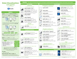
1. Graphical Primitives
Data Visualization
with ggplot2
Cheat Sheet
RStudio® is a trademark of RStudio, Inc. • CC BY RStudio • info@rstudio.com • 844-448-1212 • rstudio.com Learn more at docs.ggplot2.org • ggplot2 0.9.3.1 • Updated: 3/15
Geoms - Use a geom to represent data points, use the geom’s aesthetic properties to represent variables. Each function returns a layer.
One Variable
a + geom_area(stat = "bin")
x, y, alpha, color, fill, linetype, size
b + geom_area(aes(y = ..density..), stat = "bin")
a + geom_density(kernel = "gaussian")
x, y, alpha, color, fill, linetype, size, weight
b + geom_density(aes(y = ..county..))
a + geom_dotplot()
x, y, alpha, color, fill
a + geom_freqpoly()
x, y, alpha, color, linetype, size
b + geom_freqpoly(aes(y = ..density..))
a + geom_histogram(binwidth = 5)
x, y, alpha, color, fill, linetype, size, weight
b + geom_histogram(aes(y = ..density..))
Discrete
b <- ggplot(mpg, aes(fl))
b + geom_bar()
x, alpha, color, fill, linetype, size, weight
Continuous
a <- ggplot(mpg, aes(hwy))
Two Variables
Continuous Function
Discrete X, Discrete Y
h <- ggplot(diamonds, aes(cut, color))
h + geom_jitter()
x, y, alpha, color, fill, shape, size
Discrete X, Continuous Y
g <- ggplot(mpg, aes(class, hwy))
g + geom_bar(stat = "identity")
x, y, alpha, color, fill, linetype, size, weight
g + geom_boxplot()
lower, middle, upper, x, ymax, ymin, alpha,
color, fill, linetype, shape, size, weight
g + geom_dotplot(binaxis = "y",
stackdir = "center")
x, y, alpha, color, fill
g + geom_violin(scale = "area")
x, y, alpha, color, fill, linetype, size, weight
Continuous X, Continuous Y
f <- ggplot(mpg, aes(cty, hwy))
f + geom_blank()
f + geom_jitter()
x, y, alpha, color, fill, shape, size
f + geom_point()
x, y, alpha, color, fill, shape, size
f + geom_quantile()
x, y, alpha, color, linetype, size, weight
f + geom_rug(sides = "bl")
alpha, color, linetype, size
f + geom_smooth(model = lm)
x, y, alpha, color, fill, linetype, size, weight
f + geom_text(aes(label = cty))
x, y, label, alpha, angle, color, family, fontface,
hjust, lineheight, size, vjust
Three Variables
m + geom_contour(aes(z = z))
x, y, z, alpha, colour, linetype, size, weight
seals$z <- with(seals, sqrt(delta_long^2 + delta_lat^2))
m <- ggplot(seals, aes(long, lat))
j <- ggplot(economics, aes(date, unemploy))
j + geom_area()
x, y, alpha, color, fill, linetype, size
j + geom_line()
x, y, alpha, color, linetype, size
j + geom_step(direction = "hv")
x, y, alpha, color, linetype, size
Continuous Bivariate Distribution
i <- ggplot(movies, aes(year, rating))
i + geom_bin2d(binwidth = c(5, 0.5))
xmax, xmin, ymax, ymin, alpha, color, fill,
linetype, size, weight
i + geom_density2d()
x, y, alpha, colour, linetype, size
i + geom_hex()
x, y, alpha, colour, fill size
e + geom_segment(aes(
xend = long + delta_long,
yend = lat + delta_lat))
x, xend, y, yend, alpha, color, linetype, size
e + geom_rect(aes(xmin = long, ymin = lat,
xmax= long + delta_long,
ymax = lat + delta_lat))
xmax, xmin, ymax, ymin, alpha, color, fill,
linetype, size
c + geom_polygon(aes(group = group))
x, y, alpha, color, fill, linetype, size
e <- ggplot(seals, aes(x = long, y = lat))
m + geom_raster(aes(fill = z), hjust=0.5,
vjust=0.5, interpolate=FALSE)
x, y, alpha, fill
m + geom_tile(aes(fill = z))
x, y, alpha, color, fill, linetype, size
k + geom_crossbar(fatten = 2)
x, y, ymax, ymin, alpha, color, fill, linetype,
size
k + geom_errorbar()
x, ymax, ymin, alpha, color, linetype, size,
width (also geom_errorbarh())
k + geom_linerange()
x, ymin, ymax, alpha, color, linetype, size
k + geom_pointrange()
x, y, ymin, ymax, alpha, color, fill, linetype,
shape, size
Visualizing error
df <- data.frame(grp = c("A", "B"), fit = 4:5, se = 1:2)
k <- ggplot(df, aes(grp, fit, ymin = fit-se, ymax = fit+se))
d + geom_path(lineend="butt",
linejoin="round’, linemitre=1)
x, y, alpha, color, linetype, size
d + geom_ribbon(aes(ymin=unemploy - 900,
ymax=unemploy + 900))
x, ymax, ymin, alpha, color, fill, linetype, size
d <- ggplot(economics, aes(date, unemploy))
c <- ggplot(map, aes(long, lat))
data <- data.frame(murder = USArrests$Murder,
state = tolower(rownames(USArrests)))
map <- map_data("state")
l <- ggplot(data, aes(fill = murder))
l + geom_map(aes(map_id = state), map = map) +
expand_limits(x = map$long, y = map$lat)
map_id, alpha, color, fill, linetype, size
Maps
AB
C
Basics
Build a graph with qplot() or ggplot()
ggplot2 is based on the grammar of graphics, the
idea that you can build every graph from the same
few components: a data set, a set of geoms—visual
marks that represent data points, and a coordinate
system.
To display data values, map variables in the data set
to aesthetic properties of the geom like size, color,
and x and y locations.
Graphical Primitives
Data Visualization
with ggplot2
Cheat Sheet
RStudio® is a trademark of RStudio, Inc. • CC BY RStudio • info@rstudio.com • 844-448-1212 • rstudio.com Learn more at docs.ggplot2.org • ggplot2 0.9.3.1 • Updated: 3/15
Geoms - Use a geom to represent data points, use the geom’s aesthetic properties to represent variables
Basics
One Variable
a + geom_area(stat = "bin")
x, y, alpha, color, fill, linetype, size
b + geom_area(aes(y = ..density..), stat = "bin")
a + geom_density(kernal = "gaussian")
x, y, alpha, color, fill, linetype, size, weight
b + geom_density(aes(y = ..county..))
a+ geom_dotplot()
x, y, alpha, color, fill
a + geom_freqpoly()
x, y, alpha, color, linetype, size
b + geom_freqpoly(aes(y = ..density..))
a + geom_histogram(binwidth = 5)
x, y, alpha, color, fill, linetype, size, weight
b + geom_histogram(aes(y = ..density..))
Discrete
a <- ggplot(mpg, aes(fl))
b + geom_bar()
x, alpha, color, fill, linetype, size, weight
Continuous
a <- ggplot(mpg, aes(hwy))
Two Variables
Discrete X, Discrete Y
h <- ggplot(diamonds, aes(cut, color))
h + geom_jitter()
x, y, alpha, color, fill, shape, size
Discrete X, Continuous Y
g <- ggplot(mpg, aes(class, hwy))
g + geom_bar(stat = "identity")
x, y, alpha, color, fill, linetype, size, weight
g + geom_boxplot()
lower, middle, upper, x, ymax, ymin, alpha,
color, fill, linetype, shape, size, weight
g + geom_dotplot(binaxis = "y",
stackdir = "center")
x, y, alpha, color, fill
g + geom_violin(scale = "area")
x, y, alpha, color, fill, linetype, size, weight
Continuous X, Continuous Y
f <- ggplot(mpg, aes(cty, hwy))
f + geom_blank()
f + geom_jitter()
x, y, alpha, color, fill, shape, size
f + geom_point()
x, y, alpha, color, fill, shape, size
f + geom_quantile()
x, y, alpha, color, linetype, size, weight
f + geom_rug(sides = "bl")
alpha, color, linetype, size
f + geom_smooth(model = lm)
x, y, alpha, color, fill, linetype, size, weight
f + geom_text(aes(label = cty))
x, y, label, alpha, angle, color, family, fontface,
hjust, lineheight, size, vjust
Three Variables
i + geom_contour(aes(z = z))
x, y, z, alpha, colour, linetype, size, weight
seals$z <- with(seals, sqrt(delta_long^2 + delta_lat^2))
i <- ggplot(seals, aes(long, lat))
g <- ggplot(economics, aes(date, unemploy))
Continuous Function
g + geom_area()
x, y, alpha, color, fill, linetype, size
g + geom_line()
x, y, alpha, color, linetype, size
g + geom_step(direction = "hv")
x, y, alpha, color, linetype, size
Continuous Bivariate Distribution
h <- ggplot(movies, aes(year, rating))
h + geom_bin2d(binwidth = c(5, 0.5))
xmax, xmin, ymax, ymin, alpha, color, fill,
linetype, size, weight
h + geom_density2d()
x, y, alpha, colour, linetype, size
h + geom_hex()
x, y, alpha, colour, fill size
d + geom_segment(aes(
xend = long + delta_long,
yend = lat + delta_lat))
x, xend, y, yend, alpha, color, linetype, size
d + geom_rect(aes(xmin = long, ymin = lat,
xmax= long + delta_long,
ymax = lat + delta_lat))
xmax, xmin, ymax, ymin, alpha, color, fill,
linetype, size
c + geom_polygon(aes(group = group))
x, y, alpha, color, fill, linetype, size
d<- ggplot(seals, aes(x = long, y = lat))
i + geom_raster(aes(fill = z), hjust=0.5,
vjust=0.5, interpolate=FALSE)
x, y, alpha, fill
i + geom_tile(aes(fill = z))
x, y, alpha, color, fill, linetype, size
e + geom_crossbar(fatten = 2)
x, y, ymax, ymin, alpha, color, fill, linetype,
size
e + geom_errorbar()
x, ymax, ymin, alpha, color, linetype, size,
width (also geom_errorbarh())
e + geom_linerange()
x, ymin, ymax, alpha, color, linetype, size
e + geom_pointrange()
x, y, ymin, ymax, alpha, color, fill, linetype,
shape, size
Visualizing error
df <- data.frame(grp = c("A", "B"), fit = 4:5, se = 1:2)
e <- ggplot(df, aes(grp, fit, ymin = fit-se, ymax = fit+se))
g + geom_path(lineend="butt",
linejoin="round’, linemitre=1)
x, y, alpha, color, linetype, size
g + geom_ribbon(aes(ymin=unemploy - 900,
ymax=unemploy + 900))
x, ymax, ymin, alpha, color, fill, linetype, size
g <- ggplot(economics, aes(date, unemploy))
c <- ggplot(map, aes(long, lat))
data <- data.frame(murder = USArrests$Murder,
state = tolower(rownames(USArrests)))
map <- map_data("state")
e <- ggplot(data, aes(fill = murder))
e + geom_map(aes(map_id = state), map = map) +
expand_limits(x = map$long, y = map$lat)
map_id, alpha, color, fill, linetype, size
Maps
F M A
= 1
2
3
0
0 1 2 3 4
4
1
2
3
0
0 1 2 3 4
4
+
data geom coordinate
system
plot
+
F M A
= 1
2
3
0
0 1 2 3 4
4
1
2
3
0
0 1 2 3 4
4
data geom coordinate
system
plot
x = F
y = A
color = F
size = A
1
2
3
0
0 1 2 3 4
4
plot
+
F M A
=1
2
3
0
0 1 2 3 4
4
data geom coordinate
systemx = F
y = A
x = F
y = A
ggsave("plot.png", width = 5, height = 5)
Saves last plot as 5’ x 5’ file named "plot.png" in
working directory. Matches file type to file extension.
qplot(x = cty, y = hwy, color = cyl, data = mpg, geom = "point")
Creates a complete plot with given data, geom, and
mappings. Supplies many useful defaults.
ggplot(data = mpg, aes(x = cty, y = hwy))
Begins a plot that you finish by adding layers to. No
defaults, but provides more control than qplot().
ggplot(mpg, aes(hwy, cty)) +
geom_point(aes(color = cyl)) +
geom_smooth(method ="lm") +
coord_cartesian() +
scale_color_gradient() +
theme_bw()
data
aesthetic mappings
add layers,
elements with +
layer = geom +
default stat +
layer specific
mappings
additional
elements
data geom
Add a new layer to a plot with a geom_*()
or stat_*() function. Each provides a geom, a
set of aesthetic mappings, and a default stat
and position adjustment.
last_plot()
Returns the last plot
2. RStudio® is a trademark of RStudio, Inc. • CC BY RStudio • info@rstudio.com • 844-448-1212 • rstudio.com Learn more at docs.ggplot2.org • ggplot2 0.9.3.1 • Updated: 3/15
Stats - An alternative way to build a layer Coordinate Systems
r + coord_cartesian(xlim = c(0, 5))
xlim, ylim
The default cartesian coordinate system
r + coord_fixed(ratio = 1/2)
ratio, xlim, ylim
Cartesian coordinates with fixed aspect
ratio between x and y units
r + coord_flip()
xlim, ylim
Flipped Cartesian coordinates
r + coord_polar(theta = "x", direction=1 )
theta, start, direction
Polar coordinates
r + coord_trans(ytrans = "sqrt")
xtrans, ytrans, limx, limy
Transformed cartesian coordinates. Set
extras and strains to the name
of a window function.
r <- b + geom_bar()
Scales Faceting
t <- ggplot(mpg, aes(cty, hwy)) + geom_point()
Position Adjustments
s + geom_bar(position = "dodge")
Arrange elements side by side
s + geom_bar(position = "fill")
Stack elements on top of one another,
normalize height
s + geom_bar(position = "stack")
Stack elements on top of one another
f + geom_point(position = "jitter")
Add random noise to X and Y position
of each element to avoid overplotting
s <- ggplot(mpg, aes(fl, fill = drv))
Labels
t + ggtitle("New Plot Title")
Add a main title above the plot
t + xlab("New X label")
Change the label on the X axis
t + ylab("New Y label")
Change the label on the Y axis
t + labs(title =" New title", x = "New x", y = "New y")
All of the above
Legends
ZoomingThemes
Facets divide a plot into subplots based on the values
of one or more discrete variables.
t + facet_grid(. ~ fl)
facet into columns based on fl
t + facet_grid(year ~ .)
facet into rows based on year
t + facet_grid(year ~ fl)
facet into both rows and columns
t + facet_wrap(~ fl)
wrap facets into a rectangular layout
Set scales to let axis limits vary across facets
t + facet_grid(y ~ x, scales = "free")
x and y axis limits adjust to individual facets
• "free_x" - x axis limits adjust
• "free_y" - y axis limits adjust
Set labeller to adjust facet labels
t + facet_grid(. ~ fl, labeller = label_both)
t + facet_grid(. ~ fl, labeller = label_bquote(alpha ^ .(x)))
t + facet_grid(. ~ fl, labeller = label_parsed)
Position adjustments determine how to arrange
geoms that would otherwise occupy the same space.
Each position adjustment can be recast as a function
with manual width and height arguments
s + geom_bar(position = position_dodge(width = 1))
r + theme_classic()
White background
no gridlines
r + theme_minimal()
Minimal theme
t + coord_cartesian(
xlim = c(0, 100), ylim = c(10, 20))
With clipping (removes unseen data points)
t + xlim(0, 100) + ylim(10, 20)
t + scale_x_continuous(limits = c(0, 100)) +
scale_y_continuous(limits = c(0, 100))
t + theme(legend.position = "bottom")
Place legend at "bottom", "top", "left", or "right"
t + guides(color = "none")
Set legend type for each aesthetic: colorbar, legend,
or none (no legend)
t + scale_fill_discrete(name = "Title",
labels = c("A", "B", "C"))
Set legend title and labels with a scale function.
Each stat creates additional variables to map aesthetics
to. These variables use a common ..name.. syntax.
stat functions and geom functions both combine a stat
with a geom to make a layer, i.e. stat_bin(geom="bar")
does the same as geom_bar(stat="bin")
+
x ..count..
= 1
2
3
0
0 1 2 3 4
4
1
2
3
0
0 1 2 3 4
4
data geom coordinate
system
plot
x = x
y = ..count..
fl cty cyl
stat
ggplot() + stat_function(aes(x = -3:3),
fun = dnorm, n = 101, args = list(sd=0.5))
x | ..y..
f + stat_identity()
ggplot() + stat_qq(aes(sample=1:100), distribution = qt,
dparams = list(df=5))
sample, x, y | ..x.., ..y..
f + stat_sum()
x, y, size | ..size..
f + stat_summary(fun.data = "mean_cl_boot")
f + stat_unique()
i + stat_density2d(aes(fill = ..level..),
geom = "polygon", n = 100)
stat function
layer specific
mappings
variable created
by transformation
geom for layer parameters for stat
a + stat_bin(binwidth = 1, origin = 10)
x, y | ..count.., ..ncount.., ..density.., ..ndensity..
a + stat_bindot(binwidth = 1, binaxis = "x")
x, y, | ..count.., ..ncount..
a + stat_density(adjust = 1, kernel = "gaussian")
x, y, | ..count.., ..density.., ..scaled..
f + stat_bin2d(bins = 30, drop = TRUE)
x, y, fill | ..count.., ..density..
f + stat_binhex(bins = 30)
x, y, fill | ..count.., ..density..
f + stat_density2d(contour = TRUE, n = 100)
x, y, color, size | ..level..
m + stat_contour(aes(z = z))
x, y, z, order | ..level..
m+ stat_spoke(aes(radius= z, angle = z))
angle, radius, x, xend, y, yend | ..x.., ..xend.., ..y.., ..yend..
m + stat_summary_hex(aes(z = z), bins = 30, fun = mean)
x, y, z, fill | ..value..
m + stat_summary2d(aes(z = z), bins = 30, fun = mean)
x, y, z, fill | ..value..
g + stat_boxplot(coef = 1.5)
x, y | ..lower.., ..middle.., ..upper.., ..outliers..
g + stat_ydensity(adjust = 1, kernel = "gaussian", scale = "area")
x, y | ..density.., ..scaled.., ..count.., ..n.., ..violinwidth.., ..width..
f + stat_ecdf(n = 40)
x, y | ..x.., ..y..
f + stat_quantile(quantiles = c(0.25, 0.5, 0.75), formula = y ~ log(x),
method = "rq")
x, y | ..quantile.., ..x.., ..y..
f + stat_smooth(method = "auto", formula = y ~ x, se = TRUE, n = 80,
fullrange = FALSE, level = 0.95)
x, y | ..se.., ..x.., ..y.., ..ymin.., ..ymax..
1D distributions
2D distributions
3 Variables
Comparisons
Functions
General Purpose
Scales control how a plot maps data values to the visual
values of an aesthetic. To change the mapping, add a
custom scale.
n <- b + geom_bar(aes(fill = fl))
n
n + scale_fill_manual(
values = c("skyblue", "royalblue", "blue", "navy"),
limits = c("d", "e", "p", "r"), breaks =c("d", "e", "p", "r"),
name = "fuel", labels = c("D", "E", "P", "R"))
scale_ aesthetic
to adjust
prepackaged
scale to use
scale specific
arguments
range of values to
include in mapping
title to use in
legend/axis
labels to use in
legend/axis
breaks to use in
legend/axis
General Purpose scales
Use with any aesthetic:
alpha, color, fill, linetype, shape, size
scale_*_continuous() - map cont’ values to visual values
scale_*_discrete() - map discrete values to visual values
scale_*_identity() - use data values as visual values
scale_*_manual(values = c()) - map discrete values to
manually chosen visual values
X and Y location scales
Color and fill scales
Shape scales
Size scales
Use with x or y aesthetics (x shown here)
scale_x_date(labels = date_format("%m/%d"),
breaks = date_breaks("2 weeks")) - treat x
values as dates. See ?strptime for label formats.
scale_x_datetime() - treat x values as date times. Use
same arguments as scale_x_date().
scale_x_log10() - Plot x on log10 scale
scale_x_reverse() - Reverse direction of x axis
scale_x_sqrt() - Plot x on square root scale
Discrete Continuous
n <- b + geom_bar(
aes(fill = fl))
o <- a + geom_dotplot(
aes(fill = ..x..))
n + scale_fill_brewer(
palette = "Blues")
For palette choices:
library(RcolorBrewer)
display.brewer.all()
n + scale_fill_grey(
start = 0.2, end = 0.8,
na.value = "red")
o + scale_fill_gradient(
low = "red",
high = "yellow")
o + scale_fill_gradient2(
low = "red", hight = "blue",
mid = "white", midpoint = 25)
o + scale_fill_gradientn(
colours = terrain.colors(6))
Also: rainbow(), heat.colors(),
topo.colors(), cm.colors(),
RColorBrewer::brewer.pal()
p <- f + geom_point(
aes(shape = fl))
p + scale_shape(
solid = FALSE)
p + scale_shape_manual(
values = c(3:7))
Shape values shown in
chart on right
Manual Shape values
0
1
2
3
4
5
6
7
8
9
10
11
12
13
14
15
16
17
18
19
20
21
22
23
24
25
**
.
oo
OO
00
++
--
||
%%
##
Manual shape values
q <- f + geom_point(
aes(size = cyl))
q + scale_size_area(max = 6)
Value mapped to area of circle
(not radius)
ggthemes - Package with additional ggplot2 themes
60
long
lat
z + coord_map(projection = "ortho",
orientation=c(41, -74, 0))
projection, orientation, xlim, ylim
Map projections from the mapproj package
(mercator (default), azequalarea, lagrange, etc.)
fl: c fl: d fl: e fl: p fl: r
c d e p r
↵c
↵d ↵e
↵p
↵r
Use scale functions
to update legend
labels
Without clipping (preferred)
0
50
100
150
c d e p r
fl
count
0
50
100
150
c d e p r
fl
count
0
50
100
150
c d e p r
fl
count
r + theme_bw()
White background
with grid lines
r + theme_grey()
Grey background
(default theme) 0
50
100
150
c d e p r
fl
count
Some plots visualize a transformation of the original data set.
Use a stat to choose a common transformation to visualize,
e.g. a + geom_bar(stat = "bin")