Downloaded 35 times
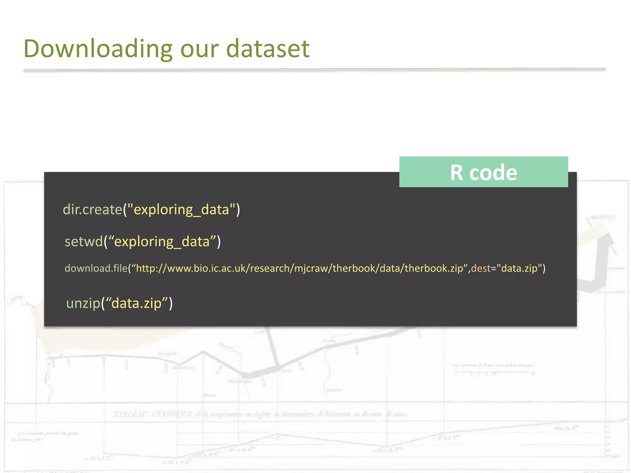


![Final Challenge
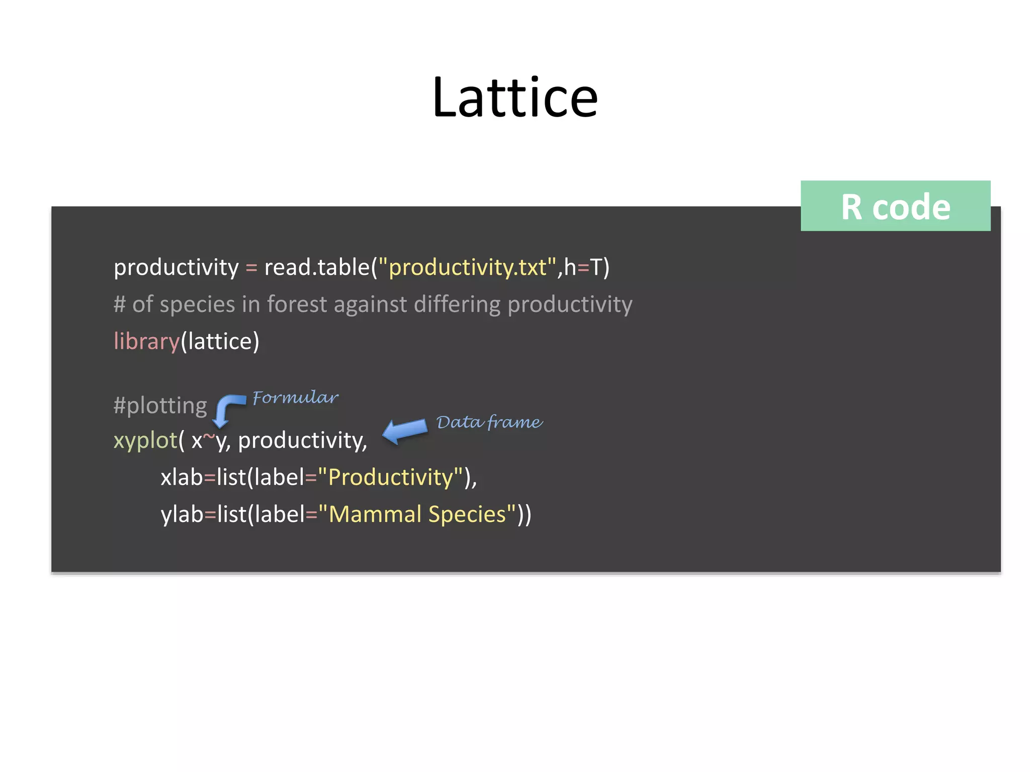
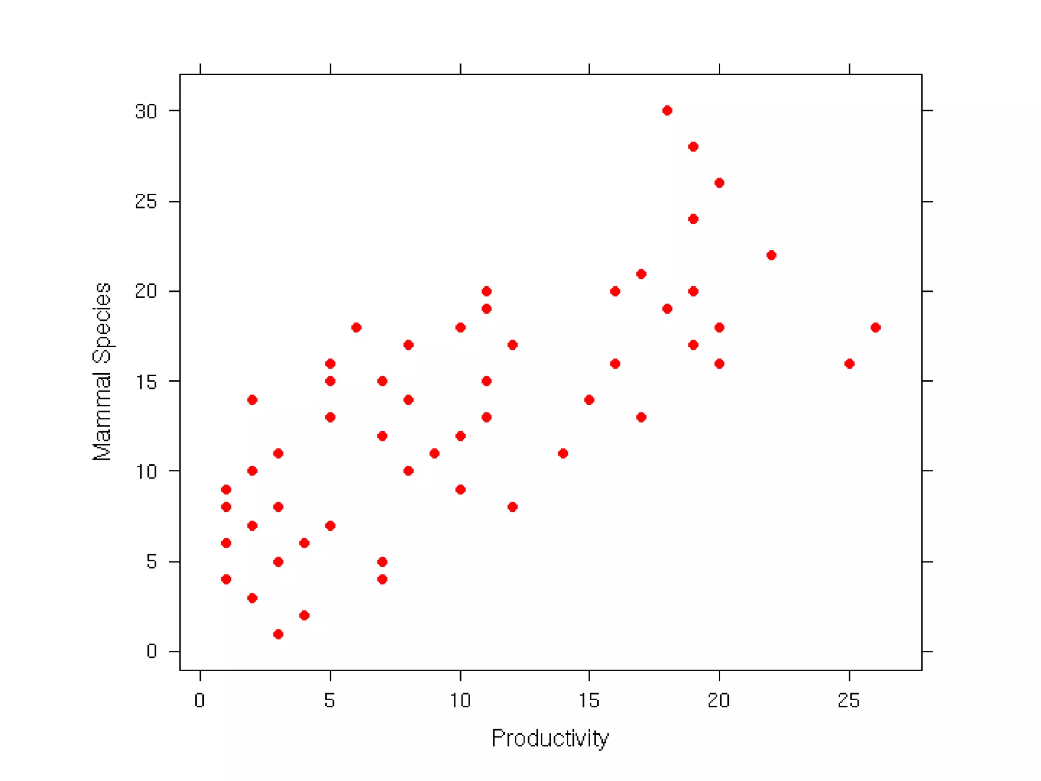
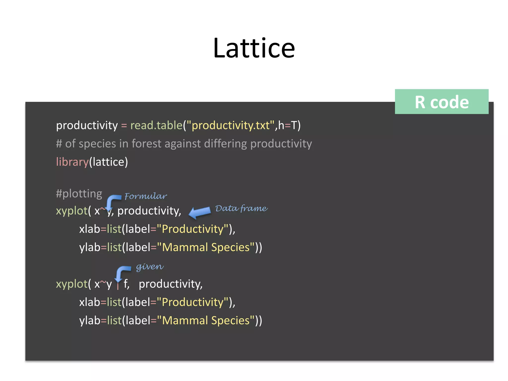
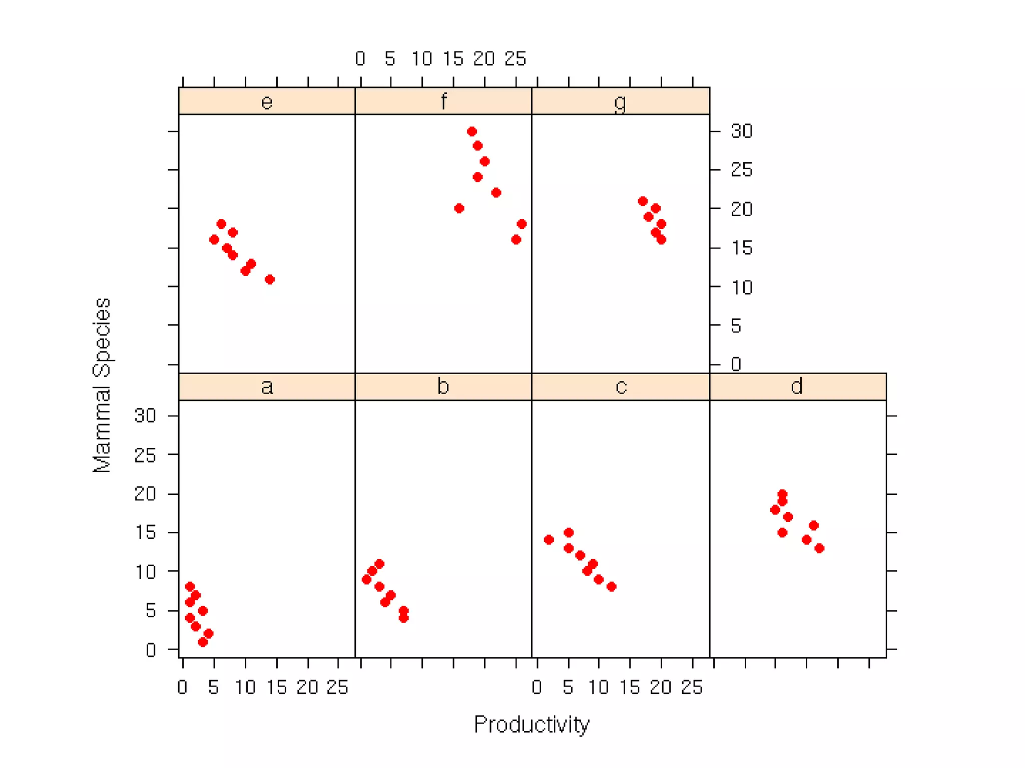
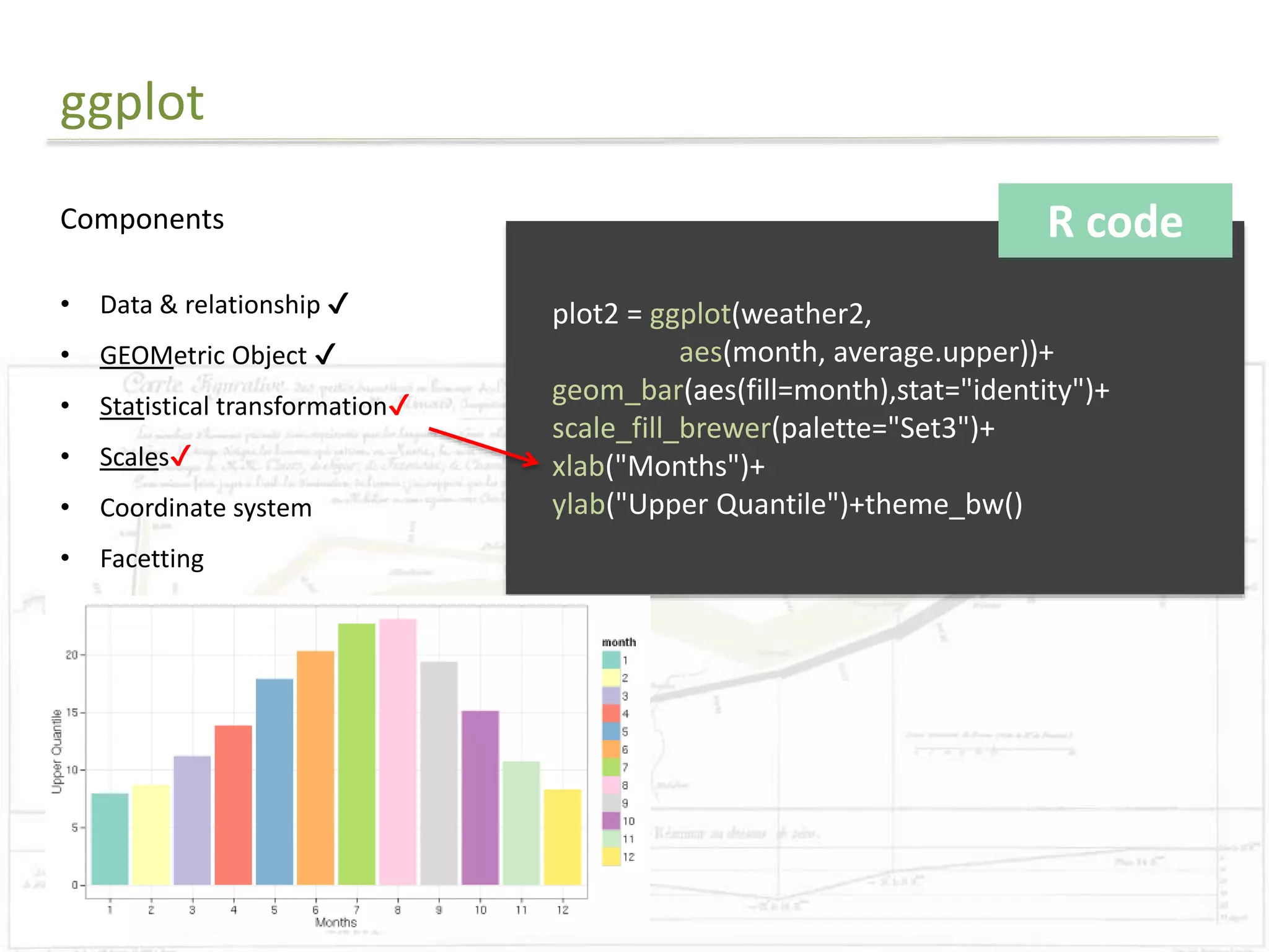
R code
library(ggplot2)
#Reads in data
data = read.csv("final.csv")
#Preparing for the rectangle background
areas=unique(subset(data, select=c(Planning_Area,Planning_Region)))
areas=areas[order(areas$Planning_Region),]
areas$rectid=1:nrow(areas)
rectdata = areas %>% group_by(Planning_Region) %>% summarise(xstart=min(rectid)-
0.5,xend= max(rectid)+0.5)
#Order the levels
data$Planning_Area=factor(data$Planning_Area,
levels=as.character(areas[order(areas$Planning_Region),]$Planning_Area))](https://image.slidesharecdn.com/presentation1-141107085534-conversion-gate02/75/Exploratory-Analysis-Part1-Coursera-DataScience-Specialisation-37-2048.jpg)
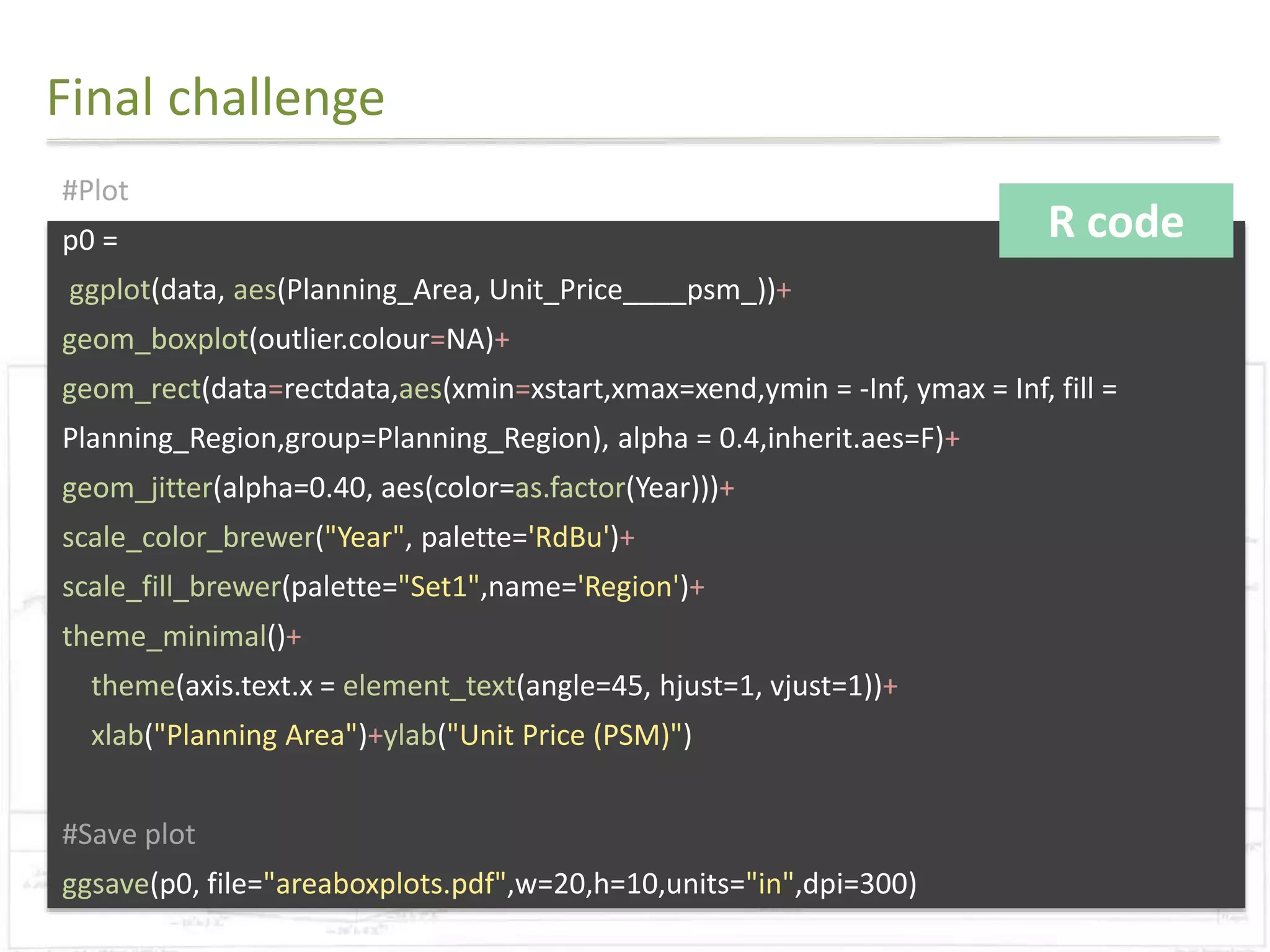

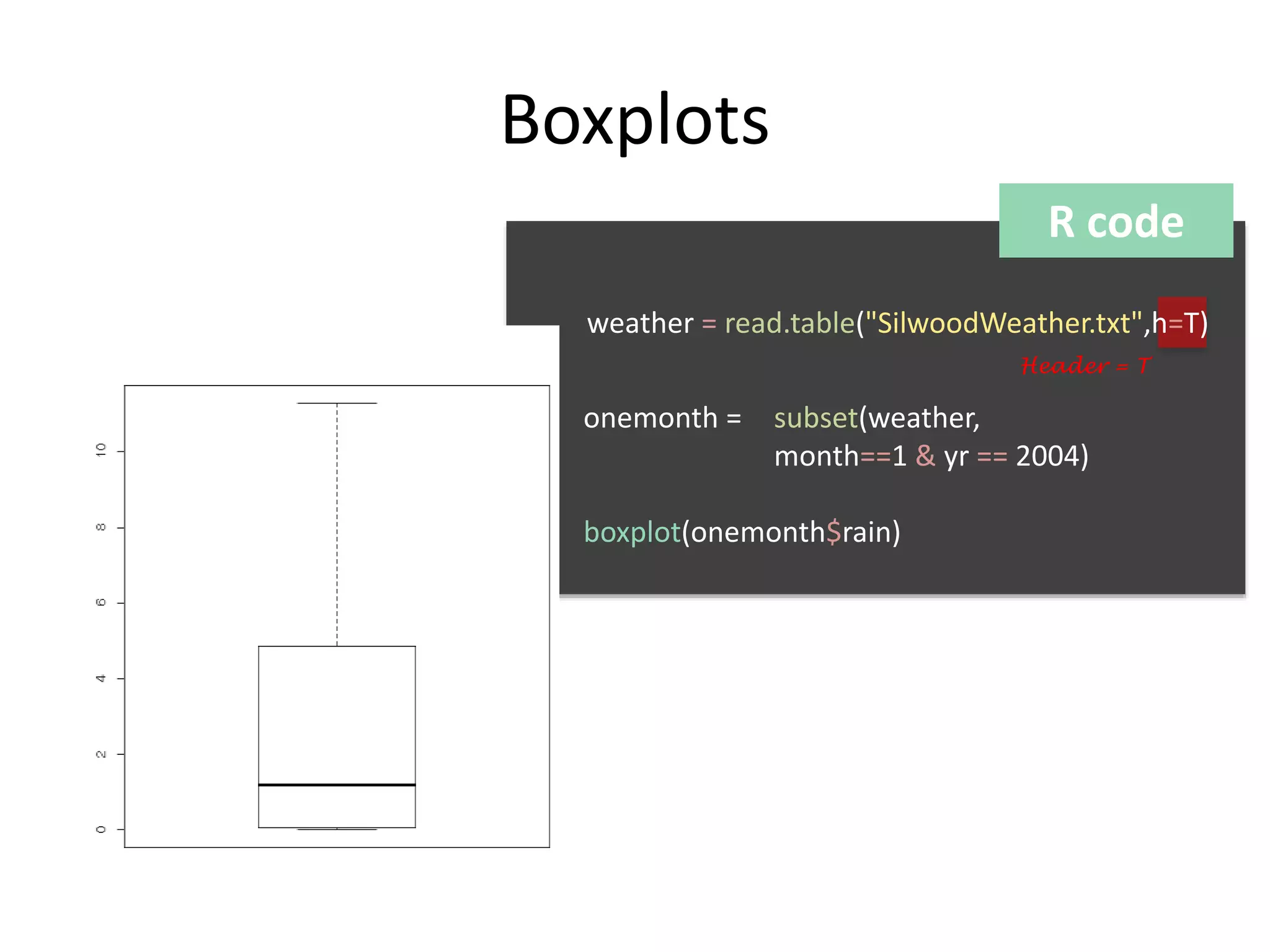
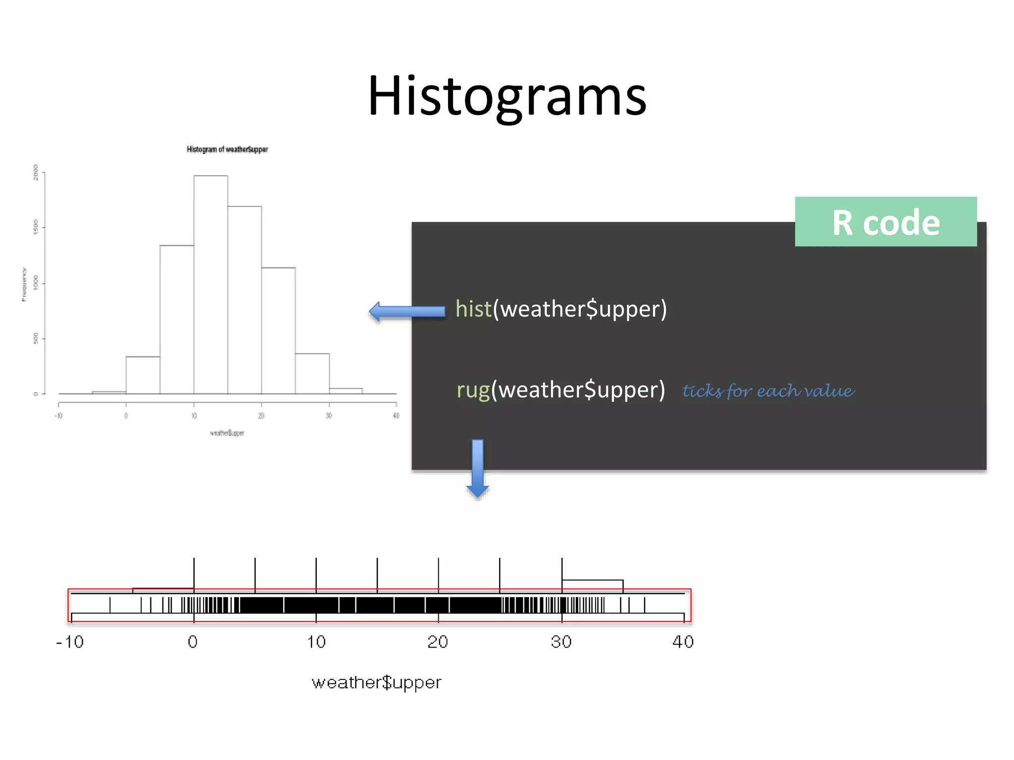
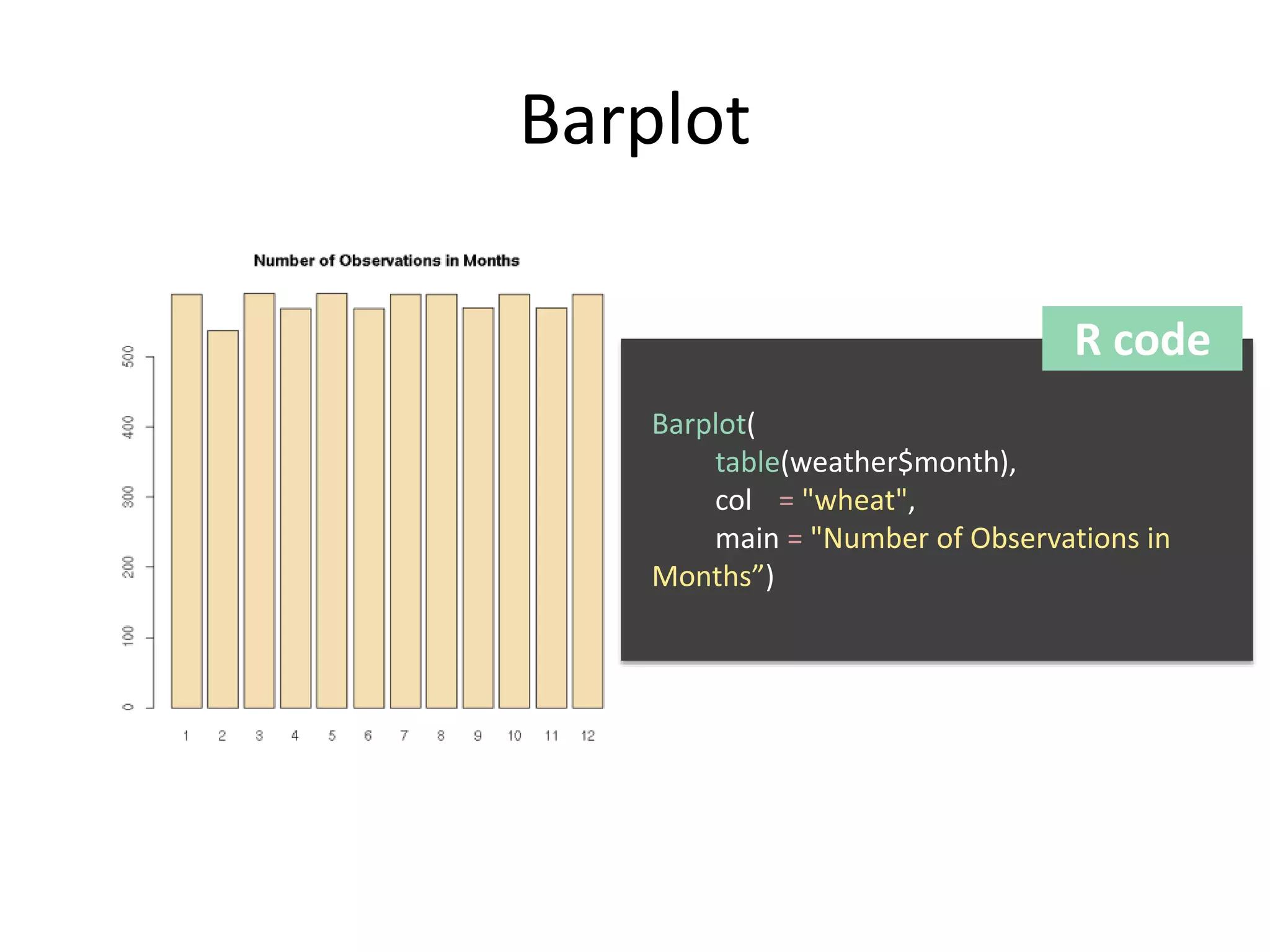
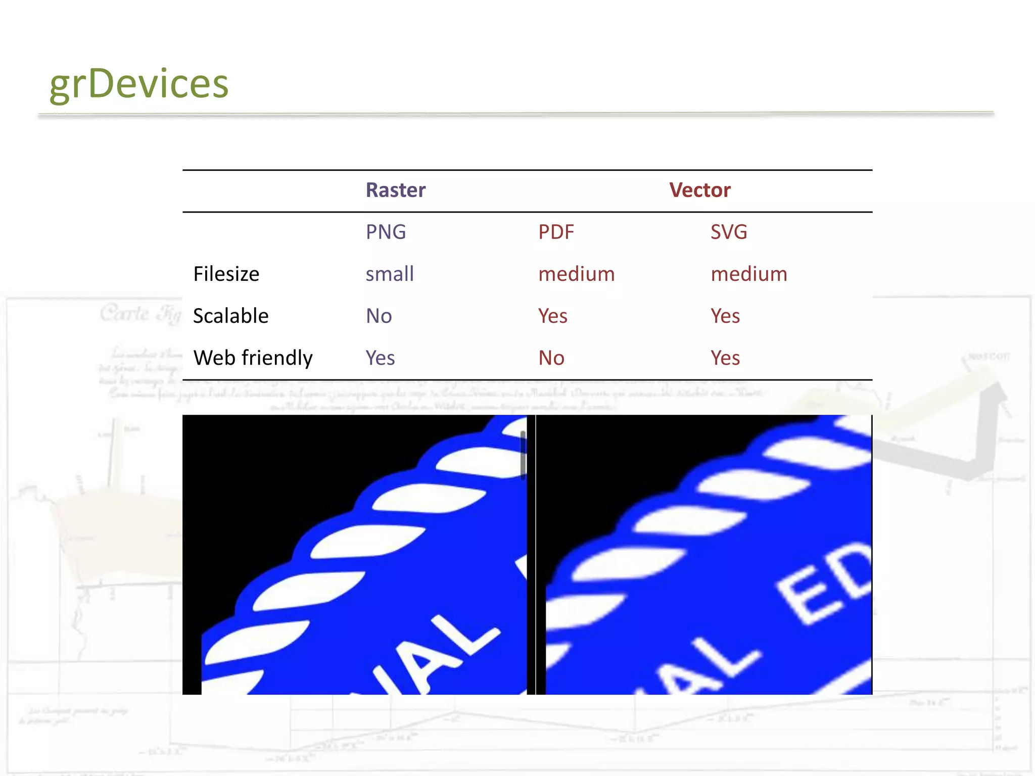
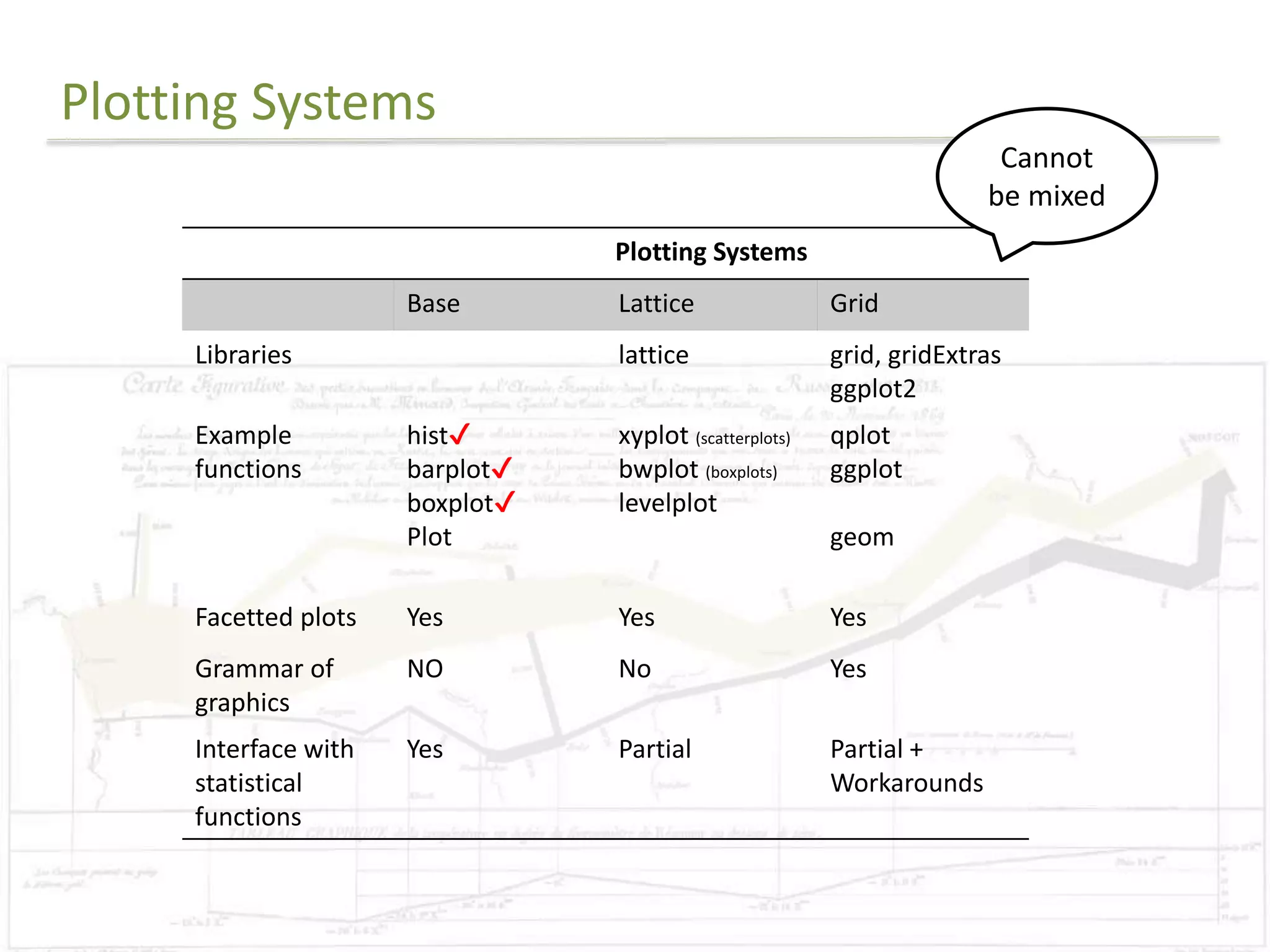
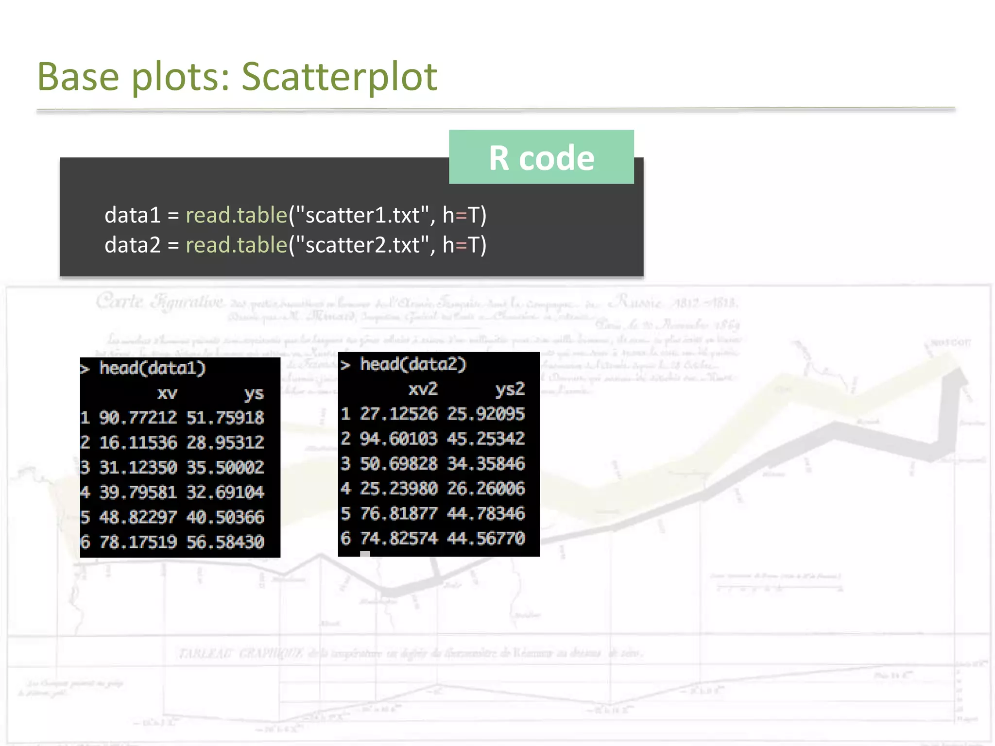
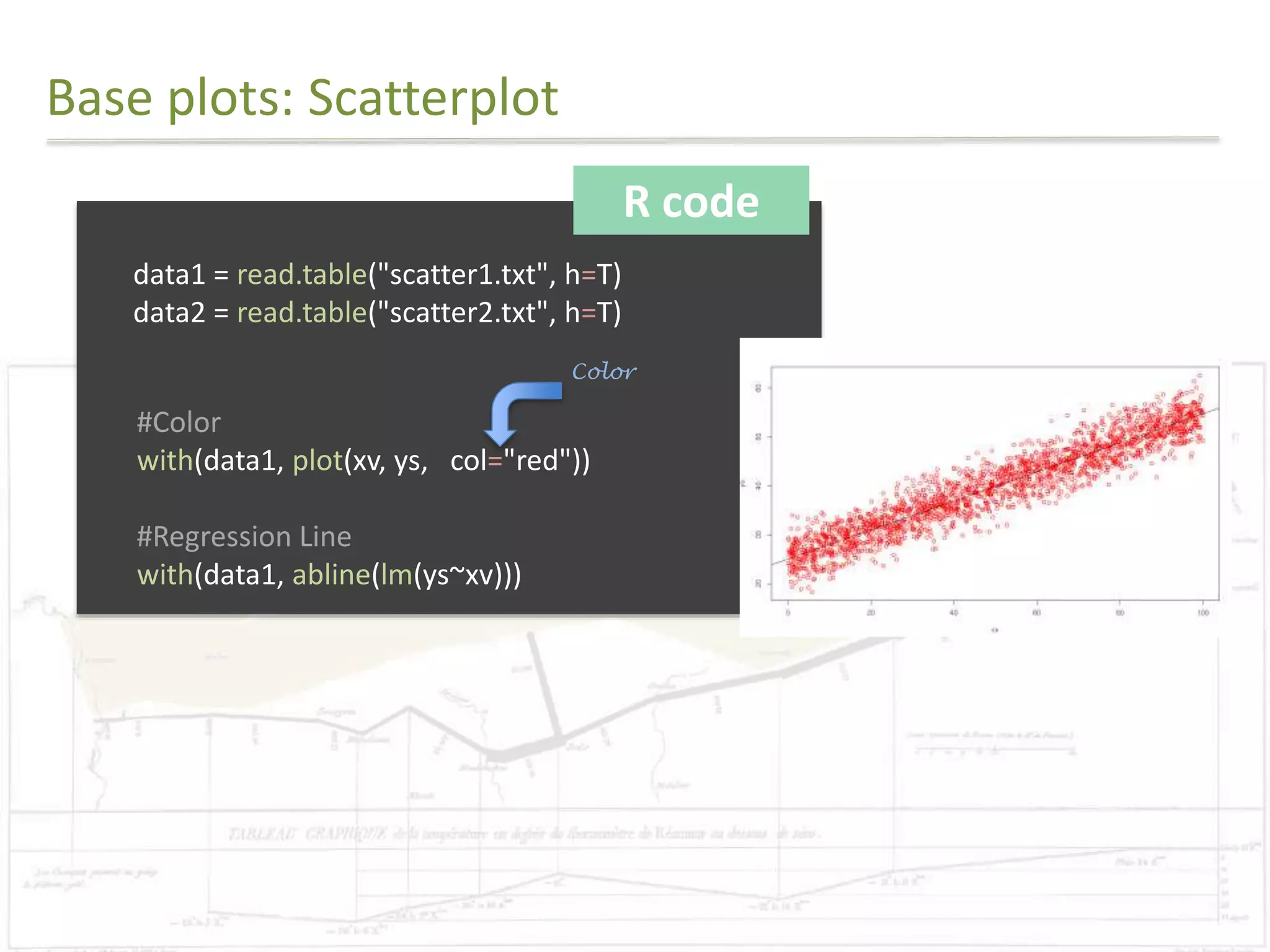
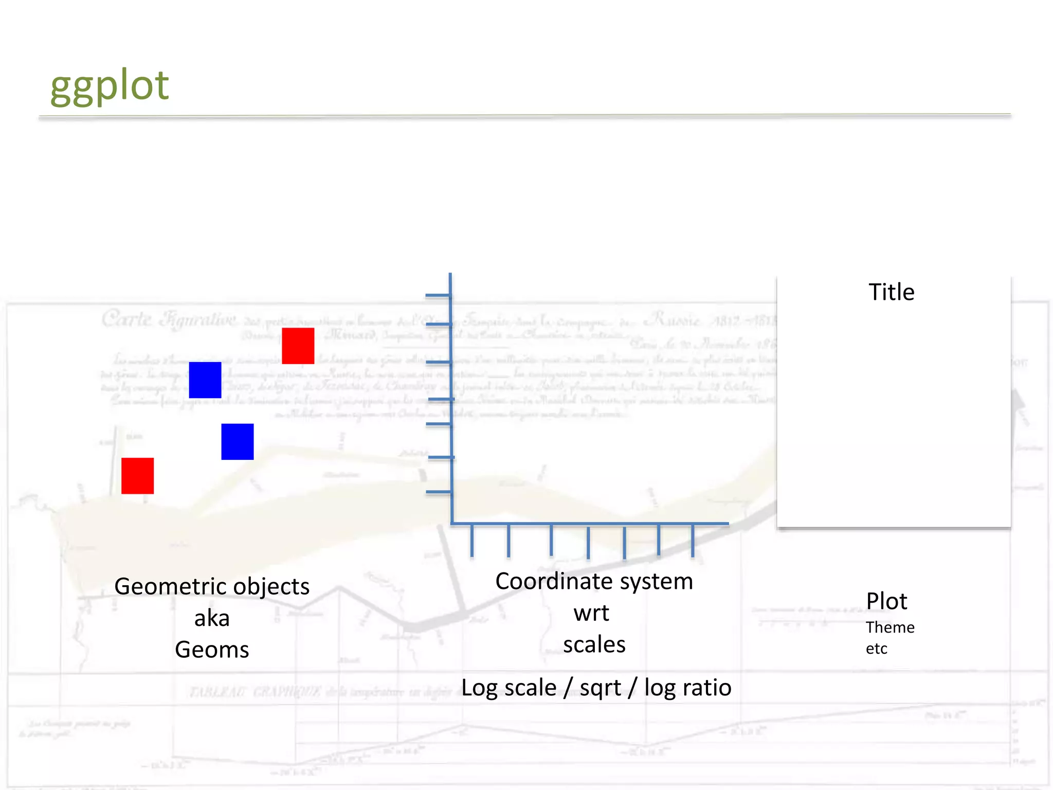
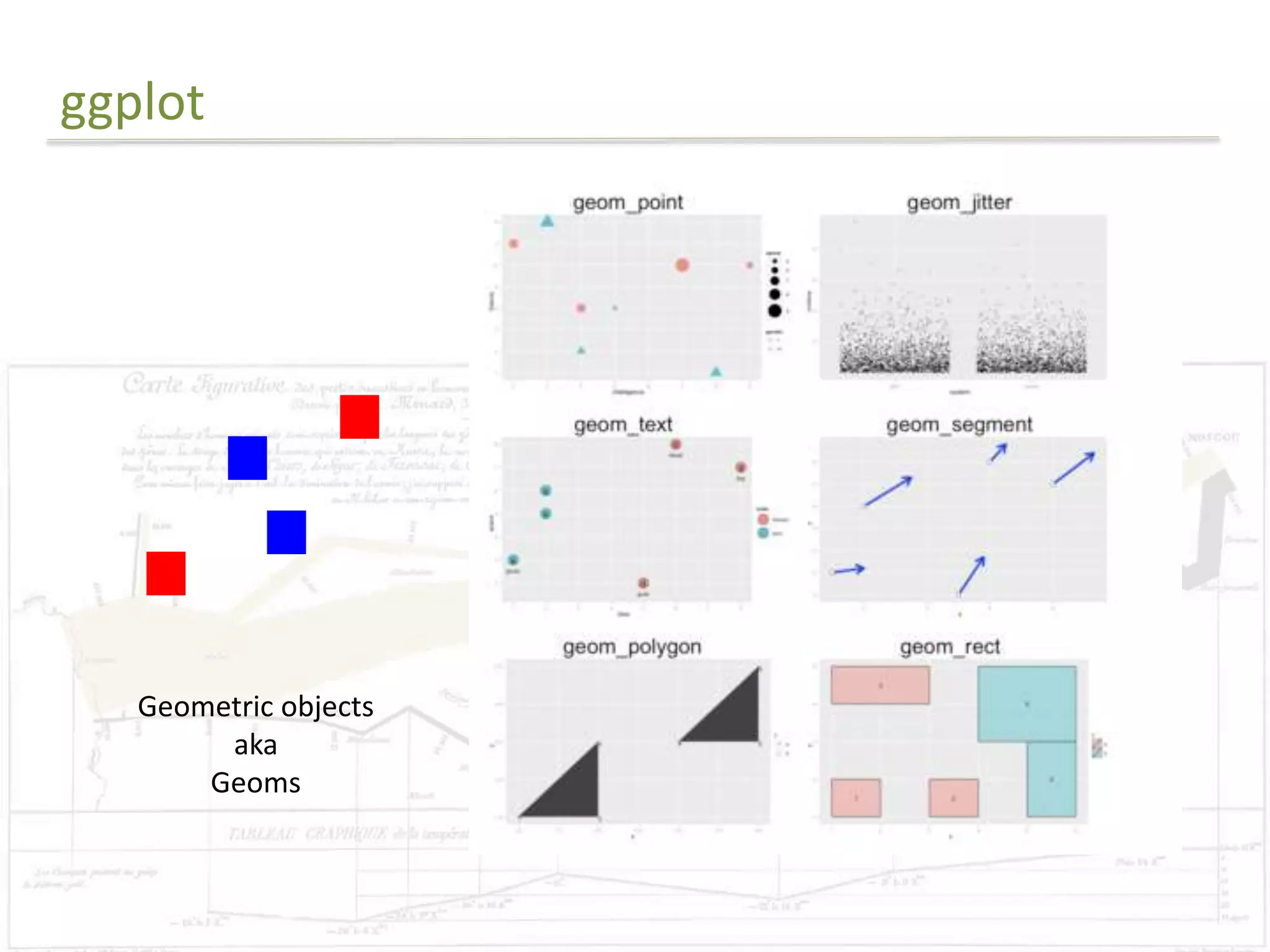
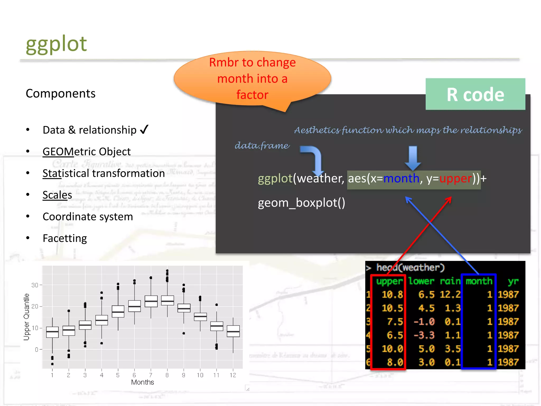
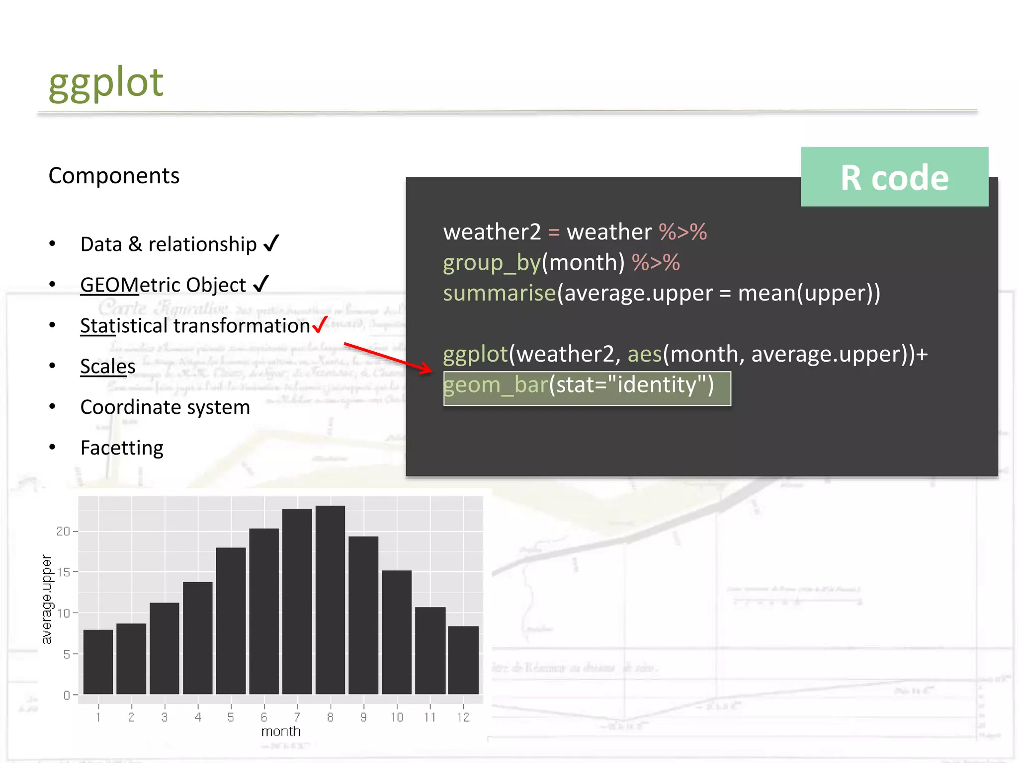
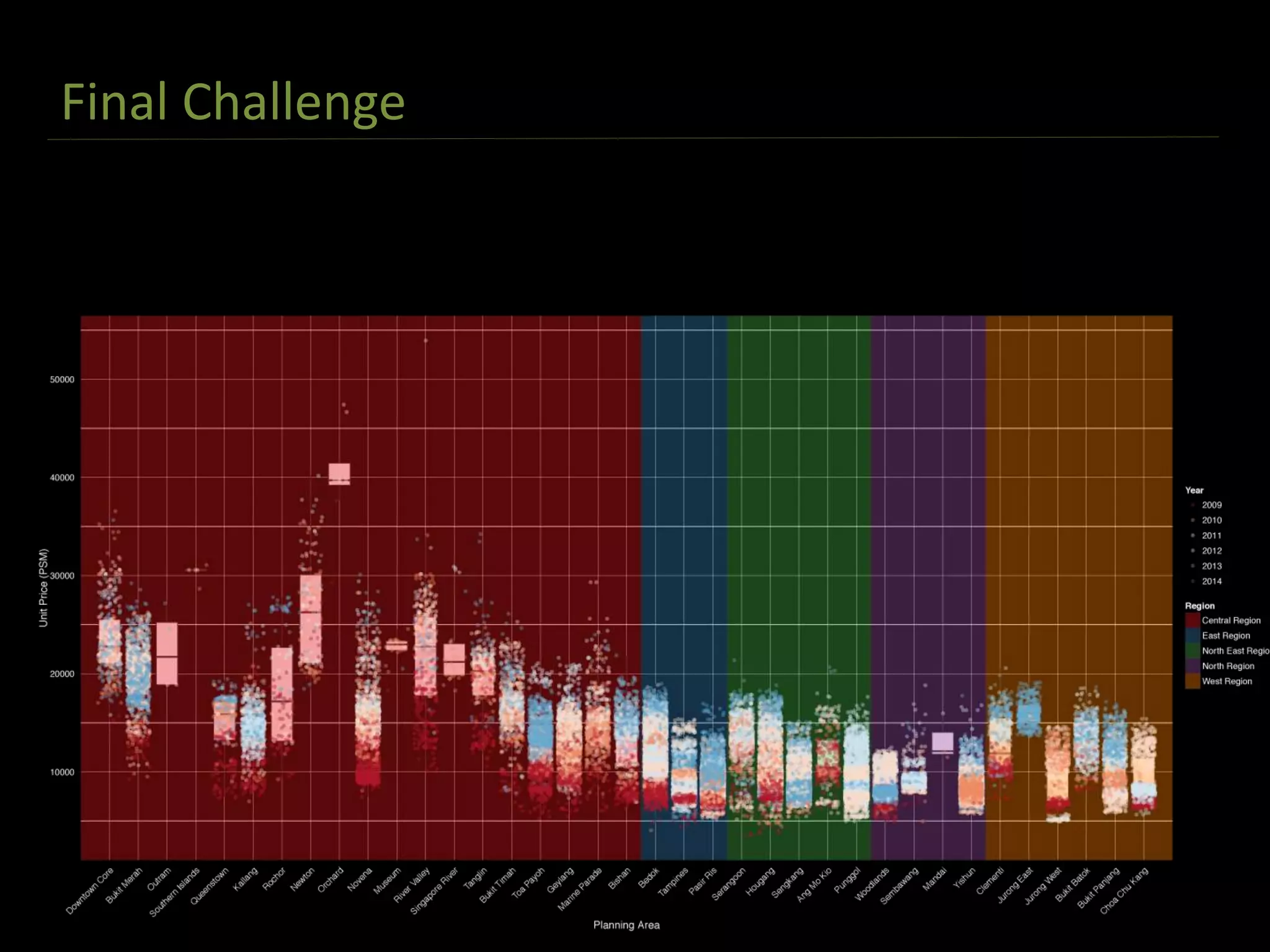
The document discusses exploratory data analysis techniques in R, including various plotting systems and graph types. It provides code examples for creating boxplots, histograms, bar plots, and scatter plots in Base, Lattice, and ggplot2. It also covers downloading data, transforming data, adding scales and themes, and creating faceted plots. The final challenge involves creating a boxplot with rectangles to represent regions and jittered points to show trends over years.