Responsive Webdesign
   or: "webdesign, done right"

        by Tom Hermans - tomhermans.com
                 @tomhermans
about me
designer / developer / wp guy
free-lancing
Sony Europe - UX - e-Platform

reach me via:
tomhermans.com
@tomhermans
design
A plan or drawing produced
to show the look and function or workings
of a building, garment, or other object
(before it is built or made.)
print
card
packaging
nicer packaging
car wrap
fashion
body paint
what do these designs
all have in common ?

great slide pic to pose a question
to the audience i guess
all applied on a
     canvas
canvas
    physical size
     constraints

power to the designer
how does the web canvas look like?
web pages are elastic
in both horizontal and vertical dimensions
               in a way that
           paper pages are not.
terminology
“masthead”
“whitespace”
“leading”
“fold”

all derived from print design
“The control which designers know in the print
medium, and often desire in the web medium,
is simply a function of the limitation of the
printed page. We should embrace the fact that
the web doesn’t have the same constraints, and
design for this flexibility. But first, we must
“accept the ebb and flow of things.“

- John Allsopp
“Webdesign is responsive design.
Responsive Webdesign
is web design,
done right.”
           - Andy Clarke
WTF should you care ?
mobile is growing..
FAST
Solutions
native app
web app
mobile website
responsive webdesign
what to choose ?
mmm.. depends..
native ?
Yes, if:
specific device functionality

camera
gyrometer
gps
etc..
native app : issues
- extra build
- extra cost
- many platforms
- even more extra cost
- sharing content
- findability
- walled garden
- duplicate content management
- there are pro's too..
mobile website?
optimized, but not really
mobile website : issues
- redirects
- urls (m. vs www)
- sharing (desktop to mobile and viceversa)
- duplicate content
- often catering for certain brands / types / OS
- duplicate content - duplicate mgmt
- different devices
- expensive and unsatisfying
responsive
a site that is able to adapt to the context
in which it is being viewed.
99 viewports - iPhone's just 1
viewports ?
smartphones
feature phones
tablets
desktops

future ?
benefits responsive webdesign
1 website
1 content
1 url
what's so responsive about that?
1 codebase

diff. functionality

diff. layout
examples
cool
how do you do that ?
rwd consists of
flexible grid
flexible images and media
media queries
stop thinking in pixels
  think proportional
 think percentages
think modular
stop thinking fixed width
960 is dead - 100%
flexible design
make no assumptions
about a browser window's width
media queries
check for - condition
  usually width (also pixel-ratio,orientation)

apply different styles

breakpoints
media queries
around since css 2.1 - media type

<link rel="stylesheet" type="text/css" href="core.css"
  media="screen" />
<link rel="stylesheet" type="text/css" href="print.css"
  media="print" />
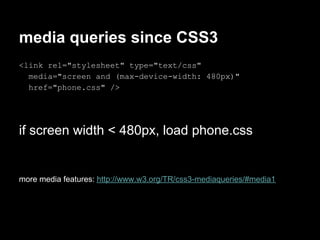
media queries since CSS3
<link rel="stylesheet" type="text/css"
  media="screen and (max-device-width: 480px)"
  href="phone.css" />


if screen width < 480px, load phone.css


more media features: http://www.w3.org/TR/css3-mediaqueries/#media1
<link rel="stylesheet" type="text/css"
  media="screen and (min-device-width: 480px)"
  href="desktop.css" />


if screen width > 600px, load desktop.css
media queries in css file
@media screen and (max-device-width: 480px){
  .column {
     float: none;
  }
   .logo {
      margin: 0 auto;
   }
}
media queries summary
       if media query test is met
                     >
           css will be applied
media queries itself
breakpoints ?
common breakpoints
320
480
600
768
960
1200
or when the design starts to look bad
  responsivepx.com
mobile first
apply basic formatting to page

type
colors
margins
mobile first pt.2
media queries for bigger screens
progressive enhancement

> less capable browsers will always be served
a readable site
total width ?
width:100%
max-width 1120, 1600, 1920 ..

dependent on:
- content
- modules
- design proportions
grid
helps to build modular
forget 960
look at responsive grids
build your own!
tools
modular grid extension
     modulargrid.org/#app
responsinator
     responsinator.com
'my' best practice
use a max-width
use a flexible width
design fluid modules
mobile first
serve basic stylesheet first

type
colors
margins
progressive enhancement
add css through mediaqueries

> less capable browsers will always be served
a readable site
build your own grid


    (target % context) * 100 = result


720 in 940
76,595744680851063829787234042553 %

1 col (55 in 1200) :
4,5833333333333333333333333333333 %
flexible modules

easy to "place" in the layout

order in DOM becomes even more important

left to right = top to bottom (mostly)
fluid media
.entry-content img, .widget img
{ max-width: 100%; }

embed, object, video {
max-width: 100%;
height: auto;
}
more (good) practices
try using CSS3 and svg
polyfills
   css3-mediaqueries-js
   respond.js
   modernizr

new developments (cssgrid, flexbox,..)
some resources
responsive webdesign - ethan marcotte
(abookapart)

alistapart.com/articles/responsive-web-design

mediaqueri.es
wordpress
twentyeleven (and successors)
many others, but be aware..
premium is often not. (in general imho)
bottomline
content should be accessible

put user first - think about User eXperience
mobile users will do
       anything and everything
        desktop users will do,
provided it's presented in a usable way.

                                - brad frost
the device can't be an obstacle
think future friendly
thanks.


    questions:
  @tomhermans
tomhermans.com
more resources
the whole argument on media
https://github.com/filamentgroup/Responsive-Images
http://adaptive-images.com/
http://unstoppablerobotninja.com/entry/fluid-images
snippet - media reporter
.site-title:before {
   position: absolute;
   top:0;
   content: "768 and up";
   background-color: hsla(150,60%,
   40%,.7);
   color: white; font-size: 16px;
   padding: 5px 10px;
}
> handy to see which mq is active

Responsive webdesign WordCampNL 2012